Page 5 of 49
Posted: Sun Dec 17, 2006 6:55 am
by HerrSchreck
Has anyone else noticed how much the WACKY C resembles the dreaded CONTINENTAL FILMS "C" from the German Occupation of France?
Posted: Sun Dec 17, 2006 8:24 am
by hammock
HerrSchreck wrote:Has anyone else noticed how much the WACKY C resembles the dreaded CONTINENTAL FILMS "C" from the German Occupation of France?


Kindly linked from
this site. Many of the posters are worthy Criterion covers - one can only hope.
Posted: Sun Dec 17, 2006 10:42 am
by HerrSchreck
So we can not-- in conclusion that is-- say with any actual safety that that Wacky C is fighting those NaZi's, my friends. They have been in deep collusion with one another putting out films that abruptly say "HEY WHAT'S THAT OVER THERE?" then secretly slipping in " you snivelling piece of inferior poot, you will yeild and obey and from this point forward do precisely as you are told in the service of my World Domination Project as well as my Nice People Butchering Thingy.. DID I TELL YOU HOW PRETTY YOU LOOK TODAY, YOU TOTALLY FREE, UN BRAINWASHED PERSON?"
Posted: Sun Dec 17, 2006 3:19 pm
by jbeall
LMFAO!! Maybe the wacky C is part of the Army of Shadows. One can only hope, anyway. Vive le resistance!!!
Posted: Mon Dec 18, 2006 6:53 pm
by criterionsnob
Posted: Mon Dec 18, 2006 6:57 pm
by domino harvey
those are great
Posted: Mon Dec 18, 2006 7:56 pm
by Christmas Cyclops
Do the Ichikawas have to match?
Posted: Mon Dec 18, 2006 8:08 pm
by zedz
Three great covers. The Naked City may be one of their best yet.
Posted: Mon Dec 18, 2006 8:13 pm
by hammock
Absolutely amazing covers - right up my alley!
Posted: Mon Dec 18, 2006 9:02 pm
by blindside8zao
the "wacky" C looks so terribly absurd and out of place on the "Fires" cover, like an unwanted friend at a party, like the Underground Man with his childhood friends, or just like a spot of mustard on your new button up white dress shirt. The cover is just so amazing and the wacky C looks like it fits more with comical covers instead of tragic ones.
Posted: Mon Dec 18, 2006 10:06 pm
by Highway 61
I love The Naked City cover. Easily among my favorites. I'm just a sucker for architecture and urban landscapes. The lettering is fantastic; I actually wish the bottom half were cut out and it was just "Jules Dassin's THE NAKED CITY" across the entire cover. Not to keen on the Ichikawa's, however. I would like them more if they were solely black and white.
Posted: Tue Dec 19, 2006 5:42 am
by Derek Estes
I love the Wacky C. I love how understated it is. I love that it stays in it's corner. I love that it's monochromatic. I love that it isn't a bunch of words. I love that it's wacky.
I Love Wacky C
Wacky C is Good To Me
Long Live Wacky C
or
Oh Where It May Be
Countryside Or The City
It's My Wacky C
Posted: Tue Dec 19, 2006 10:12 am
by godardslave
blindside8zao wrote:the wacky C looks like it fits more with comical covers instead of tragic ones.
This is because you're thinking of it as "wacky"

please cross ref. my earlier post: "the elegant and minimalist C"
Derek Estes wrote:I love the Wacky C. I love how understated it is. I love that it stays in it's corner. I love that it's monochromatic. I love that it isn't a bunch of words. I love that it's wacky.
yes, i agree! finally a voice of reason! (in this absurdly unimportant debate)
Posted: Tue Dec 19, 2006 10:18 am
by HerrSchreck
Who can stay unmoved by the great CC changing itself to Broken Nosering Collection.
I mean Continental (cough) Film. LE CORBEAU was great...
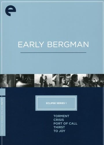
Posted: Fri Dec 22, 2006 5:45 pm
by Ashirg
Different colors at Amazon:
Posted: Fri Dec 22, 2006 5:50 pm
by Greathinker
I'm guessing Amazon is the wrong one.
Not bad, though very minimalistic, appropriate for the eclipse line I suppose.
Posted: Fri Dec 22, 2006 5:52 pm
by Steven H
Very "BFI". Are Criterion turning socialist?
Posted: Fri Dec 22, 2006 5:58 pm
by Matt
It will be interesting to see if that is the design template for the entire line or just a one-off. I can imagine if it's the former, it will be an incredible relief for Criterion's design team. Plus, they will look pretty nice all lined up in a row.
Posted: Fri Dec 22, 2006 6:27 pm
by domino harvey
that is one of the worst covers I have ever seen.
Posted: Fri Dec 22, 2006 7:23 pm
by Jeff
domino harvey wrote:that is one of the worst covers I have ever seen.
I don't think it's that bad. The Amazon colors are awful, but surely that's a mistake. Don't count on them commissioning creative, artistic designs for this line or forking over the cash for large hi-res photographs and colorful artwork to be printed on the boxes. The whole point is to make the line affordable. It can't be affordable for you if it's not affordable for them. I would imagine that, as Matt speculated, the rest of the line will follow the same template.
Posted: Fri Dec 22, 2006 7:30 pm
by denti alligator
domino harvey wrote:that is one of the worst covers I have ever seen.
No, one of the worst covers is Mouchette. This isn't all that bad, and serves its purpose well. I'm just waiting for the official announcement, which ought to be today, no?
Posted: Fri Dec 22, 2006 7:45 pm
by Jeff
denti alligator wrote:I'm just waiting for the official announcement, which ought to be today, no?
Don't count on it. The Criterion offices are
closed for the next two weeks, just as they are every year. I wouldn't count on any more blogging, website updates, or announcements until January 3, at the earliest. On a more positive note, there are, um,
mugs.
Posted: Fri Dec 22, 2006 7:54 pm
by Tribe
They did warn they were gonna keep it barebones....
Tribe
Posted: Fri Dec 22, 2006 8:11 pm
by Jun-Dai
Will everyone shoot me down if I suggested that they should accept customer submissions for the cover design?
Posted: Fri Dec 22, 2006 9:04 pm
by Matt
Jun-Dai wrote:Will everyone shoot me down if I suggested that they should accept customer submissions for the cover design?
Not a comment directed at you, but something your question brought to mind: Maybe they should just do something like
this, then none of us would have reason to complain about the cover art.


