Posted: Tue Jul 17, 2007 4:17 pm
How can people not like Rupert Grint?


My first reaction was "whose hand is that?" It looks like someone is using Peck and Quinn as shields while shooting a luger.colinr0380 wrote:Anthony Quinn's hand-gun gets more bizarre the longer I look at it!
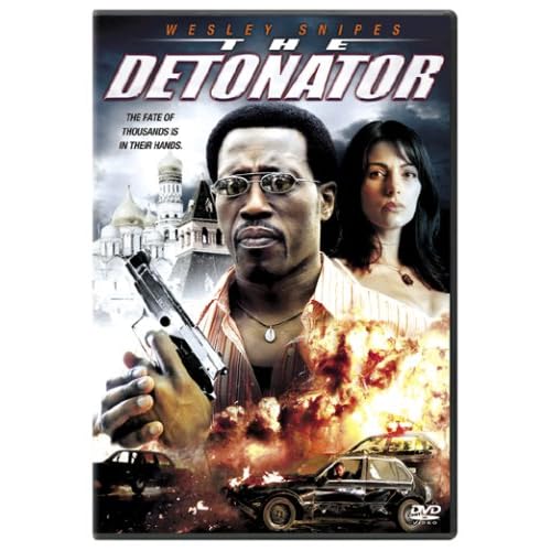
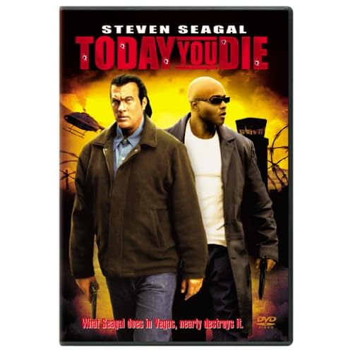
I don't know if you have noticed but Sony has been consistently producing the worst covers for a while now. Look at all the direct to DVD covers of Steven Seagal and Wesley Snipes and you'll see that they were done by 6th graders learning how to use photoshop. And with their mainstream movies, Sony loves to use the big head feature.Matt wrote:Here's a larger version. What a mess! Perhaps the biggest shock is that this is not the cover of a disc from Alpha or Madacy. It's Sony!
I see what you mean. They must have solid market research that proves that explosions in the background of the cover raise sales a significant amount.dx23 wrote:I don't know if you have noticed but Sony has been consistently producing the worst covers for a while now. Look at all the direct to DVD covers of Steven Seagal and Wesley Snipes and you'll see that they were done by 6th graders learning how to use photoshop.

I don't know what is worst, the explosions gimmick or the fact that even Kevin Sorbo looks bored in the cover:Matt wrote:I see what you mean. They must have solid market research that proves that explosions in the background of the cover raise sales a significant amount.dx23 wrote:I don't know if you have noticed but Sony has been consistently producing the worst covers for a while now. Look at all the direct to DVD covers of Steven Seagal and Wesley Snipes and you'll see that they were done by 6th graders learning how to use photoshop.

Here's a quick, just-for-the-hell-of-it try:davebert wrote:You know, I wouldn't be surprised if explosions in the background actually DID increase sales. If I had the time or energy, this would be the point where I would go grab classic melodramas and Photoshop in some nukes in the background to prove the point. But I don't have the time, so I'll just sit here and dream.

Shit, they nuked France! Someone call Kevin Sorbo for revenge tactics!tryavna wrote:Here's a quick, just-for-the-hell-of-it try:davebert wrote:You know, I wouldn't be surprised if explosions in the background actually DID increase sales. If I had the time or energy, this would be the point where I would go grab classic melodramas and Photoshop in some nukes in the background to prove the point. But I don't have the time, so I'll just sit here and dream.
Sounds kinda like Female Trouble. I wanted to see this long ago, but it wasn't released here. I forgot about it, but I will get it someday, and any movie with farting is a must have.Kirkinson wrote:Anyone who finds the cover entertaining must read the high-concept plot outline on IMDb:
An 11-year-old boy's amazing ability to break wind leads him first to fame and then to death row, before it helps him to fulfill his ambition of becoming an astronaut.
This is beautiful, nice pink on blue, great cover. Looks like a fun movie too...Magic Hate Ball wrote:The 80's are back, and they're PISSED.dx23 wrote:
if there were a Hall of Fame for these threads, might I be the first to nominate this monstrosity to the hallowed halls of balls.Matt wrote:
I'd second that nomination. I've just realized that the guy on the right is supposed to be Omar Sharif, not a refugee from a poster campaign warning hobbits about the dangers of foetal alcohol syndrome.domino harvey wrote:if there were a Hall of Fame for these threads, might I be the first to nominate this monstrosity to the hallowed halls of balls.

I want to say that it was legal reasons, but Mario is in the movie. Probably just a lazy/stupid designer.CSM126 wrote:I mean, c'mon. You'd think it would be a no-brainer to just use that bitchin' poster art. Instead we got this blandness. Not to mention that Fred Savage never once wore the Power Glove in the movie. That was a flaw in the poster too, but you'd think they would have had the decency to photoshop it out and fix the faux pas. For crying out loud.
It's a good poster but, as is often the case, the detail is too small to work on a DVD cover. That's why DVD covers are all about giant heads and explosions.CSM126 wrote:I mean, c'mon. You'd think it would be a no-brainer to just use that bitchin' poster art.

