Page 41 of 67
Posted: Fri May 26, 2006 8:43 pm
by SimonI
jmj713 wrote:Can somebody post the two versions side by side. I can't find the first one anywhere...
What gives? I linked to the current cover but it's gone back to the first design! So anyways, lucky for us I kept both copies...
Old on the left; new on the right:
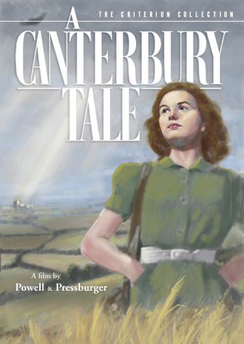
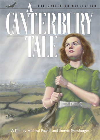
Errr... or is it new on the left, old on the right???
Posted: Sat May 27, 2006 12:17 am
by godardslave
its also worth noting that a "tree" looks nothing like a "car".
Posted: Sat May 27, 2006 4:07 pm
by backstreetsbackalright
I wouldn't be surprised if we shortly see Canterbury with a Criterion "New Look" cover design. It's currently the last spine in the Sprocket-Font series.
Posted: Mon May 29, 2006 3:56 am
by Cinesimilitude
godardslave wrote:You will find most "C's" look similar, as opposed to E's, that look nothing like C's.
its also worth noting that a "tree" looks nothing like a "car".[/quote]
Although both do have trunks, as do elephants, so one could conceivably confuse the three. Maybe you had thought about this before you posted...
Posted: Tue Jun 06, 2006 6:50 am
by Ashirg
Alternative cover?

Posted: Tue Jun 06, 2006 10:17 am
by SimonI
backstreetsbackalright wrote:I wouldn't be surprised if we shortly see Canterbury with a Criterion "New Look" cover design. It's currently the last spine in the Sprocket-Font series.
I do hope so... meanwhile, it's curious that the image currently on their site is not the latest they showed :-s
Posted: Sun Jun 11, 2006 5:50 am
by edgarnazaretian
so after searching through image's site i found the cover of seduced and abandoned and the the new spine art...i dont know if this was mentioned before but here it is...

Posted: Sun Jun 11, 2006 6:01 am
by HerrSchreck
Art direction by Jack Kirby?
All their covers are starting to look like publishing products rather than video products, S&A looking like a fucking comic book. All the SIX MORAL TALES look like college textbooks.
Posted: Sun Jun 11, 2006 6:09 am
by Cinesimilitude
I like it. I liked the way it was before even more, but it'll still be the high quality content we are used to.
Posted: Sun Jun 11, 2006 2:46 pm
by souvenir
Am I missing the spine number or is it just not there?
Posted: Sun Jun 11, 2006 2:52 pm
by CSM126
souvenir wrote:Am I missing the spine number or is it just not there?
It's near the bottom of the spine, as usual.
Posted: Sun Jun 11, 2006 3:36 pm
by denti alligator
And it's running horizontally, not vertically, if I'm seeing it right. This is a change.
Posted: Sun Jun 11, 2006 3:43 pm
by Cinesimilitude
a few of the boxsets have horizontal spine numbers, Doinel and Stage and Spectacle are a few I own that are that way, but for individual releases, yeah, its new.
Posted: Sun Jun 11, 2006 3:51 pm
by HerrSchreck
Speaking of groovy spines, anyone ever empty out their monterey box & peek inside the hollow box at the spine reverse? Innaresting young lady hiding in there...
Posted: Mon Jun 12, 2006 6:19 am
by Anonymous
HerrSchreck wrote:Art direction by Jack Kirby?
All their covers are starting to look like publishing products rather than video products, S&A looking like a fucking comic book. All the SIX MORAL TALES look like college textbooks.
It's interesting that they've used two prominent cartoonists for each of the Germi titles -- however Michael Allred is hardly Jaime Hernandez. And it's a shame they didn't try to get Alex Toth to do a cover before he recently passed:

As for Kirby, no one could've made a better EQUINOX cover
than he
Posted: Wed Jun 14, 2006 2:48 pm
by Lino
Gorgeous artwork for Jigoku (and great extras too).
Posted: Wed Jun 14, 2006 3:03 pm
by Narshty
The've got the same crappy Heaven Can Wait artist back for Amarcord.
Posted: Wed Jun 14, 2006 3:12 pm
by Gigi M.
Shit... Why would they do something like that.
Posted: Wed Jun 14, 2006 4:40 pm
by FilmFanSea
The artwork for Spirit of the Beehive is sublime--it is easily one of my all-time favorite Criterion covers.
Posted: Wed Jun 14, 2006 4:57 pm
by cgray
yeah, that amarcord cover is horrible!
however, i really like the seven samurai cover, as well as the Jigoku cover. i really dig those, as opposed to screen captures.
Posted: Wed Jun 14, 2006 5:32 pm
by Cinesimilitude
oh god september is going to be expensive...
I'm buying Amarcord, Seven Samurai, and Beehive.
and also, I love the Heaven Can Wait art, and the Amarcord art as well.
Posted: Wed Jun 14, 2006 9:01 pm
by richast2
is it just me, or does the Jigoku cover look like a close-up of somebody's tattoo?
Posted: Wed Jun 14, 2006 9:39 pm
by Cinesimilitude
i believe it is.
Posted: Wed Jun 14, 2006 10:47 pm
by Jeff
Narshty wrote:The've got the same crappy Heaven Can Wait artist back for Amarcord.
That would be
Caitlin Kuhwald. Who, apparently, likes writing
poetry and drawing pictures of her
friends. I wouldn't talk any more shit about her if I were you. She looks downright
dangerous.
Posted: Thu Jun 15, 2006 12:01 am
by bjeggert82
I really like the new covers, particularly Seven Samurai and Jigoku.
I'm excited to see what they do with Playtime, Yojimbo, and Sanjuro.
The Seven Samurai cover is a HUGE improvement to the original version.