Page 42 of 93
Re: Criterion & Eclipse Cover Art & Packaging Babble-on Vol.
Posted: Thu May 26, 2011 5:04 pm
by Breathless
Thanks a lot for the help everyone, truly appreciate this and can't wait for the amazon order to get here.
HistoryProf wrote:by "limiting myself" you mean that you won't buy films released in anything other than digipacks?
Not really, I have purchased non-digipaks such as Merry Christmas Mr. Lawrence and House but I wanted to start with what may become harder to find in the future as I always preferred cardboard sleeves, I find the artwork aesthetically more pleasing when it's a digipak or comes with a slipcover. Mind you, I'm still new to this and have yet to see the older digipaks, I've only seen the newer ones so I may change my mind later.
Had a look at some of the recently revealed covers and is there any chance the Vigo cover would change? The font is great but I dislike the sepia tone and totally agree with Saturnome, at first glance it does look like a dvd from the late 90's. Love The Killing though and impressed with the If... cover too, great typography on that one!
Re: Criterion & Eclipse Cover Art & Packaging Babble-on Vol.
Posted: Thu May 26, 2011 6:06 pm
by swo17
Re: Criterion & Eclipse Cover Art & Packaging Babble-on Vol.
Posted: Thu May 26, 2011 6:19 pm
by Murdoch
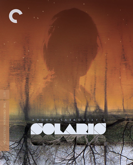
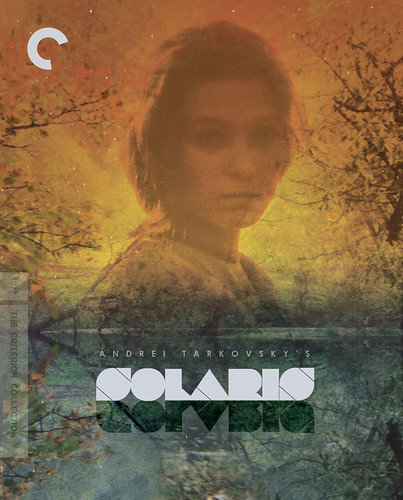
I think
this cover is the best of the bunch, although none of them I think are particularly great
Re: Criterion & Eclipse Cover Art & Packaging Babble-on Vol.
Posted: Thu May 26, 2011 6:31 pm
by dadaistnun
Murdoch wrote:I think
this cover is the best of the bunch, although none of them I think are particularly great
Agreed, though I like the
one between it and the final version ok. I really like the cover from the original release (minority opinion, I'm sure) with it's perverse refusal to show Hari's face in the mirror. Bondarchuck is such a lovely actress that I understand the desire to use her on the cover, but I was disappointed with what they came up with for the rerelease.
Re: Criterion & Eclipse Cover Art & Packaging Babble-on Vol.
Posted: Mon May 30, 2011 4:14 pm
by Der Spieler
I think the re-release cover looks pretty bad. But looking at the other options, it's probably the best.
Re: Criterion & Eclipse Cover Art & Packaging Babble-on Vol.
Posted: Mon May 30, 2011 5:08 pm
by James
I really like all the covers on that post; except, I'm really glad they didn't go with the Friends typography.
Re: Criterion & Eclipse Cover Art & Packaging Babble-on Vol.
Posted: Wed Jun 01, 2011 5:02 am
by cdnchris
Re: Criterion & Eclipse Cover Art & Packaging Babble-on Vol.
Posted: Wed Jun 01, 2011 5:03 am
by mfunk9786
Say what you will about the front cover, but the inside is all class.
Re: Criterion & Eclipse Cover Art & Packaging Babble-on Vol.
Posted: Wed Jun 01, 2011 2:01 pm
by Roger Ryan
So is it luck of the draw whether you get Einstein and Monroe
or DiMaggio and McCarthy as tray art?
EDIT: Okay, I just answered my own question by looking closer and seeing the booklet - sorry about the silly question.
Re: Criterion & Eclipse Cover Art & Packaging Babble-on Vol.
Posted: Sat Jun 04, 2011 10:55 pm
by cdnchris
Re: Criterion & Eclipse Cover Art & Packaging Babble-on Vol.
Posted: Sun Jun 05, 2011 3:24 pm
by Finch
Kiss Me Deadly looks rather good overall even if I'd have still made small changes to the front cover.
Re: Criterion & Eclipse Cover Art & Packaging Babble-on Vol.
Posted: Mon Jun 06, 2011 5:37 am
by HistoryProf
They totally hit a home run w/ Kiss Me Deadly...looks great.
Re: Criterion & Eclipse Cover Art & Packaging Babble-on Vol.
Posted: Tue Jun 07, 2011 3:45 pm
by TMDaines
Not a fan of these Blu-ray cases. Three badly damaged booklets out of three because of where the plastic sticks out on the spine. Clips snapped in one of the cases also. Between banana shaped DVD cases and these Blu cases, it's such a shame a quality product is often reaching the customer in less than ideal condition. I've not really had many of these such problems with anyone else who packages booklets in their DVD cases.
Re: Criterion & Eclipse Cover Art & Packaging Babble-on Vol.
Posted: Wed Jun 15, 2011 6:42 pm
by swo17
Re: Criterion & Eclipse Cover Art & Packaging Babble-on Vol.
Posted: Wed Jun 15, 2011 6:52 pm
by matrixschmatrix
Huh, the triangles from the original Makioka Sisters cover make a reappearance. They're definitely better here than they were there, anyway.
Phantom Carriage is gorgeous.
Re: Criterion & Eclipse Cover Art & Packaging Babble-on Vol.
Posted: Wed Jun 15, 2011 6:53 pm
by Murdoch
No more triangles, pleeeaaasssee.
Phantom Carriage is nice tho
Re: Criterion & Eclipse Cover Art & Packaging Babble-on Vol.
Posted: Wed Jun 15, 2011 6:53 pm
by colinr0380
Those Chabrol covers are fantastic, and I'm glad to see they went with one of the best posters for Carlos. Even The Phantom Carriage is great. Finally a month of covers that I can get behind. I slightly prefer the original My Life As A Dog cover but this one is nice too.
And 3 Women on Blu - I wonder whether the trippy dream sequence recontextualising the entire film into new and frightening forms is just going to be too overwhelming with the higher resolution!
Re: Criterion & Eclipse Cover Art & Packaging Babble-on Vol.
Posted: Wed Jun 15, 2011 7:10 pm
by Brian C
I really love the
Carlos one-sheet, but the translation to Blu cover loses something. On
the original poster, the white space at the bottom played off the image much better, giving it a very natural '70s poster vibe, but the effect is lost without any credits other than the awkwardly-placed "directed by Olivier Assayas" line. The image-to-white-space proportion is out of whack.
I think they'd have been better served to incorporate the title somehow within the image - which really is terrific - instead of simply trying to recreate the one-sheet effect.
Re: Criterion & Eclipse Cover Art & Packaging Babble-on Vol.
Posted: Wed Jun 15, 2011 7:25 pm
by aox
The Carlos cover is terrible. Doesn't get near the scope of the film. So much opportunity. He isn't Che. He can't carry a cover on his own.
Re: Criterion & Eclipse Cover Art & Packaging Babble-on Vol.
Posted: Wed Jun 15, 2011 7:29 pm
by Jean-Luc Garbo
I'm also quite disappointed by the Carlos cover. The Phantom Carriage one is great, though. Nice upgrade art on the Hallstrom. I guess that paired Chabrol (like Malle) can't get a decent shake.
Re: Criterion & Eclipse Cover Art & Packaging Babble-on Vol.
Posted: Wed Jun 15, 2011 7:47 pm
by Anhedionisiac
I dunno, I really like the Carlos cover. Especially in Blu-Ray package. The Phantom Carriage's pretty good. What stands out for me it's that I find Le Beau Serge cover allright but hate Les Cousins.
Re: Criterion & Eclipse Cover Art & Packaging Babble-on Vol.
Posted: Wed Jun 15, 2011 8:12 pm
by Napier
The Le Beau Serge cover looks like a sweater I got in Inverness.
Re: Criterion & Eclipse Cover Art & Packaging Babble-on Vol.
Posted: Wed Jun 15, 2011 9:05 pm
by movielocke
did the my life as a dog and 3 women art change?
Re: Criterion & Eclipse Cover Art & Packaging Babble-on Vol.
Posted: Wed Jun 15, 2011 9:07 pm
by knives
The former most definitely is new and I think the later is a cleaned up job ala The Leopard.
Re: Criterion & Eclipse Cover Art & Packaging Babble-on Vol.
Posted: Wed Jun 15, 2011 9:13 pm
by swo17
movielocke wrote:did the my life as a dog and 3 women art change?
You can compare the new and old art on each film's page.
3 Women's color scheme looks a little more dynamic, but basically hasn't changed.


