I've liked all of Greg Ruth's covers for the Collection. I don't think its quite as good as his work on the King Hu releases, but I definitely think its bette than the old dvd. 4 Months is about as disappointing as the other Mungiu covers. I like how In the Heat of the Night recalls the old posters.
Edit: Thought it was funny that the Grant character has his back to us. Will we never get a cover that has Grant in it where he looks like himself?
Criterion & Eclipse Cover Art & Packaging Babble-on Vol. 7
-
ng4996

- the Wizard of Ozu
- Joined: Mon May 02, 2016 3:01 am
- Location: Missoula, MT
Re: Criterion & Eclipse Cover Art & Packaging Babble-on Vol. 7
Last edited by ng4996 on Mon Oct 15, 2018 9:33 pm, edited 2 times in total.
-
domino harvey

- Dot Com Dom
- Joined: Wed Jan 11, 2006 6:42 pm
Re: Criterion & Eclipse Cover Art & Packaging Babble-on Vol. 7
I don't like the film but I agree the cover for May's film is quite nice
-
John Shade
- Joined: Sat Jan 14, 2017 7:04 pm
Re: Criterion & Eclipse Cover Art & Packaging Babble-on Vol. 7
Take to Twitter and demand the old Notorious cover and it just might happen...
-
Boosmahn

- Joined: Tue Sep 05, 2017 2:08 am
Re: Criterion & Eclipse Cover Art & Packaging Babble-on Vol. 7
In the Heat of the Night is structured pretty oddly. I like the headshot of Poiter, color scheme, and title font, but the side-profile of Steiger looks out of place.
Mikey and Nicky's cover is very good; I especially dig the faux paper tear down the middle.
Notorious has too much dead space.
Mikey and Nicky's cover is very good; I especially dig the faux paper tear down the middle.
Notorious has too much dead space.
-
MongooseCmr
- Joined: Sun Dec 16, 2012 3:50 am
Re: Criterion & Eclipse Cover Art & Packaging Babble-on Vol. 7
Criterion are really bent on doing Mungiu dirty by selling his work in the least appealing way possible. If I was a young cinephile again their plot synopses and these covers would put them at the very bottom of my to-watch list; it makes very dry realist films look even “worse” than they are.
-
Cinephrenic

- Joined: Tue Nov 02, 2004 6:58 pm
- Location: Paris, Texas
Re: Criterion & Eclipse Cover Art & Packaging Babble-on Vol. 7
Notorious notoriously horrible. Mikey and Nicky is the best this month.
-
Randall Maysin

- Joined: Tue Apr 02, 2013 4:26 pm
Re: Criterion & Eclipse Cover Art & Packaging Babble-on Vol. 7
Terrific cover for ITHOTN, one of the very best 'Criterion original' covers that there are, although that's a bar that's so low that its somewhere in Hades.
-
mizo

- Joined: Tue Aug 07, 2012 2:22 am
Re: Criterion & Eclipse Cover Art & Packaging Babble-on Vol. 7
I don't mind the Mikey & Nicky or In the Heat of the Night covers too much, although they make Cassavetes look like Bruce Dern and Steiger like Douglas MacArthur
-
criterionsnob

- Joined: Wed Nov 03, 2004 5:23 am
- Location: Canada
Re: Criterion & Eclipse Cover Art & Packaging Babble-on Vol. 7
I like how the Mungiu cover is almost exactly the same as the image leaked in the Apu Trilogy video about three years ago.
-
DRW.mov

- Joined: Thu Sep 15, 2016 6:43 pm
- Location: Los Angeles, CA
Re: Criterion & Eclipse Cover Art & Packaging Babble-on Vol. 7
Well it would be weird if that looked like Cary Grant because that character is Claude Raines.ng4996 wrote: Mon Oct 15, 2018 9:16 pm Edit: Thought it was funny that the Grant character has his back to us. Will we never get a cover that has Grant in it where he looks like himself?
-
ng4996
- the Wizard of Ozu
- Joined: Mon May 02, 2016 3:01 am
- Location: Missoula, MT
Re: Criterion & Eclipse Cover Art & Packaging Babble-on Vol. 7
I guess its been a while since I've seen it, didn't even stop to think. Oops!DRW.mov wrote: Mon Oct 15, 2018 10:43 pmWell it would be weird if that looked like Cary Grant because that character is Claude Raines.ng4996 wrote: Mon Oct 15, 2018 9:16 pm Edit: Thought it was funny that the Grant character has his back to us. Will we never get a cover that has Grant in it where he looks like himself?
-
Gerald Christie
- Joined: Wed Jun 08, 2016 4:06 pm
Re: Criterion & Eclipse Cover Art & Packaging Babble-on Vol. 7
I actually kind like the cover for Notorious and Mickey and Nicky, the others not too much.
-
jbeall

- Joined: Sat Aug 12, 2006 1:22 pm
- Location: Atlanta-ish
Re: Criterion & Eclipse Cover Art & Packaging Babble-on Vol. 7
Love the Mikey and Nicky cover, and also quite like the In the Heat of the Night one. Agree that Criterion whiffed on an updated Notorious cover when the old one was among their best. The damn key is so obvious that the cover is basically fanboy service. The Kiarostami cover is "meh," but so are most of CC's Kiarostami covers.
-
Finch

- Joined: Mon Jul 07, 2008 9:09 pm
- Location: United States
Re: Criterion & Eclipse Cover Art & Packaging Babble-on Vol. 7
They seem to be hellbent on replacing great covers with inferior updates. I like the idea behind the new Notorious cover as it's lifted from one of the film's most suspenseful scenes but they had to futz around with the image (the key, and Bergman's face has this strange diffusing filter over it).
-
DRW.mov
- Joined: Thu Sep 15, 2016 6:43 pm
- Location: Los Angeles, CA
Re: Criterion & Eclipse Cover Art & Packaging Babble-on Vol. 7
That “filter” is called being hand illustrated.Finch wrote: Tue Oct 16, 2018 12:49 am They seem to be hellbent on replacing great covers with inferior updates. I like the idea behind the new Notorious cover as it's lifted from one of the film's most suspenseful scenes but they had to futz around with the image (the key, and Bergman's face has this strange diffusing filter over it).
-
zedz

- Joined: Sun Nov 07, 2004 11:24 pm
Re: Criterion & Eclipse Cover Art & Packaging Babble-on Vol. 7
The Notorious cover is an okay idea executed poorly. If it was only the key that was rendered as negative space, it might work better, but the whole suit filled in with magic marker looks amateurish to me.
In the Heat of the Night reminds me of a toned down, better drawn, version of this monstrosity:
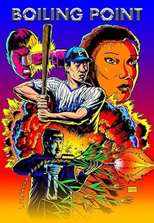
In the Heat of the Night reminds me of a toned down, better drawn, version of this monstrosity:
-
Jean-Luc Garbo

- Joined: Thu Dec 09, 2004 5:55 am
- Contact:
Re: Criterion & Eclipse Cover Art & Packaging Babble-on Vol. 7
Not a fan of that Notorious cover at all. Glad the reissue will have new work from Angelica Jade Bastien, Bordwell, and John Bailey tho.
-
domino harvey
- Dot Com Dom
- Joined: Wed Jan 11, 2006 6:42 pm
Re: Criterion & Eclipse Cover Art & Packaging Babble-on Vol. 7
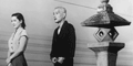
For posterity, the original Notorious cover:

-
kcota17
- Joined: Sat Mar 01, 2014 1:05 am
Re: Criterion & Eclipse Cover Art & Packaging Babble-on Vol. 7
No reason they couldn’t have slapped a Wacky C on that, changed the text a bit and called it a day.
-
FrauBlucher

- Joined: Tue Jul 16, 2013 12:28 am
- Location: Greenwich Village
-
britcom68
Re: Criterion & Eclipse Cover Art & Packaging Babble-on Vol. 7
What I liked from Sean Phillips' In the Heat of the Night cover is that he captured much of the color and style of the film's original soundtrack album cover (I had that one tacked up in my classroom when I was teaching court rulings for my US government students). However, it is disappointing that Criterion did not go for a yellow for the spine wraparound or include the original album cover. I won't bother to include the album cover art here as it is very accessible on any basic Google search, but the album's stylized palette and lines, for me, really echoes the Raisin in the Sun's art. (then again, Criterion doesn't usually provide continuity of its cover art or packaging for films that share actors and themes, just for when they share directors).
-
Matt

- Joined: Tue Nov 02, 2004 4:58 pm
Re: Criterion & Eclipse Cover Art & Packaging Babble-on Vol. 7
I like both the old and the new Notorious covers. Change is okay! Greg Ruth has posted all of his illustrations for this package and they are gorgeous. I almost wish Criterion had gone with the illustration of the famous glass of milk for the cover.
-
domino harvey
- Dot Com Dom
- Joined: Wed Jan 11, 2006 6:42 pm
Re: Criterion & Eclipse Cover Art & Packaging Babble-on Vol. 7
That one would have been way better!Matt wrote: Tue Oct 16, 2018 4:43 pmI almost wish Criterion had gone with the illustration of the famous glass of milk for the cover.
-
John Shade
- Joined: Sat Jan 14, 2017 7:04 pm
Re: Criterion & Eclipse Cover Art & Packaging Babble-on Vol. 7
Let's keep these conversations going and take some of them to twitter--lately it seems to be swaying Criterion to actually just change them.
-
dustybooks
- Joined: Thu Mar 15, 2007 2:52 pm
- Location: Wilmington, NC
Re: Criterion & Eclipse Cover Art & Packaging Babble-on Vol. 7
I like the glass of milk illustration too, though I'd imagine they didn't go with it primarily because of potential confusion with the much more iconic glass of milk in Suspicion!