Page 48 of 147
Re: Criterion & Eclipse Cover Art & Packaging Babble-on
Posted: Sat Feb 14, 2009 6:55 pm
by psufootball07
I will be doing the opposite of you, I feel Ran is the only thing worthwhile in May, depending how significant the upgrade is in comparison with CC original release.
Re: Criterion & Eclipse Cover Art & Packaging Babble-on
Posted: Sat Feb 14, 2009 11:06 pm
by colinr0380
There may the possibility of changes in a couple of the covers since it looks as if The Friends of Eddie Coyle has a date of 1962 on its cover, and The Rise of Catherine the Great seems to have a 'Directed by Alexander Korda' line to match the other films instead of being credited to Paul Czinner.
Re: Criterion & Eclipse Cover Art & Packaging Babble-on
Posted: Sun Feb 22, 2009 12:29 am
by cdnchris
Re: Criterion & Eclipse Cover Art & Packaging Babble-on
Posted: Sun Feb 22, 2009 1:21 am
by Cinephrenic
Re: Criterion & Eclipse Cover Art & Packaging Babble-on
Posted: Sun Feb 22, 2009 2:04 am
by domino harvey
Jesus, why wasn't the inside the cover?
Re: Criterion & Eclipse Cover Art & Packaging Babble-on
Posted: Sun Feb 22, 2009 3:27 am
by lacritfan
Did Kurosawa paint the cover?
Re: Criterion & Eclipse Cover Art & Packaging Babble-on
Posted: Sun Feb 22, 2009 4:52 am
by cdnchris
The booklet says the "cover illustration" is courtesy of Kurosawa Productions, but doesn't state the artist.
EDIT: Strike that. Yes, Kurosawa is/was the artist.
Re: Criterion & Eclipse Cover Art & Packaging Babble-on
Posted: Sun Feb 22, 2009 4:40 pm
by lacritfan
Criterion needs to color correct their cover scans. The reds on Dodes'ka-den appear pink. This was the reason I hated the Mishima cover so much when it first appeared on the website. (I still mildly hate it).
Re: Criterion & Eclipse Cover Art & Packaging Babble-on
Posted: Mon Feb 23, 2009 10:20 pm
by Matt
kaujot wrote:[Pigs, Pimps & Prostitutes cover]
Fun use of a typeface's width expansion, rather than just varying the weight. A similar font can be found here:
Hannah, which is obviously an homage to the work of Pablo Ferro, the artist behind the opening sequence of
Dr. Strangelove, among others.
Eric Skillman says all the type is hand-drawn and that the
Wise Blood cover illustration is by
Josh Cochran.
Re: Criterion & Eclipse Cover Art & Packaging Babble-on
Posted: Wed Feb 25, 2009 4:40 am
by AtlantaFella
Does anyone have insights as to whether Criterion has plans to change the flimsy packaging of its Blu-ray releases? I am excited about forthcoming titles (particularly "Wages of Fear" and "Ran"), but I find the packaging more than a little off-putting. I e-mailed this feedback to CC several weeks ago but never received a reply. Thanks.
Re: Criterion & Eclipse Cover Art & Packaging Babble-on
Posted: Wed Feb 25, 2009 5:47 am
by fdm
No doubt they will stick with it. Given that even their new titles that on DVD come in keep cases are being cardboarded, seems like that's their plan. "Premium" packaging for their premium product. Since they've all been single disk (right?), they all could have easily been put in keep cases too, and probably would sell better too.
Why is it Criterion's premium packaging always ends up being flimsy-ass cardboard? No need to answer.
Re: Criterion & Eclipse Cover Art & Packaging Babble-on
Posted: Wed Feb 25, 2009 4:14 pm
by keeproductions
Add me to to the list of people who have sent Mulvaney an email complaining about the BD packaging.
I'll let you all know as soon as I don't get an answer....
Re: Criterion & Eclipse Cover Art & Packaging Babble-on
Posted: Thu Feb 26, 2009 8:04 pm
by keeproductions
My email to Mulvaney:
Hey Jon-
I know I am not the first person to write of this, but I must offer my 3 cents.
As much as I love the presentation of the first few Criterion Blu-Ray discs, I just cringe every time I look at or handle the packaging.
I proudly display all of my Criterions (every disc released so far, in fact) in my TV room and have always been a sucker for the care and skill that goes into the packaging of many of the finer discs.
I find it so hard to resolve the disparity of the Blu-Ray discs having such a great disc presentation and such a sub-par packaging presentation.
There is no other way to put it other than to blunty say they are Cheap! Cheap looking, Cheap feeling. Just cheap.
I know it was a big deal for Criterion to offer the BD for the same price as the DVD, but if it was at the expense of quality, Criterion-worthy packaging, then count me as one of many that would be willing to pay a premium for BD Criterions in appropriate packaging.
OK, enough from me. Now I'll go worry about important things in the world, like why I can't get TCM in HD on my cable box.
Best,
And Jon's response (
bold added by me)
Hi Keith,
Thanks for taking the time to write in with feedback! Don't worry, the sturdy plastic cases that many of our customers know and love haven't gone away. We didn't want to use the blue case with the built-in plastic topliner, so we've been working on a custom clear plastic case in the blu-ray size and some of our releases will be coming out in that packaging later this year.
We want you to be satisfied with your Criterion purchase(s), so if you are unsatisfied with the Criterion Blu-ray discs that you bought, you may send them to my attention at the address below, and exchange them for any other Criterion title(s) of equal or lesser value. If you choose to do this, please be sure to include your U.S. or Canadian address inside the package as we are unable to sell or send our DVDs outside of North America.
I hope this helps, and please feel free to e-mail me again if you have other questions!
Sincerely,
Jon Mulvaney
The Criterion Collection
215 Park Ave. So. 5th Floor
New York, NY 10003
Re: Criterion & Eclipse Cover Art & Packaging Babble-on
Posted: Fri Feb 27, 2009 2:11 am
by AtlantaFella
That is great news, kp. Thank you for posting.

Re: Criterion & Eclipse Cover Art & Packaging Babble-on
Posted: Sat Feb 28, 2009 7:03 am
by Tom Hagen
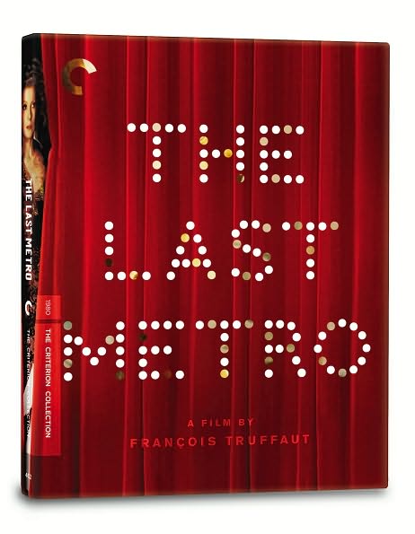
The Last Metro spine:
Re: Criterion & Eclipse Cover Art & Packaging Babble-on
Posted: Sat Feb 28, 2009 1:15 pm
by TheGodfather
Looks like a digipack to me. Hopefully it will be
Re: Criterion & Eclipse Cover Art & Packaging Babble-on
Posted: Tue Mar 03, 2009 6:45 am
by cdnchris
Re: Criterion & Eclipse Cover Art & Packaging Babble-on
Posted: Tue Mar 03, 2009 6:46 am
by kaujot
So happy to see that the outer cover for TLM is die-cut.
Re: Criterion & Eclipse Cover Art & Packaging Babble-on
Posted: Tue Mar 03, 2009 8:32 am
by psufootball07
Thanks for the images, I really want The Last Metro, will probably have a big spending spree during the May DVD sales to pick up this as well as some of the other new releases that have caught my eye.
Re: Criterion & Eclipse Cover Art & Packaging Babble-on
Posted: Tue Mar 03, 2009 2:28 pm
by Dr. Snaut
Wow. TLM packaging looks great. I was expecting the typical clear, plastic keep-case.
Re: Criterion & Eclipse Cover Art & Packaging Babble-on
Posted: Tue Mar 03, 2009 4:19 pm
by geoffcowgill
cdnchris wrote:
Well, I guess buying
The Last Metro and getting X's
Los Angeles is a better deal than buying
Pandora's Box and getting a Cher concert.
Re: Criterion & Eclipse Cover Art & Packaging Babble-on
Posted: Tue Mar 03, 2009 4:30 pm
by ccfixx
Yeah, that packaging for "The Last Metro" is closely resembling the packaging for Criterion's first blu-ray releases. It's cool to see, though... very nice!
CC
Re: Criterion & Eclipse Cover Art & Packaging Babble-on
Posted: Tue Mar 03, 2009 4:36 pm
by Dr. Snaut
ccfixx wrote:Yeah, that packaging for "The Last Metro" is closely resembling the packaging for Criterion's first blu-ray releases. It's cool to see, though... very nice!
Really? I thought this resembled The Third Man packaging. The blu ray packaging didn't impress me much, so I hope TLM packaging in not similar to Criterion's blu ray packages.
Re: Criterion & Eclipse Cover Art & Packaging Babble-on
Posted: Tue Mar 03, 2009 5:26 pm
by Matt
I don't know what either of you are talking about. It's a digipak with a slipcase, so it looks exactly like about half their releases over the last few years.
Re: Criterion & Eclipse Cover Art & Packaging Babble-on
Posted: Tue Mar 03, 2009 7:12 pm
by Dr. Snaut
Matt wrote:I don't know what either of you are talking about. It's a digipak with a slipcase, so it looks exactly like about half their releases over the last few years.
Exactly. Hence my observation that it looks like The Third Man release. It was the first release that came to mind.