Page 6 of 64
Posted: Wed Aug 02, 2006 2:37 pm
by Michael Kerpan
A Japanese poster for "Repast" -- from a Setsuko Hara retrospective, I suspect.
The
artwork for the Japanese DVD release.
Posted: Wed Aug 02, 2006 2:41 pm
by Monsieur Verdoux
mmmmmm two people at a table.... IMPACT =D>
Posted: Wed Aug 02, 2006 2:47 pm
by Michael Kerpan
A few shots I like from the film -- but maybe not cover material:
1 -
2 -
3 -
4 -
5...
and for cat lovers.
Posted: Wed Aug 02, 2006 2:52 pm
by Michael Kerpan
Monsieur Verdoux wrote:mmmmmm two people at a table.... IMPACT =D>
The title means "(Ordinary) Meal" -- and this shot is as good a one as there is in the film that relates to the title.
But, I was just providing other Japanese material for reference.
Posted: Wed Aug 02, 2006 5:40 pm
by fred
I think the poster is stunning (I want one!). Not crazy about the cropping on the Japanese DVD, but that shouldn't be a problem for Masters of Cinema.
Posted: Wed Aug 02, 2006 5:55 pm
by Michael Kerpan
fred wrote:I think the poster is stunning (I want one!). Not crazy about the cropping on the Japanese DVD, but that shouldn't be a problem for Masters of Cinema.
I agree. Although the Japanese DVD cover uses the same shot as the poster, it mucks up the composition.
I'm not entirely certain whether this exact shot occurs in the film or not -- but there certainly are similar ones.
MEK
Posted: Mon Aug 21, 2006 2:06 am
by Jun-Dai
I'd have to agree with Kerpan's points about the cover, and I prefer the poster/cover he posted.
I threw up a stub on the film
at wikipedia
Posted: Tue Aug 22, 2006 10:11 pm
by der_Artur
peerpee wrote:Having said that. We're constantly re-evaluating everything, and it may change.
If my vote counts: I love the artwork. Original poster artwork on the DVD for me can somehow influence the mood of the experience. MOC's selection of filmstills as covers is always great, but if you ave original artwork, even if it might disappoint modern tastes, you should use it.
Posted: Wed Aug 23, 2006 3:04 am
by peerpee
The latest is... because of the actual REPAST poster being twice the size we thought it was, we're ditching the colour posters on the covers, and going for nice stills, including the one Kerpan posted for REPAST. Thanks Michael!
Posted: Wed Aug 23, 2006 4:13 am
by Michael Kerpan
Did you ever post a link to the full-size (presumably oddly double length) poster? I'd be curious to see what they did on the top half. ;~}
Sounds like the upcoming DVD covers should be nice.
(Hoping to see a few more Naruse rarities soon).
I hope the first set sells well -- and you can release some of the less well-known (but also remarkable) films like "Traveling Actors" and "Song Lantern" (and some silents).
MEK
Posted: Thu Aug 24, 2006 7:30 am
by jamie_summers
To consider:
Beaver,
Village Voice,
Stylus Magazine. I appreciate they're in low quality but they're interesting ideas to look at.
Posted: Thu Aug 24, 2006 11:01 am
by Cinesimilitude
something like this might look good.

Posted: Thu Aug 24, 2006 5:36 pm
by a.khan
No, don't change it, it's brilliant!
Posted: Wed Aug 30, 2006 3:04 pm
by Jem
Sorry, disagree, SncDthMnky's cover is far superior.
Posted: Wed Aug 30, 2006 4:32 pm
by Narshty
SncDthMnky's cover is a nice idea in concept, but I suspect on shop shelves it would just look ineptly printed.
Posted: Thu Aug 31, 2006 2:57 am
by Cinesimilitude
maybe, but the people who buy MoC's would notice the banner immediately, and I would also bet most of MoC's business is online. maybe Peerpee can comment on that...
Posted: Thu Aug 31, 2006 4:50 am
by Jem
Narshty wrote:SncDthMnky's cover is a nice idea in concept, but I suspect on shop shelves it would just look ineptly printed.
Looking at the black and white MOC banner, I assumed it was only a 'mock-up' of the final concept anyway. Though I could se the final 'SncDthMnky' cover with bit of restrained color, just to bring it home.

Posted: Thu Aug 31, 2006 8:46 am
by Cinesimilitude
when I get photoshop installed on my pc, I'll see what I can do about adding some color. any recommendations? the blue and gold perhaps?
Posted: Thu Aug 31, 2006 1:08 pm
by Michael Kerpan
I think the use of black and white in SncDthMnky's mock-up is just fine -- all it needs is a bit more tonal range and sharpness. ;~]
Posted: Thu Aug 31, 2006 7:48 pm
by Cinesimilitude
well, I blurred it on purpose, it's an eyechart reference(if that wasn't obvious) because the film is very much to me, about what you see and what you don't. and the header being inverted gives it a bit of a bootleg feel, so it's a... wait for it...
fake.
Posted: Thu Aug 31, 2006 7:58 pm
by indiannamednobody
I never looked at it that way, but now that I have I think it's brilliant!
Posted: Thu Aug 31, 2006 8:52 pm
by Cinesimilitude
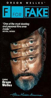
I still like the first one better, with the smoke, but these are a little more appropriate since orson has a beard.
Fake 1
Fake 2
Fake 3
Posted: Fri Sep 01, 2006 1:46 am
by Jem
Your first incarnation was better.
Maybe add a secondary color to the B&W image, something very subtle, it will make it richer, not so flat.
Posted: Sat Sep 02, 2006 9:32 pm
by peerpee
Nice designs!
We're toying with going with
this one now, or
this one.
Posted: Sat Sep 02, 2006 10:42 pm
by Glass
It's lovely. Only, it's almost identical to the criterion cover.
edit: the latter one does it better, stick to the original poster
