Page 6 of 49
Posted: Fri Dec 22, 2006 9:07 pm
by justeleblanc
I like this minimal design, similar to the Rohmer box, I even wonder if it's the same designer. The DVDs look more like textbooks.
Posted: Fri Dec 22, 2006 9:13 pm
by Jun-Dai
That's an awesome idea. They should just send an empty amaray box with nothing but the disc in a special "design your own goddamn cover!" edition.
Posted: Fri Dec 22, 2006 9:50 pm
by mteller
Posted: Fri Dec 22, 2006 9:55 pm
by domino harvey
I do like the layout for the individual covers, just not the main box look
Posted: Fri Dec 22, 2006 10:10 pm
by Matt
At least we now know it won't be packaged in some monstrous fold-out single digipak. Have you guys seen the gruesome mess that is the new Preston Sturges collection?
Posted: Fri Dec 22, 2006 10:22 pm
by Jeff
Matt wrote:Have you guys seen the gruesome mess that is the new Preston Sturges collection?
Yes. I try not to be fanatical about cover art and packaging, but nothing irks me more than multiple films in a single digipack. Universal is the worst about this.
The Bergman box is way too skinny for full size Amaray cases. They will probably uses the single digipaks like the Rohmer set, but I wonder if they will finally bust out the thinpacks since they would quite a bit cheaper. Let's hope so!
Posted: Fri Dec 22, 2006 10:30 pm
by GringoTex
I t seems obvious this will be the standard design for all releases, and I love it.
Posted: Fri Dec 22, 2006 10:41 pm
by Jeff
GringoTex wrote:
It seems obvious this will be the standard design for all releases, and I love it.
The more I look at it, the more I like it too. The 3/4 perspective shot of the box is what sold me on the look. The font, the muted two-tone, and the stills look great together. They will look like a little set of encyclopedias lined up on my shelves. I'm a sucker for that kind of shit, and Criterion knows it.
Posted: Sat Dec 23, 2006 12:00 am
by Jeff LeVine
I like it and am hoping they stick to the same format for the series. It'll look really nice on a shelf. The "e" doesn't create any real problems this way too...
Posted: Sat Dec 23, 2006 12:18 am
by justeleblanc
Okay, now without question, this is the same designer as the Rohmers.
Posted: Sat Dec 23, 2006 12:32 am
by What A Disgrace
Spine numbers?
Time to make a new shelf.
Posted: Sat Dec 23, 2006 2:27 am
by Cinesimilitude
I'd do the artwork for free, but nobody asked...

Anywho, It looks ok. I think the big fat "Eclipse Series 1" on the cover signifies a package uniformity, but they may still change it up a bit for us in the future. I love how they still manage to get "The Criterion Collection" on every cover.
This will make it very easy for me to dupe and fool you guys in april when I announce some long awaited box with just a different hue and new images and titles. don't say I didn't warn you.
Posted: Sat Dec 23, 2006 11:07 am
by godardslave
Its a nice and clean, modern/minimalist design, if somewhat predictable.
Obviously it fits with the rebranded criterion style and website etc etc.
justeleblanc wrote:Okay, now without question, this is the same designer as the Rohmers.
Its a similar graphic design template or style, which is actually fairly standard. Any professional in the field could design that.
Posted: Sat Dec 23, 2006 8:57 pm
by keeproductions
Matt wrote:Have you guys seen the gruesome mess that is the new Preston Sturges collection?
Yea. I was out Christmas shopping at Best Buy this morning and jumped when I saw it. First thing I noticed was that the set repeated the existing Criterion titles and second thing I noticed was the terrible design of the packaging. Since I wasn't really shopping for myself anyway that was certainly enough to make me put it back on the shelf. Ick.
Posted: Sat Dec 23, 2006 9:08 pm
by blindside8zao
those crime and punishment covers are the shit. Also, I love the Picture of Dorian Gray cover with some ominous penguin on the cover.
Posted: Sat Dec 23, 2006 10:45 pm
by Greathinker
blindside8zao wrote:those crime and punishment covers are the shit. Also, I love the Picture of Dorian Gray cover with some ominous penguin on the cover.
"are the shit" or are shit? I agree with the latter, but it's their covers.
Posted: Sat Jan 06, 2007 7:55 pm
by tavernier
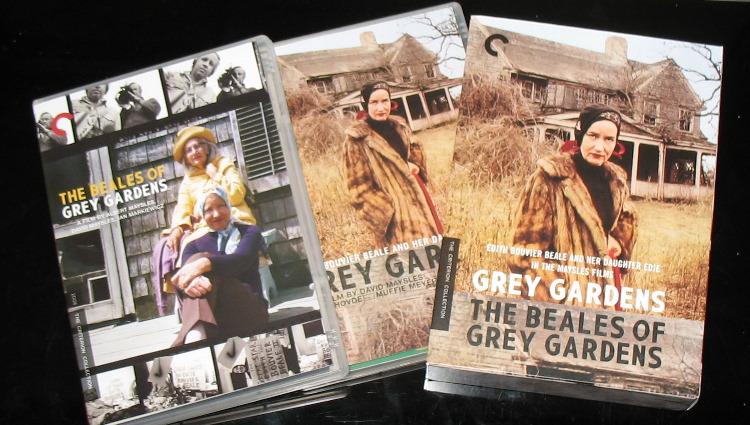
The new YOJIMBO/SANJURO box is packaged like the new GREY GARDENS box.
Posted: Sat Jan 06, 2007 11:59 pm
by daniel p
tavernier wrote:The new YOJIMBO/SANJURO box is packaged like the new GREY GARDENS box.
I didn't get Grey Gardens, was it 2 cases inside a slipcase? And the booklets inside the cases?
Posted: Sun Jan 07, 2007 12:01 am
by Ashirg
Posted: Sun Jan 07, 2007 6:17 am
by pianocrash
Wow, those individual discs look just like secondrun's! Should be snazzy sitting on the shelf, all that white & all those color bands, they should.
Posted: Tue Jan 09, 2007 3:20 pm
by Narshty
I thought I'd hate the new 2-disc cases (transparent and with the overlapping figure-8 configuration), but I've got Symbiopsychotaxiplasm here and I think it looks very attractive - neat and compact. I certainly prefer them to the chunkier 2-disc alpha cases of yesteryear.
Posted: Tue Jan 09, 2007 7:23 pm
by jbeall
Narshty wrote:I thought I'd hate the new 2-disc cases (transparent and with the overlapping figure-8 configuration), but I've got Symbiopsychotaxiplasm here and I think it looks very attractive - neat and compact. I certainly prefer them to the chunkier 2-disc alpha cases of yesteryear.
I totally agree. When I ordered
Hands Over the City, I assumed it would be in the 2-disc case, and figured there had to be some mistake when I saw the slimmer case.
But I'd like it if they could standardize all the 2-disc sets into the figure-8 case, as I'm running out of shelf space!
Posted: Tue Jan 09, 2007 11:49 pm
by godardslave
Is that just two regular width clear keepcases?
or are they slimmer?
why is one keepcase open and looking like it swallows the other, does one keepcase fit inside the other.

Posted: Wed Jan 10, 2007 12:01 am
by filmghost
Ehm...it seems to me that it is just the reflection on the table glass...

Posted: Wed Jan 10, 2007 12:19 am
by arsonfilms
Grey Gardens has two standard-width keepcases in a cardboard case. It's similar to I Am Curious, except that these cases are transparant and the outer case isn't glossy.
I can only assume Yojimbo and Sanjuro will be the same.