Criterion & Eclipse Cover Art & Packaging Babble-on Vol.4
-
Cinephrenic

- Joined: Tue Nov 02, 2004 6:58 pm
- Location: Paris, Texas
Re: Criterion & Eclipse Cover Art & Packaging Babble-on
Wow, who is the designer?
-
domino harvey

- Dot Com Dom
- Joined: Wed Jan 11, 2006 6:42 pm
Re: Criterion & Eclipse Cover Art & Packaging Babble-on
Some college art student with a Wacom tablet?
-
movielocke

- Joined: Fri Jan 18, 2008 4:44 am
Re: Criterion & Eclipse Cover Art & Packaging Babble-on
[img]http://criterion_production.s3.amazonaws.com/release_images/2293/NikkatsuNoir.jpg[/img]
-
Dadapass

- Joined: Thu Oct 09, 2008 10:57 pm
Re: Criterion & Eclipse Cover Art & Packaging Babble-on
what the fuck!
I wasn't expecting this and I love it
I wasn't expecting this and I love it
-
domino harvey
- Dot Com Dom
- Joined: Wed Jan 11, 2006 6:42 pm
Re: Criterion & Eclipse Cover Art & Packaging Babble-on
Yes, like Criterion, Kay Thompson is the first place my mind goes to when I hear "noir"
-
Cinephrenic
- Joined: Tue Nov 02, 2004 6:58 pm
- Location: Paris, Texas
Re: Criterion & Eclipse Cover Art & Packaging Babble-on
I just had a mind orgasm :-"
-
justeleblanc

- Joined: Wed Nov 03, 2004 10:05 pm
- Location: Connecticut
Re: Criterion & Eclipse Cover Art & Packaging Babble-on
I hope that's not the final design, Beckinsale's breasts aren't big enough.
-
Antoine Doinel

- Joined: Sat Mar 04, 2006 5:22 pm
- Location: Montreal, Quebec
- Contact:
Re: Criterion & Eclipse Cover Art & Packaging Babble-on
Are they really running out of color combinations for Eclipse? Wouldn't black and red have made more sense?
-
Saturnome

- Joined: Sun Aug 12, 2007 9:22 pm
Re: Criterion & Eclipse Cover Art & Packaging Babble-on
Black and hot pink looks like the 80s to me.
-
knives

- Joined: Sat Sep 06, 2008 10:49 pm
Re: Criterion & Eclipse Cover Art & Packaging Babble-on
I think the Black & Pink is more striking then using red would be. It makes the release appear more unique.
In the middle of Last days, and have to say that cover is not helping it. The pitch won't attract who the product would be enjoyed the most by. Something like the Rules of Attraction would have been better.
Edit: And I do know that Metropolitan was done in the same style.
In the middle of Last days, and have to say that cover is not helping it. The pitch won't attract who the product would be enjoyed the most by. Something like the Rules of Attraction would have been better.
Edit: And I do know that Metropolitan was done in the same style.
Last edited by knives on Sat May 16, 2009 5:04 am, edited 1 time in total.
-
Doctor Sunshine

- Joined: Wed Nov 03, 2004 2:04 am
- Location: Brain Jail
Re: Criterion & Eclipse Cover Art & Packaging Babble-on
Hot pink alone or red and black -- like my former killer backpack -- are 80s things, this scheme is noir meets cherry blossoms.Saturnome wrote:Black and hot pink looks like the 80s to me.
-
Cosmic Bus

- Joined: Tue Sep 12, 2006 2:12 am
- Location: Seattle, WA
- Contact:
Re: Criterion & Eclipse Cover Art & Packaging Babble-on
Like Knife In the Water and Repulsion, Last Days would seem to be designed to go along with Metropolitan.
-
mrschroeder1982
- Joined: Thu Sep 28, 2006 7:54 pm
- Location: Spokane, WA
Re: Criterion & Eclipse Cover Art & Packaging Babble-on
That same thought occurred to me! I saw that cover and was immediately transported back to my third-grade year, when everyone was using the "neon"-colored crayons...Saturnome wrote:Black and hot pink looks like the 80s to me.
-
CSM126

- Joined: Thu Nov 04, 2004 12:22 pm
- Location: The Room
- Contact:
Re: Criterion & Eclipse Cover Art & Packaging Babble-on
Nearly had a Hart Attack when I saw it!Saturnome wrote:Black and hot pink looks like the 80s to me.
Speaking of 80's...
-
TheGodfather

- Joined: Sun Sep 17, 2006 8:39 pm
- Location: The Netherlands
Re: Criterion & Eclipse Cover Art & Packaging Babble-on
Last Days of Disco cover looks good, Nikkatsu set sound interesting.
-edit- Jeanne Dielman, 23 Quai du Commerce, 1080 Bruxelles is coming in august, according to the site =D>
-edit- Jeanne Dielman, 23 Quai du Commerce, 1080 Bruxelles is coming in august, according to the site =D>
-
oldsheperd

- Joined: Thu Nov 11, 2004 9:18 pm
- Location: Rio Rancho/Albuquerque
Re: Criterion & Eclipse Cover Art & Packaging Babble-on
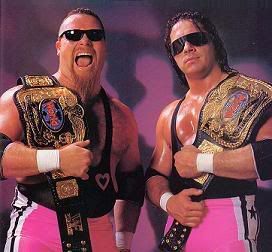
Does the Nikkatsu box come with a coupon for a free box of Good and Plentys?
Big ups on the Hart Foundation!
Big ups on the Hart Foundation!
-
cdnchris

- Site Admin
- Joined: Tue Nov 02, 2004 6:45 pm
- Location: Washington
- Contact:
Re: Criterion & Eclipse Cover Art & Packaging Babble-on

For those that care this is what I have for cover art. Though considering it's not on the site (as proved in the past) the final artwork will probably be very different.
-
domino harvey
- Dot Com Dom
- Joined: Wed Jan 11, 2006 6:42 pm
Re: Criterion & Eclipse Cover Art & Packaging Babble-on
I'd kind of like it if it had a white spaced line dividing the two pictures
-
HerrSchreck

- Joined: Sun Sep 04, 2005 3:46 pm
Re: Criterion & Eclipse Cover Art & Packaging Babble-on
Black and pink-- the color of the uniform trim of Heinz Guderian's Panzer divisions.
-
TheGodfather
- Joined: Sun Sep 17, 2006 8:39 pm
- Location: The Netherlands
Re: Criterion & Eclipse Cover Art & Packaging Babble-on
No offense, but yes: I do hope it`ll be different 
-
cdnchris
- Site Admin
- Joined: Tue Nov 02, 2004 6:45 pm
- Location: Washington
- Contact:
Re: Criterion & Eclipse Cover Art & Packaging Babble-on
I agree with Domino on the divider but other than that I actually like the cover. But I lack imagination and in all honesty, considering the film, I can't imagine what else you could do with the cover. I'll be interested in seeing what the final one looks like.
-
Bloody Benten
- Joined: Wed Nov 26, 2008 6:52 am
Re: Criterion & Eclipse Cover Art & Packaging Babble-on
The font looks temporary but once it changes cover will look fine
-
Cinephrenic
- Joined: Tue Nov 02, 2004 6:58 pm
- Location: Paris, Texas
Re: Criterion & Eclipse Cover Art & Packaging Babble-on
I hope that is not it, it's horrible.
-
domino harvey
- Dot Com Dom
- Joined: Wed Jan 11, 2006 6:42 pm
Re: Criterion & Eclipse Cover Art & Packaging Babble-on
You really don't see too many DVDs with Georgia font, maybe Criterion's making a new branding statementBloody Benten wrote:The font looks temporary but once it changes cover will look fine
-
Antoine Doinel
- Joined: Sat Mar 04, 2006 5:22 pm
- Location: Montreal, Quebec
- Contact:
Re: Criterion & Eclipse Cover Art & Packaging Babble-on
Repeating frames seems to be a new trend Criterion cover art.