Criterion & Eclipse Cover Art & Packaging Babble-on Vol. 6
-
chatterjees

- Joined: Tue Apr 02, 2013 10:08 pm
- Location: Pittsburgh, PA
Re: Criterion & Eclipse Cover Art & Packaging Babble-on Vol.
Another leaflet/insert! 
-
domino harvey

- Dot Com Dom
- Joined: Wed Jan 11, 2006 6:42 pm
Re: Criterion & Eclipse Cover Art & Packaging Babble-on Vol.
A fresh reminder of another highly eligible Worst Cover of the Year
-
rwiggum
- Joined: Mon Oct 01, 2012 2:11 am
Re: Criterion & Eclipse Cover Art & Packaging Babble-on Vol.
I've actually come around on it a lot. I hated it at first, but it has its charms. And it's "badness" comes from a clear stylistic choice, and it can be appreciated in the context of that, whereas I still can't comprehend how the Bitter Tears of Petra Von Kant cover made it through even one round.domino harvey wrote:A fresh reminder of another highly eligible Worst Cover of the Year
-
cdnchris

- Site Admin
- Joined: Tue Nov 02, 2004 6:45 pm
- Location: Washington
- Contact:
Re: Criterion & Eclipse Cover Art & Packaging Babble-on Vol.
I forgot to take a pic but it folds out similar to the one with La dolce vitachatterjees wrote:Another leaflet/insert!
-
chatterjees
- Joined: Tue Apr 02, 2013 10:08 pm
- Location: Pittsburgh, PA
Re: Criterion & Eclipse Cover Art & Packaging Babble-on Vol.
No worries, I figured that out from your pics anyhow. So, what's wrong with them now? Have they run out of writers, or the writers run out of ink and paper? ](*,)cdnchris wrote:I forgot to take a pic but it folds out similar to the one with La dolce vitachatterjees wrote:Another leaflet/insert!
I guess I will just have to take it as a compensation for having two books included in the packaging this year.
-
cdnchris
- Site Admin
- Joined: Tue Nov 02, 2004 6:45 pm
- Location: Washington
- Contact:
-
ordinaryperson

- Joined: Fri Feb 28, 2014 8:18 pm
- Location: Earth, Solar System, Milky Way Galaxy, Universe
Re: Criterion & Eclipse Cover Art & Packaging Babble-on Vol.
I picked up The Blob Blu-Ray at the B&N sale and the booklet for it was one of those leaflet things. Does anybody else have this? Is Criterion making all the booklets into leaflets?
-
domino harvey
- Dot Com Dom
- Joined: Wed Jan 11, 2006 6:42 pm
Re: Criterion & Eclipse Cover Art & Packaging Babble-on Vol.
Hasn't it always been a fold-out poster?
-
Charles

- Joined: Fri Mar 04, 2011 9:06 pm
Re: Criterion & Eclipse Cover Art & Packaging Babble-on Vol.
Leaflet. The DVD included a poster, the Blu-ray didn't. At least my copy didn't.
-
danieltiger

- Joined: Wed Apr 16, 2014 12:48 am
- Location: San Francisco, CA
- Contact:
Re: Criterion & Eclipse Cover Art & Packaging Babble-on Vol.
My copy of the Blu-Ray also has the leaflet.ordinaryperson wrote:I picked up The Blob Blu-Ray at the B&N sale and the booklet for it was one of those leaflet things. Does anybody else have this? Is Criterion making all the booklets into leaflets?
-
swo17

- Bloodthirsty Butcher
- Joined: Tue Apr 15, 2008 2:25 pm
- Location: SLC, UT
Re: Criterion & Eclipse Cover Art & Packaging Babble-on Vol.
I actually don't think it's the box that's too tight but the individual spines that are all just slightly too wide. It's like the box width was measured based on seven standard digis plus the booklet, but then the spine widths were each set at one-seventh of that available space, forgetting about the book. (The digis all feel uncomfortably non-flush along the spine ends when you straighten them out. And I can fit seven slim-digis from other Criterion sets plus the Tati booklet into this Tati box just fine.) This is going to bother me forever.cdnchris wrote:The Complete Jacques Tati
I'll mention that I don't think they made the Tati box wide enough. Everything is a little tight and the box can look like its bulging. If you take the booklet out the individual titles fit in the box far better.
-
aox

- Joined: Fri Jun 20, 2008 4:02 pm
- Location: nYc
Re: Criterion & Eclipse Cover Art & Packaging Babble-on Vol.
I bought the Tati box last night and had the same concerns. Beautiful set, but even when I flatten the spines, the box bulges.
-
Charles
- Joined: Fri Mar 04, 2011 9:06 pm
Re: Criterion & Eclipse Cover Art & Packaging Babble-on Vol.
From your description, it already bothers me forever and I haven't even seen it yet. (With luck I'll be picking out my copy tomorrow in-store.) I don't think we're being excessively OCD to ask why this has been such a challenge for Criterion lately. Why was the original Night of the Hunter package so loose you could fling the contents across the room? Why was Godzilla so tight it took delicate surgery to get the contents out? Why was IAMMMMW so un-squared/lopsided that most copies won't stand up by themselves? And now this -- when their previous digipack packaging over the years has been, in my experience, stunningly perfect.swo17 wrote:I actually don't think it's the box that's too tight but the individual spines that are all just slightly too wide. It's like the box width was measured based on seven standard digis plus the booklet, but then the spine widths were each set at one-seventh of that available space, forgetting about the book. (The digis all feel uncomfortably non-flush along the spine ends when you straighten them out. And I can fit seven slim-digis from other Criterion sets plus the Tati booklet into this Tati box just fine.) This is going to bother me forever.cdnchris wrote:The Complete Jacques Tati
I'll mention that I don't think they made the Tati box wide enough. Everything is a little tight and the box can look like its bulging. If you take the booklet out the individual titles fit in the box far better.
I take great pride in the way my collection looks, in whole and part, and I treasure the deluxe editions of Criterion and others. I am sorry Criterion has lost their grip on this end of things.
-
rrenault
- Joined: Wed Nov 17, 2010 7:49 pm
Re: Criterion & Eclipse Cover Art & Packaging Babble-on Vol.
I'll also mention the case in the Rossellini-Bergman set specifically for Voyage to Italy where I'm afraid to try and remove the disc. That's how fragile the plastic tray, designed for two discs, is.Charles wrote:From your description, it already bothers me forever and I haven't even seen it yet. (With luck I'll be picking out my copy tomorrow in-store.) I don't think we're being excessively OCD to ask why this has been such a challenge for Criterion lately. Why was the original Night of the Hunter package so loose you could fling the contents across the room? Why was Godzilla so tight it took delicate surgery to get the contents out? Why was IAMMMMW so un-squared/lopsided that most copies won't stand up by themselves? And now this -- when their previous digipack packaging over the years has been, in my experience, stunningly perfect.swo17 wrote:I actually don't think it's the box that's too tight but the individual spines that are all just slightly too wide. It's like the box width was measured based on seven standard digis plus the booklet, but then the spine widths were each set at one-seventh of that available space, forgetting about the book. (The digis all feel uncomfortably non-flush along the spine ends when you straighten them out. And I can fit seven slim-digis from other Criterion sets plus the Tati booklet into this Tati box just fine.) This is going to bother me forever.cdnchris wrote:The Complete Jacques Tati
I'll mention that I don't think they made the Tati box wide enough. Everything is a little tight and the box can look like its bulging. If you take the booklet out the individual titles fit in the box far better.
I take great pride in the way my collection looks, in whole and part, and I treasure the deluxe editions of Criterion and others. I am sorry Criterion has lost their grip on this end of things.
-
DeprongMori

- Joined: Fri Apr 04, 2014 5:59 am
- Location: San Francisco
Re: Criterion & Eclipse Cover Art & Packaging Babble-on Vol.
Has anyone contacted Criterion directly regarding the Tati packaging problem? It would be great to have this resolved in a second production run.
-
swo17
- Bloodthirsty Butcher
- Joined: Tue Apr 15, 2008 2:25 pm
- Location: SLC, UT
Re: Criterion & Eclipse Cover Art & Packaging Babble-on Vol.
For what it's worth, when I contacted them a while ago about Godzilla, their response was simply something like "yeah, those boxes are a little tight."
-
Gregory

- Joined: Tue Nov 02, 2004 8:07 pm
Re: Criterion & Eclipse Cover Art & Packaging Babble-on Vol.
I'm not sure it's just become a problem for them lately. The worst error in that area was probably the Six Moral Tales in 2006. (As a forum we must never forget major events like that, naturally.) I have both the original outer box and the replacement box (I keep one inside the other) and a tape measure near my computer, and there's almost a 3/8 inch difference in width!Charles wrote:From your description, it already bothers me forever and I haven't even seen it yet. (With luck I'll be picking out my copy tomorrow in-store.) I don't think we're being excessively OCD to ask why this has been such a challenge for Criterion lately. Why was the original Night of the Hunter package so loose you could fling the contents across the room? Why was Godzilla so tight it took delicate surgery to get the contents out? Why was IAMMMMW so un-squared/lopsided that most copies won't stand up by themselves? And now this -- when their previous digipack packaging over the years has been, in my experience, stunningly perfect.
I'm not sure why this happens as often as it does, but I've seen it sometimes with boxed sets of books as well.
-
rrenault
- Joined: Wed Nov 17, 2010 7:49 pm
Re: Criterion & Eclipse Cover Art & Packaging Babble-on Vol.
When did they fix the outer box for the Six Moral Tales, because I bought mine in late 2010, and my outer box has always seemed fine. I'm assuming it was only an issue with the first pressing.Gregory wrote:I'm not sure it's just become a problem for them lately. The worst error in that area was probably the Six Moral Tales in 2006. (As a forum we must never forget major events like that, naturally.) I have both the original outer box and the replacement box (I keep one inside the other) and a tape measure near my computer, and there's almost a 3/8 inch difference in width!Charles wrote:From your description, it already bothers me forever and I haven't even seen it yet. (With luck I'll be picking out my copy tomorrow in-store.) I don't think we're being excessively OCD to ask why this has been such a challenge for Criterion lately. Why was the original Night of the Hunter package so loose you could fling the contents across the room? Why was Godzilla so tight it took delicate surgery to get the contents out? Why was IAMMMMW so un-squared/lopsided that most copies won't stand up by themselves? And now this -- when their previous digipack packaging over the years has been, in my experience, stunningly perfect.
I'm not sure why this happens as often as it does, but I've seen it sometimes with boxed sets of books as well.
-
domino harvey
- Dot Com Dom
- Joined: Wed Jan 11, 2006 6:42 pm
Re: Criterion & Eclipse Cover Art & Packaging Babble-on Vol.
It was right after it came out
-
Feiereisel
- Joined: Fri Aug 16, 2013 1:41 pm
Re: Criterion & Eclipse Cover Art & Packaging Babble-on Vol.
Did anyone else turn the corner on the La Dolce Vita cover art when they saw it in person? Viewing it online I had no strong opinion about it, but looking at it up-close I think it's lovely in a restrained, remote sort of way. It's striking but not ostentatious, like a crisp tuxedo.
Tangentially: I had a surprisingly hard time picking out My Darling Clementine when I couldn't find it in the general Criterion blu-ray selection. I finally saw it when I took a third glance at a high shelf of recently released Criterions, racked overlapping horizontally, from an angle where I could pick up the brownish-orange on the spine. The design is appealing enough, but the box's...sneakiness...perhaps doesn't speak well to the design of the package as a whole.
Tangentially: I had a surprisingly hard time picking out My Darling Clementine when I couldn't find it in the general Criterion blu-ray selection. I finally saw it when I took a third glance at a high shelf of recently released Criterions, racked overlapping horizontally, from an angle where I could pick up the brownish-orange on the spine. The design is appealing enough, but the box's...sneakiness...perhaps doesn't speak well to the design of the package as a whole.
-
zedz

- Joined: Sun Nov 07, 2004 11:24 pm
Re: Criterion & Eclipse Cover Art & Packaging Babble-on Vol.
I have the same 'double-boxed' arrangement - because what else are you going to do with the wrong box? But let's not forget the grandfather of all box set packaging debacles: "jimmy crack corn". Nobody suspected at the time, but this was merely the thin end of the wedge.Gregory wrote:I'm not sure it's just become a problem for them lately. The worst error in that area was probably the Six Moral Tales in 2006. (As a forum we must never forget major events like that, naturally.) I have both the original outer box and the replacement box (I keep one inside the other) and a tape measure near my computer, and there's almost a 3/8 inch difference in width!Charles wrote:From your description, it already bothers me forever and I haven't even seen it yet. (With luck I'll be picking out my copy tomorrow in-store.) I don't think we're being excessively OCD to ask why this has been such a challenge for Criterion lately. Why was the original Night of the Hunter package so loose you could fling the contents across the room? Why was Godzilla so tight it took delicate surgery to get the contents out? Why was IAMMMMW so un-squared/lopsided that most copies won't stand up by themselves? And now this -- when their previous digipack packaging over the years has been, in my experience, stunningly perfect.
I'm not sure why this happens as often as it does, but I've seen it sometimes with boxed sets of books as well.
-
stagefright50
- Joined: Sun Dec 06, 2009 9:14 pm
- Location: St. Louis, MO
Re: Criterion & Eclipse Cover Art & Packaging Babble-on Vol.
This frightened me a bit to do this, but I've just carefully pinched my thumb and index and ran them along the spine of each digi. I didn't do any harm to the spines (was careful at the ends not too pinch hard), and now everything fits perfectly.swo17 wrote:I actually don't think it's the box that's too tight but the individual spines that are all just slightly too wide. It's like the box width was measured based on seven standard digis plus the booklet, but then the spine widths were each set at one-seventh of that available space, forgetting about the book. (The digis all feel uncomfortably non-flush along the spine ends when you straighten them out. And I can fit seven slim-digis from other Criterion sets plus the Tati booklet into this Tati box just fine.) This is going to bother me forever.cdnchris wrote:The Complete Jacques Tati
I'll mention that I don't think they made the Tati box wide enough. Everything is a little tight and the box can look like its bulging. If you take the booklet out the individual titles fit in the box far better.
It's a shame that we would even have to think to do something like this. Hopefully future pressings will be corrected.
-
swo17
- Bloodthirsty Butcher
- Joined: Tue Apr 15, 2008 2:25 pm
- Location: SLC, UT
Re: Criterion & Eclipse Cover Art & Packaging Babble-on Vol.
Could you perhaps take some pictures of how your set and individual digis look now?
-
swo17
- Bloodthirsty Butcher
- Joined: Tue Apr 15, 2008 2:25 pm
- Location: SLC, UT
Re: Criterion & Eclipse Cover Art & Packaging Babble-on Vol.
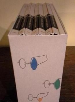
So I was able to coax my overwide spines into a configuration that's reasonably pleasing to the eye and perhaps even a little Tatiesque, which I suppose I can live with (if you can even call this living)...


-
domino harvey
- Dot Com Dom
- Joined: Wed Jan 11, 2006 6:42 pm
Re: Criterion & Eclipse Cover Art & Packaging Babble-on Vol.
I could understand Complete Humphrey Jennings next to Complete Jacques Tati but then the other Tati BFIs were on the other side and I just got upset