Criterion & Eclipse Cover Art & Packaging Babble-on Vol.3

News on Criterion and Janus Films
Locked
Message
Author
User avatar
CSM126
Joined: Thu Nov 04, 2004 12:22 pm
Location: The Room
Contact:

#176 Post by CSM126 »

toiletduck! wrote:Poor Paul, I know how you feel -- my Monterey Pop digis pop out just like that.
The horror...the horror...
User avatar
godardslave
Joined: Tue Nov 02, 2004 8:44 pm
Location: Confusing and open ended = high art.

#177 Post by godardslave »

toiletduck! wrote:Poor Paul, I know how you feel -- my Monterey Pop digis pop out just like that.
well, you know, its a hard life.
I think both sets look superb.
User avatar
toiletduck!
Joined: Tue Nov 02, 2004 9:43 pm
Location: The 'Go
Contact:

#178 Post by toiletduck! »

You guys just take a look at Paul's face. He understands.

It's us against the world, Paul!

-Toilet Dcuk
User avatar
TheGodfather
Joined: Sun Sep 17, 2006 8:39 pm
Location: The Netherlands

#179 Post by TheGodfather »

souvenir wrote:More digipaks
oh boy, my weekend has just been made!! that looks awesome. can`t wait for it now :D =D>
User avatar
thethirdman
Joined: Wed Nov 03, 2004 8:26 pm

#180 Post by thethirdman »

Wow, those are two horrible looking sets.

I had hopes that Bicycle Thieves would be packaged like Hands over the City.
The color scheme is very unappealing.
User avatar
TheGodfather
Joined: Sun Sep 17, 2006 8:39 pm
Location: The Netherlands

#181 Post by TheGodfather »

thethirdman wrote:Wow, those are two horrible looking sets.

I had hopes that Bicycle Thieves would be packaged like Hands over the City.
The color scheme is very unappealing.
How can you call that horrible? isn`t Hands over the city packed in one of those slim case plastic type-of-cases? I really don`t like them, so I`m uber glad they made it the way they did!
User avatar
godardslave
Joined: Tue Nov 02, 2004 8:44 pm
Location: Confusing and open ended = high art.

#182 Post by godardslave »

the la Haine cover is clever conceptually (hiding the faces), but the black and white is somewhat predictable.
portnoy
Joined: Sat Apr 01, 2006 3:03 pm

#183 Post by portnoy »

i mean, the film is in black and white
Cinesimilitude
Joined: Tue Jul 09, 2013 4:43 am

#184 Post by Cinesimilitude »

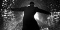
If they aren't going to use the poster (which I quite like) they could definitely find some better stills. I'd love to see the title look like it does but slightly reddish, on a black and white still of the gun sticking out of vinz' pants.
User avatar
domino harvey
Dot Com Dom
Joined: Wed Jan 11, 2006 6:42 pm

#185 Post by domino harvey »

April's covers are all really quite bad
User avatar
jbeall
Joined: Sat Aug 12, 2006 1:22 pm
Location: Atlanta-ish

#186 Post by jbeall »

I *really* prefer the R2 Optimum cover of La Haine. It just looks cool.

Although I agree that the cover of Overlord is a bit too busy, I kinda like it. Guilty pleasure, I suppose.
User avatar
backstreetsbackalright
Joined: Fri Dec 17, 2004 10:49 pm
Location: 313

#187 Post by backstreetsbackalright »

I must disagree. I think the CC cover for Le Haine is super hot, and I much prefer it to the Optimum cover.
User avatar
domino harvey
Dot Com Dom
Joined: Wed Jan 11, 2006 6:42 pm

#188 Post by domino harvey »

backstreetsbackalright wrote:I must disagree. I think the CC cover for Le Haine is super hot, and I much prefer it to the Optimum cover.
there is too much dead space, like half the cover is wasted
User avatar
jbeall
Joined: Sat Aug 12, 2006 1:22 pm
Location: Atlanta-ish

#189 Post by jbeall »

In fairness to backstreetbackalright, the desolate cover of criterion's version nicely underlines the theme of a banlieue society abandoned by 'legitimate' French society, but I just think the Optimum cover is super hot(ter).
User avatar
jon
Joined: Wed Sep 06, 2006 1:03 am

#190 Post by jon »

I almost love the La Haine cover, but the white space bothers the hell out of me.

I have to say, the new covers aren't very good. What happened to that amazing streak of creative covers that came with the logo change?
User avatar
CSM126
Joined: Thu Nov 04, 2004 12:22 pm
Location: The Room
Contact:

#191 Post by CSM126 »

It might be better if the title on the La Haine cover was moved up into the white space. The actual dead space doesn't bother me, but the title over the faces does, for some reason.
User avatar
Mr Pixies
Joined: Sun Nov 07, 2004 2:03 am
Location: Fla

#192 Post by Mr Pixies »

Well I love that you can't see their faces, and all the white space. I also dig the Bicycle Thieves and Robeson sets.
User avatar
Derek Estes
Joined: Wed Nov 03, 2004 12:00 am
Location: Portland Oregon

#193 Post by Derek Estes »

Mr Pixies wrote:Well I love that you can't see their faces, and all the white space. I also dig the Bicycle Thieves and Robeson sets.
I completely agree.
User avatar
der_Artur
Joined: Mon Nov 08, 2004 10:22 pm
Location: stuttgart

#194 Post by der_Artur »

CSM126 wrote:It might be better if the title on the La Haine cover was moved up into the white space. The actual dead space doesn't bother me, but the title over the faces does, for some reason.

But that's the whole point of the design. The faces are obscured, to generalize the characters. These are not three singular young men, but actually anybody raised in a problematic neighborhood as shown in the movie. Plus using a stencil to create the title connects the cover even more to a story from the streets. And the void in the upper half of the cover? The future of these people is just as empty as the depicted sky. I really like the cover.
jmj713
Joined: Sun Apr 24, 2005 2:47 am

#195 Post by jmj713 »

Image
User avatar
Schkura
Joined: Sat Sep 17, 2005 5:48 pm
Location: Mississippi

#196 Post by Schkura »

Flippin' gorgeous, mate
User avatar
TheGodfather
Joined: Sun Sep 17, 2006 8:39 pm
Location: The Netherlands

#197 Post by TheGodfather »

Looking good! hope to receive mine this week.
User avatar
Cinephrenic
Joined: Tue Nov 02, 2004 6:58 pm
Location: Paris, Texas

#198 Post by Cinephrenic »

Simply Beautiful.
User avatar
thethirdman
Joined: Wed Nov 03, 2004 8:26 pm

#199 Post by thethirdman »

I thought the Monsters/Madmen set was nicely packaged when I picked it up Friday, but the Yojimbo/Sanjuro set blows it away. The packaging is sturdy, simple, elegant, and appropriate.
User avatar
jon
Joined: Wed Sep 06, 2006 1:03 am

#200 Post by jon »

That looks gorgeous. I assume that the final product will have clear cases instead of the black ones in the picture...

Can't wait to get it.
Locked