Page 9 of 64
Posted: Fri Nov 17, 2006 7:45 pm
by 125100
peerpee wrote:125100, sorry to hear you're not happy with our final artwork -- but we did spend an unusual amount of time on this. I wonder what you would have done in the same circumstances? All three original Japanese posters had copious Japanese text, and nowhere for English text (unless the Japanese text was airbrushed).
One of the posters was very tall and twice the size of a DVD cover.
Rather than butchering the posters, airbrushing them, and cropping the tall poster, we decided to go with stylish, tasteful stills from the films.
If you so wish, you can turn the DVD sleeves round, where we will be printing the original, untouched, Japanese posters.
Sorry peerpee I didn't see your post before

I appreciate that you were in a tough position, I think you made the right decision to scrap the posters rather than cropping or resizing them.
I'm not sure what I'd have done different to be honest, although after hearing the Criterions are likely to be the bfi films not the MoC releases I've decided to buy these now. I'll just chuck the box (which is what I really don't like, i just find it dull, sorry).
I'll either use the reverse covers you mentioned or get a guy who does graphics work for me to scan the stills side of the individual boxes then colourise them in a 50's Japanese Poster style.
thanks for the headsup about the "not braking", I'll be sure to listen out for someone aggressively driving a beige Skoda...
Don't worry, I love my car too much to damage it. I wish I did have a Skoda though it wouldn't cost £11,000 a year to insure nor would it need a new pair of rear tyres every 3-4 months.
fred wrote:I can't wait for these to finally arrive so that we can stop talking about the packaging.

It's foolish to think packaging doesn't matter. A lot of people will buy the gorgeous Criterion "Monster's and Madmen" set knowing the films are trash. And like Peerpee said, they spent a lot of time on these so I'm sure he appreciates the positive remarks on it (even if some of those people are just fan-boys who would like anything MoC did

). If he relies on just us hardcore collectors to buy these he won't get far. They need people to see this on a shelf and feel the urge to buy it (which hopefully they will).
Posted: Fri Nov 17, 2006 8:37 pm
by fred
125100 wrote:It's foolish to think packaging doesn't matter.
I didn't say packaging doesn't matter. I'd just rather read posts about the films than the cover art. I'm sure attractive cover art may make a few more people pick something up in a shop and look it over, but if they haven't heard of the film and don't have an interest in seeing it they're not going to buy it. By this logic, we should all be rigorously critiquing the back cover copy, which is undoubtedly the first thing they'll look at once they pick it up. If that doesn't sell them, it doesn't matter how beautiful the cover is. True packaging fetishists--who would buy something *just* because it looks good--are probably even rarer than "hardcore collectors".
Posted: Sat Dec 16, 2006 6:49 pm
by Jem
125100 wrote: I pre-ordered this as soon as it was listed on amazon.co.uk but then canceled it when I saw the final artwork. For me no matter how much I wanted this a DVD sits on a shelf most of the time and as a designer artwork is a must for me when buying DVDs. They just have to be pretty, and to me (who's opinion I know doesn't matter to anyone here), this just isn't. I hear Criterion have Naruse films in the pipeline though so all is not lost.

125100 wrote:(which is what I really don't like, i just find it dull, sorry).
Just rude!
At least have some respect for the amount of time and effort someone has put into designing these covers.
And for what it's worth the Naruse covers are very strong, good work.
Posted: Wed Dec 20, 2006 2:29 am
by jon
Are you even looking at the individual artworks? They are beautiful. And are you really going to get a graphic designer to colorize the black and white stills? >< that seems a bit silly...
Anyways, can't wait to pick this set up. Im ordering right now...
Posted: Thu Jan 04, 2007 4:37 pm
by Lino
Final?
Posted: Thu Jan 04, 2007 4:53 pm
by denti alligator
He looks like an insect. I'm scared of it.
Posted: Thu Jan 04, 2007 5:23 pm
by a.khan
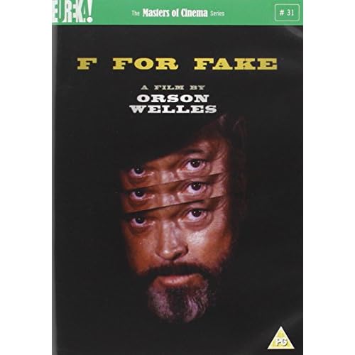
The Criterion artwork kicks major ass. I remember Nick hinting they were considering the same image of Welles, but in its entirety.
Posted: Mon Jan 08, 2007 11:07 pm
by jon
SncDthMnky has an awesome piece of art for it on page 7
Posted: Sat Jan 13, 2007 6:45 am
by Matango
peerpee wrote:If you so wish, you can turn the DVD sleeves round, where we will be printing the original, untouched, Japanese posters.
I've just done that with all three and they look fantastic. What a great idea to have reversible/optional covers. Ilike the originals but the posters look more retro and authentic somehow. And more Japanese in the style of presentation.
Posted: Sat Jan 13, 2007 11:58 pm
by Franky
I think all of the MoC DVDs look amazing, especially the ones of the Idiot and Twenty-four eyes. The Naruse box looks great as well.
Posted: Thu Mar 15, 2007 7:05 pm
by What A Disgrace
Posted: Thu Mar 15, 2007 7:11 pm
by dadaistnun
Wow.
Posted: Thu Mar 15, 2007 8:31 pm
by domino harvey
that is an amazing cover for Diary of a Lost Girl. Well done!
Posted: Thu Mar 15, 2007 8:32 pm
by rwaits
Wow, I'm extremely excited.
Posted: Thu Mar 15, 2007 8:46 pm
by zedz
Fantastic cover for Silence de la mer - is that really original poster art?
Posted: Fri Mar 16, 2007 1:48 am
by Apu
Both covers are beautiful and among the best MOC-covers ever.
Posted: Fri Mar 16, 2007 1:51 am
by domino harvey
Criterion Art Designers: TAKE NOTE OF THE ABOVE PLZ
Posted: Fri Mar 16, 2007 2:01 am
by zombeaner
Those two are very nice.
Posted: Fri Mar 16, 2007 3:49 am
by Via_Chicago
zedz wrote:Fantastic cover for Silence de la mer - is that really original poster art?
I'm pretty sure that it is. Remarkable poster, that.
Posted: Fri Mar 16, 2007 4:40 pm
by Anthony
Great art work. I wish Criterion would put this much effort into their DVD covers.
Posted: Fri Mar 16, 2007 11:11 pm
by mbalson
Anthony wrote:Great art work. I wish Criterion would put this much effort into their DVD covers.
It doesn't take more effort to use the original poster artwork... if anything Criterion put more effort into their artwork/packaging. That being said I think using the original poster artwork for pre 80's films is usually the best choice.
Posted: Fri Mar 16, 2007 11:42 pm
by TheGodfather
Those are extremely beautiful. That said, I can`t wait for Diary Of A Lost Girl. Been waiting for that for a while now
Posted: Sat Mar 17, 2007 12:37 am
by hieronymus
mbalson wrote:It doesn't take more effort to use the original poster artwork... if anything Criterion put more effort into their artwork/packaging. That being said I think using the original poster artwork for pre 80's films is usually the best choice.
I concur. MoC and Criterion are all about presenting classic films in their original form (correct aspect ratio, complete version, etc.), and since marketing is also part of the film's history, it's fitting to use its original poster as its cover. They usually are successful in delivering the mood and period of the film. Some argue that is not always a good thing commercial wise, but I wonder how many people completely indifferent to classic cinema will watch GREEN FOR DANGER on the bases of its revamped cover. (On a second thought, a lot of people might...)
I'm easy with new but simple designs, such as those with film still plus the title (ala A NOS AMOURS), but those design-conscious ones with a voice of their own (THE TIN DRUM, SEDUCED AND ABANDONED, etc.), although often aesthetically pleasing, seem a bit out of place. Needless to say, I hate the ones that go against the aesthetic characteristics of the film (e.g. close-upped TOKYO STORY).
But why only for pre 80s films? Is it because the post 80s stuffs are too recent to have an nostalgic tint, or do you think poster designs generally declined in quality since then?
Posted: Mon Mar 19, 2007 12:42 am
by mbalson
hieronymus wrote:But why only for pre 80s films? Is it because the post 80s stuffs are too recent to have an nostalgic tint, or do you think poster designs generally declined in quality since then?
Both reasons!
Posted: Fri Mar 23, 2007 6:53 am
by hammock
Both are absolutely lovely and so are the latest batch from Criterion.

