Page 9 of 147
Posted: Fri Apr 18, 2008 3:11 am
by Svevan
kaujot wrote:That said, I hope they issue [the Trafic cover] as a poster, as I know that's what the original poster looked like (at least I'm 90% sure of that).
I think the original poster didn't have the cars or the yellow lane divider: see
Beaver.
Posted: Fri Apr 18, 2008 3:22 am
by Saturnome
Using the provided link for comparison, I prefer the colors on the new Trafic cover than the original poster. Great work here!
But I would have liked some snow for Mon Oncle Antoine. Glad they kept the French title.
Posted: Fri Apr 18, 2008 3:30 am
by Jeff
justeleblanc wrote:For anyone else who ever interned or worked at Tribeca Productions, that poster used to grace the 6th floor when you opened the elevators.
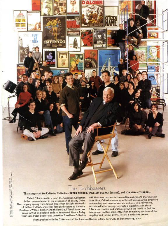
It hung in the
old Criterion offices too.
Posted: Fri Apr 18, 2008 5:46 am
by Svevan
The poster in THAT pic does have the cars. Wonder which one is ab origine.
Posted: Fri Apr 18, 2008 6:42 pm
by TheGodfather
Morbii wrote:Is it just me, or is Vampyr Criterion's best cover ever?
It`s certainly up there with the best. Love the High And Low cover as well
Gonna be another expensive month
Posted: Fri Apr 18, 2008 7:17 pm
by Michael Kerpan
Posted: Fri Apr 18, 2008 7:26 pm
by domino harvey
Yeah,
that cover makes me want to rush out to Borders and pick it up

Posted: Fri Apr 18, 2008 7:53 pm
by Michael Kerpan
domino harvey wrote:Yeah, that cover makes me want to rush out to Borders and pick it up :roll:
I need to see what I can come up with in terms of screen captures....
Posted: Fri Apr 18, 2008 8:06 pm
by arsonfilms
The Canadian DVD cover is one of the few I've EVER seen that would actually prevent me from seeing a film I might otherwise enjoy. I mean, if you look at the Worst DVD Covers Ever thread, most of those aren't anything any of us would bother with anyway. This one though... for god's sake, no wonder I've never seen the film before.
Posted: Sat Apr 19, 2008 5:34 am
by Feego
foggy eyes wrote:Not that I want to take the contrarian view, but Vampyr looks a bit too much like a bad metal t-shirt to me (perhaps it's the font and scythe silhouette). MoC's cover was genuinely elegant.
I really love the
Vampyr cover, but I do agree about the font. I whipped up an alternative cover (same picture, different font) in the Fake Criterion Covers thread, if anyone's interested.
Posted: Sat Apr 19, 2008 12:27 pm
by Michael Kerpan
arsonfilms wrote:The Canadian DVD cover is one of the few I've EVER seen that would actually prevent me from seeing a film I might otherwise enjoy. I mean, if you look at the Worst DVD Covers Ever thread, most of those aren't anything any of us would bother with anyway. This one though... for god's sake, no wonder I've never seen the film before.
A bit hyperbolic, maybe?
I looked through my copy of MOA -- and must say no screen shot jumps out as a distillation of the whole of the film. all the same, the Criterion cover is pretty misleading.
Posted: Sat Apr 19, 2008 1:03 pm
by Kinsayder
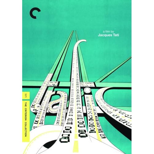
jaredsap wrote:This is a gorgeous poster so I'm happy Criterion decided not to mess with it much, but I'd love know why no other filmmaker in the collection besides Tati -- to my knowledge, perhaps someone can correct me -- has been consistently represented by original key art. This isn't a complaint. I'm just curious.
Possibly because Tati worked on the poster art himself for most of his films. With the exception of
Holiday, each title is designed like a corporate logo, with a distinctive typography and colour scheme. The logo appears at the start of each film and it was clearly his intention for it to be used on all publicity material as well. DVD cover designers stray from it at their peril.
Posted: Thu May 01, 2008 7:25 am
by jaredsap
Does anyone know why the TRAFIC cover on Amazon is an
absolutely revolting light green rather than the turquoise incarnation on Criterion's site?
Posted: Sat May 03, 2008 2:15 pm
by psufootball07
Of all the Criterions, in my opinion The Ice Storm has the most beautiful cover art. However, clearly some films have better overall packaging and extras.
Posted: Wed May 14, 2008 10:03 am
by lacritfan
I think they're prominently/subliminally putting their logo front and center on the High and Low cover.
Posted: Wed May 14, 2008 5:33 pm
by Jean-Luc Garbo
lacritfan wrote:I think they're prominently/subliminally putting their logo front and center on the High and Low cover.
That's the chief reason I hate it. I even said so when I wrote in to them about the cover.
Posted: Wed May 14, 2008 10:23 pm
by Doctor Sunshine
Come on. It's a target and sound waves to add tension and draw attention to the importance of the phone. The only reason that piece is cut out is so you can see his eye.
Posted: Thu May 15, 2008 9:54 pm
by souvenir
Posted: Thu May 15, 2008 10:02 pm
by Cronenfly
Let the bitching and moaning about another wasted month begin!
Posted pre-Shepitko and Salo, of course.
Posted: Thu May 15, 2008 10:09 pm
by HelenLawson
Looks like my tax rebate is safe for another month.
--oops, posted before Shepitko
Posted: Thu May 15, 2008 10:10 pm
by Cinephrenic
l'll start the bitching, and it is mostly on Salo. I have elected it already as the worst cover ever!!!! Also, not many extras and no commentary on a film that needs one more than any other film.
Posted: Thu May 15, 2008 10:11 pm
by denti alligator
That Salo cover is brilliant! Almost makes me want to buy it. Almost.
Cinephrenic: what are you talking about? It's a great cover. And this from someone who's not too hot on the film. Sure, no commentary, but there are plenty of extras. It's 2-discs, for god's sake.
Posted: Thu May 15, 2008 10:15 pm
by Cronenfly
All the covers are pretty solid this month, IMO; Salo's is a matter of personal taste I think (even more so than most-the grainy, near-animated look, the 120 tally marks, the modern font [which I can't quite place, but which looks out of Wes Anderson], the choice of Renata Moar with accompanying near-nudity/implied shit-eating), and in that way it suits the movie to a tee. Looks a little too Haneke for me, but that's okay.
Posted: Thu May 15, 2008 10:15 pm
by Tom Hagen
I am curious about the politics of putting a female victim on the cover of Salo, rather than a male victim . . .
Posted: Thu May 15, 2008 10:17 pm
by Cronenfly
Tom Hagen wrote:I am curious about the politics of putting a female victim on the cover of Salo, rather than a male victim . . .
Gotta grab the torture porn audience.


