They're counting on that wacky C (and the lower price point) to do the heavy lifting on this one.swo17 wrote:Y'know, if Criterion were really so ashamed of Jellyfish Eyes, they could have easily had one of those clouds be passing over the wacky C...
Criterion & Eclipse Cover Art & Packaging Babble-on Vol. 6
-
FakeBonanza
- Joined: Mon Dec 03, 2012 2:35 am
Re: Criterion & Eclipse Cover Art & Packaging Babble-on Vol.
-
Michael Kerpan

- Spelling Bee Champeen
- Joined: Wed Nov 03, 2004 5:20 pm
- Location: New England
- Contact:
Re: Criterion & Eclipse Cover Art & Packaging Babble-on Vol.
Has anyone here actually seen this? Just wondering...
-
flyonthewall2983

- Joined: Mon Jun 27, 2005 7:31 pm
- Location: Indiana
- Contact:
Re: Criterion & Eclipse Cover Art & Packaging Babble-on Vol.
domino harvey wrote:I cannot believe Criterion had another opportunity to use the original poster art for the Downhill Racer upgrade and instead stuck with that monstrosity
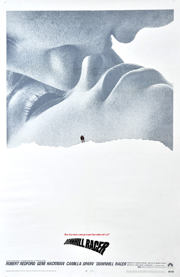
I was going to say I prefer the Criterion cover, but it would have been nice if they used this, provided they got rid of that silly logo on the bottom and used something more muted.
-
carmilla mircalla
- Joined: Tue Jul 14, 2015 1:47 am
Re: Criterion & Eclipse Cover Art & Packaging Babble-on Vol.
Rosemary's Racer
-
cdnchris

- Site Admin
- Joined: Tue Nov 02, 2004 6:45 pm
- Location: Washington
- Contact:
-
FrauBlucher

- Joined: Tue Jul 16, 2013 12:28 am
- Location: Greenwich Village
-
cdnchris
- Site Admin
- Joined: Tue Nov 02, 2004 6:45 pm
- Location: Washington
- Contact:
-
carmilla mircalla
- Joined: Tue Jul 14, 2015 1:47 am
Re: Criterion & Eclipse Cover Art & Packaging Babble-on Vol.
Wow. The Brood is just flat out terrible, in and out and all around
-
criterion10
Re: Criterion & Eclipse Cover Art & Packaging Babble-on Vol.
Not a fan of the leaflet art, but otherwise, I think it actually looks pretty good.
-
criterion10
Re: Criterion & Eclipse Cover Art & Packaging Babble-on Vol.
Criterion seems to have added "A Film by Masaki Kobayashi" at the bottom of the front cover of Kwaidan (photo courtesy of a poster at the Blu-Ray.com forums):

-
cdnchris
- Site Admin
- Joined: Tue Nov 02, 2004 6:45 pm
- Location: Washington
- Contact:
-
Jean-Luc Garbo

- Joined: Thu Dec 09, 2004 5:55 am
- Contact:
Re: Criterion & Eclipse Cover Art & Packaging Babble-on Vol.
I had a feeling Mulholland Dr might be a digipak so to match Eraserhead. A very lovely effort even if the cover isn't so great. Certainly getting my package design of the year vote.
-
flyonthewall2983
- Joined: Mon Jun 27, 2005 7:31 pm
- Location: Indiana
- Contact:
Re: Criterion & Eclipse Cover Art & Packaging Babble-on Vol.
Maybe a Lynch box set in the future?
-
TheGodfather

- Joined: Sun Sep 17, 2006 8:39 pm
- Location: The Netherlands
Re: Criterion & Eclipse Cover Art & Packaging Babble-on Vol.
That`s one great Mulholland Dr. package
-
richast2
- Joined: Wed Feb 02, 2005 1:49 pm
Re: Criterion & Eclipse Cover Art & Packaging Babble-on Vol.
It's certainly a letdown compared to the packaging for Naked Lunch, Scanners, and Videodrome.carmilla mircalla wrote:Wow. The Brood is just flat out terrible, in and out and all around
-
swo17

- Bloodthirsty Butcher
- Joined: Tue Apr 15, 2008 2:25 pm
- Location: SLC, UT


-
FakeBonanza
- Joined: Mon Dec 03, 2012 2:35 am
Re: Criterion & Eclipse Cover Art & Packaging Babble-on Vol.
I spent much of today really hoping that Yuko Shimizu would have done the Lady Snowblood artwork, but I can't say I'm disappointed with the artwork they've given us.
-
The Narrator Returns
- Joined: Tue Nov 15, 2011 10:35 pm

-
DarkImbecile

- Ask me about my visible cat breasts
- Joined: Mon Dec 09, 2013 10:24 pm
- Location: Albuquerque, NM
Re: Criterion & Eclipse Cover Art & Packaging Babble-on Vol.
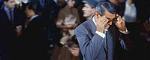
Might be just because I'm happy to see the film among this month's releases, but I like The American Friend's cover quite a bit.
-
FrauBlucher
- Joined: Tue Jul 16, 2013 12:28 am
- Location: Greenwich Village
Re: Criterion & Eclipse Cover Art & Packaging Babble-on Vol.
The cover for Inside Llewyn Davis is terrific.
-
criterion10
Re: Criterion & Eclipse Cover Art & Packaging Babble-on Vol.
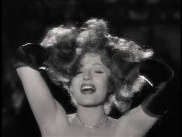
Gilda's cover art looks terrible, but all the rest are actually quite good, Inside Llewyn Davis especially.
-
scubadonc

- Joined: Wed Sep 15, 2010 5:51 am
- Location: Wyoming
- Contact:
Re: Criterion & Eclipse Cover Art & Packaging Babble-on Vol.
Yeah... Gilda is just awful (maybe my worst of the year). This is a cover that could've really benefited from the original poster art. Even the DVD cover is better. To Criterion's credit, Lady Snowblood looks incredible and makes me grubble at how plain my Arrow blu ray is.
-
feihong

- Joined: Thu Nov 04, 2004 4:20 pm
Re: Criterion & Eclipse Cover Art & Packaging Babble-on Vol.
Really good designs this time! Hopefully Gilda is some kind of temp image? I wouldn't mind that same layout if it was a painting or illustration, and the Typography was only changed completely.
If only I liked the Lady Snowblood movies. I think the only ones I'll be getting out of these will be The American Friend and Gilda.
If only I liked the Lady Snowblood movies. I think the only ones I'll be getting out of these will be The American Friend and Gilda.
-
giovannii84
- Joined: Sat May 12, 2012 8:44 am
- Location: Melbourne, Australia
- Contact:
Re: Criterion & Eclipse Cover Art & Packaging Babble-on Vol.
Agree.criterion10 wrote:Gilda's cover art looks terrible, but all the rest are actually quite good, Inside Llewyn Davis especially.
There were so many stunning promotional stills taken of Rita Hayworth for 'Gilda', and they selected the most unflattering photo.
-
swo17
- Bloodthirsty Butcher
- Joined: Tue Apr 15, 2008 2:25 pm
- Location: SLC, UT
Re: Criterion & Eclipse Cover Art & Packaging Babble-on Vol.
It's one of the most iconic images from the film, but probably would have worked better if it weren't so zoomed in.