Page 99 of 108
Re: Criterion & Eclipse Cover Art & Packaging Babble-on Vol.
Posted: Tue Apr 19, 2016 12:13 am
by feihong
pzadvance wrote:What's with the weird text cropping on The New World title?
I think it's to create the sensation that you're moving through a doorway? That the text is about to become fully visible, once you cross the threshold of the box it's in?
I'm surprised no one else regards the new Night and Fog cover as a significant downgrade. I like The New World. The Muriel one looks pretty good, but there's something about it that doesn't quite feel right. The colors, maybe?
Re: Criterion & Eclipse Cover Art & Packaging Babble-on Vol.
Posted: Tue Apr 19, 2016 1:03 am
by jbeall
domino harvey wrote:Except my comment was a compliment!
Sure. And I'm willing to accept that my reaction is idiosyncratic. If I had to try and pinpoint why I don't care for it, it's for the same reason I prefer the cover for
Days of Heaven to the
Thin Red Line cover. I'm not really a Malick fan, but he does shoot beautiful images, and I'm perfectly happy to see a still on the cover, rather than an image meant to connote nostalgia. (Indeed, Malick is one of the few directors whose dvd/blu covers, IMO, should just be stills from the film.) I don't mind what Criterion was going for, but I suppose the pleasure I get from Malick's films is something different.
Re: Criterion & Eclipse Cover Art & Packaging Babble-on Vol.
Posted: Tue Apr 19, 2016 6:38 am
by JabbaTheSlut
The New World cover looks like Jehova's witness "Watchtower" cover.
Re: Criterion & Eclipse Cover Art & Packaging Babble-on Vol.
Posted: Tue Apr 19, 2016 11:16 pm
by Minkin
I'm not sure how I feel about the Carnival of Souls cover. Somewhere between liking it and hating it. I wasn't that fond of the old cover either, so I guess nothings changed!
I'm assuming that The New World will be in a digipack - as its 3 discs and includes a "book." If this promises to actually be a substantial book - then it will be the first since the end of Dual Formats and arriving at a strange time where Criterion is discontinuing large books from editions (Vampyr, Two Lane Blacktop). It will also be the first book to be on separate DVD and Blu editions - thus I wonder whether they'll print two different sizes or do the more intelligent idea of printing a blu sized book and making the DVD digipack include space to hold the smaller size.
Which reminds me, that I was at B&N the other day - and they had the new reissued Burden of Dreams - now in a plastic case without the included book. So if you are interested in that - it appears that Criterion.com still stock it for now (although you might want to confirm /double check).
Re: Criterion & Eclipse Cover Art & Packaging Babble-on Vol.
Posted: Wed Apr 20, 2016 9:30 am
by tenia
I'm not sure what's the cheapest but elaborated packaging usually is expensive to produce. They might be better off simply doing 2 different sizes of packaging with 2 different sizes of book.
Re: Criterion & Eclipse Cover Art & Packaging Babble-on Vol.
Posted: Thu Apr 21, 2016 5:10 am
by bugsy_pal
I haven't seen Carnival of Souls, but I think the cover is excellent - certainly better than the DVD cover. It's a great illustration and from the look of various stills I've seen, nicely in keeping with the look of the film. I'm looking forward to seeing the film.
Re: Criterion & Eclipse Cover Art & Packaging Babble-on Vol.
Posted: Thu Apr 21, 2016 5:38 am
by Gregory
It's not just an unflattering angle, as I was saying earlier, but it just plain doesn't resemble Hilligoss or make sense as a single image for the film. If I hadn't seen CoS yet I'd have to wonder, is she supposed to look ghoulish? Terrified? Something else? Is there drag in this movie?
I believe it is based on a specific frame from one of the close-up shots that makes sense in its original context, but plucked out of that context it's a really odd choice. It's a little like when someone catches someone off guard and takes a bad photo of them. The facial features are weirdly distorted, and even taking into account that it's a horror film, it seems like even more of a lapse in resemblance than the much-protested Fox Blu-ray cover for Laura.
Re: Criterion & Eclipse Cover Art & Packaging Babble-on Vol.
Posted: Thu Apr 21, 2016 1:48 pm
by Feego
Exactly. The image is in fact based on a specific close-up shot of Candace Hilligoss toward the end of the film, but as you say, it makes sense in the context of the film but not as a cover design. For someone who has not seen the movie, it's understandable that the cover may look interesting and appropriately spooky, as the concept of it is nifty, but this is just not representative of Hilligoss's character in the movie. She is, for all intents and purposes, meant to be depicted as a rather normal and relatable (and attractive) woman with nightmarish things happening around her. Imagine picking the most distorted, unflattering image of Jamie Lee Curtis screaming in Halloween and using it as the cover art for that film. Sure, it may come straight from the movie, but it undermines the essence of her character as a normal, sympathetic person by making her look so off-putting.
Re: Criterion & Eclipse Cover Art & Packaging Babble-on Vol.
Posted: Thu Apr 21, 2016 2:00 pm
by jindianajonz
It's been a while since I've seen the film, but I like the cover. I particularly disagree with the assessment that Hilligoss comes across as warped and weird in that cover- I think she appears rather normal other than the bad angle, and thus see it more as the context she is currently in (in this case, the camera angle) shaping and distorting her, which is a similar feel to what I remember getting in the movie. I also think that despite the odd angle, she has a very clear dear-in-headlights look about her, something that I think garners a bit of sympathy for her.
Re: Criterion & Eclipse Cover Art & Packaging Babble-on Vol.
Posted: Sat Apr 23, 2016 5:16 am
by cdnchris
Re: Criterion & Eclipse Cover Art & Packaging Babble-on Vol.
Posted: Sat Apr 23, 2016 8:23 pm
by Norbie
I've gone back ten pages or so in this Forum to find more info/discussion about re-releases of certain DVD's like Salo (the digipak was one of the first Criterion I purchased along the 3 disc Seven Samurai, and back then living in Australia these beautiful sets opened new waters for me) but I didn't come across anything about it in this forum. There is some discussion in the Criterion OOP forum, but if someone could be so kind and direct me to more relevant information/discussion about these editions going out of print it would be much appreciated.
Thanks.
Re: Criterion & Eclipse Cover Art & Packaging Babble-on Vol.
Posted: Tue Apr 26, 2016 1:42 am
by Minkin
Norbie wrote:I've gone back ten pages or so in this Forum to find more info/discussion about re-releases of certain DVDs like Salo (the digipak was one of the first Criterion I purchased along the 3 disc Seven Samurai, and back then living in Australia these beautiful sets opened new waters for me) but I didn't come across anything about it in this forum. There is some discussion in the Criterion OOP forum, but if someone could be so kind and direct me to more relevant information/discussion about these editions going out of print it would be much appreciated.
I keep track of the status of all of the digipacks and releases with "larger booklets" on the
Criterion FAQ page. There hasn't been any official word, but a number of titles have been reissued in plastic cases from digipacks / reissues where the larger book(let) is either removed or slimmed down. With the parallel rise in the appearance of leaflets, the conclusion is that Criterion is reducing costs by eliminating the heavy book(let)s - which make the packages alot heavier to ship, cost more to print, etc (leaflets can just be printed in one size, and then refolded for both DVD + Blu releases, thus even further savings). As some consolation, most of the removed essay content has been posted on Criterion's website.
A few months ago, someone noticed that Salo + Repo Man on DVD were being repackaged (on Jan 26, 2016) - thus we all assumed they would go from digipack to standard case DVD. I still don't know whether any of the booklet content was slimmed down in the process (the Criterion site doesn't indicate, so does anybody know for sure?). I do know that Burden of Dreams was recently reissued and that the large included book is now absent in the reissue (though it still might be available at Criterion.com). Most of the discussion here has been on a case by case basis with someone noticing a forthcoming reissue, so there hasn't been too much discussion on this topic (its been more about leaflets and less about losing digipacks).
For those that enjoy digipacks / the large book(let)s, I'd use my reference as a guide as to what to purchase sooner than later (unless you enjoy paying high priced gambles on Ebay). There isn't any word about any further reissues at the moment, but I expect the rest of the large books (and more digipacks) to go OOP at some point. So I wouldn't be waiting for a blu upgrade of The Furies / Mr Arkadin if you are interested in the book, best to get it now.
Re: Criterion & Eclipse Cover Art & Packaging Babble-on Vol.
Posted: Wed Apr 27, 2016 2:08 am
by Minkin
It looks like Dr Strangelove will be in a digipack (thanks to Blu-ray.com forums):
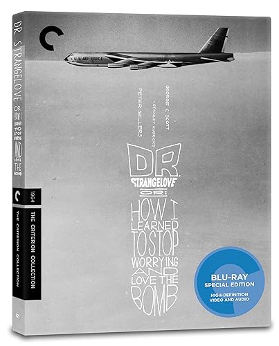
Re: Criterion & Eclipse Cover Art & Packaging Babble-on Vol.
Posted: Wed Apr 27, 2016 10:13 am
by FrauBlucher
The Dr Strangelove release gets even better!

Re: Criterion & Eclipse Cover Art & Packaging Babble-on Vol.
Posted: Wed Apr 27, 2016 3:55 pm
by chatterjees
This might be the first digipak without a booklet :-k
Re: Criterion & Eclipse Cover Art & Packaging Babble-on Vol.
Posted: Wed Apr 27, 2016 5:09 pm
by tenia
chatterjees wrote:This might be the first digipak without a booklet :-k
Ace in the Hole DF release is already a digipack with a folded leaflet.
Re: Criterion & Eclipse Cover Art & Packaging Babble-on Vol.
Posted: Thu Apr 28, 2016 1:05 pm
by TheGodfather
More digipacks, always a good thing
Re: Criterion & Eclipse Cover Art & Packaging Babble-on Vol.
Posted: Thu Apr 28, 2016 5:17 pm
by nosy lena
I kind of loathe digipacks. Didn't think it was something people actually liked.
Criterion & Eclipse Cover Art & Packaging Babble-on Vol. 6
Posted: Thu Apr 28, 2016 5:21 pm
by johnnysnatchclub7
The digi-lovers big thing is that you do get more artwork. My big thing is they get scuffed up and look bad on the shelf with the other spines. I like the uniformity.
But this topic has been discussed ad nauseam.
Re: Criterion & Eclipse Cover Art & Packaging Babble-on Vol.
Posted: Sun May 08, 2016 4:28 am
by cdnchris
The Naked Island (I just noticed the one is fuzzy, I'll fix that when I can)
The Player (the film opens with the Janus logo now, FYI)
Road Trilogy
Re: Criterion & Eclipse Cover Art & Packaging Babble-on Vol.
Posted: Tue May 10, 2016 12:48 am
by dwk
Bill Sienkiewicz posted his Cat People cover:

Re: Criterion & Eclipse Cover Art & Packaging Babble-on Vol.
Posted: Tue May 10, 2016 12:55 am
by feihong
That looks just amazing.
Re: Criterion & Eclipse Cover Art & Packaging Babble-on Vol.
Posted: Tue May 10, 2016 1:07 am
by chatterjees
So, no box set then?

Re: Criterion & Eclipse Cover Art & Packaging Babble-on Vol.
Posted: Tue May 10, 2016 1:29 am
by knives
Not necessarily. It could be the individual cover for a larger boxset ala The War trilogy.
Re: Criterion & Eclipse Cover Art & Packaging Babble-on Vol.
Posted: Tue May 10, 2016 1:59 am
by FrauBlucher
I hope they catch the incorrect year on the cover. But it does look terrific.