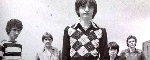
I fail to see what was at all satisfactory about the Opening disc, at least going by the caps. The grain structure between the two remind me of the difference between the TT and Arrow versions of The Fury, although not to the same degree. Whatever you think of the saturation on the Arrow disc, it can also be claimed that the Opening is lacking in this department completely, with colours barely registering. It's very washed out (compare the denim jacket in the second set of comparisons).
Saturation aside, I have the Arrow disc myself and can say there is not a thing wrong with the colour scheme. The most troubling cap from DVDBeaver is the first comparison, as it appears to be awash in blue (teal!). The character's bead design on his shoulders has gone from white to blue, as has the rest of the scene. Strange then, that in other scenes featuring this jacket the beads appear bright white on the Arrow disc. Perhaps it has something to do with the character being under a, you guessed it, blue light in that particular scene (as is the stage/dance floor in the background).
As for contrast and detail, the disc is a knockout, far more impressive than the caps suggest (and comparing to the Opening caps, light years ahead).
Phantom of the Paradise
Moderators: MichaelB, yoloswegmaster
-
tenia

- Ask Me About My Bassoon
- Joined: Wed Apr 29, 2009 3:13 pm
Re: Phantom of the Paradise
Judging by the caps, the Arrow disc seems at least far superior in terms of precision. However, like _shadow_, I tend to think the Arrow disc might be too dark, leading to a loss of information in the shadows.
But I have no idea which one is closer to how Phantom should look, so whatever.
But I have no idea which one is closer to how Phantom should look, so whatever.
-
David M.
- Joined: Sat May 10, 2008 5:10 pm
Re: Phantom of the Paradise
HJackson could be seeing exactly as he describes - on his monitor.HJackson wrote:You're overstating it a wee bit, no?_shadow_ wrote:the receptionist's hair is turned into a blob that's not differentiated from the Swan bird logo behind her.
Without measuring and calibrating, there's no way of telling what your screen is doing to shadow details.
Screen shots are good for making comparisons (the two discs look quite different, make no mistake) but unless you're looking at a calibrated display, it's impossible to be too precise with observations about things like near-black detail.
-
_shadow_
- Joined: Tue Nov 22, 2011 5:48 am
Re: Phantom of the Paradise
Regarding the point about the receptionist's hair, based only on the DVD Beaver comparison it's not much of an overstatement.

I'm looking forward to finally getting my disc in the mail, but my expectations have been slightly lowered.
I'm looking forward to finally getting my disc in the mail, but my expectations have been slightly lowered.
-
Anthony Thorne
- Joined: Mon Jan 26, 2009 7:45 am
Re: Phantom of the Paradise
Whilst _shadow_ regrets the loss of the receptionist's hair in the darkness, I note the bottom of that dual/cropped screengrab shows much improved colour and detail on the metal and denim. The mood of those Arrow Beaver caps looked fine to me so I'm looking forward to getting the disc.
-
Drucker
- Your Future our Drucker
- Joined: Wed May 18, 2011 1:37 pm
-
rwaits
- Joined: Tue Dec 21, 2004 4:24 pm
Re: Phantom of the Paradise
I just stopped by to post that link as well. I really hope someone here will post their thoughts upon viewing the Arrow disc. Each set of caps I see, the less optimistic I become.
-
EddieLarkin

- Joined: Sat Sep 08, 2012 2:25 pm
Re: Phantom of the Paradise
Hmm, I really don't see the justification for the Opening disc being superior.
Svet's choice of caps to compare are interesting. In the first, with Beef in the shower, the tiles have gone from their presumably correct white on the Arrow disc to a shade of pink on the Opening. That looks more like an incorrect red bias to me, rather than nuanced intention. The Arrow disc appeared oversaturated at times to me, but Calvin did post something interesting over on BD.com about the lighting/colour.
Svet's choice of caps to compare are interesting. In the first, with Beef in the shower, the tiles have gone from their presumably correct white on the Arrow disc to a shade of pink on the Opening. That looks more like an incorrect red bias to me, rather than nuanced intention. The Arrow disc appeared oversaturated at times to me, but Calvin did post something interesting over on BD.com about the lighting/colour.
-
rwaits
- Joined: Tue Dec 21, 2004 4:24 pm
Re: Phantom of the Paradise
Eddie, I will take a look at your link. Is the extreme saturation somehow a byproduct of the overall darker timing? I've seen this film projected (many years ago) and don't recall the colors looking so gaudy.
-
EddieLarkin
- Joined: Sat Sep 08, 2012 2:25 pm
Re: Phantom of the Paradise
I've no idea what the hell I'm actually talking about, but I would have thought the oversaturation was what led to the darker timing, not the other way around.
I wouldn't describe the transfer as dark though, just darker compared to the Opening, which looks brightened and washed out.
shadow's comparison from DVDBeaver for instance is likely based on what his LCD monitor is showing. Sure enough, from my PC the detail in the hair looks lost, but I checked that shot specifcally when I watched the disc and actually the detail is more than plain to see. This stuff goes a lot further on a PDP with super duper black levels.
The colours are certainly gaudy, and I cannot speak for prints as I've never seen one, but the garishness certainly fits the film. What about the information Calvin posted? Someone who knows what they're talking about will need to help me here; wouldn't high key lighting result in gaudier colours (but lower contrast)?
-
domino harvey

- Dot Com Dom
- Joined: Wed Jan 11, 2006 6:42 pm
Re: Phantom of the Paradise
If Criterion can fuck up releases without people defending them on principle, perhaps it's time to accept that something went wrong here rather than working up a sweat trying to defend Arrow. People use the "Oh, Gary captures his movies weirdly, don't trust the caps, blah blah blah" only when it doesn't serve their argument-- where are these decriers when his results look good? To take what you've been saying and turn it around, I don't know how anyone can look at the caps and see the dark sludge of Arrow as superior to being able to see colors and details
-
EddieLarkin
- Joined: Sat Sep 08, 2012 2:25 pm
Re: Phantom of the Paradise
I at least have not discredited Gary's caps, and have in fact relied on them to make points about the Opening disc. As for the Arrow disc, I've seen it and would not describe it as too dark. Darker than the Opening caps? A lot, but they look washed out to me, as I've said. Certainly the detail that may appear lost in the caps is plain to see on my PDP. I specifically checked out the secretary scene and the scene in the street with the cops.
-
tenia
- Ask Me About My Bassoon
- Joined: Wed Apr 29, 2009 3:13 pm
Re: Phantom of the Paradise
The Arrow disc does look more detailed (based on caps here and there), but the color timing is indeed very debatable. The issue will remain as long as somebody from the movie (or from Arrow) will express himself on why the Arrow disc looks like this. Because so far, I'm not sure anyone around here or blu-ray.com actually knows how the movie is supposed to look, and thus, which disc is the best regarding the cinematography.
-
tojoed
- Joined: Wed Jan 16, 2008 3:47 pm
- Location: Cambridge, England
Re: Phantom of the Paradise
I saw this film a couple of times in the 1970s, but I haven't got the Arrow disc yet.
When I do, I'll let you know my view on the colours, as far as my memory allows.
When I do, I'll let you know my view on the colours, as far as my memory allows.
-
swo17

- Bloodthirsty Butcher
- Joined: Tue Apr 15, 2008 2:25 pm
- Location: SLC, UT
Re: Phantom of the Paradise
Well, at the very least, we already know that the disc looks like this because that's how the master that Fox prepared looks. It would be nice to hear from someone at Fox (doubtful) or from someone who had a hand in making the film.tenia wrote:The issue will remain as long as somebody from the movie (or from Arrow) will express himself on why the Arrow disc looks like this.
-
pro-bassoonist

- Joined: Wed Jun 07, 2006 4:26 am
Re: Phantom of the Paradise
Hi Tenia,tenia wrote:The Arrow disc does look more detailed (based on caps here and there), but the color timing is indeed very debatable. The issue will remain as long as somebody from the movie (or from Arrow) will express himself on why the Arrow disc looks like this. Because so far, I'm not sure anyone around here or blu-ray.com actually knows how the movie is supposed to look, and thus, which disc is the best regarding the cinematography.
There are a couple of problems here.
1. The color balance is dramatically shifted and saturation is pushed up to a level that will immediately have people familiar with De Palma's work questioning the new look. As far as I am concerned, the end result is as awkward as Fox's new master of Leave Her to Heaven. I have both discs (Opening and Arrow) and the transfers they use simply enhance drastically different qualities. Unless someone at Fox comes out and states that De Palma approved/endorsed the master, I am very sure that the new presentation cannot be seen as accurate. Again, the saturation is very strong and at times simply becomes distracting.
2. For detailed answers one should contact Fox. From the information that is provided by Arrow, it is clear that all the important work was done at Fox. Arrow simply encoded what was sent to them as a restored file, and it is pretty clear that they did a very good job.
Frankly, as we move more and more towards high-end 4K remastering as the standard, I am convinced that this is exactly the type of issue you will see on a regular basis. Nowadays virtually all labels are perfectly aware that degraining and sharpening are problematic, so 99% of all new 2K and 4K transfers are approached with the proper care and awareness. However, color grading is an entirely different matter and I simply do not believe that control is as good as it should be. At least this does not appear to be the case with most of the U.S. majors.
-
tenia
- Ask Me About My Bassoon
- Joined: Wed Apr 29, 2009 3:13 pm
Re: Phantom of the Paradise
Honestly, I prefer the color scheme of the Opening disc. But yes, somebody from Fox or Arrow needs to explain how they came to this end result.
-
MichaelB

- Joined: Fri Aug 11, 2006 10:20 pm
- Location: Worthing
- Contact:
Re: Phantom of the Paradise
You'll have to ask Fox: it's their transfer and their grading.
-
EddieLarkin
- Joined: Sat Sep 08, 2012 2:25 pm
Re: Phantom of the Paradise
For a film that is quite unlike his other work, I don't have a hard time believing de Palma might have wanted a different than usual look. I've already linked to information suggesting de Palma was going for a unique look, and ended up choosing a DP that he had never worked with before (or since).pro-bassoonist wrote:1. The color balance is dramatically shifted and saturation is pushed up to a level that will immediately have people familiar with De Palma's work questioning the new look.
-
tojoed
- Joined: Wed Jan 16, 2008 3:47 pm
- Location: Cambridge, England
Re: Phantom of the Paradise
Well, I've seen the disc now, and it seems as bright and garish as I remember it.
I only have the Fox DVD and the French DVD to compare it to, and they both look washed out to me.
So, for once, I'm definitely with Eddie.
I only have the Fox DVD and the French DVD to compare it to, and they both look washed out to me.
So, for once, I'm definitely with Eddie.
-
med

- Joined: Tue Mar 17, 2009 9:58 pm
Re: Phantom of the Paradise
Pedantic post: there are people in this thread using "accurate" when what they mean is "what I prefer."
-
MichaelB
- Joined: Fri Aug 11, 2006 10:20 pm
- Location: Worthing
- Contact:
Re: Phantom of the Paradise
To be strictly accurate, just one person used the word, and it was in a context that made it clear that it was a personal opinion.
Cinematographer Larry Pizer died a few years ago, so the only real authority on this is Brian De Palma himself - but nobody outside Fox knows whether he was involved.
Cinematographer Larry Pizer died a few years ago, so the only real authority on this is Brian De Palma himself - but nobody outside Fox knows whether he was involved.
-
TMDaines
- Joined: Wed Nov 11, 2009 5:01 pm
- Location: Greater Manchester
Re: Phantom of the Paradise
How many people here have actually calibrated their monitors to the correct standard? It's worth asking, even if you all may have done. There was another thread elsewhere where about half a dozen people were bickering over the differences between two caps and it transpired that no-one was looking at screenshots on a calibrated monitor.
Edit: typo
Edit: typo
Last edited by TMDaines on Mon Feb 24, 2014 4:52 pm, edited 1 time in total.
-
EddieLarkin
- Joined: Sat Sep 08, 2012 2:25 pm
Re: Phantom of the Paradise
My PC monitor is not calibrated at all. For discussions like this, I'll look at the caps on my PDP, where things like brightness, contrast, gamma etc. are "calibrated" in so far as Spears & Munsil tell me they are. Colour, not so much. I have my own settings mainly done by eye. I'm saving shelling out for a professional calibration once I have a projector and a dedicated room.TMDaines wrote:How many people here have actually calibrated their monitors to the correct standard? It's worth asking, even if you all may have done. There was another thread elsewhere where about half a dozen people were bickering other the differences between two caps and it transpired that no-one was looking at screenshots on a calibrated monitor.
-
MichaelB
- Joined: Fri Aug 11, 2006 10:20 pm
- Location: Worthing
- Contact:
Re: Phantom of the Paradise
I watched the Blu-ray on a professionally calibrated monitor before the present kerfuffle broke out. In fact, it was calibrated by the man who did the encode, so it's a reasonably safe bet that all the settings were bang on (at least as far as his own encodes are concerned!).TMDaines wrote:How many people here have actually calibrated their monitors to the correct standard? It's worth asking, even if you all may have done. There was another thread elsewhere where about half a dozen people were bickering other the differences between two caps and it transpired that no-one was looking at screenshots on a calibrated monitor.
And while it was clear that the overall picture tended towards the dark side (which is ironic, since Arrow usually gets accused of brightening things), I thought the colours were terrifically punchy and vivid in ways that certainly wouldn't have suited a realistic drama, but which seemed absolutely appropriate to this particular film. It certainly never occurred to me that the colour scheme might have been "wrong", and of course we don't know that this is the case.
But it was the first and so far only time that I've seen it, so I'm not pretending to be any kind of authority, except insofar as I can be reasonably certain that I was watching exactly what was encoded.