Mr. Klein is an ok piece of art, but I'm not sure about it fitting the movie. The rest are pretty good.
Criterion & Eclipse Cover Art & Packaging Babble-on Vol. 7
-
soundchaser

- Leave Her to Beaver
- Joined: Sun Aug 28, 2016 4:32 am
Re: Criterion & Eclipse Cover Art & Packaging Babble-on Vol. 7


-
domino harvey

- Dot Com Dom
- Joined: Wed Jan 11, 2006 6:42 pm
Re: Criterion & Eclipse Cover Art & Packaging Babble-on Vol. 7
All good covers, Klein is my fave
-
RSTooley
- Joined: Thu May 30, 2013 1:35 am
Re: Criterion & Eclipse Cover Art & Packaging Babble-on Vol. 7
I'm loving the cover for Double Indemnity. It's one of my favorite covers in recent memory.
-
ryannichols7
- Joined: Mon Jul 16, 2012 6:26 pm
Re: Criterion & Eclipse Cover Art & Packaging Babble-on Vol. 7
love the Mississippi Masala and Funeral covers a lot. both eye popping without being too overwhelming
Double Indemnity is very classic looking. it'll be a nice counter to the MOC edition already on my shelf
Double Indemnity is very classic looking. it'll be a nice counter to the MOC edition already on my shelf
-
Jean-Luc Garbo

- Joined: Thu Dec 09, 2004 5:55 am
- Contact:
Re: Criterion & Eclipse Cover Art & Packaging Babble-on Vol. 7
Not a bad month! I love the Gary Kelley and Sister Hyde covers particularly.
-
JayAlmighty

- Joined: Mon Aug 18, 2014 2:24 am
Re: Criterion & Eclipse Cover Art & Packaging Babble-on Vol. 7
My thoughts on the covers:
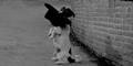
MR. KLEIN - Losey is FINALLY welcomed into the collection with a fantastic cover. It's moody and paranoid, yet vibrant and expressive; it can really only be described as Kafkaesque. Love it.
THE FUNERAL - I'm thrilled to finally have more Itami in the collection, and I think, for the most part cover works. It's certainly an improvement over the Tampopo cover, which i felt was lacking; the only thing I can't stand is the text. It heavily clashes with the rest of the cover (especially the title), and feels like it was placed as an afterthought. I get that some contrast was needed to make the text readable, I just think it went too far in the wrong direction.
MISSISSIPPI MASALA - This simple, colorful collage would get an "A+" in any graphic design class. The individual elements are placed thoughtfully, the color palette is appealing, and the text is readable. Not the most creative cover, but it's undeniably pleasing to the eye.
CHANG IS MISSING - And in stark contrast to the MISSISSIPPI MASALA cover, this one features a collage that doesn't work as well. I like the main concept of the cover, as well as the tone it illicits, but I find that it's usage of more square elements in it's collage (ie- the polaroid, the newspaper, etc) makes the overall image fall a little flat. In that same class where the MISSISSIPI MASALA cover got an "A+," this one would get a "B."
DOUBLE INDEMNITY - This is a pure film noir cover if I ever saw one. The cigarette smoke, the window blinds, and the bold 40's style text all come together to make something that would be perfect as the front cover of a pulp magazine. A near perfect cover, in my opinion.
Overall a pretty good month for covers.
-
TraverseTown

- Joined: Tue Nov 18, 2014 8:38 am
Re: Criterion & Eclipse Cover Art & Packaging Babble-on Vol. 7
I feel like they were trying to make THE FUNERAL cover work alongside the existing TAMPOPO cover, but I think the former film is much darker and a lot less lighthearted than the latter, so I'm not sure the new cover really captures the vibe. One of the funniest moments in THE FUNERAL is when they are in a crematory discussing the exploding carcass of a dead baby, or when a man has a sexual liaison with his mistress while his wife is actively grieving her recently deceased father. Its a funny film, but not very lighthearted. But I'm not an artist or graphic designer, so I won't judge too harshly.
Last edited by TraverseTown on Tue Feb 15, 2022 6:25 pm, edited 1 time in total.
-
therewillbeblus

- Joined: Tue Dec 22, 2015 7:40 pm
Re: Criterion & Eclipse Cover Art & Packaging Babble-on Vol. 7
I’m getting Cat City vibes so not surprising!
-
Walter Kurtz

- Joined: Sat Jul 25, 2020 7:03 pm
Re: Criterion & Eclipse Cover Art & Packaging Babble-on Vol. 7
Newsflash: Criterion artist finally reveals the other Robert Klein!
-
tolbs1010
- Joined: Wed Oct 21, 2020 11:01 pm
Re: Criterion & Eclipse Cover Art & Packaging Babble-on Vol. 7
Mr. Klein is an ok piece of art, but I'm not sure about it fitting the movie.
[/quote]
It doesn't. I'm not sure I like it even as a piece of art. But the Studio Canal cover is worse.
-
Walter Kurtz
- Joined: Sat Jul 25, 2020 7:03 pm
Re: Criterion & Eclipse Cover Art & Packaging Babble-on Vol. 7
The Klein cover fits the movie perfectly because the artist is capturing Delon's interior mental landscape and the Klein he is perhaps envisioning.
-
Walter Kurtz
- Joined: Sat Jul 25, 2020 7:03 pm
Re: Criterion & Eclipse Cover Art & Packaging Babble-on Vol. 7
PS: Delon's Klein is wearing a hat and is just below Losey's name.
-
tolbs1010
- Joined: Wed Oct 21, 2020 11:01 pm
Re: Criterion & Eclipse Cover Art & Packaging Babble-on Vol. 7
I get that, but the style of the drawing doesn't really capture/suggest the austere tone and look of the film. And I guess I wanted to see Delon in the hat he wears in all of the outdoor scenes--though I guess that is represented in the shadowy Klein figure behind his head. Some reference to the historical context and/or artwork/paintings would have been good too.
Nitpicking. Really happy to see this release. Hopefully more Losey forthcoming...
Nitpicking. Really happy to see this release. Hopefully more Losey forthcoming...
-
knives

- Joined: Sat Sep 06, 2008 10:49 pm
Re: Criterion & Eclipse Cover Art & Packaging Babble-on Vol. 7
I was thinking more in line with Schulz which admittedly is cutting hairs.JayAlmighty wrote: Tue Feb 15, 2022 5:23 pm My thoughts on the covers:
MR. KLEIN - Losey is FINALLY welcomed into the collection with a fantastic cover. It's moody and paranoid, yet vibrant and expressive; it can really only be described as Kafkaesque. Love it.
-
FrauBlucher

- Joined: Tue Jul 16, 2013 12:28 am
- Location: Greenwich Village
Re: Criterion & Eclipse Cover Art & Packaging Babble-on Vol. 7
The Mr. Klein cover art strikes me as it could be a possible digipak. Kind of like the Amarcord release
-
dwk

- Joined: Sat Jun 12, 2010 10:10 pm
-
cdnchris

- Site Admin
- Joined: Tue Nov 02, 2004 6:45 pm
- Location: Washington
- Contact:
-
yoloswegmaster

- Joined: Tue Nov 01, 2016 7:57 pm
Re: Criterion & Eclipse Cover Art & Packaging Babble-on Vol. 7
Posted by a Reddit user, 'The Last Waltz' comes in a standard Scanovo case:

-
cdnchris
- Site Admin
- Joined: Tue Nov 02, 2004 6:45 pm
- Location: Washington
- Contact:
-
dwk
- Joined: Sat Jun 12, 2010 10:10 pm
-
therewillbeblus
- Joined: Tue Dec 22, 2015 7:40 pm
Re: Criterion & Eclipse Cover Art & Packaging Babble-on Vol. 7
That’s a pretty silly Easter egg, I like the design of the men on the wings- it looks like they could be constructing the plane or hanging by it in mid-air depending on the step you are in making the thing!
-
swo17

- Bloodthirsty Butcher
- Joined: Tue Apr 15, 2008 2:25 pm
- Location: SLC, UT
Re: Criterion & Eclipse Cover Art & Packaging Babble-on Vol. 7
It being a toy plane is thematically fitting too!
-
FrauBlucher
- Joined: Tue Jul 16, 2013 12:28 am
- Location: Greenwich Village
Re: Criterion & Eclipse Cover Art & Packaging Babble-on Vol. 7
There's a certain Monty Python feel to it
-
ryannichols7
- Joined: Mon Jul 16, 2012 6:26 pm
Re: Criterion & Eclipse Cover Art & Packaging Babble-on Vol. 7
two years in a row a Fox license has a cool easter egg like that - Nightmare Alley being the other. I definitely like them doing this sort of thing, adds much needed flair to the usual fold out insert and disc in plastic case feel we get...
-
domino harvey
- Dot Com Dom
- Joined: Wed Jan 11, 2006 6:42 pm
Re: Criterion & Eclipse Cover Art & Packaging Babble-on Vol. 7
Worst Person is easy fave cover of the year so far, but good month all around