Page 12 of 147
Posted: Wed May 21, 2008 4:30 am
by kaujot
I'm sort of surprised and not surprised that Patriotism is a small digipak a la Sansho the Bailiff. All that text.
Posted: Wed May 21, 2008 10:18 am
by TheGodfather
Both look excellent! =D>
Posted: Wed May 21, 2008 4:29 pm
by Cinephrenic
This cover has grown on me, but I'm still trying to digest Salo.
Posted: Wed May 21, 2008 5:34 pm
by miless
Cinephrenic wrote:This cover has grown on me, but I'm still trying to digest Salo.
don't worry, it's only chocolate and marmalade.
Posted: Thu May 22, 2008 5:25 pm
by lacritfan
Agree with everyone about Twenty-Four Eyes, the cover art director seems to be under the impression early David Lean directed it. Those four laurel thingies around A Film by...Kinoshita'? Yeah, totally appropriate for pre-post WWII Japan. Also, I bet originally it was clearly "Eyes" but then they decided, hey wait, if we blow up the lower part of the E we can surround the teacher and kids, that would be cool.
souvenir wrote:Some Mishima innards courtesy of Barnes & Noble (places the cover art in a better light)
Well, I guess it makes a little more sense when you see what the overlapping elements are (oh, those pink parts are squatting naked Mishima's.). Also either they made some changes or the cover image from Criterion's page is just really bad. This isn't as blindingly fluorescent, the background is now light green instead of beige and now you can tell the blue at the bottom is supposed to be the ocean.
I still say the colors are all wrong. It's like the inspiration was the Powerpuff Girls.
Posted: Thu May 22, 2008 6:32 pm
by Jean-Luc Garbo
lacritfan wrote:It's like the inspiration was the Powerpuff Girls.
I wish I'd said that to them when I e-mailed about the Mishima cover art. I still wish they'd change
High and Low.
Posted: Thu May 22, 2008 7:33 pm
by mfunk9786
Jean-Luc Garbo wrote:I wish I'd said that to them when I e-mailed about the Mishima cover art. I still wish they'd change High and Low.
Not to be ultra-judgmental, but you just e-mail them every month cover art is revealed to give them your two cents? Really?
Posted: Thu May 22, 2008 8:13 pm
by jmj713
HerrSchreck wrote:Your point being?
Sorry, I should've elaborated. It's just that's what I instantly thought of what I saw this new cover. They both have these swirls and a really nice looking sky taking a large portion of the real estate. I Vitelloni less so (no swirls), but same color spectrum.
Posted: Thu May 22, 2008 9:20 pm
by klee13
This is going to sound really superficial, but the foil totally makes the Mishima cover for me. I almost like the complete packaging more then Patriotism's.
What can I say? I like shiny stuff.
Posted: Sat May 24, 2008 8:29 am
by Tootletron
Patriotism and Mishima look awesome. More Criterions need that kind of packaging - it looks better on the shelf, too. Nice squared box.
Posted: Sun May 25, 2008 12:39 am
by Jean-Luc Garbo
mfunk9786 wrote:Jean-Luc Garbo wrote:I wish I'd said that to them when I e-mailed about the Mishima cover art. I still wish they'd change High and Low.
Not to be ultra-judgmental, but you just e-mail them every month cover art is revealed to give them your two cents? Really?
Actually, no. It's the first time I e-mailed them in two years. The
Mishima art really bothered me.
Posted: Wed May 28, 2008 11:10 pm
by Cinephrenic


Striking resemblance? Lazy covers, I think.
Posted: Thu May 29, 2008 7:22 pm
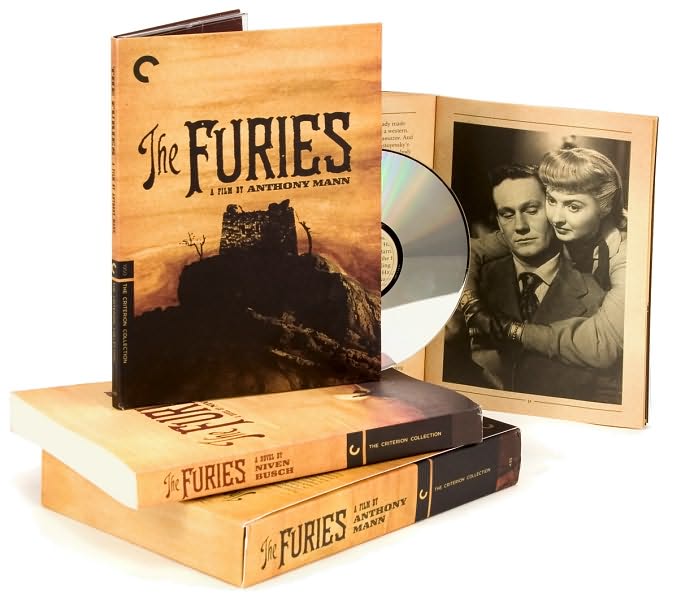
by souvenir
The Furies packaging courtesy of Barnes & Noble:
Posted: Thu May 29, 2008 8:01 pm
by sidehacker
Looks gorgeous.
Posted: Thu May 29, 2008 8:36 pm
by Jean-Luc Garbo
This is only making me want to buy it even more.
Posted: Thu May 29, 2008 8:42 pm
by jbeall
I know nothing about Anthony Mann, and while the inclusion of the novel made this a likely buy, that package made it a must-buy. Gorgeous.
Posted: Thu May 29, 2008 10:43 pm
by HerrSchreck
jbeall wrote:I know nothing about Anthony Mann, and while the inclusion of the novel made this a likely buy, that package made it a must-buy. Gorgeous.
You should get your ass out there and acquire
T-Men and
Raw Deal pronto. (and He Walked By Night). Absolute peaks and paradigm-layer-downers of what became known as films noir. My favorite Mann is his work with John Alton at Eagle Lion. But--
Then
Side Street.
The Black Book (the
Furies fits in right about here).
Winchester 73. El Cid. Fall of the Roman Empire.
The man practically invented "lemonade from lemons". And one of the most masculine, and urban-American, of all filmmakers. What John Ford was to the gruff grabassing West under the hot sun, Mann was to the shadows and alleys of LA & NYC. But whereas Ford could never really achieve a major voice of his own in Urbana, Mann absolutely could slide right over into the western, or ancient Rome, or Revolutionary France, and bust his shit out just as powerfully. The man
was snare-tight cinema.
Posted: Thu May 29, 2008 11:12 pm
by sidehacker
The only Mann feature I've seen is The Tin Star but it was really great and this is coming from someone who generally doesn't like "classic" Hollywood.
Posted: Fri May 30, 2008 12:13 am
by jbeall
HerrSchreck wrote:You should get your ass out there and acquire T-Men and Raw Deal pronto. (and He Walked By Night). Absolute peaks and paradigm-layer-downers of what became known as films noir. My favorite Mann is his work with John Alton at Eagle Lion. But--
Then Side Street. The Black Book (the Furies fits in right about here). Winchester 73. El Cid. Fall of the Roman Empire.
Well, I won't be buying them--I have relatively little kevyip, and prefer to keep it that way--but my Netflix queue is spiraling out of control, esp. with films noir on the basis of your recommendations!! I'll start with
The Furies and <sigh> add the rest to my netflix queue.
Posted: Fri May 30, 2008 1:28 am
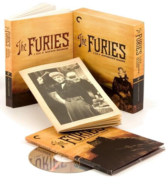
by fdm
More cardboard

And yet another book I will probably never have time to read #-o
(Furies) Looks purty though...
(Thumbs down on Patriotism, could have easily been snap-cased...)
(Mishima, guess I'll defer my judgment until after I get an undamaged copy... or maybe just wait for the blu-ray.)
Posted: Fri May 30, 2008 1:29 am
by domino harvey
banned
Posted: Fri May 30, 2008 1:40 am
by miless
I don't think I've ever heard someone argue that anything should be packaged in a snapper case.
Posted: Fri May 30, 2008 1:44 am
by fdm
miless wrote:I don't think I've ever heard someone argue that anything should be packaged in a snapper case.
Actually meant keep-case, but now that you mention it, is there really all that much difference between a snap case and a digipak?
Posted: Fri May 30, 2008 1:45 am
by miless
other than an outer box and a thick book, yes.
Trafic
Posted: Fri May 30, 2008 9:47 am
by Keith Kawaii
This may be the best Criterion cover art...