Page 120 of 164
Re: Criterion & Eclipse Cover Art & Packaging Babble-on Vol. 7
Posted: Tue Oct 18, 2022 12:44 am
by Computer Raheem
MONTHLY COVER THOUGHTS: January 2023
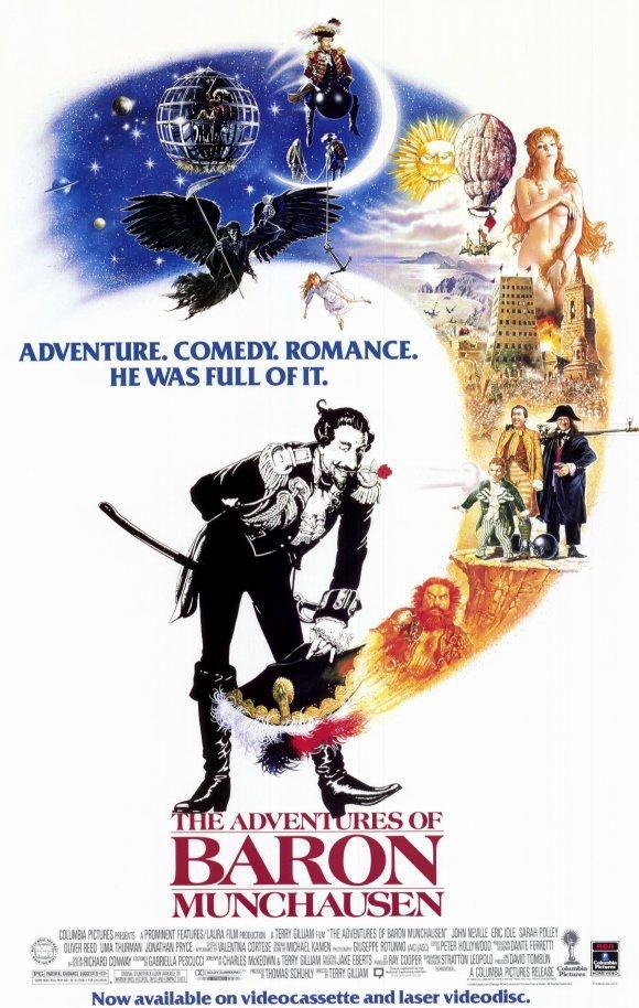
- The Adventures of Baron Munchausen: Easily the most well-done cover of the bunch. Gilliam's releases generally stick to the original posters (with the distinct exception of The Fisher King #-o), but this is an instance where I don''t mind new art. Obviously, the new cover doesn't compare to the original poster (or the beautiful alternate poster), but it's befitting of the film's tone and has a nice whimsy to it. It reminds me of the artwork of the Karel Zeman boxset (fitting, not only because of the obvious connection between the two releases, but also because of Zeman's influence of Gilliam). The depth of Munchausen against the background has me thinking that this may be a digipak release. Fingers crossed [-o<
- Imitation of Life : It's boring. Criterion's inability to create good artwork for old Hollywood is nonsensical to me. I understand that the original poster does not feature any of the Black characters (and I do think that is a problem), but this is the solution? It looks cheap and thrown-together. At least it's not a cartoon, I guess?
- Lars von Trier's Europe Trilogy: The overall cover is mediocre. I understand the impulse to unify these three films in a visual sense, but given just how disparate their visual styles are, the end product looks generic. It also oddly favors The Element Of Crime's visual scheme as well, which is an interesting choice given how the film is intentionally designed to look unappealing. The individual covers are nice though
- This Is Not a Burial, It's a Resurrection: This is the best cover of the batch. I'm not sure if this is a still from the film or an edited photo, but it is visually perfect. It's simple, elegant, and it makes me want to watch the film more than I was already planning on doing, which is what any good cover should do
- Bergman Island: I like the idea of the cover, but it's not entirely well-executed. Unless you're a celluloid freak, I don't think most people would not recognize what it's supposed to be. A poorly-executed version of a pretty cool idea
While not the perfect slate of covers I was hoping for, the good definitely outweighs the mediocre. Here's hoping this is a sign of good covers to come
Re: Criterion & Eclipse Cover Art & Packaging Babble-on Vol. 7
Posted: Wed Nov 02, 2022 9:00 pm
by cdnchris
I'll get pictures up later but I just thought I'd note beforehand that all of November's digipaks (Wall-E, Malcolm X and Infernal Affairs Trilogy) are all very sturdy. Of course, probably won't completely stop dings during shipping, but the construction for them feels better than usual.
Re: Criterion & Eclipse Cover Art & Packaging Babble-on Vol. 7
Posted: Wed Nov 02, 2022 9:34 pm
by ryannichols7
looking forward to this, very reassuring news. one step at a time obviously, but a return to booklets next would be most welcome...
Re: Criterion & Eclipse Cover Art & Packaging Babble-on Vol. 7
Posted: Wed Nov 02, 2022 10:09 pm
by cdnchris
In the Mood for Love [4K]
Daisies
The Power of the Dog [4K]
Infernal Affairs Trilogy
Malcolm X [4K]
WALL-E [4K]
All of the Digipaks come with booklets. The others are inserts.
Re: Criterion & Eclipse Cover Art & Packaging Babble-on Vol. 7
Posted: Tue Nov 15, 2022 6:34 pm
by knives
Re: Criterion & Eclipse Cover Art & Packaging Babble-on Vol. 7
Posted: Tue Nov 15, 2022 7:10 pm
by zedz
Romeo & Juliet is quick and boring, like something from Criterion's very early years.
The composition of Hollywood Shuffle is wonky, like it's trying to attain balance by counterpointing different unbalanced elements (the title, the people crammed on the left) but falling short. Maybe the CC sidebar is the last nail in the coffin?
The Duras is the best here by default, but the thick white border just makes the Criterion logo look cramped. Still: Duras!
Re: Criterion & Eclipse Cover Art & Packaging Babble-on Vol. 7
Posted: Tue Nov 15, 2022 10:33 pm
by Feego
zedz wrote: Tue Nov 15, 2022 7:10 pm
Romeo & Juliet is quick and boring, like something from Criterion's very early years.
Yeah, the solid color filter is very similar to their
Great Expectations cover. If they were going to use the original poster photo, why not just use the original coloring?
Re: Criterion & Eclipse Cover Art & Packaging Babble-on Vol. 7
Posted: Tue Nov 15, 2022 10:42 pm
by domino harvey
Because editions of Romeo and Juliet have historically been associated with red? I think it looks fine
Re: Criterion & Eclipse Cover Art & Packaging Babble-on Vol. 7
Posted: Wed Nov 16, 2022 4:55 pm
by Computer Raheem
MONTHLY COVER THOUGHTS: February 2023
- Three Colors: I've always been a bit ambivalent towards this cover, and my thoughts haven't changed. It does unify the films visually, but I feel that outside of the context of which the image is taken from, it doesn't visually sell the trilogy as a whole. I guess Criterion presumed these film's reputations preceded them, but Dekalog's art does a similar concept much better in my opinion
- Romeo and Juliet: It's simple, but I like it. It's pleasing to the eye. Then again (as revealed to me via scrolling through Instagram), this is based off the film's original Polish poster, and I am extremely partial to Polish film posters, so that may explain why I like it as much as I do :-"
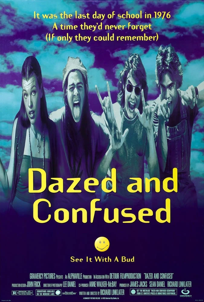
- Dazed and Confused: I've always liked this cover, and it fits the film better than Universal's poor attempts to market it as a low-brow stoner comedy. Not much to say outside of that; it's the same art as previous
- Two Films By Marguerite Duras: I hate this cover. It's, in my opinion, half-assed. Little to no identity given to films that, from what I have been able to gather, are deeply complex and intricate works. Wouldn't be able to guess that with this artwork. Plus, the white border is too big. Just a miserable cover overall
- Hollywood Shuffle: I like the idea of the cover, but it feels... off. It might just be how clean it is; something a little less mannered would've fitted better, especially for this film. I do like the references to the film throughout the cover, though
A pretty poor month - the best cover is almost 20 years old. 2023 is not off to the best start.
Re: Criterion & Eclipse Cover Art & Packaging Babble-on Vol. 7
Posted: Wed Nov 16, 2022 5:07 pm
by ryannichols7
Computer Raheem wrote: Wed Nov 16, 2022 4:55 pmThen again (as revealed to me via scrolling through Instagram), this is based off
the film's original Polish poster, and I am extremely partial to Polish film posters, so that may explain why I like it as much as I do :-" [/list]
I gotta hand it to them for that, as I also love Polish film posters, but for me they couldn't have picked a worse entry to start with!
am I the only one who really likes the
Three Colors cover and the rest of the packaging? I love all the covers and don't think its super necessary to have the typical pictures of the actresses that have been used to promote the films for ages (especially for
White as it sells the movie in the worst way imaginable). not to mention the interior art and booklet are nice - I even kept my DVD copy after I upgraded just because I like the bonus "Kieslowski" disc they did for the DVD set for all the KK-specific extras. this is one I can't wait to buy the upgrade for, it'll be my third time and the two sets I have already feature plenty of wear on them...
Re: Criterion & Eclipse Cover Art & Packaging Babble-on Vol. 7
Posted: Thu Nov 17, 2022 1:25 am
by skilar
In case this information is helpful to anyone, I recently placed a very belated request for All About Eve's updated packaging, as well for a replacement Citizen Kane disc, and received both without charge. They even included the $10 coupon for Kane. Really wonderful customer service.
Re: Criterion & Eclipse Cover Art & Packaging Babble-on Vol. 7
Posted: Fri Nov 25, 2022 5:29 pm
by therewillbeblus
My copy of Wall-E arrived early today, but they must've packaged it in a hurry because the inside digi sleeve was upside down
Re: Criterion & Eclipse Cover Art & Packaging Babble-on Vol. 7
Posted: Tue Nov 29, 2022 6:38 pm
by flyonthewall2983
That happened with my copy of Lost Highway
Re: Criterion & Eclipse Cover Art & Packaging Babble-on Vol. 7
Posted: Wed Nov 30, 2022 7:15 am
by tenia
I had the sleeve upside down in my Nightmare Alley copy last week.
Re: Criterion & Eclipse Cover Art & Packaging Babble-on Vol. 7
Posted: Tue Dec 13, 2022 5:17 am
by cdnchris
Re: Criterion & Eclipse Cover Art & Packaging Babble-on Vol. 7
Posted: Tue Dec 13, 2022 5:36 am
by ryannichols7
I guess we can estimate that the $79.95 "boxsets" will be in a plastic case and the $99.95 ones will be digipacks? disappointing that we didn't see more of the Infernal Affairs-style digis for this month's two trilogies. at least they have booklets.
shame The Velvet Underground didn't do anything further with its cover concept
Re: Criterion & Eclipse Cover Art & Packaging Babble-on Vol. 7
Posted: Tue Dec 13, 2022 9:21 pm
by mfunk9786
Not great! When I received the Haneke in the mail (prior to these photos being up), I was looking forward to seeing the individual art for each film. Corner cutting when other labels are doing exclusive slipcovers, boxes, etc makes Criterion seem even more behind.
Re: Criterion & Eclipse Cover Art & Packaging Babble-on Vol. 7
Posted: Tue Dec 13, 2022 9:52 pm
by therewillbeblus
mfunk9786 wrote: Tue Dec 13, 2022 9:21 pm
Not great! When I received the Haneke in the mail (prior to these photos being up), I was looking forward to seeing the individual art for each film. Corner cutting when other labels are doing exclusive slipcovers, boxes, etc makes Criterion seem even more behind.
While perhaps disappointing, I don't think this should be surprising, as we predicted this would be the case when these two sets were announced at a lower price point than
Infernal Affairs and all the other $100 MSRP box sets. Criterion has been marking down prices for larger 'sets' packaged in scanavo cases for a while (i.e.
Marlon Riggs; Eight Hours Don't Make a Day; The Human Condition trilogy repackaging for the upgrade) so it's a (to me, inexplicably-decided) trade-off between what comes in which form and twenty bucks, or ten during a sale. These releases are following an internal logic though, so rest assured the upcoming
Lars von Trier’s Europe Trilogy will come with individual art and all the goodies one gets from a normal box set. If it doesn't I'll write Mulvaney myself and sign my name with a pitchfork emoji
Re: Criterion & Eclipse Cover Art & Packaging Babble-on Vol. 7
Posted: Tue Dec 13, 2022 10:24 pm
by CSM126
Probably worth noting that the Marlon Riggs set is actually a digipak.
Re: Criterion & Eclipse Cover Art & Packaging Babble-on Vol. 7
Posted: Wed Dec 14, 2022 12:13 am
by therewillbeblus
CSM126 wrote: Tue Dec 13, 2022 10:24 pm
Probably worth noting that the Marlon Riggs set is actually a digipak.
Yeah, and I even own it and went through it a year ago, so that was my goof
Re: Criterion & Eclipse Cover Art & Packaging Babble-on Vol. 7
Posted: Wed Dec 14, 2022 2:30 am
by Ribs
Uh, I shared the 3D packshots for these releases right here when they were announced - not sure why anybody is surprised!
Re: Criterion & Eclipse Cover Art & Packaging Babble-on Vol. 7
Posted: Wed Dec 14, 2022 3:44 am
by swo17
I do like this 3-disc plastic case better than the 3-disc digipak that the early dual formats (and Marlon Riggs) had, but less than a box with slim digis for each title
Re: Criterion & Eclipse Cover Art & Packaging Babble-on Vol. 7
Posted: Wed Dec 14, 2022 4:38 am
by therewillbeblus
Same, but I’m also happy to save the shelf space these days, and you rarely see a label produce the same level of multi-film sets at a decreased price compared to the normal set price from 5-10 years ago, which is a cool move on their part. I doubt sales would change much if they charged the normal MSRP for scanavo cases, what with shrinkflation being the norm and all
Re: Criterion & Eclipse Cover Art & Packaging Babble-on Vol. 7
Posted: Wed Dec 14, 2022 6:28 am
by Matt
I keep trying to tell you all how expensive paper and printing costs have become (and how backlogged printers are), so I’m smugly unsurprised that digipaks are becoming even more rare and premium-priced.
I am surprised that Criterion isn’t cramming more films onto a disc, but maybe disc authoring and pressing costs aren’t as rising as quickly.
Re: Criterion & Eclipse Cover Art & Packaging Babble-on Vol. 7
Posted: Wed Dec 14, 2022 7:14 am
by tenia
From what I've heard in France, paper and printing are only mentioned when talking about rising costs on the physical market. The increase in costs was +40% between march 22 and october 22. It looks like authoring/encoding either hasn't increased by that much or is such a smaller part of the costs that the increase is trumped by the issue with paper.
Indeed, I'm not surprised either to see plastic cases instead of digipacks.
Imagine the issues for a collection like Carlotta's UCE, which is fully structured around 180 pages books and cardboard all over.


