Criterion Cover Art & Packaging Babble-on Vol.2

News on Criterion and Janus Films
Locked
Message
Author
User avatar
backstreetsbackalright
Joined: Fri Dec 17, 2004 10:49 pm
Location: 313

#451 Post by backstreetsbackalright »

oldsheperd wrote:Screw it, I'm just going to pop in some Throbbing Gristle!
You really can't go wrong there!
User avatar
Jem
Joined: Mon May 02, 2005 3:03 am
Location: Potts Point

#452 Post by Jem »

I like the Young Mr. Lincoln cover a lot, but not the 'directed by' text. I think moving said text to the bottom of the cover would help it out a lot and would in turn make it easier to read.
Remember you are looking at a screen version of the cover and everyones screens are calibrated differently, some are darker some are lighter.
My guess is the type will be legible enough at full size and in print.

Anyway, could there be any confusion that John Ford is not the director, it's not like it's John Ford the tall skinny actor!

Eitherway, I love the cover, the font is perfect.
User avatar
Theodore R. Stockton
Joined: Tue Nov 02, 2004 8:55 pm
Location: Where Streams Of Whiskey Are Flowing

#453 Post by Theodore R. Stockton »

My Problem with the "Directed by John Ford" being so prominent is that it looks like it is a double feature including the documentary. But maybe they're just over excited, it been what 21 years and this is their first Ford.
analoguezombie

#454 Post by analoguezombie »

JusteLeblanc wrote:
godardslave wrote:i like the way that guy made that imponderable/inpenetrable/extreme "this cover looks like Nazi imagery" statement, then disappears again.

thats style.
Is analogue's avatar in spite of the nazi imagery?
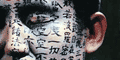
It's actually form the Criterion The Bad Sleep Well cover. Nice way to bring this thread back on topic =D>
jmj713
Joined: Sun Apr 24, 2005 2:47 am

#455 Post by jmj713 »

I didn't disappear, I just rarely visit this forum. As to the reason for why I said the cover reminds me of Nazi imagery, well it's a longshot perhaps, but it's due to the black-red-white motif, plus the choice of font, as well as the architecture of the building...
User avatar
zedz
Joined: Sun Nov 07, 2004 11:24 pm

#456 Post by zedz »

On the previous incarnation of this thread, there were some postings of alternative cover art. For those who are interested in this sort of thing, I just noticed that Deep Discount DVD has a completely different cover for Hearts and Minds here.
User avatar
pzman84
Joined: Mon Dec 20, 2004 8:05 pm

#457 Post by pzman84 »

Any info on the artwork for The Virgin Spring or The Children Are Watching Us?
User avatar
swimminghorses
Joined: Wed Nov 03, 2004 2:34 am
Location: État de siège

#458 Post by swimminghorses »

What is with the packaging on the new Samarai box set. The opening is on the bottom so if you pick it up all the films fall out. You can't read the titles unless you are on the floor picking them up. The cheapest looking set ever from the gang at Criterion.
User avatar
Gigi M.
Joined: Wed Jul 06, 2005 9:09 pm
Location: Santo Domingo, Dominican Rep

#459 Post by Gigi M. »

Actually, all collector's set ala the Kurosawa's Samurai Classics, Great Adaptations, Hicthcock's Wrong Men & Notorious Women, and the Samurai Trilogy are exactly as you described. I believe that that is the form to differentiate Collector's set from others sets.
User avatar
godardslave
Joined: Tue Nov 02, 2004 8:44 pm
Location: Confusing and open ended = high art.

#460 Post by godardslave »

swimminghorses wrote:What is with the packaging on the new Samarai box set. The opening is on the bottom so if you pick it up all the films fall out. You can't read the titles unless you are on the floor picking them up. The cheapest looking set ever from the gang at Criterion.
yes it is somewhat bizarre packaging.

maybe criterion should rename them "the sets that fall out all over the floor when you pick them up" collection.
User avatar
bunuelian
Joined: Wed Nov 03, 2004 3:49 pm
Location: San Diego

#461 Post by bunuelian »

Or the "collectors will put up with anything" box.
User avatar
Cinephrenic
Joined: Tue Nov 02, 2004 6:58 pm
Location: Paris, Texas

#462 Post by Cinephrenic »

...."or where collectors drop and break their dvds only to buy more from Criterion"
User avatar
daniel p
Joined: Wed Nov 03, 2004 1:01 am
Location: Melbourne, Australia

#463 Post by daniel p »

Image
Narshty
Joined: Tue Nov 02, 2004 6:27 pm
Location: London, UK

#464 Post by Narshty »

Oh Christ. Here it comes.
Cinesimilitude
Joined: Tue Jul 09, 2013 4:43 am

#465 Post by Cinesimilitude »

very blah. I've never seen this, and have no interest to.
User avatar
Nihonophile
Joined: Thu Nov 04, 2004 4:57 am
Location: Florida
Contact:

#466 Post by Nihonophile »

Alright its the end of the month and still no Virgin Spring cover. Its time to get violent, who's with me?
User avatar
Cinephrenic
Joined: Tue Nov 02, 2004 6:58 pm
Location: Paris, Texas

#467 Post by Cinephrenic »

Both missing covers are most likely going to be still shots so why is it taking so long to design a neorealist and classic Bergman cover??
User avatar
Andre Jurieu
Joined: Tue Nov 02, 2004 7:38 pm
Location: Back in Milan (Ind.)

#468 Post by Andre Jurieu »

cinephrenic wrote:Both missing covers are most likely going to be still shots so why is it taking so long to design a neorealist and classic Bergman cover??
Probably because we so often complain about the font.
User avatar
hammock
Joined: Wed Nov 03, 2004 5:52 pm
Location: www.criteriondungeon.com
Contact:

#469 Post by hammock »

Another ugly cover - jeeezzz! Imagine this one in postersize over your bed...
User avatar
Cinephrenic
Joined: Tue Nov 02, 2004 6:58 pm
Location: Paris, Texas

#470 Post by Cinephrenic »

That one is actually a poster art.
User avatar
godardslave
Joined: Tue Nov 02, 2004 8:44 pm
Location: Confusing and open ended = high art.

#471 Post by godardslave »

i like the metropolitan cover a lot.

shouldn't metropolitan have an official thread now?
User avatar
tavernier
Joined: Sat Apr 02, 2005 11:18 pm

#472 Post by tavernier »

The Ugetsu set has the 2 discs and the accompanying booklet in a box similar to - but slimmer than - the Antoine Doinel set and the Fanny and Alexander set, for those who care.
User avatar
souvenir
Joined: Wed Nov 03, 2004 4:20 pm

#473 Post by souvenir »

cinephrenic wrote:Both missing covers are most likely going to be still shots so why is it taking so long to design a neorealist and classic Bergman cover??
DVD Empire has very blurry cover art up for both. I like the one for The Children Are Watching Us because the child is literally watching the man.
User avatar
godardslave
Joined: Tue Nov 02, 2004 8:44 pm
Location: Confusing and open ended = high art.

#474 Post by godardslave »

i feel compelled to say that the virgin spring cover looks fucking awesome.

even when that blurry.

thankyou.
User avatar
Jem
Joined: Mon May 02, 2005 3:03 am
Location: Potts Point

#475 Post by Jem »

Another ugly cover
What the??
If you think Criterion covers are ugly, i'd love to see what you think a good cover is.

For that comment, your punishment should be a trip down to your local Blockbuster to rent out the Sandra Bullock box set.
Locked