What has realism to do with it? The "greenish haze," as you call it, is present in the Shochiku release.mfunk9786 wrote:It looks a lot more realistic, they managed to remove that greenish haze over the whole film. This looks like an excellent transfer.
446 An Autumn Afternoon
-
Jack Phillips
- Joined: Mon Jun 25, 2007 6:33 am
-
Tommaso

- Joined: Fri May 19, 2006 2:09 pm
Just because it is in the Shochiku release it need not be authoritative. The debate about how Japanese films of that vintage should look has been going on here for awhile, and while I'm the first to get enraged about CC's usual contrast boosting, especially with their Japanese b&w films ("Early Summer" and "Drunken Angel" come to my mind immediately), I wasn't unhappy with the colours of the films in the Late Ozu set (whereas the old CC "Good Morning" is obviously completely off). But I'm not saying these colours are right, only that they just seem more 'natural' indeed and very pleasing to me, even including the more than obvious contrast boost in the first cap. But that is a matter of taste, and for those that don't like the CC look, there are plenty of alternatives around. Neither the Panorama nor the Tartan look too bad to me (judging from caps only, I don't have the film yet).Jack Phillips wrote:What has realism to do with it? The "greenish haze," as you call it, is present in the Shochiku release.
-
HerrSchreck

- Joined: Sun Sep 04, 2005 3:46 pm
-
Michael Kerpan

- Spelling Bee Champeen
- Joined: Wed Nov 03, 2004 5:20 pm
- Location: New England
- Contact:
I guess the question is (if one can determine the answer) -- what did the films actually look like on first release?HerrSchreck wrote:Interesting that CC gets slammed for going "blue" (i e non vintage look) on these Ozu's, but gets the hammer for it elsewhere (i e w the Trafic release which preserved the vintage greenish tint of old "off" color).
I would assume that there are plenty of people still alive who actually saw the Japanese prints of the late Ozu films when they were first shown. But can any of these people recall whether the films had the color balance of the Shochiku versions? (I would suspect some old Shochiku employees might recall).
-
ellipsis7

- Joined: Tue Nov 02, 2004 5:56 pm
- Location: Dublin
-
Michael Kerpan
- Spelling Bee Champeen
- Joined: Wed Nov 03, 2004 5:20 pm
- Location: New England
- Contact:
Bordwell's contribution will be the main reason for my purchase as well.ellipsis7 wrote:For me - having the slightly greener Tartan from Ozu Box #4 already - I'm double dipping on this for the CC transfer treatment less so, more majorly for the Bordwell commentary. Hopefully this will reflect his previous wonderfully intelligent & insightful writings on YO...
I've posted some screen captures from the Shochiku DVD in the Screen Captures thread. Except for the stuttering (in the source) towards the beginning, this is a lovely transfer.
-
manicsounds

- Joined: Wed Nov 03, 2004 2:58 am
- Location: Tokyo, Japan
-
HerrSchreck
- Joined: Sun Sep 04, 2005 3:46 pm
Agreed, of course, but with this caveat--Michael Kerpan wrote:I guess the question is (if one can determine the answer) -- what did the films actually look like on first release?HerrSchreck wrote:Interesting that CC gets slammed for going "blue" (i e non vintage look) on these Ozu's, but gets the hammer for it elsewhere (i e w the Trafic release which preserved the vintage greenish tint of old "off" color).
Vintage film stock is vintage film stock, and it doesn't exist any longer. What directors like Ozu and others had to work with, of course, is not available to us today when new prints are struck from negs-- the new stocks emulsions respond differently to the registration on old negs. So it's simply not possible, when you hear (especially for an old color film) "NEW 35mm PRINT!" being advertised, to expect the lab to contend with the same visual/chemical potentials that the vintage director did, and come off with the same result.
I wonder whether or not some disc producers say "rather than treat the look of a vintage print as the last word on what the director wanted this film to look like, let's take into consideration the fact that the director didn't have the resources available to him that we do today.. and let's assume that if he did have these resources available to him that he would have foound the look of those vintage prints completely unacceptable-- so let's do him a solid and bring his vision up to date," yadda yadda. We see directors do this all the time in these "Director Approved" editions, where they second guess themselves and tinker with their films.
Which, in the case of a disc-producers case, is complete poop and arrogance. I'd actually love to know what CC's mission statement is on this-- does the co have an overarching policy on this or is it up to (in the case where the director & dp are dead) the disc producer, who directs the telecine supervisor & color timing & correction staff?
Some disc producers seem to want to make these films look "as good as possible" in terms of "make it look like it was released today with cutting edge film stock", rather than "duplicate the look of the film upon release"... whereby you get consumers from todays generation who've never seen what color films used to look like recoil in horror at "the unnatural color". As I said, CC seems to go both routes (i e preserve the vintage look as in Trafic, as well as tweak up to modern caliber i e this Ozu release) and gets conked over the head no matter what.
A perfect example of the variance between the "preserved vintage look" vs "best case modern look" missions seems to be well illustrated by the brand new gamut of Classic Media releases of 50's - early 70's Toho kaiju films when compared with the Sony TriStar 50th Anniversary Godzilla releases... clearly these Classic Media Toho discs are transfers from vintage positives, or carefully duplicated like-for-like copies of vintage prints, which reproduces that greenish, off, muted color very prevalent in prints from this era/region. Compare these with the Sony-Tristar releases of the same Toho catalog from the same director & period: they clearly are new prints on modern stock tweaked for true color registration of what's on the neg, making these films look like they were shot yesterday (see Godzilla v Hedorah, v Gigan, etc)... and look nothing like their brethren from Classic Media (which incidentally look JUST like the Panorama / Shochiku Ozu's).
-
Tommaso
- Joined: Fri May 19, 2006 2:09 pm
If I remember correctly (sorry, not an Ozu expert here), one of the reasons why Ozu shied back from colour for a long time was that he was unhappy with the existing stocks at the time. The question is whether when he actually turned to colour he was indeed happy with the stock he had available then, i.e. around 1958, or whether he would have ideally wanted an even more 'natural'-looking colour. All this is pure speculation, and as Schreck says, directors and cinematographers may change their mind when revisiting a film after 40 years or so. Thus the endless debate on Cardiff's colour choice on the CC "Red Shoes", for example. But in this case at least the cinematographer was alive and could realise what he wanted, if only in retrospect, but with Ozu we simply have no clue. Even if people who saw his films in the cinema in the 60s were still available, I highly doubt that their memory would still be 'correct', not least because they too would have been influenced by all the completely different looks of modern films.
The whole situation reminds me a little of what goes on in classical music; people trying to recreate the original sound of a Bach or Mozart piece. I'm very much for those efforts (I simply can't stand to listen to those composers' works on modern instruments), but am aware that the results are not necessarily what the music sounded like in the 18th century. So after all, it's a matter of individual choice, as I said before, and that choice may even vary from film to film: I like the look of this new Ozu but am equally appalled by the much-discussed 'colour correction' on "The Searchers".
But we will just not arrive at precise knowledge about what Ozu wanted these films to look like. So, as Schreck surmises, it's probably indeed due to the individual disc/telecine producer at Criterion what the result will be. There doesn't seem to be a company policy, unlike in the case of contrast boosting, which in my view is far more pertinent and irritating and happens on practically everything they release.
-
Michael Kerpan
- Spelling Bee Champeen
- Joined: Wed Nov 03, 2004 5:20 pm
- Location: New England
- Contact:
My recollection (from reading things) is that Ozu was quite pleased by the way Afgacolor stock performed in the late 50s, which was why he finally agreed to make color films. I suspect he would have retired rather than shoot in color -- if he had not been happy shooting in color. He also stuck with color (using the same type of film -- at 3 different studios), whereas contemporaries (Naruse, for instance) often shifted back and forth (from color to b&w and back).

-
Michael Kerpan
- Spelling Bee Champeen
- Joined: Wed Nov 03, 2004 5:20 pm
- Location: New England
- Contact:
Well, this answers the question of whether the glitches in the first reel have been fixed. answer -- no.kaujot wrote:DVDTalk
;~{
-
Tom Hagen

- Joined: Mon Apr 14, 2008 4:35 pm
- Location: Salt Lake City, Utah
-
domino harvey

- Dot Com Dom
- Joined: Wed Jan 11, 2006 6:42 pm
-
ellipsis7
- Joined: Tue Nov 02, 2004 5:56 pm
- Location: Dublin
I'm looking at this now, and comparing it with the Tartan... To me the Criterion is a lovely restrained transfer, whereas the Tartan seems a little oversaturated and forced, while colourwise the Criterion pallette seems actually truer, with greater degrees of subtlety and delineation (which Bordwell talks of in his commentary - did he advise on the transfer?)...
The effect of the Tartan transfer is to put a green sheen/tint to everything, so objects, screen space and shots blend into each other, and notably the yellow background to the opening main title on the Tartan becomes a sickly green-yellow, whereas it's plain yellow on the Criterion, and juxtaposition of the different colours of each title card here becomes very effective, building to the film itself (rather than merely moving through the various shades of off green of the Tartan)...
But most beautifully the Criterion transfer, while not lacking in an appropriate green element, brings out the sensitive and exact brush strokes of Ozu and his wonderful colour compositions - it's like watching a very fine watercolour (Japanese?) being painted in meticulous, subtle and precise detail... Objects and space are carefully separated and the film moves like a gentle but powerful modern visual symphony...
Also - it will take several listens to absorb it all - Bordwell's commentary is simply superb on my first pass...
-
Perkins Cobb
- Joined: Tue Apr 29, 2008 4:49 pm
-
swo17

- Bloodthirsty Butcher
- Joined: Tue Apr 15, 2008 2:25 pm
- Location: SLC, UT
-
ellipsis7
- Joined: Tue Nov 02, 2004 5:56 pm
- Location: Dublin
-
Jack Phillips
- Joined: Mon Jun 25, 2007 6:33 am
It wasn't exactly product placement. Suntory probably knew if they comped Ozu a generous supply of their product, the empties would show up on screen. You can see that Sapporo had the same idea: otherwise, why is it Ozu's character all just happen to frequent snack pubs and izakayas that never serve Kirin or Asahi?ellipsis7 wrote:Bordwell points out that there may be an early example of product placement, with a favourite Ozu tipple Suntory Whisky stacked high on the shelves above the bar.... The distillers apparently provided the director with generous gifts of the stuff for his personal consumption....
I made a first pass through the CC last night too, but it was difficult to concentrate on all three sources of stimulation at once: the new image; the new subtitle translation; the Bordwell commentary. As far as the image goes, I'm sure the colors are wrong. Many of the characters exhibit the pinkish hue that you tend to see only on inebriated Nihon-jin. Sure, there's a lot of drinking in the film, but are we really intended to believe that the main characters spend every waking minute totally smashed?
I'll have to study the new subtitles again; they're sure different. In places, the translator seems to have made some weird choices (for example, having one of the men refer to his departing friend as a "fool" seems overly harsh), but elsewhere fresh nuances emerge that may be valid. As I say, I'll have to give those another look.
The Bordwell commentary seems, on balance, worthy of our attention. Especially when he addresses issues of composition and montage, Bordwell makes some very astute observations (he had me cracking up on one particular sequence where he pointed out a dancing bottle of soy). I'm not always convinced he's sufficiently sensitive to some of the cultural aspects, though (a feeling I also had in his Ozu book). It's not that he gets things wrong so much as he seems sometimes not to see the forest for the trees. He rightly points out, in an early homecoming scene, that the men treat the heroine badly. Of course they do: because the mother has died, the adult daughter has assumed the role of mistress of the house. She interrogates her father when he comes home and chides him for drinking--just as a Japanese wife would do. For their part, the men (father and son) take the girl for granted--just as they'd do for the mother if she were present. A 1962 Japanese audience would have recognized this for what it was--a picture of domestic bliss. This is what must be sacrificed--and it is indeed a sacrifice--when the get-the-daughter-married-off plot slips into gear. Given that the dissolution of families (for the purpose of making way for new ones) is a staple of late Ozu, and that in this particular film different domestic arrangements are paralleled and contrasted, it seems odd that Bordwell just mentions the bad treatment while neglecting the larger point. Of course, he can't cover everything, and I don't mean to sound churlish; I appreciate the commentary and will give it several more listens.
The commentary and the new subtitles, then, make this release worth owning, but for image I think I prefer either the R4 or the Shochiku (I haven't seen the Tartan). I'm sure this will be a point of contention for many posts to come . . .
-
ellipsis7
- Joined: Tue Nov 02, 2004 5:56 pm
- Location: Dublin
I'm pretty convinced this colour schema is true... As Bordwell notes, Ozu's compositions are deliberate and precise.... In black and white film space and planes of space in a shot are often delineated by light and darkness - shade - which in turn is controlled by lighting, and to a much lesser extent, set design... At its simplest, key lights focussed on figures in the foreground make the characters stand out from a darker (less lit) background... Lighting cannot provide the same control on colour film, and if done in the same way, would look artificial and unrealistic, and anyway is generally ineffective... Planes of space and separation of objects in colour film are mainly achieved through colour design... And while no current film stock would exactly match the Agfa stock originally used by Ozu, it is likely the current Criterion transfer is closest to his intentions, the image as composed by him through the camera viewfinder... For, as I mentioned above, on the greener Tartan transfer the overall green hue has the effect of merging objects and planes into one another - there is not adequate separation (which should be achieved through colour) because everything is kind of greenish.... In the Criterion transfer the crisp and clear colours achieve that separation, and shots appear to have greater depth and layering of space because we're getting the visual cues which Ozu obviously intended....
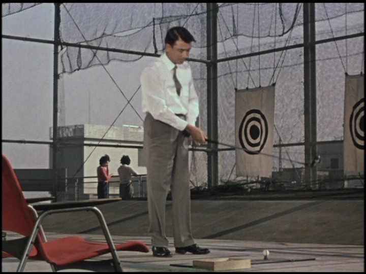
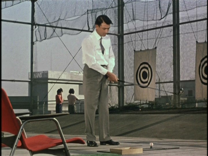
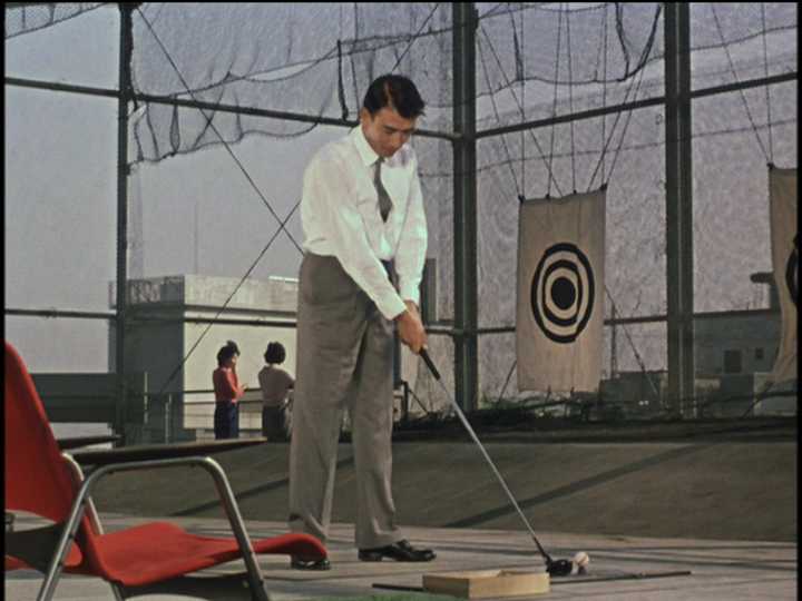
Looking at a simple scene like that at the driving range - the golfer Koichi is dressed monochromatically, so although his size and movement gives us a cue to his relative position, colourwise he does not stand out from his surroundings - however the bright red chair in left of frame signals and anchors foreground space (a colour cue), while line and surface spatial cues show the monochromatic net and targets are background space, crucially helped by a discreet yet very distinct colour and size cue - the delibarately placed woman in the red top (so we gather her and her companion's relative size compared with the chair & Koichi, indicating perspective) - overall effect is the shot achieves depth and dimension... Comparing with the Tartan (or Madman or Panaroma) transfer, this red is dulled and diluted and with a green hue, so you barely notice the chair, and certainly not the woman in the red top - they become virtually superfluous objects (so why would Ozu have placed them there then?) and without the colour cues the shot appears flat and without depth and dimension.... For in all examples a simple size clue - Koichi versus the second woman who is dressed monochramatically - simply does not register effectively on colour film - she is too small and blended into the background to be really noticed... Red chair and monochromatic Koichi in foreground relative to red topped woman and monochromatic woman in background is perfect composition, and everything in frame falls into natural place....
This is the Madman...
This is the Panaroma...
While this is the Criterion...
Note in the Criterion the edge of the green mat in centre foreground registers well too as a distinct and separate object, whereas in the Panorama it just merges in to general greenness of frame...
I projected the Criterion last night on my system (through HD projector on 2.5 metre screen) and it looked simply wonderful, and really modern (a forerunner of Antonioni's RED DESERT even)... I'm reviewing all Ozu's colour films, as I believe he achieved something quite remarkable in his use of colour, and he was developing and enhancing techniques through his final five films....
To show Ozu was acutely aware of visual structure, look at the this shot from TOKYO STORY - the climactic moment, dawn after death on a nondescript bluff overlooking the bay - low key dialogue and little action, but just look at the visual cues - the frame is positively zinging with activity and intensity... The double gaze off frame left is enhanced by the edge lines and surface plane of the terrace and the shadows of the characters, then relating to the lines of the telegraph cables in the sky behind and above the characters... While our focus is brought to head height by the angles of the sculpture behind the pair.... So vectors are radially converging on an artificially created vanishing point off frame right coming from the distance off frame left, passing through Noriko and Shukichi, while in actuality the sun is shining in right towards the two people, casting shadows of the characters to create the line of two lower frame vectors.... The scene unfolds after TOMI has just died...
NORIKO: Keizo has just come, Father
SHUKICHI: Has he?
(Then with deep emotion)
It was such a beautiful dawn.
NORIKO looks down. SHUKICHI quietly turns back.
SHUKICHI: I'm afraid we're going to have another hot day today.

Short but sweet!....
Looking at a simple scene like that at the driving range - the golfer Koichi is dressed monochromatically, so although his size and movement gives us a cue to his relative position, colourwise he does not stand out from his surroundings - however the bright red chair in left of frame signals and anchors foreground space (a colour cue), while line and surface spatial cues show the monochromatic net and targets are background space, crucially helped by a discreet yet very distinct colour and size cue - the delibarately placed woman in the red top (so we gather her and her companion's relative size compared with the chair & Koichi, indicating perspective) - overall effect is the shot achieves depth and dimension... Comparing with the Tartan (or Madman or Panaroma) transfer, this red is dulled and diluted and with a green hue, so you barely notice the chair, and certainly not the woman in the red top - they become virtually superfluous objects (so why would Ozu have placed them there then?) and without the colour cues the shot appears flat and without depth and dimension.... For in all examples a simple size clue - Koichi versus the second woman who is dressed monochramatically - simply does not register effectively on colour film - she is too small and blended into the background to be really noticed... Red chair and monochromatic Koichi in foreground relative to red topped woman and monochromatic woman in background is perfect composition, and everything in frame falls into natural place....
This is the Madman...
This is the Panaroma...
While this is the Criterion...
Note in the Criterion the edge of the green mat in centre foreground registers well too as a distinct and separate object, whereas in the Panorama it just merges in to general greenness of frame...
I projected the Criterion last night on my system (through HD projector on 2.5 metre screen) and it looked simply wonderful, and really modern (a forerunner of Antonioni's RED DESERT even)... I'm reviewing all Ozu's colour films, as I believe he achieved something quite remarkable in his use of colour, and he was developing and enhancing techniques through his final five films....
To show Ozu was acutely aware of visual structure, look at the this shot from TOKYO STORY - the climactic moment, dawn after death on a nondescript bluff overlooking the bay - low key dialogue and little action, but just look at the visual cues - the frame is positively zinging with activity and intensity... The double gaze off frame left is enhanced by the edge lines and surface plane of the terrace and the shadows of the characters, then relating to the lines of the telegraph cables in the sky behind and above the characters... While our focus is brought to head height by the angles of the sculpture behind the pair.... So vectors are radially converging on an artificially created vanishing point off frame right coming from the distance off frame left, passing through Noriko and Shukichi, while in actuality the sun is shining in right towards the two people, casting shadows of the characters to create the line of two lower frame vectors.... The scene unfolds after TOMI has just died...
NORIKO: Keizo has just come, Father
SHUKICHI: Has he?
(Then with deep emotion)
It was such a beautiful dawn.
NORIKO looks down. SHUKICHI quietly turns back.
SHUKICHI: I'm afraid we're going to have another hot day today.
Short but sweet!....
-
Jack Phillips
- Joined: Mon Jun 25, 2007 6:33 am
Your comments are interesting, but from the screen captures you made the Panorama (which I believe is identical to the Shochiku) comes off looking best to me. De gustibus non disputadum, eh?
I applaud your desire to tour all the color Ozus. If you can swing it, you should get hold of the Japanese DVDs of The End of Summer (Toho) and Floating Weeds (Daiei). The colors on each of those are stunning, and I'd be very surprised if you preferred any of the alternative transfers available.
I applaud your desire to tour all the color Ozus. If you can swing it, you should get hold of the Japanese DVDs of The End of Summer (Toho) and Floating Weeds (Daiei). The colors on each of those are stunning, and I'd be very surprised if you preferred any of the alternative transfers available.
-
ellipsis7
- Joined: Tue Nov 02, 2004 5:56 pm
- Location: Dublin
Yes, in the end it's in the eye of the perceiver I suppose, as long as all the colours register sharply and clearly to achieve Ozu's desired effect as described - monochrome should not be mono green, if you get me... To me the Panorama grab shows green on the white shirt and in the blacks and greys...Jack Phillips wrote: De gustibus non disputadum, eh?
Those are DVD Beaver captures- Gary providentially grabbed the scene I wanted to talk about.... So I wasn't able to include the Tartan, which appears closer to the Panorama, but is maybe even slightly greener... Still for me the Criterion has far more apparent depth to the frame, so maybe it's not only the colour but that difference which is surprising people and giving rise to suspicion...
So it looks like I am a wholesale convert to the Criterion transfers, excepting for FLOATING WEEDS which could have done with a little more green...
I have both Tartan and Criterion/Eclipse versions of EQUINOX FLOWER, GOOD MORNING, LATE AUTUMN and AN AUTUMN AFTERNOON, and both AE and Criterion/Eclipse versions of END OF SUMMER, and just the Criterion of FLOATING WEEDS so I'll be rewatching these with enthusiasm and fresh insight...
-
Michael Kerpan
- Spelling Bee Champeen
- Joined: Wed Nov 03, 2004 5:20 pm
- Location: New England
- Contact:
-
ellipsis7
- Joined: Tue Nov 02, 2004 5:56 pm
- Location: Dublin
Michael's grab of the scene from the Shochiku - seems to be less green and more red than the Panorama, but not quite as far the Criterion... The white shirt is still registering as slightly green, but the red objects are working as effective colour cues...
Last edited by ellipsis7 on Fri Oct 03, 2008 1:40 pm, edited 1 time in total.