Page 24 of 164
Re: Criterion & Eclipse Cover Art & Packaging Babble-on Vol.
Posted: Thu Nov 16, 2017 10:34 am
by CSM126
SOTL is ok, I guess but it’s too cute for my tastes. A Rorschach blot made of blood doesn’t even seem to connect with the film (unless we just assume Lecter used Rorschachs on his patients, I guess?). I would’ve preferred either the poster art or even criterion’s simple-but-effective laserdisc cover art (Clarice looking through the glass with Lecter reflected so he seems to be peering over her shoulder).
Re: Criterion & Eclipse Cover Art & Packaging Babble-on Vol.
Posted: Thu Nov 16, 2017 3:21 pm
by Big Ben
It's meant to be the death's-head hawkmoth from the film mixed with blood. It's one of the most astoundingly simple things Criterion could have done. Unless someone wanted lambs with duct taped mouths as the cover.
Re: Criterion & Eclipse Cover Art & Packaging Babble-on Vol.
Posted: Thu Nov 16, 2017 3:27 pm
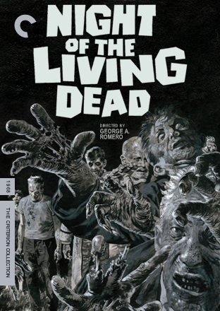
by What A Disgrace
You know you've been spoiled by Arrow Video when you look at the specs for Night of the Living Dead and go "where's the 100 page hardback book?!"
Re: Criterion & Eclipse Cover Art & Packaging Babble-on Vol.
Posted: Thu Nov 16, 2017 3:38 pm
by Malickite
Re: Criterion & Eclipse Cover Art & Packaging Babble-on Vol.
Posted: Thu Nov 16, 2017 4:30 pm
by dwk
Here is Sean Phillips interior and booklet cover art for
Night of the Living Dead:
Image 1
Image 2
Re: Criterion & Eclipse Cover Art & Packaging Babble-on Vol.
Posted: Thu Nov 16, 2017 5:13 pm
by Glowingwabbit
dwk wrote:Here is Sean Phillips interior and booklet cover art for
Night of the Living Dead:
Image 1
Image 2
Image 2 would have been a better cover.
Re: Criterion & Eclipse Cover Art & Packaging Babble-on Vol.
Posted: Thu Nov 16, 2017 5:23 pm
by CSM126
Big Ben wrote:It's meant to be the death's-head hawkmoth from the film mixed with blood. It's one of the most astoundingly simple things Criterion could have done. Unless someone wanted lambs with duct taped mouths as the cover.
I’m aware. I still think it’s too cute.
Re: Criterion & Eclipse Cover Art & Packaging Babble-on Vol.
Posted: Thu Nov 16, 2017 5:30 pm
by bearcuborg
I’ve come to accept that most Criterion art is gonna be terrible, and while this new batch is no exception for the most part, I feel like it should only be Ben and Barbara on the Living Dead cover.
Re: Criterion & Eclipse Cover Art & Packaging Babble-on Vol.
Posted: Thu Nov 16, 2017 5:33 pm
by swo17
In contrast, I think it would be better with just the hands.
Re: Criterion & Eclipse Cover Art & Packaging Babble-on Vol.
Posted: Thu Nov 16, 2017 5:51 pm
by Feego
This FTW:

Re: Criterion & Eclipse Cover Art & Packaging Babble-on Vol.
Posted: Thu Nov 16, 2017 8:33 pm
by Finch
Glowingwabbit wrote:
Image 2 would have been a better cover.
Image 2 is just perfect. By comparison the actual cover feels very cluttered.
Re: Criterion & Eclipse Cover Art & Packaging Babble-on Vol.
Posted: Thu Nov 16, 2017 8:37 pm
by swo17
Image 2 is basically the cover for the Mill Creek Blu-ray that just came out.
Re: Criterion & Eclipse Cover Art & Packaging Babble-on Vol.
Posted: Fri Nov 17, 2017 1:23 am
by felipe
Silence of the Lambs is awful. That could've been the poster for a dozen cheap horror movies, or maybe a new season of AHS, but it's just not SOTL.
Re: Criterion & Eclipse Cover Art & Packaging Babble-on Vol.
Posted: Fri Nov 17, 2017 2:34 am
by Feego
dwk wrote:Here is Sean Phillips interior and booklet cover art for
Night of the Living Dead:
Image 1
Image 2
Even Image 1 would have made a pretty snazzy cover if cropped correctly:
Re: Criterion & Eclipse Cover Art & Packaging Babble-on Vol.
Posted: Fri Nov 17, 2017 5:57 am
by swo17
That looks great!
Re: Criterion & Eclipse Cover Art & Packaging Babble-on Vol.
Posted: Fri Nov 17, 2017 5:58 am
by Morbii
Agreed. Someone email Mulvaney stat!
Re: Criterion & Eclipse Cover Art & Packaging Babble-on Vol.
Posted: Fri Nov 17, 2017 4:56 pm
by Graphist
CSM126 wrote:SOTL is ok, I guess but it’s too cute for my tastes. A Rorschach blot made of blood doesn’t even seem to connect with the film (unless we just assume Lecter used Rorschachs on his patients, I guess?). I would’ve preferred either the poster art or even criterion’s simple-but-effective laserdisc cover art (Clarice looking through the glass with Lecter reflected so he seems to be peering over her shoulder).
Yes, I agree with another poster about it being a death’s-head hawkmoth, but with a twist depicting it as a Rorschach ink drawing to echo the psychological undertones in the film. It is one of the best recent covers, though the type could have been a bit smaller in relation to the illustration. (I wonder if a black background would have looked much better though.)
Criterion & Eclipse Cover Art & Packaging Babble-on Vol. 7
Posted: Fri Nov 17, 2017 5:02 pm
by Graphist
I like the inside drawings much better than the cover one.
The Tom Jones cover feels unfinished and that typeface goes neither with the film nor with that particular drawing.
A bit upset Malle’s film did not get a new cover.
Re: Criterion & Eclipse Cover Art & Packaging Babble-on Vol.
Posted: Fri Nov 17, 2017 5:56 pm
by geoffcowgill
Graphist wrote:CSM126 wrote:SOTL is ok, I guess but it’s too cute for my tastes. A Rorschach blot made of blood doesn’t even seem to connect with the film (unless we just assume Lecter used Rorschachs on his patients, I guess?). I would’ve preferred either the poster art or even criterion’s simple-but-effective laserdisc cover art (Clarice looking through the glass with Lecter reflected so he seems to be peering over her shoulder).
Yes, I agree with another poster about it being a death’s-head hawkmoth, but with a twist depicting it as a Rorschach ink drawing to echo the psychological undertones in the film. It is one of the best recent covers, though the type could have been a bit smaller in relation to the illustration. (I wonder if a black background would have looked much better though.)
It strikes me as a less successful version of the
Don't Look Now cover's approach.
Re: Criterion & Eclipse Cover Art & Packaging Babble-on Vol.
Posted: Sun Nov 26, 2017 2:28 am
by cdnchris
Re: Criterion & Eclipse Cover Art & Packaging Babble-on Vol.
Posted: Sun Nov 26, 2017 2:31 am
by Ribs
Hoo boy, Election's a *real* miss altogether.
Re: Criterion & Eclipse Cover Art & Packaging Babble-on Vol.
Posted: Sun Nov 26, 2017 2:39 am
by Never Cursed
Monterey Pop, however, is even better than I thought. The liner art reminds me of the freakout scene from Belladonna Of Sadness.
Re: Criterion & Eclipse Cover Art & Packaging Babble-on Vol.
Posted: Sun Nov 26, 2017 6:04 pm
by cdnchris
Ribs wrote:Hoo boy, Election's a *real* miss altogether.
This is one where it's even worse when you have it in your hands.
Re: Criterion & Eclipse Cover Art & Packaging Babble-on Vol.
Posted: Sun Nov 26, 2017 9:09 pm
by kcota17
Is Election a booklet or fold out?
Re: Criterion & Eclipse Cover Art & Packaging Babble-on Vol.
Posted: Sun Nov 26, 2017 9:35 pm
by cdnchris
It's a fold out