Page 25 of 93
Re: Criterion & Eclipse Cover Art & Packaging Babble-on Vol.
Posted: Thu Feb 17, 2011 4:05 pm
by mteller
I blame Sapphire for this.
Re: Criterion & Eclipse Cover Art & Packaging Babble-on Vol.
Posted: Thu Feb 17, 2011 5:17 pm
by Jeff
The Fanciful Norwegian wrote:Another theory: It may well have been Loach's own request -- he doesn't have much truck for the auteur theory, and the UK posters for his recent films (at least as far back as Sweet Sixteen) have a credit for Paul Laverty in the same size as Loach's. They also use the "directed by" phrasing instead of "a film by." Perhaps Loach wanted to single out Hines' role in the original story instead of going with something like "Screenplay by Barry Hines, Ken Loach, and Tony Garnett."
I believe we have a winner. The bit about changing "a film by" to "directed by" was almost certainly done at Loach's request, and I wouldn't be surprised if he insisted the author get equal credit too.
Re: Criterion & Eclipse Cover Art & Packaging Babble-on Vol.
Posted: Thu Feb 17, 2011 11:20 pm
by zedz
That's certainly interesting and persuasive, though it doesn't account for the shrinking of the title (and why it maintains the same proportions with the director credit as the original design).
Re: Criterion & Eclipse Cover Art & Packaging Babble-on Vol.
Posted: Fri Feb 18, 2011 10:44 am
by CSM126
zedz wrote:the shrinking of the title (and why it maintains the same proportions with the director credit as the original design).
Contractual obligations. MGM has a thing about keeping the title and the names at a certain ratio to one another on covers.
Re: Criterion & Eclipse Cover Art & Packaging Babble-on Vol.
Posted: Fri Feb 18, 2011 8:06 pm
by zedz
Or:
See My Original Post
Re: Criterion & Eclipse Cover Art & Packaging Babble-on Vol.
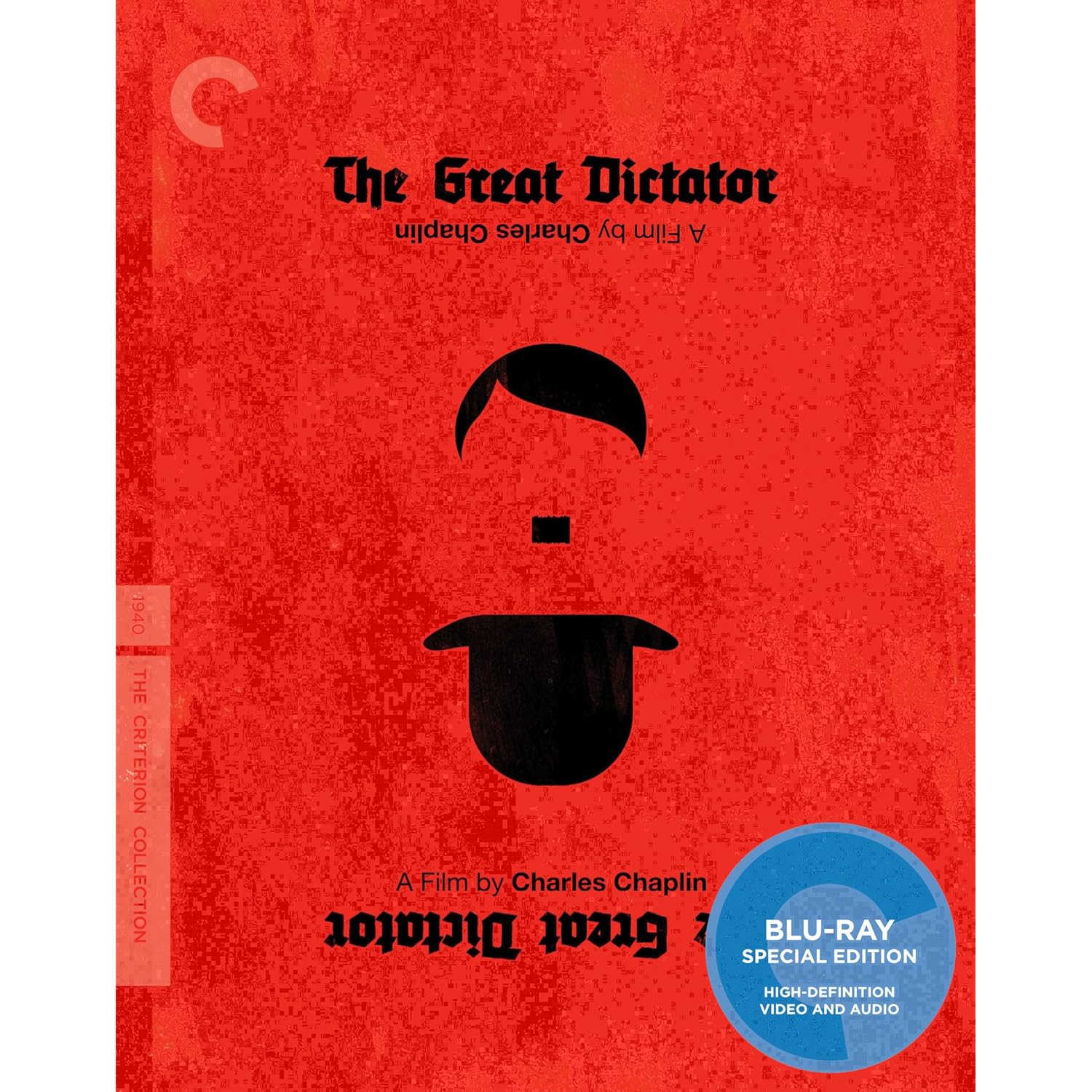
Posted: Sat Feb 19, 2011 5:35 am
by Archers of Loaf
The Great Dictator is up for pre-order on Amazon with modified (?) cover art.
Perhaps the texture suggests that this will be a digipack with the look and feel of a leather-bound book?
Re: Criterion & Eclipse Cover Art & Packaging Babble-on Vol.
Posted: Sat Feb 19, 2011 6:00 am
by Saturnome
When you zoom in it looks like compression artefacts from the picture file.
Re: Criterion & Eclipse Cover Art & Packaging Babble-on Vol.
Posted: Sat Feb 19, 2011 8:58 am
by Cinephrenic
Pixelated version
Re: Criterion & Eclipse Cover Art & Packaging Babble-on Vol.
Posted: Sat Feb 19, 2011 9:33 am
by Archers of Loaf
I think that there is more to it than artifacts. On the left, there appears to be a "spine" - that seems pretty deliberate. Also,
when you blow it up to full size, the text and the blu-ray sticker remain fairly sharp despite the pixelation of the red space. You would think that the edges of the blue, for example, would be impacted if it was merely a problem with the way that the image was compressed.
Or maybe i'm just failing to accept that the cover we see on Criterion's website is indeed final...
Re: Criterion & Eclipse Cover Art & Packaging Babble-on Vol.
Posted: Sat Feb 19, 2011 1:15 pm
by Feego
Old or new, it still looks like crap.
Re: Criterion & Eclipse Cover Art & Packaging Babble-on Vol.
Posted: Sat Feb 19, 2011 4:50 pm
by James
It's still probably the worst cover in the collection.
Re: Criterion & Eclipse Cover Art & Packaging Babble-on Vol.
Posted: Sat Feb 19, 2011 4:55 pm
by matrixschmatrix
James wrote:It's still probably the worst cover in the collection.

Re: Criterion & Eclipse Cover Art & Packaging Babble-on Vol.
Posted: Sat Feb 19, 2011 5:11 pm
by mfunk9786
Re: Criterion & Eclipse Cover Art & Packaging Babble-on Vol.
Posted: Sat Feb 19, 2011 5:26 pm
by fdm


ftw
Re: Criterion & Eclipse Cover Art & Packaging Babble-on Vol.
Posted: Sat Feb 19, 2011 5:33 pm
by Murdoch
I'll suppress my urge to post the new Solaris
Re: Criterion & Eclipse Cover Art & Packaging Babble-on Vol.
Posted: Sat Feb 19, 2011 5:34 pm
by James
fdm wrote:
ftw
I know they make me think of lemonade; that's for damn sure.
Re: Criterion & Eclipse Cover Art & Packaging Babble-on Vol.
Posted: Sat Feb 19, 2011 6:50 pm
by Crab Society North
I think so far for 2011 Criterion has unveiled not only some of their worst covers (something wild, Naked Kiss) but some of their best in the history of the company (blow out and Pale Flower)
Re: Criterion & Eclipse Cover Art & Packaging Babble-on Vol.
Posted: Sat Feb 19, 2011 6:56 pm
by mfunk9786
Eh, I still find Pale Flower to be a "good concept, shoddy execution" situation.
Re: Criterion & Eclipse Cover Art & Packaging Babble-on Vol.
Posted: Sat Feb 19, 2011 7:21 pm
by Cinephrenic
I'm surprised the new Solaris cover is getting good marks on this forum. I personally find it hideous.
Re: Criterion & Eclipse Cover Art & Packaging Babble-on Vol.
Posted: Sat Feb 19, 2011 8:21 pm
by triodelover
mfunk9786 wrote:
I'm sorry. Any cover that has Gabin and the gorgeous Mireille Balin on it cannot by any definition be the "worst".
Re: Criterion & Eclipse Cover Art & Packaging Babble-on Vol.
Posted: Sat Feb 19, 2011 8:41 pm
by domino harvey
It's too bad there's no hyperbole in this thread from anyone
Re: Criterion & Eclipse Cover Art & Packaging Babble-on Vol.
Posted: Sat Feb 19, 2011 9:18 pm
by HistoryProf
fdm wrote:
ftw
we get it. you don't like them. others do. I actually think they look pretty cool in hand. so no 'ftw' - which, btw, is one of the most annoying message board cliches on the planet. all you are missing is "they make me throw up in my mouth a little."
Re: Criterion & Eclipse Cover Art & Packaging Babble-on Vol.
Posted: Sat Feb 19, 2011 9:55 pm
by swo17
Calling things the "best" or "worst" things ever is the laziest form of criticism in the entire history of the universe.
Re: Criterion & Eclipse Cover Art & Packaging Babble-on Vol.
Posted: Sat Feb 19, 2011 10:04 pm
by knives
swo17 wrote:Calling things the "best" or "worst" things ever is the laziest form of criticism in the entire history of the universe.
Worst attempt to cool things ever.

Re: Criterion & Eclipse Cover Art & Packaging Babble-on Vol.
Posted: Sat Feb 19, 2011 11:40 pm
by fdm
HistoryProf wrote:fdm wrote:ftw
we get it. you don't like them. others do. I actually think they look pretty cool in hand. so no 'ftw' - which, btw, is one of the most annoying message board cliches on the planet. all you are missing is "they make me throw up in my mouth a little."
I reserve the right to post them whenever anyone else starts posting covers that aren't really all that bad. Adds a little perspective. Neither of those other ones came close.