Page 30 of 164
Re: Criterion & Eclipse Cover Art & Packaging Babble-on Vol.
Posted: Tue Mar 27, 2018 9:00 pm
by cdnchris
Re: Criterion & Eclipse Cover Art & Packaging Babble-on Vol.
Posted: Tue Mar 27, 2018 9:01 pm
by mfunk9786
Re: Criterion & Eclipse Cover Art & Packaging Babble-on Vol.
Posted: Tue Mar 27, 2018 11:10 pm
by Saturnome
"Disc made in Mexico" ??
Re: Criterion & Eclipse Cover Art & Packaging Babble-on Vol.
Posted: Tue Mar 27, 2018 11:29 pm
by cdnchris
It's only on the plastic wrap but I laughed at how prominent it was.
Re: Criterion & Eclipse Cover Art & Packaging Babble-on Vol.
Posted: Wed Mar 28, 2018 1:05 am
by Boosmahn
The color scheme for The Awful Truth is good on the front, back, and spine at first, but becomes kind of grating and ugly after looking at it for awhile...
Re: Criterion & Eclipse Cover Art & Packaging Babble-on Vol.
Posted: Wed Mar 28, 2018 5:07 am
by Graphist
Love how they utilized that scene with the church silhouette on the foldout for The Color of Pomegranates!
Re: Criterion & Eclipse Cover Art & Packaging Babble-on Vol.
Posted: Wed Mar 28, 2018 1:23 pm
by DFR
I like The Awful Truth cover, but the style makes them look like characters from Archer.
Re: Criterion & Eclipse Cover Art & Packaging Babble-on Vol.
Posted: Mon Apr 02, 2018 7:57 pm
by cdnchris
Re: Criterion & Eclipse Cover Art & Packaging Babble-on Vol.
Posted: Mon Apr 02, 2018 8:27 pm
by Boosmahn
Both of those look very good. Not sure what the point of having those different fonts for "The Virgin Suicides" is, but I like it.
Re: Criterion & Eclipse Cover Art & Packaging Babble-on Vol.
Posted: Mon Apr 02, 2018 8:39 pm
by okcmaxk
The picture of the different fonts is the title card of the film.
Re: Criterion & Eclipse Cover Art & Packaging Babble-on Vol.
Posted: Mon Apr 02, 2018 11:03 pm
by Graphist
I think I prefer the design with the fawn as the cover for Dead Man. It is more intriguing and poetic.
Re: Criterion & Eclipse Cover Art & Packaging Babble-on Vol.
Posted: Mon Apr 16, 2018 9:06 pm
by swo17
Re: Criterion & Eclipse Cover Art & Packaging Babble-on Vol.
Posted: Mon Apr 16, 2018 9:09 pm
by Ribs
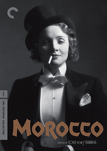
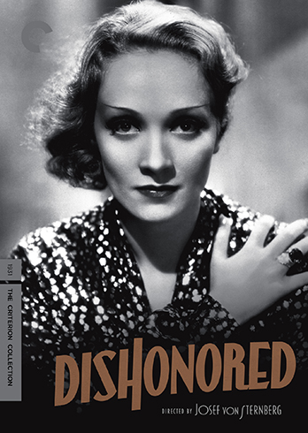
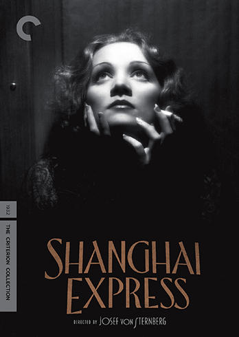
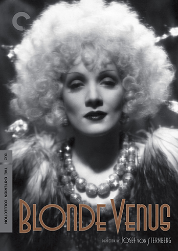
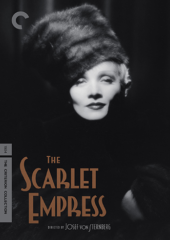
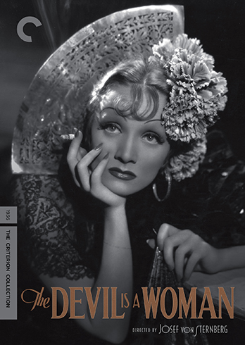
I'm absolutely shocked that the Sternbergs are actually across six discs.
Re: Criterion & Eclipse Cover Art & Packaging Babble-on Vol.
Posted: Mon Apr 16, 2018 9:10 pm
by mfunk9786
Totally stunning covers for the von Sternberg/Dietrich set. Wow.
EDIT: Great month for covers all around!
Re: Criterion & Eclipse Cover Art & Packaging Babble-on Vol.
Posted: Mon Apr 16, 2018 9:11 pm
by KJones77
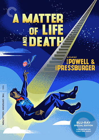
Love the Dietrich box covers but the A Matter of Life and Death and Bull Durham covers are underwhelming.
Re: Criterion & Eclipse Cover Art & Packaging Babble-on Vol.
Posted: Mon Apr 16, 2018 9:12 pm
by FrauBlucher
Dietrich/Sternberg may be the release of the year. Awesome!
Re: Criterion & Eclipse Cover Art & Packaging Babble-on Vol.
Posted: Mon Apr 16, 2018 9:12 pm
by John Shade
A Matter of Life and Death is one of my favorite films ever...as far as animated covers go, I like it?
Re: Criterion & Eclipse Cover Art & Packaging Babble-on Vol.
Posted: Mon Apr 16, 2018 9:14 pm
by kcota17
All covers are great except AMOLAD, which makes it look like a cheap 50’s Sci Fi
Re: Criterion & Eclipse Cover Art & Packaging Babble-on Vol.
Posted: Mon Apr 16, 2018 9:15 pm
by FrauBlucher
Put me in the yea column for the AMOLAD cover.
Re: Criterion & Eclipse Cover Art & Packaging Babble-on Vol.
Posted: Mon Apr 16, 2018 9:17 pm
by Ribs
A little surprised that weird Sony licensing doesn't force them to also put "AKA Stairway to Heaven" or something like that, even in the blurb.
Re: Criterion & Eclipse Cover Art & Packaging Babble-on Vol.
Posted: Mon Apr 16, 2018 9:17 pm
by Brian C
I really like the Matter of Life and Death cover. Don't know if it's based on poster art but looks like something that maybe could have been ... both appropriate to the film and very attractive on its own terms.
Bull Durham doesn't quite work for me. It's awfully busy and I don't think the art style is a good match for the tone of the film. Maybe it'll look nicer in person, though, since the Blu sticker is sort of covering up a key detail.
Re: Criterion & Eclipse Cover Art & Packaging Babble-on Vol.
Posted: Mon Apr 16, 2018 9:32 pm
by Feego
I get what the Bull Durham cover is referencing, but I can't help thinking of Stephen King's Gerald's Game as I look at it. I also love the AMOLAD cover and am so relieved they didn't follow the screenshot precedent set by the previous P&P covers.
Marlene Dietrich's face should be on every Criterion cover.
Re: Criterion & Eclipse Cover Art & Packaging Babble-on Vol.
Posted: Mon Apr 16, 2018 9:33 pm
by Kirkinson
I haven't seen AMOLAD but I adore that cover, and it doesn't seem at all inappropriate to the vibe I get from other P&P films.
Re: Criterion & Eclipse Cover Art & Packaging Babble-on Vol.
Posted: Mon Apr 16, 2018 9:50 pm
by bearcuborg
Kinda feels like A Matter of Life and Death should have made heaven a monochromatic grey. After all, one is starved for technicolor up there... I dig the stairway.
Also, the Dietrich set is gorgeous. Homerun.
Speaking of which, Bull Durham is awful.
Re: Criterion & Eclipse Cover Art & Packaging Babble-on Vol.
Posted: Mon Apr 16, 2018 9:54 pm
by domino harvey
Every cover is awesome, wow