Page 33 of 67
Posted: Mon Apr 24, 2006 6:42 am
by hammock
Jem wrote:I know the logotype is supposed to reference the sprocket holes on a roll film
Thanks for that information, never noticed!
SncDthMnky - Le Talking Samourai is a winner - love it!
Posted: Mon Apr 24, 2006 7:46 am
by godardslave
heh, funny.
Posted: Mon Apr 24, 2006 3:27 pm
by Cinesimilitude
I liked merging the two... I might do more, that one was very quickly done, we'll see...
Posted: Mon Apr 24, 2006 4:26 pm
by Jean-Luc Garbo
I love the cover to Koko le Talking Samourai - by Barbet-Pierre Melville nonetheless!!
Posted: Mon Apr 24, 2006 4:57 pm
by What A Disgrace
SncDthMnky wrote:What A Disgrace wrote:Koko, Le Talking Samourai.
Someone, make my dream come true.
Voila.
Yep, my dream has come true.
Posted: Mon Apr 24, 2006 8:38 pm
by criterionsnob
Posted: Mon Apr 24, 2006 8:45 pm
by Gigi M.
Where's the Criterion Collection logo?
Posted: Mon Apr 24, 2006 8:46 pm
by LightBulbFilm
It's their new look... remember?
It kind of looks like the cover of a novel...
Posted: Mon Apr 24, 2006 8:49 pm
by Gigi M.
So, they're not going to have anything that says Criterion on front? Is that going to sell? Big mistake.
Posted: Mon Apr 24, 2006 8:52 pm
by LightBulbFilm
I don't know, man... As long as they keep the spine they should be alright...
Posted: Mon Apr 24, 2006 8:53 pm
by domino harvey
wow, what a colossal mistake this new move is. without the Criterion Logo, I'm sorry, but what differentiates this from a Fox Lorber box? horrible.
Posted: Mon Apr 24, 2006 8:54 pm
by rwaits
It does look like a novel...one you might find at a Christian bookstore.
Posted: Mon Apr 24, 2006 8:54 pm
by domino harvey
I know this is on the Criterion site, but maybe it's a mistake? I mean, isn't that Times New Roman font on the "A Film By..."?
everyone who bitched about Virdania, see, THIS is what you should save complaining for.
Posted: Mon Apr 24, 2006 9:04 pm
by indiannamednobody
Why wouldn't they just wait until they cross-over to a new format before they make a change this drastic?
Posted: Mon Apr 24, 2006 9:08 pm
by Donald Trampoline
This cover does not happily jibe with my love of this film. It does not conjure up the themes or visual appeal of the film in any way, nor does it evoke the feelings that the film gives rise to.
It looks a bit like a cheesy novel cover from the "teen" section of the bookstore-- some garden or girl and her garden type of story.
Posted: Mon Apr 24, 2006 9:12 pm
by Donald Trampoline
Such as this:

Posted: Mon Apr 24, 2006 9:48 pm
by Matt
domino harvey wrote:everyone who bitched about Virdania, see, THIS is what you should save complaining for.
I hate to admit it, but you may have a point. This is the most hilariously awful cover in the Criterion canon.
Posted: Mon Apr 24, 2006 10:00 pm
by denti alligator
It looks like the cover of some "inspirational" Christian book.
Scary.
Very.
Posted: Mon Apr 24, 2006 10:23 pm
by The Fanciful Norwegian
The Fanciful Norwegian wrote:I think Criterion is tired of other companies ripping off their current logo. There's another DVD coming out this week (some tiny indie thing I never heard of before) which isn't even remotely subtle about it (they do it on the cover and the spine), although I can't for the life of me remember what it's called.
In case anyone cares, I found it:

The mitigating factor being that it's a Home Vision release, but it's still lame.
Posted: Mon Apr 24, 2006 11:20 pm
by justeleblanc
matt wrote:I hate to admit it, but you may have a point. This is the most hilariously awful cover in the Criterion canon.
10-4 on the
hilarious...
Also Matt, I've been meaning to ask if that's Amy Pohler in your avatar?
Posted: Mon Apr 24, 2006 11:35 pm
by Derek Estes
That cover is Terrible! And, this is coming from someone who liked the Viridiana and King of Kings covers. Truly awful.
Posted: Mon Apr 24, 2006 11:41 pm
by Derek Estes
Though I do like the fact that she has a gin blossom nose. I think this might be to make up for the fact that The Bank Dick is out of print.
Posted: Mon Apr 24, 2006 11:53 pm
by Dear Catastrophe Totoro
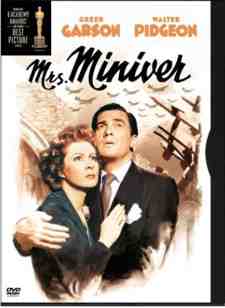
Since Criterion hasn't officially posted this yet, is it possible they could still tweak it a tad? To be honest, the font size and type is killing this cover for me. I'm not saying that it is wonderful otherwise, but there is a thin line between a Mrs. Miniver/Best Years of Our Lives type of poster and the cover of a Christian and/or pulp romance novel. If the font changes, it could be closer to what they are assumably trying to achieve (the former).
Edit:
for example...
Posted: Mon Apr 24, 2006 11:55 pm
by Narshty
I wonder why they only ever employ talentless artists for their painted covers? A total aesthetic disaster. Why is her right arm covered in random blotches of pink, and why is her left one purple? It's blatantly clear the cover is by someone who's never been anywhere near England - you never get fields all the same colour like that, and it's not marshland either. And what's the black smudge above the "C"? I don't like the lack of a CC logo either - that banner gave their covers balance somehow.
Posted: Tue Apr 25, 2006 12:07 am
by arsonfilms
The black smudge is obviously a UFO. Clearly, the transfer is so pristine, that previously unseen nuances are only now being discovered.
This may be the first time that a DVD cover has made me substantially lose interest in a release. So much so, that I don't think I could justify the purchase unless the cover changed again...
