and what do you get when you're on the list?
A Pony?
Your favorite designed Criterion?
murdered?
Let's hope for all three!
Frankly, the cover for breathless could be completely blank, and I would still buy it. At least I'll be able to actually see the film, rather than a combed ghost waving around my tv screen.
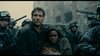
I just received 'Ivan's Childhood' today and the image on the cover looks even better in person. I must say, though, that upon first glance it appeared to be 'Juan's Childhood'.
pauling wrote:I just received 'Ivan's Childhood' today and the image on the cover looks even better in person. I must say, though, that upon first glance it appeared to be 'Juan's Childhood'.
I agree about the cover art. One of the nicer ones in the past couple months.
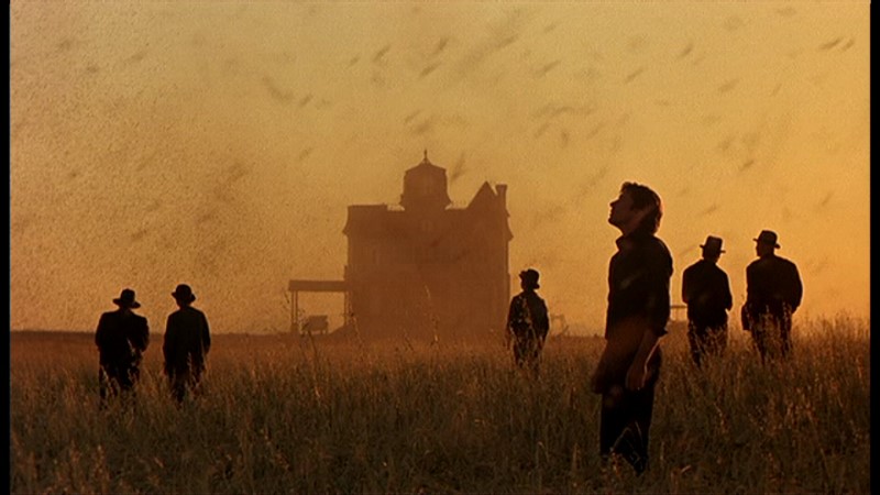
This film's always reminded me of Edward Hopper and Andrew Wyeth, particularly the latter's "Christina's World," and I'll be damned if this cover doesn't remind - specifically - of that painting. Well played.
The new cover is a great mesh of the film's beauty and plot. The out of focus character (Richard Gere) looks longingly at the porch where his girlfriend lives with another man, who is standing tauntingly on the porch. Yet the framing of the house and the sky is perfect, recalling American realism (Wyeth maybe?) at the same time as being accurate to the film.
agreed. This is my favorite film of all time, I get a certain feeling after each viewing that no other film has matched. Release of the year bar none for me.
May be its just me, but the outline of man's face-to-neck could use a little bit of cleaning up: the stark blur (against the crop) is not exactly rocking my boat.
a.khan wrote:May be its just me, but the outline of man's face-to-neck could use a little bit of cleaning up: the stark blur (against the crop) is not exactly rocking my boat.
But, overall, this is really nice.
The blur needs to be effecting the wheat slightly as well. the figure is very close to it.


