Page 34 of 49
Posted: Sat Jul 21, 2007 3:59 am
by pianocrash
and what do you get when you're on the list?
A Pony?
Your favorite designed Criterion?
murdered?
Let's hope for all three!
Frankly, the cover for
breathless could be completely blank, and I would still buy it. At least I'll be able to actually see the film, rather than a combed ghost waving around my tv screen.
Posted: Sat Jul 21, 2007 4:52 am
by sidehacker
Nuno wrote:Is this one the only cover which has the line "The Criterion Collection" different than what is usual?
(I apologize for this incorrect english sentence :p)
No,
Rushmore.
Posted: Mon Jul 23, 2007 7:46 pm
by pauling
I just received 'Ivan's Childhood' today and the image on the cover looks even better in person. I must say, though, that upon first glance it appeared to be 'Juan's Childhood'.
Posted: Wed Jul 25, 2007 11:34 pm
by Luke M
pauling wrote:I just received 'Ivan's Childhood' today and the image on the cover looks even better in person. I must say, though, that upon first glance it appeared to be 'Juan's Childhood'.
I agree about the cover art. One of the nicer ones in the past couple months.

Very nice. =D>
Posted: Wed Jul 25, 2007 11:37 pm
by kaujot
Beautiful, though I wish the man wasn't there. My eyes are drawn away from the house and the title to him.
Posted: Wed Jul 25, 2007 11:40 pm
by Cinesimilitude
Greathinker's cover was way better.
Posted: Wed Jul 25, 2007 11:41 pm
by domino harvey
that is good, at least they managed to take the time to produce one decent cover this month.
Posted: Wed Jul 25, 2007 11:42 pm
by Jeff
Could have been a bit more
magic houry, but pretty damn great anyway.
Posted: Thu Jul 26, 2007 12:07 am
by javelin
This film's always reminded me of Edward Hopper and Andrew Wyeth, particularly the latter's "Christina's World," and I'll be damned if this cover doesn't remind - specifically - of that painting. Well played.
Posted: Thu Jul 26, 2007 12:10 am
by denti alligator

Greathinkers cover was way better.
I think I agree.
Posted: Thu Jul 26, 2007 12:42 am
by Gigi M.
I like Paramount's original cover much better, and of course, Greathinker's even more!!!

Posted: Thu Jul 26, 2007 12:47 am
by arsonfilms
You people are all insane.
Posted: Thu Jul 26, 2007 1:12 am
by domino harvey
No offense to those of you who I am sure are nice people, but there has never been a good fantasy Criterion cover posted on this board.
Posted: Thu Jul 26, 2007 1:24 am
by Svevan
Agreed, sans sass, with Domino.
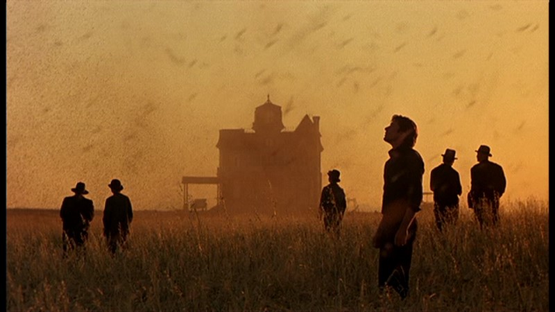
The new cover is a great mesh of the film's beauty and plot. The out of focus character (Richard Gere) looks longingly at the porch where his girlfriend lives with another man, who is standing tauntingly on the porch. Yet the framing of the house and the sky is perfect, recalling American realism (Wyeth maybe?) at the same time as being accurate to the film.
So, I love it.
Posted: Thu Jul 26, 2007 1:31 am
by Macintosh
agreed. This is my favorite film of all time, I get a certain feeling after each viewing that no other film has matched. Release of the year bar none for me.
Posted: Thu Jul 26, 2007 2:05 am
by mogwai
The cover is beautiful! Simply perfect.
Posted: Thu Jul 26, 2007 2:21 am
by Nuno
I love this cover!
sidehacker wrote:Nuno wrote:Is this one the only cover which has the line "The Criterion Collection" different than what is usual?
(I apologize for this incorrect english sentence :p)
No,
Rushmore.
Thanks Sidehacker. But it's not as different as "Le Corbeau"...
Posted: Thu Jul 26, 2007 5:05 am
by pianocrash
Wow, I just....wow!
Fantasy covers are/will always be just that: simply fantasy.
Posted: Thu Jul 26, 2007 6:36 am
by a.khan
May be its just me, but the outline of man's face-to-neck could use a little bit of cleaning up: the stark blur (against the crop) is not exactly rocking my boat.
But, overall, this is really nice.
Posted: Thu Jul 26, 2007 7:16 am
by Jem
That blurred figure is so fake, come on people!
Posted: Thu Jul 26, 2007 7:22 am
by jaredsap
Jem wrote:That blurred figure is so fake, come on people!
Yes. I can hardly even look at this cover without seeing the designer's cursor dragging Carefully Blurred Man into the frame.
Posted: Thu Jul 26, 2007 8:22 am
by Cinesimilitude
a.khan wrote:May be its just me, but the outline of man's face-to-neck could use a little bit of cleaning up: the stark blur (against the crop) is not exactly rocking my boat.
But, overall, this is really nice.
The blur needs to be effecting the wheat slightly as well. the figure is very close to it.
Posted: Thu Jul 26, 2007 9:58 am
by a.khan
Can we really expect a revision of The Blurred Man?
In all certainty, this version of the artwork itself must have gone through a tedious approval process ala Way of the Malick.
Posted: Thu Jul 26, 2007 10:03 am
by Napoleon
The Bates motel relocated to a wheatfield. Norman!
That blurred man recalls the photoshopped horror of the Secret Honor cover.
Posted: Thu Jul 26, 2007 11:35 am
by Antoine Doinel
Love the Days Of Heaven cover. Though I guess you can't go wrong with a Malick image.