Page 34 of 147
Posted: Sat Oct 11, 2008 3:38 pm
by karmajuice
But wouldn't that completely contradict the notion of the dog going from calm to furious? Going from fury to calm is hardly interesting.
Posted: Sat Oct 11, 2008 4:19 pm
by kidc85
pianocrash wrote:
Awesome. This needs to be their next release.
Posted: Sat Oct 11, 2008 4:20 pm
by domino harvey
White Jules and Jim Dog sounds like an awesome new Ebony and Ivory R&B duo
Posted: Sat Oct 11, 2008 4:35 pm
by Jeff
domino harvey wrote:White Jules and Jim Dog sounds like an awesome new Ebony and Ivory R&B duo
I was thinking the same thing, but "Dog" should be spelled "Dawg." They would make good "buddy-cops" too.
Posted: Sat Oct 11, 2008 8:48 pm
by Dante Vescio
karmajuice wrote:But wouldn't that completely contradict the notion of the dog going from calm to furious? Going from fury to calm is hardly interesting.
Agreed. It's just that the previous cover was better so I just thought it could come as the first. But either way would be fine by me, just as long as they include that cover, which was far better than the new one.
Oh well...
Posted: Tue Oct 14, 2008 10:33 pm
by TheGodfather
Street Dude wrote:I like the new, white artwork better now.
Yup me too. Good thing they changed it, I think.
Posted: Wed Oct 15, 2008 4:25 pm
by Harmonov
Perhaps the "old cover" will be in artwork inside the disc, especially if it's a digipak. Then you could have the calm white outside and the black rage inside. Makes sense, no?
Posted: Wed Oct 15, 2008 6:09 pm
by The Glue Man
pianocrash wrote:
WIN

Personally I quite like the new cover. The old one looked like a halfhearted version of that poster art, and as such, IMO, it's better to have something completely different...
Re the Europa cover (not THAT bad but the fan cover posted elsewhere was better), I never realised before just how *bad* the Milky Way cover was until now, seeing it next to Europa... thank goodness I have the Optimum Bunuel box!
Posted: Wed Oct 15, 2008 10:02 pm
by domino harvey
Posted: Wed Oct 15, 2008 10:03 pm
by domino harvey
BEAUTIFUL cover for MO. Criterion finally got a period cover right! =D>
All three look great actually. Sorry to disappoint my negativity junkies
Posted: Wed Oct 15, 2008 10:05 pm
by denti alligator
I like all three of them. A lot.
So wait: no Magnificent Obsessions on Blu-ray?
Posted: Wed Oct 15, 2008 10:06 pm
by zedz
I like all of them (but I'm notoriously unfussy), particularly the austere Rossellini one, a pretty bold design decision.
Posted: Wed Oct 15, 2008 10:16 pm
by Finch
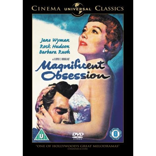
That cover for Magnificent Obsession is a beauty. =D>
The El Norte and Rossellini artwork are not to be sniffed at, either. Let this sink in for a moment: the covers aren't just alright but genuinely good across the board. I'm positively shocked.
Posted: Wed Oct 15, 2008 10:19 pm
by domino harvey
Mr Finch wrote:That cover for Magnificent Obsession is a beauty. =D>
The El Norte and Rossellini artwork are not to be sniffed at, either. Let this sink in for a moment: the covers aren't just alright but genuinely good across the board. I'm positively shocked.
Thank you Criterion for listening to us bitch and clearly making a positive step forward. Look at even the extras for these: brilliant stuff! =D>
Posted: Wed Oct 15, 2008 10:19 pm
by Musashi219
Posted: Wed Oct 15, 2008 10:22 pm
by souvenir
I also like the Magnificent Obsession cover, but it's very close to the
existing R2
Posted: Wed Oct 15, 2008 10:25 pm
by jaredsap
souvenir wrote:I also like the Magnificent Obsession cover, but it's very close to the
existing R2
That's because the image is essentially the
original one-sheet.
Posted: Wed Oct 15, 2008 10:26 pm
by domino harvey
Because when the original is so perfect, no need to fuck around. See: White Dog
Posted: Wed Oct 15, 2008 10:29 pm
by HerrSchreck
Ditto. Sometimes they want to be too "Criterion"y, and they feel the need to honor their art dept/contractors rather than the film and it's visual history. This (the Sirk) is almost a page from the MoC playbook... and it works really well.
Nice to see some indispensible stuff getting ready to hit shelves.
Posted: Wed Oct 15, 2008 10:33 pm
by colinr0380
The Criterion cover is better laid out though - I like the way she is gazing at the wacky C!
Also liking the burgundy and gold of the Rossellini Eclipse set.
HerrSchreck wrote:Nice to see some indispensible stuff getting ready to hit shelves.
But aren't these all
color films?

Posted: Wed Oct 15, 2008 10:35 pm
by domino harvey
The MO reminds me in style and even in font of the best cover from this year, also from January: Miss Julie
Posted: Wed Oct 15, 2008 10:54 pm
by Finch
The artwork for the Eclipse sets would be so much stronger if they just picked one image from each film, filled the entire page with it and put the title with the caption "a film by" on top of it. This almost blank page with a small-sized stretch of pictures in the centre is totally unappealing. The only exceptions are the Late Ozu covers. Even with Eclipse being the "low-budget" sibling of the main line, the artwork still could and should look a great deal better than the current output, the new Rossellini set included.
Posted: Wed Oct 15, 2008 11:00 pm
by domino harvey
That's not the only one. Plenty of the Eclipse sets have big pics (Fuller, Klein, Mizo, Late Ozu, Shepitko) and the other half have the little strip of pics. I agree that the bigger pic is better but it's by no means a rarity
Posted: Wed Oct 15, 2008 11:08 pm
by Finch
Re Fuller/Klein/Mizo/Shepitko: should have remembered those #-o
Posted: Wed Oct 15, 2008 11:11 pm
by HerrSchreck
colinr0380 wrote:HerrSchreck wrote:Nice to see some indispensible stuff getting ready to hit shelves.
But aren't these all
color films?
(Reclines back in chair... taps cathedral of ten fingertips together repeatedly, while chewing inner lip... Lightbulb appears over head.)
"aha!"
(Types furiously:)
TECHNICOLOR IS NOT 'COLOR'


