Criterion & Eclipse Cover Art & Packaging Babble-on Vol.5
-
Jean-Luc Garbo

- Joined: Thu Dec 09, 2004 5:55 am
- Contact:
Re: Criterion & Eclipse Cover Art & Packaging Babble-on Vol.
I love the disc art for Solaris and Les Diaboliques.
-
HistoryProf

- Joined: Mon Mar 13, 2006 7:48 am
- Location: KCK
Re: Criterion & Eclipse Cover Art & Packaging Babble-on Vol.
boy...Pale Flower is the prettiest package of the year so far. Diabolique is pretty amazing in its own right. Why couldn't Amazon have put those on sale too?!?!?
-
aox

- Joined: Fri Jun 20, 2008 4:02 pm
- Location: nYc
Re: Criterion & Eclipse Cover Art & Packaging Babble-on Vol.
Could that have been Chaplin's original point and not some clever person at Criterion?
EDIT:
I guess there is no basis to my assumption. Kudos to the creative Criterion staffer. I still have to squint my eye to make it work, which amazes me.
EDIT:
I guess there is no basis to my assumption. Kudos to the creative Criterion staffer. I still have to squint my eye to make it work, which amazes me.
-
Doctor Sunshine

- Joined: Wed Nov 03, 2004 2:04 am
- Location: Brain Jail
Re: Criterion & Eclipse Cover Art & Packaging Babble-on Vol.
No, you're probably right. You can still get two halves of a swastika from that. But there's still some degree of cleverness involved in picking up on it--I never would have caught that.
-
Murdoch

- Joined: Mon Apr 21, 2008 3:59 am
- Location: Upstate NY
-
The Elegant Dandy Fop

- Joined: Thu Dec 09, 2004 7:25 am
- Location: Los Angeles, CA
Re: Criterion & Eclipse Cover Art & Packaging Babble-on Vol.
My question is if Sam Smith didn't want to make the Something Wild cover more 80's and opted to go for a more "21st century" look, why is his idea of 21st century a third-rate Saul Bass imitation from the 60's?
-
Harmonov

- Joined: Thu Apr 17, 2008 3:26 pm
- Location: Bloomington, IN
Re: Criterion & Eclipse Cover Art & Packaging Babble-on Vol.
That cover with just Melanie Griffith on it might be the best thing he's ever done. Shame it couldn't be used.
-
domino harvey

- Dot Com Dom
- Joined: Wed Jan 11, 2006 6:42 pm
Re: Criterion & Eclipse Cover Art & Packaging Babble-on Vol.
I hate 80s nostalgia as much as the next guy, but duh doy it would have made a lot more sense here
-
kaujot

- Joined: Mon May 08, 2006 10:28 pm
- Location: Austin
- Contact:
Re: Criterion & Eclipse Cover Art & Packaging Babble-on Vol.
Criterion called him one of their favorite designers. 
-
matrixschmatrix

- Joined: Wed May 26, 2010 3:26 am
Re: Criterion & Eclipse Cover Art & Packaging Babble-on Vol.
It's strange, I think I like every iteration of that cover less than the previous one. Smith is obviously a talented designer, but either he or Criterion seems to pick the worst idea from every batch he submits.
-
The Fonz

- Joined: Sat Apr 23, 2011 3:10 pm
- Location: Milwaukee, Wisconsin
Re: Criterion & Eclipse Cover Art & Packaging Babble-on Vol.
I don't like the first one, which is just Melanie Griffith's face; but I do agree with you. The color scheme they went with is hands-down the worst. The actual cover art is all right, though. I still have a buzz from how good the art for Blow Out is, so I can let one or two more after this slide.matrixschmatrix wrote:It's strange, I think I like every iteration of that cover less than the previous one. Smith is obviously a talented designer, but either he or Criterion seems to pick the worst idea from every batch he submits.
-
swo17

- Bloodthirsty Butcher
- Joined: Tue Apr 15, 2008 2:25 pm
- Location: SLC, UT
Re: Criterion & Eclipse Cover Art & Packaging Babble-on Vol.


Last edited by swo17 on Tue May 17, 2011 5:45 pm, edited 5 times in total.
-
domino harvey
- Dot Com Dom
- Joined: Wed Jan 11, 2006 6:42 pm
Re: Criterion & Eclipse Cover Art & Packaging Babble-on Vol.
That Orpheus cover sucks shit
-
Finch

- Joined: Mon Jul 07, 2008 9:09 pm
- Location: United States
Re: Criterion & Eclipse Cover Art & Packaging Babble-on Vol.
Cul-de-Sac and Orpheus apart, this is certainly one of their strongest months cover-wise. Love The Killing artwork.
-
Murdoch
- Joined: Mon Apr 21, 2008 3:59 am
- Location: Upstate NY
Re: Criterion & Eclipse Cover Art & Packaging Babble-on Vol.
I think if you have to exclude two of the covers it isn't one of their strongest months
-
matrixschmatrix
- Joined: Wed May 26, 2010 3:26 am
Re: Criterion & Eclipse Cover Art & Packaging Babble-on Vol.
I like Orpheus. I love the Killing. Cul-de-Sac is embarrassingly bad.
-
rockysds

- Joined: Wed May 19, 2010 3:25 pm
- Location: Denmark
-
domino harvey
- Dot Com Dom
- Joined: Wed Jan 11, 2006 6:42 pm
Re: Criterion & Eclipse Cover Art & Packaging Babble-on Vol.
Now there's a great cover!rockysds wrote:
-
Murdoch
- Joined: Mon Apr 21, 2008 3:59 am
- Location: Upstate NY
Re: Criterion & Eclipse Cover Art & Packaging Babble-on Vol.
C'mon Vigo, show yourself!
-
colinr0380

- Joined: Mon Nov 08, 2004 8:30 pm
- Location: Chapel-en-le-Frith, Derbyshire, UK
Re: Criterion & Eclipse Cover Art & Packaging Babble-on Vol.
I don't mind the new covers although I prefer the mirrored pool previously used for Orpheus, but can understand why they changed it up. And I suppose the interchangable use of mirrors and glass still provides the best imagery next to the sleepwalking/struggling through the corridor, which would probably be difficult to capture in a still image. And I would perhaps have liked some use of the thin causeway flooding with the tide/abandoned car imagery to illustrate Cul-de-Sac. But they'll do! (I'm so spoilt!  )
)
Although that's the problem with these reissues - I have to keep directly comparing the older covers on announcement month with the newer ones and find them wanting. Although anything would be found wanting when placed up against the covers for Battle of Algiers and If...!
EDIT: Although I immediately take it all back - Secret Sunshine is fantastic!
(British cinema seems to be Criterion's 2011 theme - the Basil Dearden Eclipse set, new releases of Fish Tank, Insignificance, Topsy-Turvy, The Mikado, Kes, and reissues of Naked and now If...! Only May so far this year is entirely British film free!)
Last edited by colinr0380 on Thu May 19, 2011 10:56 pm, edited 4 times in total.
-
LQ
- Joined: Thu Jun 19, 2008 11:51 am
- Contact:
Re: Criterion & Eclipse Cover Art & Packaging Babble-on Vol.
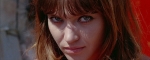
The Secret Sunshine cover is startling, in a great way...powerfully striking and delicate at once. Looking forward to seeing it. And I LOVE The Killing cover art.
-
mfunk9786

- Under Chris' Protection
- Joined: Fri May 16, 2008 8:43 pm
- Location: Miami, FL
Re: Criterion & Eclipse Cover Art & Packaging Babble-on Vol.
Every time there's a title I need to upgrade, I am excited but almost annoyed, in a way. Here comes If...!
-
Chance Hale

- Joined: Fri Nov 12, 2010 2:51 am
Re: Criterion & Eclipse Cover Art & Packaging Babble-on Vol.
The Cul-de-Sac artwork looks like the album cover of some shitty indie rock band. I haven't seen the film so does it tie into it well? Otherwise it looks stunningly amateurish. The "Secret Sunshine" art is my personal favorite this month.
-
Saturnome

- Joined: Sun Aug 12, 2007 9:22 pm
Re: Criterion & Eclipse Cover Art & Packaging Babble-on Vol.
I think it kind of fit the film's look, but that they went the wrong direction with it. I just see an iPod ad.
The Killing looks like a Polish poster, I like it.
The Killing looks like a Polish poster, I like it.
-
Murdoch
- Joined: Mon Apr 21, 2008 3:59 am
- Location: Upstate NY
Re: Criterion & Eclipse Cover Art & Packaging Babble-on Vol.
The wacky C over the Battle of Algiers title is annoying, makes me miss their old brand design