Page 1 of 4
So You Think You Can Design a Better Modern Times Cover?
Posted: Fri Aug 20, 2010 6:38 pm
by Matt
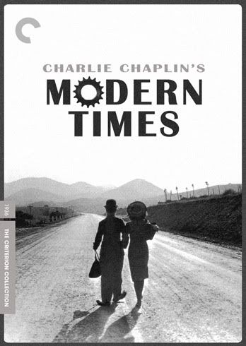
A couple of people have recently expressed mild reservations about the cover art for Criterion's forthcoming DVD and Blu-ray release of Charles Chaplin's
Modern Times. Here's your opportunity to see if you can create a fan cover that those people like better. Post them here, and we'll rip them apart or praise them as appropriate.
You should be able to find hundreds of images to use online, and those with the previous DVD release can get screen captures. If you need a Criterion template,
here's a .psd and
here's a .jpg. Have fun!
Memo to Sam Smith: This is all in good fun. Everybody loves your
House poster and cover. Just not the
Modern Times cover. But you see, we've been bagging on Criterion's DVD covers for years. It's not because we're petty and have nothing else to do. It's just that when Criterion does everything as well as they usually do, there's little to complain about
except for the covers. Okay, and color balance and aspect ratio and windowboxing and regrettable commentaries and... well, anyway. But now we'll put our money where our mouths are. We're all still going to buy
Modern Times even if we've already bought it twice before and you're still going to get paid and get more work from Criterion, so it's all good.
Re: So You Think You Can Design a Better Modern Times Cover?
Posted: Fri Aug 20, 2010 8:21 pm
by Cinephrenic

Image coming soon...

Re: So You Think You Can Design a Better Modern Times Cover?
Posted: Fri Aug 20, 2010 8:28 pm
by domino harvey
This thread just can't end well
Re: So You Think You Can Design a Better Modern Times Cover?
Posted: Fri Aug 20, 2010 8:31 pm
by swo17
Cinephrenic wrote:
Put the sprocket C in the upper left corner and then have a Beaton Chaplin* tinkering with it with a wrench. He's standing on the title.
*Though what the world really needs is a Beaton Keaton.
Re: So You Think You Can Design a Better Modern Times Cover?
Posted: Fri Aug 20, 2010 8:47 pm
by Steven H
Re: So You Think You Can Design a Better Modern Times Cover?
Posted: Fri Aug 20, 2010 8:48 pm
by TheGodfather
Yep, that`s the one. They have to release that. With the blu sticker not being a sticker but actually printed onto the cover
Re: So You Think You Can Design a Better Modern Times Cover?
Posted: Fri Aug 20, 2010 9:06 pm
by Murdoch
Suddenly the actual cover isn't looking all that bad - even though it's still awful.
Re: So You Think You Can Design a Better Modern Times Cover?
Posted: Fri Aug 20, 2010 9:06 pm
by domino harvey
Re: So You Think You Can Design a Better Modern Times Cover?
Posted: Fri Aug 20, 2010 9:48 pm
by Cinephrenic
Re: So You Think You Can Design a Better Modern Times Cover?
Posted: Fri Aug 20, 2010 10:03 pm
by knives
Nice one Domino, legitimately more interesting than the official one. Where did you find the art?
Re: So You Think You Can Design a Better Modern Times Cover?
Posted: Fri Aug 20, 2010 10:09 pm
by Cinephrenic
Nice cover, but the font is too modern. Helvetica?
Re: So You Think You Can Design a Better Modern Times Cover?
Posted: Fri Aug 20, 2010 10:11 pm
by Steven H
I like that cover too.
Here's the poster.
Re: So You Think You Can Design a Better Modern Times Cover?
Posted: Fri Aug 20, 2010 10:14 pm
by Arrow
This is a good idea, I hope the thread stays open for a few days, as I can't create a good one in a couple hours. I loved the theatrical release illustration poster that was on the site a while back, I think I'll try and draw a design from scratch.
Re: So You Think You Can Design a Better Modern Times Cover?
Posted: Fri Aug 20, 2010 11:22 pm
by domino harvey
Re: So You Think You Can Design a Better Modern Times Cover?
Posted: Fri Aug 20, 2010 11:41 pm
by cdnchris
I'm still obviously in the minority of being fine with their current cover, but I do have to admit it's odd that that image wasn't used as the basis.
Re: So You Think You Can Design a Better Modern Times Cover?
Posted: Sat Aug 21, 2010 12:15 am
by zitherstrings
To be fair this took me 12 minutes and it appears Smith only have 5-8 to do his.
Re: So You Think You Can Design a Better Modern Times Cover?
Posted: Sat Aug 21, 2010 12:55 am
by foofighters7

something like that with a little chaplin in the corner with a wrench on the C. a light grey background perhaps.
Re: So You Think You Can Design a Better Modern Times Cover?
Posted: Sat Aug 21, 2010 12:56 am
by godardslave
Re: So You Think You Can Design a Better Modern Times Cover?
Posted: Sat Aug 21, 2010 1:02 am
by foofighters7
kinda like a swimminghorses-gone-lazy. I like it.
Re: So You Think You Can Design a Better Modern Times Cover?
Posted: Sat Aug 21, 2010 1:54 am
by Highway 61
I really like your first cover Domino, but I wonder if the darker blue seen in the poster would be more powerful.
Re: So You Think You Can Design a Better Modern Times Cover?
Posted: Sat Aug 21, 2010 3:26 am
by Alphonse Doinel
I actually don't hate Sam's cover that much, but thought this would be fun so what the hell...

Re: So You Think You Can Design a Better Modern Times Cover?
Posted: Sat Aug 21, 2010 4:18 am
by godardslave
Alphonse Doinel wrote:
I like this one.
This is officially 27 times better than Criterion's cover.
Re: So You Think You Can Design a Better Modern Times Cover?
Posted: Sat Aug 21, 2010 4:33 am
by dad1153
Alphonse Doinel wrote:
IT'S A WINNAH! 
Re: So You Think You Can Design a Better Modern Times Cover?
Posted: Sat Aug 21, 2010 4:49 am
by movielocke
everything in this thread is crap so far. The real cover is much better.
Re: So You Think You Can Design a Better Modern Times Cover?
Posted: Sat Aug 21, 2010 4:53 am
by mfunk9786
False.


