Page 1 of 4
Posted: Mon Oct 23, 2006 8:14 pm
by Gordon
Is the typeface used for the opening titles in a film a important contribution to the film's value? Maybe it is just me, but sometimes I drawn into a film more strongly if the typeface of the opening titles is striking. I am somewhat obsessed with typeface, typesetting, color of type, etc generally, but in some films - even films I have a deep appreciation for - the typeface irritates me - Roeg's
Don't Look Now is probably the best example, what an awful selection; that neon blue - and in
capitals to boot! Bizarre. Unlike literature, title design in Cinema is not really about readability. In the Silent days and through to the late 50s, American and European films had very ornate and often clumsy opening title designs that filled the screen, some of which are works of art in themselves, but goodness knows who designed them - why is it that everyone these days gets a credit except the title designer? Irony! Maybe it's tucked away - after "window-cleaner" or something.
Aldo Novarese (1920-1995) and Alessandro Butti's
Microgramma, created in 1952, later developed into Eurostile is a wonderful and enduring typeface. It was used for the original
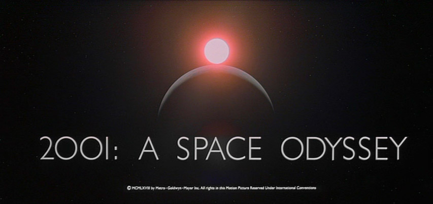
Star Trek series, Kubrick's,
2001 and Robert Wise's,
The Andromeda Strain utilised it, as did many sci-fi films, as memory serves. Novarese's
Stop was also used in many sci-fi films:

Sci-fi and horror films of the 60s through to the early 80s often have very beautiful titles - the opening credits to
Alien are among my favourites, as is
Close Encounters of the Third Kind.
Sense of Cinema article on retro titles in modern movies
Excellent article on anachronistic typefaces in movies
And another
Extensive study of movie fonts, 1955-1965 (skip to the conclusion for some fine insight by Emily King)
Sergio Leone's films, of course, have striking, highly memorable title designs; in
The Good, the Bad and the Ugly, I love the way they 'blow' away to make for the next after the gunshots, with Morricone's immortal score twanging away on the soundtrack - a highpoint in title design, no question. The early
James Bond titles were - and still are - extraordinary, but they soon became overdone. As for TV, Terry Gilliam's opening sequence to
Monty Python's Flying Circus remain dear to hearts of millions
There is another interesting case: films which
have no opening titles.
Citizen Kane is the earliest example of a mainstream film to have no real credits (bar "A Mercury Production / By Orson Welles") just that bold
CITIZEN KANE fillling the Academy frame - from the get-go, this is a film of supreme control and fastidious design. Later,
The Godfather and
Star Wars would begin in the same fashion and it is now not so striking for a film to commence in such a manner.
Lastly:
Saul Bass (let the images do the talking)
Posted: Mon Oct 23, 2006 8:35 pm
by Michael Kerpan
Typography is especially important when dealing with the intertitles of silent films. Nothing is more disruptive than new intertitles (supplanting old ones) that are typographically out of sync with the rest of the film (and often ugly, too).
Posted: Mon Oct 23, 2006 8:36 pm
by rumz
Wonderful thread!
Yes, the type used in a film's opening/closing titles and marketing ephemera contribute immeasurably to my appreciation of a film. But that's a quirk I don't share with many. What irks me the most is how type's utility as a branding device in film is so often ignored. Specifically, a film's poster and trailer will be strewn in one type treatment, and another is used in the title credits. I
hate that.
And regarding type, many period films use it inadequately. A predominant example is the
Chicago typeface, designed for use in low resolutions for Macintosh computers in the 1980s.
Further reading:
Typecasting
Son of Typecasting
Posted: Mon Oct 23, 2006 9:56 pm
by Gregory
I hope this rant isn't too off-topic, but I see "Distressed" typefaces used way too often. I thought this would be on its way out five or six years ago but, like most bad trends, it just keeps going.
Another of my pet peeves is "Se7en," "Numb3rs" and the like. This may have been original back when Journey did it, but now it's so common as to be increasingly annoying. Why more and more people are making their movie titles (and so on) to look like e-mail spam is something I don't understand. I associate it with internet slang, which I've noticed some students even use occasionally in papers and essays. It seems the whole point of this way of writing would not be to look like a moron but rather to save effort. Yet I've seen people write "n.e. one" instead of "anyone," which actually adds keystrokes. How long this way of writing starts becoming common in movie and TV show titles is anyone's guess.
I realize these pet peeves might make me appear pedantic to some. Oh well.
Posted: Mon Oct 23, 2006 10:36 pm
by Cinesimilitude
Let's not forget Star Wars. The typography of the opening sequences is universally recognized. I think main titles are very important because they are what we base our first impression on. they stylistically bring us into the world that we are supposed to believe in for the next few hours.
Posted: Mon Oct 23, 2006 10:41 pm
by Subbuteo
SncDthMnky wrote:they stylistically bring us into the world that we are supposed to believe in for the next few hours.

Posted: Mon Oct 23, 2006 10:48 pm
by Gordon
rumz wrote:What irks me the most is how type's utility as a branding device in film is so often ignored. Specifically, a film's poster and trailer will be strewn in one type treatment, and another is used in the title credits. I hate that.
Oh, god yes - I hate that, too, though I can't think of any examples of the top of my head, as it is almost bedtime (that's when I'm a pirate).
"Chicago" was a terrible font - the spaces between letters was too wide between certain letter sequences. There's a few cheap-and-nasty fonts like that - avoid!
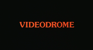
I like the typeface for
Videodrome:
I generally don't like serifs, but in the late-70s and early 80s, a few movies had some quite pleasing types.
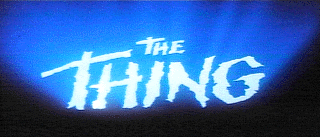
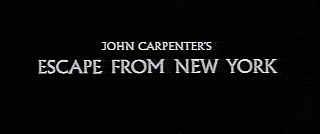
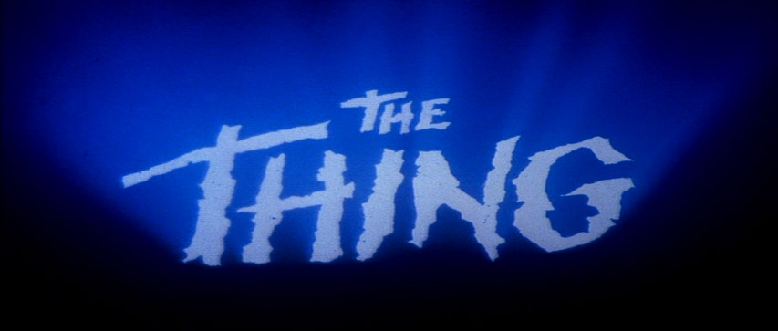
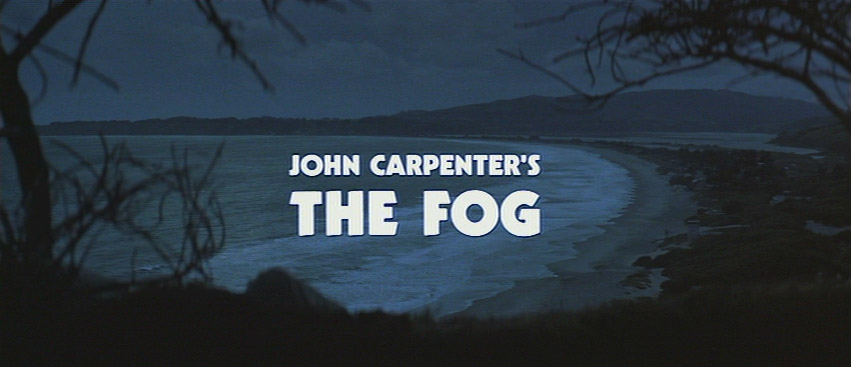
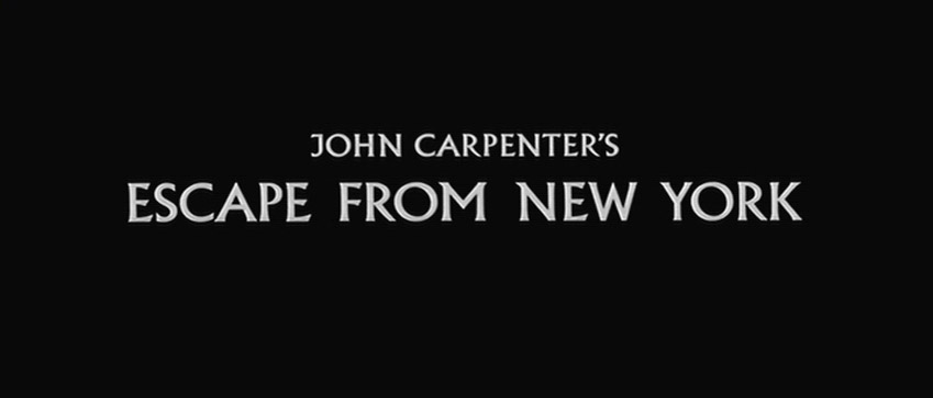
John Carpenter's,
The Thing has a brilliant title sequence, set to Morricone's creepy music:
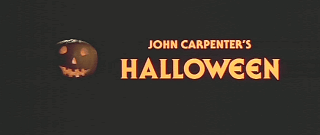
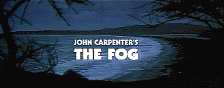
The fonts used in Carpenter's films are consistently stylish:

Kubrick, also maintained great style in his types from
2001 onwards. His fastidiousness in regard to such is legendary, of course. He hated serif fonts.
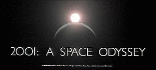
Beautiful, highly approriate font - not Microgramma by Novarese-Butti, though; that type was used for the instructions for the zero-gravity toilet,
Discovery controls, etc.
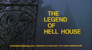
The Shining
is purposely bland and the sudden punch of the random days "TUESDAY" are very striking - a similar technique was used in Richard Matheson and John Hough's brilliant
The Legend of Hell House (1973).
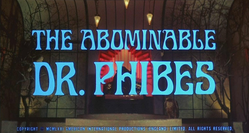
Roger Corman's Poe films have exquisite title sequences, I feel, especially...
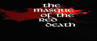 The Abominable Dr Phibes
 and its sequel have wonderful types:
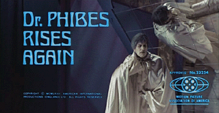
Edwardian script fonts are seldom used on non-historical films, but it was appropriate for this film:
Great stuff!
Posted: Mon Oct 23, 2006 11:06 pm
by Gordon
Gregory wrote:I hope this rant isn't too off-topic, but I see "Distressed" typefaces used way too often. I thought this would be on its way out five or six years ago but, like most bad trends, it just keeps going.
Another of my pet peeves is "Se7en," "Numb3rs" and the like.
Ugh, don't get me started.

Posted: Tue Oct 24, 2006 3:01 am
by portnoy
I wish I had access to my favorite retro title in recent memory, the title graphics for Hustle & Flow - a freeze frame of a white prostitute with huge yellow blaxploitation lettering (and the words (c) 2005 Crunk Films below it).
Truly underrated movie, that. Termite art in the best possible sense.
Posted: Tue Oct 24, 2006 5:36 am
by bufordsharkley
I've always thought the style of title credits on
Five Easy Pieces and
Easy Rider was one of the most satisfying.
Wes Anderson has been doing some great title work in recent years (Bottle Rocket is a particular high point, and he does Kubrick an honor, with his beautiful use of Futura.)
Bad screen titles can be a real turn-off. I was considering watching the TV movie
Empire Falls the summer before last, but was so repulsed with the opening credits that I decided against it. (Aesthetics are aesthetics.)
Another low point-- Topaz:
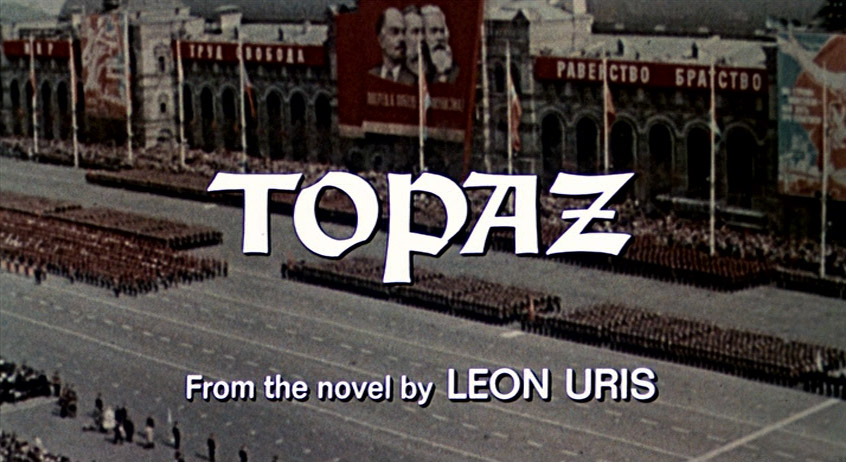
The "Topaz" font itself isn't too bad, but the font for the remainder of the credits is abysmal. (And the technology used to impose it over the images has worn terribly-- it strikes the eyes as something you'd see in a 1980s TV news weather update.)
Posted: Tue Oct 24, 2006 6:28 am
by Polybius
Gregory wrote: This may have been original back when Journey did it [...]
This is the first time that sentence has ever been written.

Posted: Tue Oct 24, 2006 7:57 am
by accatone
As far as typografie is my profession - i like this thread!
If there is a specific style in Godard, it has to be quotations, spoken and/or written on the screen. What is special about him, is the fact that he not just uses the type as an decaorative or stylistic aspect (like you "may" use it for a movie poster…) but integrates it in a wider form of "story"telling - that is his dialectical way…
The range of types he is using is pretty small, but then, like with the motion pictures in general, it is not just the image but what it stands for…
Posted: Tue Oct 24, 2006 8:23 am
by Ledos
Gregory wrote:Another of my pet peeves is "Se7en," "Numb3rs" and the like. This may have been original back when Journey did it, but now it's so common as to be increasingly annoying.
Not to mention, it makes the titles almost impossible to pronounce. "Se-seven-en"? "Numb-three-rs"? Even when saying it carefully, the ticket sales person at the theater just looked awkwardly at me.
Posted: Tue Oct 24, 2006 10:02 am
by Tommaso
Typefaces may well be used as a signature mark for a director, as well. I think of Jacques Rivette, for example. Almost all his films have the credits in the same typeface, on a simple black background.
Posted: Tue Oct 24, 2006 10:18 am
by Miguel
Tommaso wrote:Almost all his films have the credits in the same typeface, on a simple black background.
So do most of Woody Allen's films.
Posted: Tue Oct 24, 2006 10:46 am
by Dylan
Brilliantly simplistic.
And my personal favorite typeface:
Anybody know a place online where I can download that particular "circus" font?
As far as opening title sequences go, I've always loved them, even as a little kid (I remember being nine years old or so and getting ecstatic over the opening titles for "Beetlejuice"...that wonderful music and the fact that the town we're hovering above ends up being a model really floored me back then...still does).
I'm a big fan of Saul Bass, and he was definitely the master..."Seconds," "The Age of Innocence," "Vertigo"...absolutely amazing. Otto Preminger's films always begin with Bass titles, as one can see on the wonderful notcoming article.
Bertolucci's "The Last Emperor" and "The Dreamers" have great title sequences, as do Jeunet's "Delicatessen" and "Amelie," and the mournful font of the front titles of "A Very Long Engagement" (which are illuminated by the flashlight, causing shadows of the titles to be cast over the damp cement wall in the background).
Posted: Tue Oct 24, 2006 12:10 pm
by Michael
I really love the title sequence of Cleo from 5 to 7. How the letters and numbers (block typeface?) are placed on and next to the tarot cards being spread out over the rug-covered table. Very beautiful.
And lets not forget the sublime title sequence of Wings of Desire.
Posted: Tue Oct 24, 2006 12:32 pm
by Gordon
Miguel wrote:Tommaso wrote:Almost all his [Jacques Rivette] films have the credits in the same typeface, on a simple black background.
So do most of Woody Allen's films.
As did Bergman from, I believe,
Wild Strawberries through to...? Many of his films from the 60s have an identical, or near identical font. Austere, white-on-black - always a good choice for a drama.
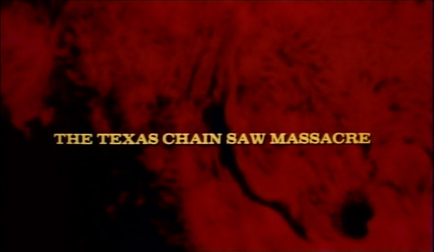
The title sequence for the original
Texas Chainsaw Massacre is still very effective and impressive for a LOW-budget film; the raging sunspots, processed to look like blood, accompanied by Wayne Bell and Hooper's unnerving soundscapes and the rudimentary capitalized titles all combine to create great tension - then there's that infamous opening shot!
Title sequence in Asian and Cyrilic-text films of the 60s and 70s have an exotic appeal, though they were often done cheaply.
The Vikings (1958) has a wonderful mock Bayeau Tapestry title sequence, created by the company responsible for the
Mr Magoo cartoons.
Posted: Tue Oct 24, 2006 12:51 pm
by portnoy
One of my favorite credit sequences/title aesthetics, in what may be my absolute favorite film:
Posted: Tue Oct 24, 2006 1:50 pm
by Lino
Special mention must also go to the opening title sequence (and font) of Wild At Heart. I will never forget the impact it caused me when I watched it for the first time -- in the theatre, no less.
Posted: Tue Oct 24, 2006 1:54 pm
by Gordon
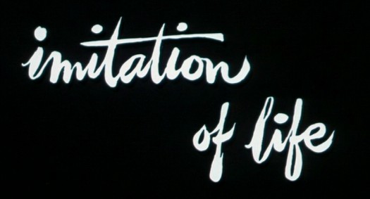
Yes, Sirk's color films have gorgeous titles.
Powell & Pressburger's...

...has a amazing title sequence. I think that when a strange or fantastical world is at the centre
of a film, the opening titles are important, as if one were opening a fairy tale book.
Posted: Tue Oct 24, 2006 2:07 pm
by Michael
Special mention must also go to the opening title sequence (and font) of Wild At Heart. I will never forget the impact it caused me when I watched it for the first time -- in the theatre, no less.
I always get this strange, indescribable feeling every time the blue velvet drapes open and close
Blue Velvet.
Posted: Tue Oct 24, 2006 2:10 pm
by Gordon
Lynch, unexpectedly, always produces imaginative title sequences.
Wild at Heart's is still very impressive.
Most of Peckinpah's films, from
The Wild Bunch thru
Cross of Iron have brilliant opening sequences and title fonts. Walter Hill, great inspired by Peckinpah in his approach to action sequence, also follows his lead with titles sequences -
The Warriors and
Southern Comfort especially, have highly distinctive and absorbing openings.
RE: Hitchcock's
Topaz
Yes, the main titles are ghastly - the same is true of all if Hitch's later workk, especially
Frenzy, yeuch!
Something else worth noting, is that many huge-budget, 'prestige' films of the late 60s and 70s had some godawful cheapshit optical titles -
Patton's and
Papillon's (both by Franklin J. Shaffner) both have that clunky, capitalized, white TV-movie font (as used on
Columbo) that aren't steady on the frame (optical printer wobble) and initially give the impression of a low-budget film, though they were anything but.
Posted: Tue Oct 24, 2006 2:31 pm
by Michael
I wrote:
I really love the title sequence of Cleo from 5 to 7. How the letters and numbers (block typeface?) are placed on and next to the tarot cards being spread out over the rug-covered table. Very beautiful.
This just came to my mind.
Cleo's typeface/font looks exactly like
The Royal Tenenbaums'. Futura then.
Posted: Tue Oct 24, 2006 2:34 pm
by Miguel
Gordon wrote:Lynch, unexpectedly, always produces imaginative title sequences.
Very true. I will never forget the opening of
Lost Highway, the camera nervously gliding over the highway accompanied by David Bowie. Perfect way to set the mood.

Exception to the rule must be
Twin Peaks, with its horrible title font and color. I never much cared for the opening sequence apart from Badalamenti's score.


