I think the May covers are absolutely, uniformly excellent. I don't think any covers since the beginning of the new "wacky C" era have looked this good.
I like them all, but have to agree with the person who mentioned the CC "Army of Shadows" artwork in relation to MS Paintbox. That made me laugh. On the same point, the simplicity of the BFI cover -- as a friend would say -- totally owns.
That Overlord cover keeps bugging me more and more. I hate the eyeball on there! The Army of Shadows cover is way too weak for me. I was hoping for something like Cercle Rouge's cover flair or at least something more imaginative.
Maybe it's just me, but it seems like this thread is devolving into an outlet for people to express just how much they hate the new cover artwork. Sure, there will be some people who express that they like a certain cover art, but the majority of responses deals with how the cover art generally stinks. Ever since the "wacky C" showed up (with which I personally have no beef), there have only been a couple that I didn't like (I wasn't so thrilled that the releases in March and April will be, for the most part, black and white), but even the ones that aren't my favorites I don't hate. I'll probably get flamed for this post, but I don't care. Maybe my opinions amount to little more than "can't we all just get along," but in my mind, even the ones that are lacking have their benefits. Even (gasp!) the cover for Bicycle Thieves.
Being such a borderline useless thread anyhow I don't see why someone can't voice their distaste. I happen to like the new trendy C and think they've done some fantastic work recently, but this month stands out as being the worst-- I don't think it's even that subjective, there's a noticeable lack of concern towards the compositions and the visual elements used (the text in particular) are put to poor use. Even from a marketing standpoint these covers look they'd recede on store shelves rather than jump out. But I don't want to say anymore because at least Sansho and Army of Shadows look tentative.
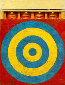
edit: if anyone care's to look here is a quick one I made for Army of Shadows.
We complain because we're going to buy the dvds anyway. Plus, criterion really has spoiled us with their usual box art. MGM, for example, consistenly puts out terrible box-art. But nobody's going to flame you, mrschroeder1982... why would they?
I think we just hold criterion to a higher standard. Whether that's justified or not, given that we're supposedly all criterion whores because of the actual movies, rather than the box-art, I'll leave up to you. As someone suggested earlier, criterion has kinda spoiled us. Besides, all the griping doesn't change the fact that plenty of us will be buying Army of Shadows sometime in May.
At least there was nothing that even approached the horror that is the Border Radio cover.
Army of Shadows really isn't bothering me as much as it should, though the font and color of the text is awful. For me, the biggest disappointment is The Third Man. Looked great when I first saw it, but every time I see it, it gets weaker and weaker.
Overlord is the most unprofessional looking cover on the coming soon page atm.
jon wrote:At least there was nothing that even approached the horror that is the Border Radio cover.
I found it less horrible in real life. I guess the metalic green didn't come to justice on the web. The disc graphics are working better than any other wacky-c release so far.
All the the covers are fine... the films way more important. Nice momentum going CC! Now for Night on Earth, Berlin Alexanderplatz, and My Dinner With Andre - ahhh.
I was hoping they were going to cobble together a more literal translation with the two cronies and Welles/Lime behind them pointing at himself and winking.
So... raise your hand if you think Criterion is NOT announcing the next Eclipse series at the same time they announce the next batch of Criterion titles just to perplex those of us who post here.


