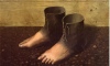
Wow, that was the first impression I had in mind when I saw it. Afterall, the designer might have had that in mind while designing it. Goya was a Spanish painter.late Goyaesque manner
Criterion & Eclipse Cover Art & Packaging Babble-on Vol.3
-
Cinephrenic

- Joined: Tue Nov 02, 2004 6:58 pm
- Location: Paris, Texas
-
portnoy
- Joined: Sat Apr 01, 2006 3:03 pm
-
Pinakotheca

- Joined: Mon Oct 23, 2006 6:49 pm
I'm sorry but this doesn't make any sense to me. The Cria cover says nothing what so ever about the film. How does it make you want to check it out? Because the design is good? No offense. I'm just surprised so many people like this cover.DRSchwarz wrote:For what's it's worth, I think both covers are great. I've never seen either of the films but these covers make me interested in checking them out, which is what I think a good cover should do.
-
domino harvey

- Dot Com Dom
- Joined: Wed Jan 11, 2006 6:42 pm

-
Cinephrenic
- Joined: Tue Nov 02, 2004 6:58 pm
- Location: Paris, Texas
I was referring to the design itself, not appropriateness to the film.Yeah, and Antonio Gaudi was a Spanish architect, but putting up a picture of La Pedrera would've been inappropriate too.
I'm not saying it's not an aesthetically interesting cover, but everything about it seems to contrast heavily with the actual form and content of the film itself.
-
DRSchwarz

- Joined: Thu Nov 03, 2005 11:18 pm
- Location: Los Angeles
Pinakotheca wrote: How does it make you want to check it out? Because the design is good? No offense. I'm just surprised so many people like this cover.
Yes, the reason I do want to check it out is because I like the design (and don't worry, I take no offense for liking the cover). Maybe the cover doesn't directly relate to the film itself (I don't know, I haven't seen the movie) but like I said before, it does make me curious about the film underneath. If it turns out, that when I finally do see the movie and if I enjoy it, I seriously doubt that I'm going to like the film any less because the cover doesn't exactly match the film inside. At that point, I'd just be happy I saw a great movie.
-
jt

- Joined: Thu Nov 30, 2006 1:47 pm
- Location: zurich
I don't get the Cria cover at all. I personally find it messy and don't like it but I appreciate that beauty is in the eye of the beholder and all that.
It seems that it is liked by enough people on this board that it has just about done its secondary job of looking good on the shelves of the CC fanatics who were going to buy it anyway, regardless of what the cover looks like.
What I do think it will fail at though is its primary purpose, ie. to make people in a store pick it up and buy it. I'd guess that about 30% of casual buyers won't even hold this in their hand for long enough to read the title because of its crappy font.
-
Jem

- Joined: Mon May 02, 2005 3:03 am
- Location: Potts Point
-
domino harvey
- Dot Com Dom
- Joined: Wed Jan 11, 2006 6:42 pm
I don't even know how to argue with someone who thinks this, but I would say you should probably walk through the art/culture magazine section at your local newsstand to see how far off the path you are.jt wrote:What I do think it will fail at though is its primary purpose, ie. to make people in a store pick it up and buy it. I'd guess that about 30% of casual buyers won't even hold this in their hand for long enough to read the title because of its crappy font.


-
rebelswede
- Joined: Sun Oct 15, 2006 8:52 pm
- Location: on the factory floor
-
justeleblanc

- Joined: Wed Nov 03, 2004 10:05 pm
- Location: Connecticut
-
thechallenger

- Joined: Mon Apr 23, 2007 4:56 pm
- Location: New York
-
justeleblanc
- Joined: Wed Nov 03, 2004 10:05 pm
- Location: Connecticut
-
Matt

- Joined: Tue Nov 02, 2004 4:58 pm
-
domino harvey
- Dot Com Dom
- Joined: Wed Jan 11, 2006 6:42 pm
-
Lino

- Joined: Wed Nov 03, 2004 10:18 am
- Location: Sitting End
- Contact:
-
denti alligator

- Joined: Thu Nov 04, 2004 1:36 am
- Location: "born in heaven, raised in hell"
-
Cinesimilitude
- Joined: Tue Jul 09, 2013 4:43 am
-
Cinephrenic
- Joined: Tue Nov 02, 2004 6:58 pm
- Location: Paris, Texas