Masc Fem should be in a white case as well?SncDthMnky wrote:PS. My Une Femme Est Une Femme came in a black case(over a year ago in one of the DDD sales) but I swapped it into a white one from my collection, same with masculin feminin, and they both look great in them.
Criterion & Eclipse Cover Art & Packaging Babble-on Vol.3
-
justeleblanc

- Joined: Wed Nov 03, 2004 10:05 pm
- Location: Connecticut
-
Cinesimilitude
- Joined: Tue Jul 09, 2013 4:43 am
No no, I just changed it to a white case cause I thought it looked better. there aren't many criterions I own with white covers, but the ones that do, I have put in white cases, If I can ever find a double amaray that is white for Contempt, I will swap it as well. I'm fairly certain that Masc Fem, by criterions packaging plans, comes in a black amaray, as mine was purchased from amazon as a pre-order and thy wouldn't run out of their intended color on pre-orders. Not to mention the fact that I don't think it even matters. amaray cases aren't unique in any way, with the exception that some companies have their logo printed inside such as blockbuster and white wii game cases. Now if criterion started putting the wacky c melted into the plastic below the discs of their intended amaray cases... I've gone too far, shutting up now.justeleblanc wrote:Masc Fem should be in a white case as well?
-
Gigi M.

- Joined: Wed Jul 06, 2005 9:09 pm
- Location: Santo Domingo, Dominican Rep
From http://www.dreamlogic.net
[quote]“As with their Antoine Doinel Box set, each disc in the Teshigahara collection is housed in its own slim, paper digipack case, which in turn is stored in a thicker collection box, whose cover art features an large embossed image of a fingerprint, fully keeping with the sense of mystery found in each film.â€
[quote]“As with their Antoine Doinel Box set, each disc in the Teshigahara collection is housed in its own slim, paper digipack case, which in turn is stored in a thicker collection box, whose cover art features an large embossed image of a fingerprint, fully keeping with the sense of mystery found in each film.â€
-
domino harvey

- Dot Com Dom
- Joined: Wed Jan 11, 2006 6:42 pm

-
Cinesimilitude
- Joined: Tue Jul 09, 2013 4:43 am
-
patrick
- Joined: Sun Mar 11, 2007 4:15 pm
- Location: Philadelphia
Forgive me if this has been discussed in one of the older incarnations of this thread, but has it ever been mentioned if Criterion is ever going to start redoing the cover art on their older titles to match the new "wacky C" format? Obviously the reissues of older titles have gotten this treatment, but can we ever expect to see, say, The Life Aquatic with the new cover art format but no change in the disc itself?
-
Cinesimilitude
- Joined: Tue Jul 09, 2013 4:43 am
-
Highway 61

- Joined: Mon Nov 08, 2004 8:40 pm
-
Jeff

- Joined: Wed Nov 03, 2004 1:49 am
- Location: Denver, CO
I believe those two are actually the only ones -- Insomnia because it was being produced at the time of the changeover, and The Lady Vanishes to match the other titles in the Hitchcock box.Highway 61 wrote:Some did. I've seen The Lady Vanishes and Insomnia in the second style plenty of times on store shelves. There are others, but nothing is coming to mind.
-
zedz

- Joined: Sun Nov 07, 2004 11:24 pm
"Collector's boxes" are an exception to this rule, I believe. The Samurai trilogy covers got updated, at any rate. Maybe somebody else can verify re. the Adaptations and Olivier sets.Jeff wrote:I believe those two are actually the only ones -- Insomnia because it was being produced at the time of the changeover, and The Lady Vanishes to match the other titles in the Hitchcock box.Highway 61 wrote:Some did. I've seen The Lady Vanishes and Insomnia in the second style plenty of times on store shelves. There are others, but nothing is coming to mind.
-
Musashi219

- Joined: Wed Dec 07, 2005 12:19 am
- Location: Chicago, IL
I have the Adaptations and Olivier sets and they never changed styles. Adaptations are all first style and Henry V is the only first style in the Olivier set.zedz wrote:"Collector's boxes" are an exception to this rule, I believe. The Samurai trilogy covers got updated, at any rate. Maybe somebody else can verify re. the Adaptations and Olivier sets.Jeff wrote:I believe those two are actually the only ones -- Insomnia because it was being produced at the time of the changeover, and The Lady Vanishes to match the other titles in the Hitchcock box.
-
pmunger
- Joined: Wed Nov 03, 2004 11:48 am
- Location: Montreal, Canada
Light change of opacity on The Milky Way cover.
-
tavernier

- Joined: Sat Apr 02, 2005 11:18 pm
My Olivier set has all 3 films in the first style....they were all released long before the wacky C came around.Musashi219 wrote:I have the Adaptations and Olivier sets and they never changed styles. Adaptations are all first style and Henry V is the only first style in the Olivier set.zedz wrote:"Collector's boxes" are an exception to this rule, I believe. The Samurai trilogy covers got updated, at any rate. Maybe somebody else can verify re. the Adaptations and Olivier sets.Jeff wrote:I believe those two are actually the only ones -- Insomnia because it was being produced at the time of the changeover, and The Lady Vanishes to match the other titles in the Hitchcock box.
-
Matt

- Joined: Tue Nov 02, 2004 4:58 pm
It appears they keep trying to "improve" this cover. Might I suggest, as an improvement, the addition of gasoline and a match?pmunger wrote:Light change of opacity on The Milky Way cover.
-
domino harvey
- Dot Com Dom
- Joined: Wed Jan 11, 2006 6:42 pm
deck chairs, Titanicpmunger wrote:Light change of opacity on The Milky Way cover.
-
Michael Kerpan

- Spelling Bee Champeen
- Joined: Wed Nov 03, 2004 5:20 pm
- Location: New England
- Contact:
Good suggestion. Truly ugly -- yet there are many extraordinary images to work with in this film: For instance, I think this frame could have served as the foundation for a much more striking cover:Matt wrote:It appears they keep trying to "improve" this cover. Might I suggest, as an improvement, the addition of gasoline and a match?pmunger wrote:Light change of opacity on The Milky Way cover.
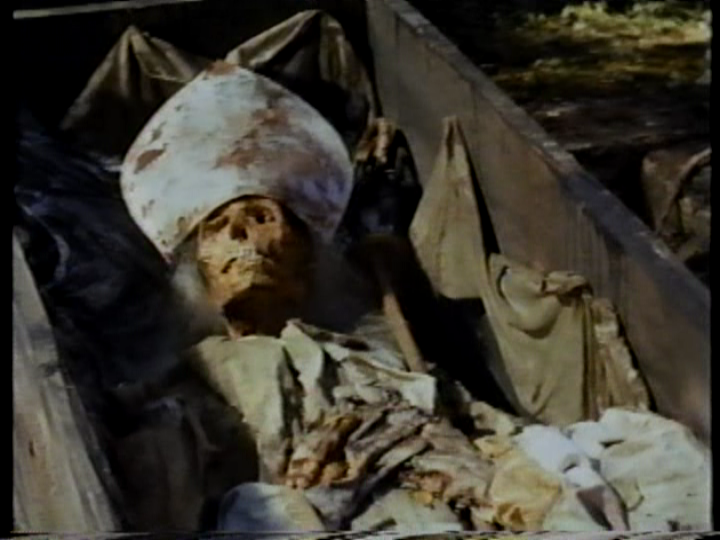
;~}
-
zedz
- Joined: Sun Nov 07, 2004 11:24 pm
-
tavernier
- Joined: Sat Apr 02, 2005 11:18 pm
No, as mentioned above, Henry is the first style and the other two are the second style. I wasn't differentiating between those two styles since they're so negligibly different, at least in comparison with the wacky C.zedz wrote:Rather than have this run and run, if all the Olivier spines are the same style, then the H V cover has been updated, confirming that they update for collectors' sets. Will they 'Wacky C' old titles in future sets? Don't know; don't care.
-
zedz
- Joined: Sun Nov 07, 2004 11:24 pm
-
dadaistnun
- Joined: Thu Nov 04, 2004 12:31 pm
Eric Skillman's latest blog.
I haven't seen the movie in a while, but every design variation he came up with (with one notable, obvious exception) really capture the mood quite well. Even though I understand why Kerrigan & Kim Hendrickson vetoed the first three from a marketing standpoint, there's no denying their disturbing value.
I haven't seen the movie in a while, but every design variation he came up with (with one notable, obvious exception) really capture the mood quite well. Even though I understand why Kerrigan & Kim Hendrickson vetoed the first three from a marketing standpoint, there's no denying their disturbing value.
-
godardslave

- Joined: Tue Nov 02, 2004 8:44 pm
- Location: Confusing and open ended = high art.
i think this one is better than the final cover that was chosen.
Im just an "abstraction" kind of person.
the font is nice too.
And big heads/faces on dvd covers are just too obvious and boring.
Im just an "abstraction" kind of person.
the font is nice too.
And big heads/faces on dvd covers are just too obvious and boring.