Criterion & Eclipse Cover Art & Packaging Babble-on Vol.3

News on Criterion and Janus Films
Locked
Message
Author
Cinesimilitude
Joined: Tue Jul 09, 2013 4:43 am

#726 Post by Cinesimilitude »

I like how there are so many, I would hope that one day we(the forum or just fans of criterion in general) get to be influential in the choosing of a dvd's cover (by way of a vote or something, as opposed to incessant bitching until the thing is changed).
User avatar
justeleblanc
Joined: Wed Nov 03, 2004 10:05 pm
Location: Connecticut

#727 Post by justeleblanc »

godardslave wrote:i think this one is better than the final cover that was chosen.

Im just an "abstraction" kind of person.
the font is nice too.
And big heads/faces on dvd covers are just too obvious and boring.
It reminds me of Dr Mabuse.
User avatar
Jeff
Joined: Wed Nov 03, 2004 1:49 am
Location: Denver, CO

#728 Post by Jeff »

Image
User avatar
Tribe
The Bastard Spawn of Hank Williams
Joined: Tue Nov 02, 2004 11:59 pm
Location: Toledo, Ohio
Contact:

#729 Post by Tribe »

That is so cool!

Tribe
User avatar
a.khan
Joined: Sat May 20, 2006 7:28 am
Location: Los Angeles

#730 Post by a.khan »

I want that huge Wacky-C Turban Kirk is wearing on the disc. Does the Criterion Store sell it?
User avatar
LightBulbFilm
Joined: Wed Nov 16, 2005 9:11 pm
Location: Florida
Contact:

#731 Post by LightBulbFilm »

I absolutely hate these damned figure-8 packs. I miss the old days.
User avatar
Awesome Welles
Joined: Fri Apr 27, 2007 10:02 am
Location: London

#732 Post by Awesome Welles »

LightBulbFilm wrote:I absolutely hate these damned figure-8 packs. I miss the old days.
I must agree, they're a pain in the butt. I think the reason is they must be cheaper. I tried cramming my Hands Over the City discs and booklet into my own 2 disc tray Amaray case and they wouldn't fit. I guess the wider cases cost more money and the figure 8's take up less room. Shame.
User avatar
Mr Pixies
Joined: Sun Nov 07, 2004 2:03 am
Location: Fla

#733 Post by Mr Pixies »

FSimeoni wrote:
LightBulbFilm wrote:I absolutely hate these damned figure-8 packs. I miss the old days.
I must agree, they're a pain in the butt. I think the reason is they must be cheaper. I tried cramming my Hands Over the City discs and booklet into my own 2 disc tray Amaray case and they wouldn't fit. I guess the wider cases cost more money and the figure 8's take up less room. Shame.
I assumed that they don't make clear double thick keep cases, so they're sticking with the figure 8's till they make something better in clear cases. I think the figure 8's suck too, hope something better comes along...
patrick
Joined: Sun Mar 11, 2007 4:15 pm
Location: Philadelphia

#734 Post by patrick »

I kind of assume the clear figure-8 cases were also probably due to some sort of branding effort, since no one else seems to use them and I've never seen similar cases for sale. I honestly don't mind them that much, and I like that they save a little space.
User avatar
Buttery Jeb
Just in it for the game.
Joined: Wed Nov 03, 2004 2:55 am

#735 Post by Buttery Jeb »

Image Image
Image Image
User avatar
denti alligator
Joined: Thu Nov 04, 2004 1:36 am
Location: "born in heaven, raised in hell"

#736 Post by denti alligator »

The Breathless cover strikes me as a daring failure.
User avatar
domino harvey
Dot Com Dom
Joined: Wed Jan 11, 2006 6:42 pm

#737 Post by domino harvey »

how could they blow Breathless so spectacularly
User avatar
CSM126
Joined: Thu Nov 04, 2004 12:22 pm
Location: The Room
Contact:

#738 Post by CSM126 »

I actually like the Breathless cover. I don't know why, exactly, but it put a smirk on my face.
User avatar
domino harvey
Dot Com Dom
Joined: Wed Jan 11, 2006 6:42 pm

#739 Post by domino harvey »

unless it's a box and that's the slipcase that you remove to see the real cover, and even then, it's an insult
User avatar
Gigi M.
Joined: Wed Jul 06, 2005 9:09 pm
Location: Santo Domingo, Dominican Rep

#740 Post by Gigi M. »

What a let down...
and where the hell is Salo?
User avatar
CSM126
Joined: Thu Nov 04, 2004 12:22 pm
Location: The Room
Contact:

#741 Post by CSM126 »

Gigi M. wrote:and where the hell is Salo?
December?
User avatar
Alonzo the Armless
Joined: Thu Nov 04, 2004 12:57 am

#742 Post by Alonzo the Armless »

The cover for Breathless looks like a lazy and dull graphic design.

I'm not crazy about the 2 panel breakup of Under the Volcano. I'm not sure the skull is even needed.

Mala Noche looks great.
User avatar
domino harvey
Dot Com Dom
Joined: Wed Jan 11, 2006 6:42 pm

#743 Post by domino harvey »

these are all pretty bad really but on the plus side, the guy who designed the Milky Way cover is suddenly walking a little taller
User avatar
CSM126
Joined: Thu Nov 04, 2004 12:22 pm
Location: The Room
Contact:

#744 Post by CSM126 »

domino harvey wrote:these are all pretty bad really but on the plus side, the guy who designed the Milky Way cover is suddenly walking a little taller
"a little taller" equalling "slightly less stooped than the second guy from the left on the evolution of man chart".
Cameron
Joined: Thu Jul 27, 2006 6:01 pm

#745 Post by Cameron »

Mala Noche and Under the Volcano are both pretty bad but Breathless...
I'm so shocked. I think I may actually love it.
User avatar
domino harvey
Dot Com Dom
Joined: Wed Jan 11, 2006 6:42 pm

#746 Post by domino harvey »

Criterion's graphic arts department must've lost a bet
User avatar
Mr Pixies
Joined: Sun Nov 07, 2004 2:03 am
Location: Fla

#747 Post by Mr Pixies »

If they make the logo translucent and lighter, then the Breathless cover would be greater, though I like it, the logo just intrudes too much.

I really like the Under the Volcano cover, too. Mala Noche is ok, looking forward to seeing it though.
User avatar
Matt
Joined: Tue Nov 02, 2004 4:58 pm

#748 Post by Matt »

I'm on the fence about Breathless. On one hand, it's very Godardian in that it upends all expectations of what a DVD cover should be. On the other hand, it's a tragically wasted opportunity for a really slick illustrated cover. There's no way they could have gone with a still from the film; every iconic image from that film has been used to death. I wouldn't complain about a nice close-up of Belmondo's gorgeous mug, though.
Last edited by Matt on Mon Jul 16, 2007 9:02 pm, edited 1 time in total.
User avatar
domino harvey
Dot Com Dom
Joined: Wed Jan 11, 2006 6:42 pm

#749 Post by domino harvey »

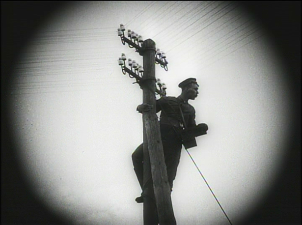
I've always thought this shot would've made a great cover
User avatar
justeleblanc
Joined: Wed Nov 03, 2004 10:05 pm
Location: Connecticut

#750 Post by justeleblanc »

the godard looks like the book cover for GODARD on GODARD.... alittle.
Locked