Criterion & Eclipse Cover Art & Packaging Babble-on Vol.3
-
kaujot

- Joined: Mon May 08, 2006 10:28 pm
- Location: Austin
- Contact:
-
patrick
- Joined: Sun Mar 11, 2007 4:15 pm
- Location: Philadelphia
This is what I was thinking; the Breathless cover is a ballsy choice (especially going vertical) and I kind of like the idea of it, but perhaps it would have been more appropriate for another film. I honestly was expecting something very similar to the previous cover, with the image of Belmondo and Seberg walking down the street. I love the font choice, so at least it's not a complete wash.There's no way they could have gone with a still from the film; every iconic image from that film has been used to death.
Under The Volcano looks too "Photoshop-y" to me, and Mala Noche doesn't really stand out at all. However, I'm really looking forward to seeing both films.
-
Matt

- Joined: Tue Nov 02, 2004 4:58 pm
A little. In that they both have words on them.justeleblanc wrote:the godard looks like the book cover for GODARD on GODARD.... alittle.
I guess if there is anything that we can be thankful for, it's that they didn't use this image. (And that they refrained, as usual, from using original poster art for Under the Volcano. Eeeesh.)
Last edited by Matt on Mon Jul 16, 2007 9:16 pm, edited 1 time in total.
-
Jean-Luc Garbo

- Joined: Thu Dec 09, 2004 5:55 am
- Contact:
-
Rich Malloy
- Joined: Tue Jun 13, 2006 4:29 pm
- Location: Boston MA
And not dissimilar to the French DVD cover for "Histoire(s)".justeleblanc wrote:the godard looks like the book cover for GODARD on GODARD.... alittle.
EDIT: why did I feel inclined to phrase that as "not dissimilar"? Something about things Godard(ian) calling out for (pre)post-structuralist evasion, use of the double negative to obscure meaning or suggest some less-than-apparent depth, or merely to signify hesitation on my part to contend forthrightly? All of the above, most likely.
Last edited by Rich Malloy on Mon Jul 16, 2007 9:24 pm, edited 1 time in total.
-
patrick
- Joined: Sun Mar 11, 2007 4:15 pm
- Location: Philadelphia
-
Awesome Welles

- Joined: Fri Apr 27, 2007 10:02 am
- Location: London
I must say that I am disappointed with the Breathless artwork. I think they should have commissioned some new original artwork. It's not very good but I think I prefer this artwork.
EDIT: Actually I hate the linked artwork. But I stand by specially commissioned artwork, just not this.
EDIT: Actually I hate the linked artwork. But I stand by specially commissioned artwork, just not this.
-
jaredsap
- Joined: Tue Jun 05, 2007 5:24 am
- Location: Los Angeles
-
colinr0380

- Joined: Mon Nov 08, 2004 8:30 pm
- Location: Chapel-en-le-Frith, Derbyshire, UK
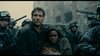
I really like the latest covers. The split between Finney and the skeleton that seems, with the Mexican setting, to suggest a day of the dead theme as well as being the obvious foreshadowing of the main character's death (I like the comparison of the dark glasses with the empty eyesockets of the skull). Not knowing anything about the film does this festival come up at any point?
It seems that the October release of the disc is just in time for the festival!
The Mala Noche cover feels a little like Flesh For Frankenstein - an objectifying feel of splitting an object of desire into the best bits! I like the way that the 'M' in Mala is sort of cuddling up to the crook of the guy's neck and the final 'E' in Noche is hooking around the nipple! (A call back, or forward, to the use of the nipple clamps in Idaho? )
)
It seems that the October release of the disc is just in time for the festival!
The Mala Noche cover feels a little like Flesh For Frankenstein - an objectifying feel of splitting an object of desire into the best bits! I like the way that the 'M' in Mala is sort of cuddling up to the crook of the guy's neck and the final 'E' in Noche is hooking around the nipple! (A call back, or forward, to the use of the nipple clamps in Idaho?
-
TheGodfather

- Joined: Sun Sep 17, 2006 8:39 pm
- Location: The Netherlands

-
jbeall

- Joined: Sat Aug 12, 2006 1:22 pm
- Location: Atlanta-ish
-
duane hall

- Joined: Sat Feb 12, 2005 8:18 am
Breathless cover... ballsy, perhaps, but ultimately foolish. Much too standoffish a facade for one of the most inviting and charming art films ever. I can't imagine it drawing the interest of anyone not already in-the-know. I don't buy any of the conceptual justifications, either.
I bet we'll see a new cover before this hits the shelves.
I bet we'll see a new cover before this hits the shelves.
-
domino harvey

- Dot Com Dom
- Joined: Wed Jan 11, 2006 6:42 pm

-
domino harvey
- Dot Com Dom
- Joined: Wed Jan 11, 2006 6:42 pm
-
mogwai
- Joined: Wed Nov 03, 2004 6:50 am
- Location: California
I quite like the Breathless cover, though I was anticipating something entirely different. I agree that they did go a bit overboard with the Photoshop effects on Under the Volcano. I'm looking forward to seeing what they do with Days of Heaven. Still, this is the most exciting month of releases for me.
-
CSM126

- Joined: Thu Nov 04, 2004 12:22 pm
- Location: The Room
- Contact:
While I do like the Under the Volcano cover, I can't help but think it would be better if they got rid of the skull and just had Finney's mug take up the whole cover. I find his visage far more eye-grabbing an image than the wacky Day of the Dead decoration. Not to mention that this kind of cover (close-up of lead actor/actress split-screened with some other image) is becoming something of a habit for Criterion (Sweetie and Clean Shaven had the same deal) of late.
-
eez28
- Joined: Wed Mar 14, 2007 3:51 pm
- Location: Houston
but then Eric Skillman mentions in his blog:CSM126 wrote:Not to mention that this kind of cover (close-up of lead actor/actress split-screened with some other image) is becoming something of a habit for Criterion (Sweetie and Clean Shaven had the same deal) of late.
.These also fall into the category of what seems to be a nervous design tick for me, the split 'em down the middle comps
-
Jeff

- Joined: Wed Nov 03, 2004 1:49 am
- Location: Denver, CO
I agree that an original illustration (paging Caitlin Kuhwald  ) would have been the best way to go for Breathless. Barring that, this poster (which has been mentioned here previously) has not been used to death, and could have turned out very well. I'm not sure what they were going for here. It was certainly a ballsy move, but I can't help but be disappointed. If Eric Skillman is responsible, I'll be very curious to hear his thought process about this one on the blog.
I like Under the Volcano fine, though I too am tired of the two-panel images. The shot of Finney with the dark shades is iconic to the film, so I can see why they wanted to go with it. A version of it was used on the VHS cover. Perhaps the dimensions of that still made them feel they had to fill the space with something else at the bottom. It's a shame they couldn't just license this image from the Penguin Modern Classics book cover.
I'm surely setting myself up for disappointment with my expectations for the Days of Heaven cover. There is so much potential for greatness there.
I can't complain about any of the art though. Other than the The Miracle of Ace in the Hole, this is the most exciting month of Criterion releases in years for me.
-
agnamaracs
- Joined: Thu Dec 21, 2006 7:13 am
Those ****ing cases put cracks in both discs of Phantom India. Pass it on.LightBulbFilm wrote:I absolutely hate these damned figure-8 packs. I miss the old days.
Also, if they foul up the Days of Heaven cover I am going to kick them right in the Wacky C.
(Note: I don't mind the Breathless cover so much, but my favorite version is the French Gaumont/Columbia.)
-
LightBulbFilm

- Joined: Wed Nov 16, 2005 9:11 pm
- Location: Florida
- Contact:
I am now scared to remove my Phantom India discs.agnamaracs wrote:Those ****ing cases put cracks in both discs of Phantom India. Pass it on.LightBulbFilm wrote:I absolutely hate these damned figure-8 packs. I miss the old days.
Also, if they foul up the Days of Heaven cover I am going to kick them right in the Wacky C.
(Note: I don't mind the Breathless cover so much, but my favorite version is the French Gaumont/Columbia.)