
My god, you're right. Everywhere I look has the same cover. Barnes and Noble even has a snazzy 3D view. How embarrassing.domino harvey wrote:it's real and the mirror ball in the background is the face of the DVD.
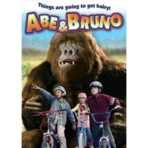
Worst DVD covers... ever! (Part Deux)


-
colinr0380

- Joined: Mon Nov 08, 2004 8:30 pm
- Location: Chapel-en-le-Frith, Derbyshire, UK
"This looks like a nice secluded spot to park up and lean casually on the bonnet of our car, maybe even lay on it - hey that's a great idea, get on up there honey!...did you hear something? Hmmm, maybe it was just the wind...could have sworn it was the sound of an engine revving. Anyway you just get comfortable up there while I set the camera up to take our pictures - don't scratch the paint now! Just kidding!
"Right, the timer's on, get in your pose quickly! There's that sound again...where could it be coming from?" *click* "There, what a great picture...let me just turn around to face you and YAAAGGGHHH!" *crunching sound of cars crashing into each other*
"Right, the timer's on, get in your pose quickly! There's that sound again...where could it be coming from?" *click* "There, what a great picture...let me just turn around to face you and YAAAGGGHHH!" *crunching sound of cars crashing into each other*
-
domino harvey

- Dot Com Dom
- Joined: Wed Jan 11, 2006 6:42 pm


-
toiletduck!

- Joined: Tue Nov 02, 2004 9:43 pm
- Location: The 'Go
- Contact:
-
Lemmy Caution
- Joined: Wed Mar 29, 2006 7:26 am
- Location: East of Shanghai
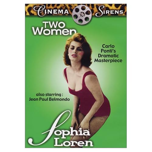
These might have been posted before (even perhaps by me). Extremely lackluster. And glamor and cheesecake poses just are so wrong for Two Women:

Last edited by Lemmy Caution on Sat Sep 22, 2007 4:53 pm, edited 2 times in total.
-
Lemmy Caution
- Joined: Wed Mar 29, 2006 7:26 am
- Location: East of Shanghai
Actually Koch Vision has a whole line of tacky cheesecake covers for various films. I discovered this by watching their abysmal transfer of Girl With A Suitcase (bleached out white, heavy contrast, full-screen which frequently cut people off the right side of the screen, etc).
One of the extras is a lineup of other Koch Vision titles. They also have a hilarious feature that tells you how to access Koch Vision online:
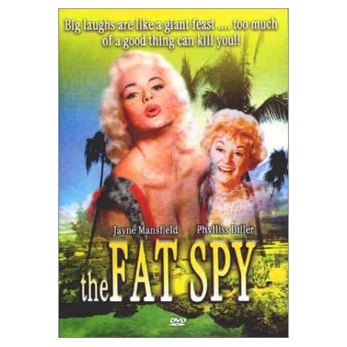
Other examples of their wonderful covers:


Some of those, like the Mansfield Too Hot To Handle are kind of fun cheesy. But Snows of Kilimanjaro and others just misrepresent the films so much that it's bizarre. I believe Ava Gardner actually received third billing on Snows of K---, after Peck and Susan Hayward.
Also notable is how they rip off Criterion with the name of their "collection" at the top, underscored by a solid line. But then on some covers they go all out with a large leopard print top border at top. (I'm guessing the leopard print was their original design and then they went "classy").
One of the extras is a lineup of other Koch Vision titles. They also have a hilarious feature that tells you how to access Koch Vision online:
I like how they never bother to actually tell your their website address. Certainly it would be faster to type "Koch Vision" into Google than to read those directions, let alone fire up your Dvd-rom (if you have one).To access our website, simply do the following:
Place this disc into a computer with an internet connection and a DVD-Rom Drive. Find the DVD disc drive icon (PC) or DVDdisc icon (Macintosh). Find the file "KOCH Vision Online." Double-click that file.
Other examples of their wonderful covers:
Some of those, like the Mansfield Too Hot To Handle are kind of fun cheesy. But Snows of Kilimanjaro and others just misrepresent the films so much that it's bizarre. I believe Ava Gardner actually received third billing on Snows of K---, after Peck and Susan Hayward.
Also notable is how they rip off Criterion with the name of their "collection" at the top, underscored by a solid line. But then on some covers they go all out with a large leopard print top border at top. (I'm guessing the leopard print was their original design and then they went "classy").
-
Lemmy Caution
- Joined: Wed Mar 29, 2006 7:26 am
- Location: East of Shanghai
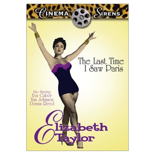
Seems to be a lot of incompetent cover designers tackling The Last Time I Saw Paris (not just Koch Vision):
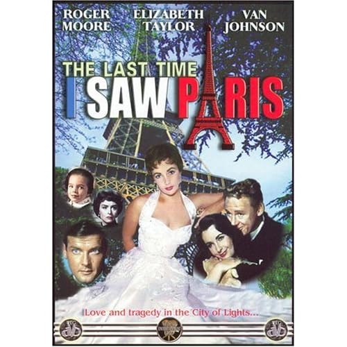
Rather weird, but one of the better ones. Has something going for it, even if it is weird and cluttered. Is the one head in black-and-white? And how did Roger Moore (and his stare) suddenly get top billing?

Though this looks like a (really) rough draft, I actually own this one. The lettering looks kind of shaky, like my old aunt wrote it. While the "The" misses the black backing and is written on Liz's shoulder. Not sure why everyone is cut off so awkwardly, unless maybe it's to tip you off that it's a crappy full-screen version which crops the sides of the image. And I couldn't find a large image of this next one to tell if it was truly bad or not:

Rather weird, but one of the better ones. Has something going for it, even if it is weird and cluttered. Is the one head in black-and-white? And how did Roger Moore (and his stare) suddenly get top billing?
Though this looks like a (really) rough draft, I actually own this one. The lettering looks kind of shaky, like my old aunt wrote it. While the "The" misses the black backing and is written on Liz's shoulder. Not sure why everyone is cut off so awkwardly, unless maybe it's to tip you off that it's a crappy full-screen version which crops the sides of the image. And I couldn't find a large image of this next one to tell if it was truly bad or not:
-
colinr0380
- Joined: Mon Nov 08, 2004 8:30 pm
- Location: Chapel-en-le-Frith, Derbyshire, UK

-
domino harvey
- Dot Com Dom
- Joined: Wed Jan 11, 2006 6:42 pm
-
Lemmy Caution
- Joined: Wed Mar 29, 2006 7:26 am
- Location: East of Shanghai


-
Cinesimilitude
- Joined: Tue Jul 09, 2013 4:43 am

-
domino harvey
- Dot Com Dom
- Joined: Wed Jan 11, 2006 6:42 pm


-
Cosmic Bus

- Joined: Tue Sep 12, 2006 2:12 am
- Location: Seattle, WA
- Contact:
The back cover should specify that the blooper reel runs, coincidentally, 105 minutes in length.jon wrote:I Know Who Killed Me

