Criterion & Eclipse Cover Art & Packaging Babble-on Vol.3
-
Oedipax
- Joined: Wed Nov 03, 2004 12:48 pm
- Location: Atlanta
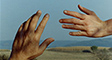
Interesting thing (to me at least) regarding the cover for The Ice Storm - this was one of the films screened for my Film & Lit class this past semester (we also read the book) and in my response paper, I had a section discussing the color red as it appears throughout the film: how it was one way of making visible the "cool" emotional climate of the film, the way it's contrasted with the drained colors elsewhere. There's more to it, but the cover feels like a small validation of that.
-
Via_Chicago
- Joined: Fri Aug 11, 2006 4:03 pm
I don't know, it sort of reminds me of this or even this.Oedipax wrote:Interesting thing (to me at least) regarding the cover for The Ice Storm - this was one of the films screened for my Film & Lit class this past semester (we also read the book) and in my response paper, I had a section discussing the color red as it appears throughout the film: how it was one way of making visible the "cool" emotional climate of the film, the way it's contrasted with the drained colors elsewhere. There's more to it, but the cover feels like a small validation of that.
-
godardslave

- Joined: Tue Nov 02, 2004 8:44 pm
- Location: Confusing and open ended = high art.
Dont like the ice storm, mafioso covers at all, weak.
However, the gaudi cover i do like.
However, the gaudi cover i do like.
how out of control was your modern age day today?HerrSchreck wrote:Don't worry, William Klein's The Model Couple deftly satirizes a modern age out of control. That aughta hold you.
Their copywriter need a space upgrade or something? That tagline on like half of the spine's teasers?
-
mogwai
- Joined: Wed Nov 03, 2004 6:50 am
- Location: California
I can certainly understand the negative feedback concerning The Ice Storm, but I fucking love that cover. Then again, I adore the hell out of that film, so they really could've slapped anything on there.
I'm fairly indifferent to the other covers, though I like the clean look of the Gaudi. And while I look forward to all these films, I really was hoping for a bit more.
I'm fairly indifferent to the other covers, though I like the clean look of the Gaudi. And while I look forward to all these films, I really was hoping for a bit more.
-
Cosmic Bus

- Joined: Tue Sep 12, 2006 2:12 am
- Location: Seattle, WA
- Contact:
-
domino harvey

- Dot Com Dom
- Joined: Wed Jan 11, 2006 6:42 pm

-
Doctor Sunshine

- Joined: Wed Nov 03, 2004 2:04 am
- Location: Brain Jail
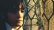
I think the Ice Storm cover, beyond being very professionally done, is interesting and captures something unique, but the 80sness of it and the Walker cover are killing me. The color schemes of both flirt with the cyan/magenta cga computer art of my youth which somehow bypasses my nostalgia triggers and glides right into hatred.

That said, I don't mind if they keep them. If I'm forced to confront this stuff now it'll lessen my therapy bills later.
That said, I don't mind if they keep them. If I'm forced to confront this stuff now it'll lessen my therapy bills later.
-
godardslave
- Joined: Tue Nov 02, 2004 8:44 pm
- Location: Confusing and open ended = high art.
Criterion should run a poll like this for 1 release per month.dx23 wrote:The Adventures of Baron Munchausen 2 disc SE is going to be released on April 8th, 2008. Amazon.com is running a poll to select the cover of the DVD.
-
Alonzo the Armless

- Joined: Thu Nov 04, 2004 12:57 am
I don't think Criterion needs people to vote on their covers. Just looking at the batch of covers they display in their holiday newsletter shows they know what they're doing. I'd rather their artists invest as much time and creativity as possible in doing one terrific cover than divide their time into trying to make three terrific covers. If any of us think we know how to make abetter cover, we should get our portfolios together and apply to Criterion.
I'm sure the designers there already do different variations in the early stages that go through his or her own voting process, as well as other high-ups at Criterion in later stages. Their track record shows that even if they make a cover that we don't care for, it's still different from the floating head crap churned out by the mainstream studios.
Now I wouldn't mind more polls from the studios. I'd love for them to realize that posters and DVD covers are more eye-catching if more emphasis was put on good design than making sure you see the faces of the big stars popping out at you. There are lots of DVD cover design commitees that could learn a lot from Criterion.
-
Cinephrenic

- Joined: Tue Nov 02, 2004 6:58 pm
- Location: Paris, Texas
Even though I voted for selection 3, all three were horrible.godardslave wrote:Criterion should run a poll like this for 1 release per month.dx23 wrote:The Adventures of Baron Munchausen 2 disc SE is going to be released on April 8th, 2008. Amazon.com is running a poll to select the cover of the DVD.
-
arsonfilms
- Joined: Wed Nov 02, 2005 4:53 pm
- Location: Philadelphia, PA

-
Thomas J.

- Joined: Tue Jan 01, 2008 11:32 pm
- Location: Monticello
Mind you I am no expert in graphic design, but I like THE ICE STORM's cover too.
Pretty simple:
Cold, blueish ice conveys...ice
Red in the background conveys...agression, tension, anger...hence, a storm
The ice in the foreground overlaid atop the storm in the background conveys...that the storm is to be associated with the ice.
Thus produces The Ice Storm.
But what do I know?
Pretty simple:
Cold, blueish ice conveys...ice
Red in the background conveys...agression, tension, anger...hence, a storm
The ice in the foreground overlaid atop the storm in the background conveys...that the storm is to be associated with the ice.
Thus produces The Ice Storm.
But what do I know?
-
Jem

- Joined: Mon May 02, 2005 3:03 am
- Location: Potts Point
Sorry Domino, I prefer the ranged right text at a smaller size, I think large centered text is little conventional and expected. With regards to lower case vs. sentence case, either option reads fine to me.domino harvey wrote:Here's a proposal for fixing that monstrosity which keeps all of their font choices save the lame lower-case capitalization:
-
Thomas J.
- Joined: Tue Jan 01, 2008 11:32 pm
- Location: Monticello
Yeah, I too like the text flushed right because it's edgier.Jem wrote:Sorry Domino, I prefer the ranged right text at a smaller size, I think large centered text is little conventional and expected. With regards to lower case vs. sentence case, either option reads fine to me.
Literally, the text is at the edge of the artwork.


-
denti alligator

- Joined: Thu Nov 04, 2004 1:36 am
- Location: "born in heaven, raised in hell"
-
domino harvey
- Dot Com Dom
- Joined: Wed Jan 11, 2006 6:42 pm
-
domino harvey
- Dot Com Dom
- Joined: Wed Jan 11, 2006 6:42 pm
-
denti alligator
- Joined: Thu Nov 04, 2004 1:36 am
- Location: "born in heaven, raised in hell"


-
sevenarts

- Joined: Tue May 09, 2006 11:22 pm
- Contact:
Death of a Cyclist looks crappy, just a lazy Photoshop job.
I think Blast of Silence is great though, and perfectly suited to a noir. If I'm not mistaken, it's by Sean Phillips, an artist who has done a lot of great work on some of writer Ed Brubaker's neo-noir comics, like Criminal and the incredibly underrated Sleeper. His blog has a post of related artwork from about a month ago.
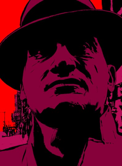
I think Blast of Silence is great though, and perfectly suited to a noir. If I'm not mistaken, it's by Sean Phillips, an artist who has done a lot of great work on some of writer Ed Brubaker's neo-noir comics, like Criminal and the incredibly underrated Sleeper. His blog has a post of related artwork from about a month ago.