Yes, indeed very surprising, not just because of the six directors, but also because of the many breaks, rebuilding bits of the scenery in Hollywood and so on. One unifying factor might be Miklos Rosza's music, which plays almost without a break (though often you hardly are aware of it, so well does it fit). Ironically one of the reasons Berger was fired was that he actually wanted to have the music composed first (by Oscar Strauss) in order to have it as a guideline for shooting/editing. Which is exactly what is essential for Powell's notion of a 'composed film' at the end of BN and in "Hoffmann".davidhare wrote:What is remarkable is that nominally six but actually three directors had a hand in it but the movie comes off as a completely unified work. Totally unlike Gone With the Wind, for instance.
431 The Thief of Bagdad
-
Tommaso

- Joined: Fri May 19, 2006 2:09 pm
-
broadwayrock
- Joined: Thu Jun 22, 2006 1:47 pm


-
HerrSchreck

- Joined: Sun Sep 04, 2005 3:46 pm
As I'd hinted at earlier, I don't think there can be much doubt that these are from the same digibeta. If they're not it goes a long way towards proving that guys like Kehr & DVDTalk etc are off the mark in suggesting the CC corrects a faulty transfer. I've yet to see a cap from the CC that looks superior, much less different. If anything, I see digital noise on the CC not resident in the MGM-- look at the two slanted vertical lines between her eyebrows...
-
Doctor Sunshine

- Joined: Wed Nov 03, 2004 2:04 am
- Location: Brain Jail
-
HerrSchreck
- Joined: Sun Sep 04, 2005 3:46 pm
I'm quite certain what you're calling grain is digital noise that is regularly mistaken for grain, or called "faux grain". And if any production house/telecine operator is going to pass the image thru degraining filters and image stabilizers it's going to be a modern CC HD transfer, not a ten buck mgm/ua disc from 2002. And the artifact I see in the CC between her eyebrows is a consistent structure, running far beyond-- sizewise-- the boundaries of the randomized scatter of grain interplay, not something that could be rendered via the intergrain exposure variegation... nor disappear via degraining tools (at least without having eyelashes, stray hairs, twigs etc disappear also!).
I take Klein at his word that a new transfer was rendered, viz--
But Kenny writes--
and think-- I need me some Doc Cyclops spectacles! I can't for the life of me make out these big differences folks are seeing in the caps!
I take Klein at his word that a new transfer was rendered, viz--
.. but it sure does look an awful lot like the same tape was used instead. The framing, the color temps, grain structure, etc-- beyond the mildest of light tweaks, they sure do look the same.After the “shrinkage expert” determined that it was safe to screen, we concluded that the film looked pretty good. After the nitrate, we also watched a bit of the BFI’s restored print of Thief, and we were able to compare the colors of more recent celluloid to the nitrate version. Along with Thelma, we talked about Technicolor and what it made sense to try and achieve in the new transfer. Scorsese would have some ideas as well. I then went off to London and looked at two original elements for potential transfer: a mid-nineties version and another, late-seventies version. I settled on the latter, as it had better color, betting timings, and better resolution. I was quite surprised by this, as I had expected the newer one to be better. But the newer one looked as though one of the three strips had shrunk a bit, causing a registration problem. This is often an issue in Technicolor restorations, which is why we see the “bleeding” of colors onto other colors.
After scanning the seventies negative in 2k resolution, I sent the data off to L.A., where Maria will finish the color correction, then show it to Thelma and Dennis Muren for one last check. Dennis has a really good idea about how the special effects should look, so his input is going to be really helpful. The images will come back to New York for restoration work, and we’ll author and replicate the DVDs. New York to London to Los Angeles to New York to your home—just another typical work flow for a Criterion title.
But Kenny writes--
I see a significant boost in both vividness (the red lipstick here makes the red lipstick of the MGM look a little smeary) and detail (the beading on the vest, the bracelet), so I have to call advantage: Criterion. That said, I'm looking forward to sitting down and watching the whole thing again, and checking out the fab extras, which
and think-- I need me some Doc Cyclops spectacles! I can't for the life of me make out these big differences folks are seeing in the caps!
-
Tommaso
- Joined: Fri May 19, 2006 2:09 pm
The difference in contrast/brightness between the two editions is not evident in these captures, and I'd say that goes for all the 'darker' scenes in the film. But there is a very slight difference in the daytime scenes, for example right at the beginning of the film, with the MGM looking minutely more vibrant in my view. In those caps, however, I can't see what Kenny is talking about if he sees a "significant boost in vividness". There might indeed by a very tiny advantage in detail regarding the CC, but again I would attribute it to the higher bitrate than to a different telecine.
Klein's comments are irritating in any case, seeing how tiny the differences are between both editions (and in many scenes they are practically non-existent). Either this blog entry is entirely misleading (and someone at CC later decided that their efforts on the transfer were no improvement, leading to the decision to use the existing telecine in the end), or the guys at MGM ran through exactly the same routines and ended up with a practically identical result.
Klein's comments are irritating in any case, seeing how tiny the differences are between both editions (and in many scenes they are practically non-existent). Either this blog entry is entirely misleading (and someone at CC later decided that their efforts on the transfer were no improvement, leading to the decision to use the existing telecine in the end), or the guys at MGM ran through exactly the same routines and ended up with a practically identical result.
-
Doctor Sunshine
- Joined: Wed Nov 03, 2004 2:04 am
- Location: Brain Jail
If you flip back an forth between the two (I copied them to my desktop and flipped back and forth in picture viewer) there is a slight difference, most evident in the branches on the right. I didn't notice it before comparing them that way.Tommaso wrote:The difference in contrast/brightness between the two editions is not evident in these captures
davidhare wrote:And looking at the MGM Thief there is no absence of what looks like normal film grain in the image on my system.
Maybe I shouldn't have said washed out but less prominent in the MGM capture.
-
skuhn8

- Joined: Tue Dec 14, 2004 8:46 pm
- Location: Chico, CA

-
Tommaso
- Joined: Fri May 19, 2006 2:09 pm
I tend to agree. If you only want to see the film, get the MGM or one of its clones around the world, if you want extra information or "The Lion has wings", go for CC.skuhn8 wrote:....so what we can all agree on then is that in motion they are utterly indistinguishable? If you need to take a magnifying glass to a couple screen caps or toggle between them repeatedly it becomes rather moot to argue which one is better when we're talking 2 dozen frames a second. No?
-
Doctor Sunshine
- Joined: Wed Nov 03, 2004 2:04 am
- Location: Brain Jail
-
domino harvey

- Dot Com Dom
- Joined: Wed Jan 11, 2006 6:42 pm
You have got to be fucking kidding me with this thread. Those images are so close to being exactly the same (if it weren't for the different hands I would just assume they were) that anyone exerting this much effort to differentiate between them needs to take James Randi's audio cable test and retire.
-
TheRanchHand
- Joined: Fri Nov 17, 2006 7:18 am
- Location: Los Angeles
LOL. Yes, this was definitely the DVD geek thread  LOL (no offense, I can get geeky about a few things in life)
I am not one that finds much use in this much examination of something that is obviously so minute and close that you will have no final answer. The image is great in both cases and maybe someone who has watched the DVD can let us know how it all pans out (film and extras on a whole) rather than dissect frames that only those dissecting frames will notice....
I am not one that finds much use in this much examination of something that is obviously so minute and close that you will have no final answer. The image is great in both cases and maybe someone who has watched the DVD can let us know how it all pans out (film and extras on a whole) rather than dissect frames that only those dissecting frames will notice....
-
Max von Mayerling

- Joined: Wed Dec 22, 2004 10:02 pm
- Location: Ann Arbor, MI
-
HerrSchreck
- Joined: Sun Sep 04, 2005 3:46 pm
These guys for real anyhow? All they're doing is repeating what we've been saying: there's no fucking dif. Whoop de frick and welcome to the club. We're not looking at the pics trying to "make up our minds", we're holding up those images trying to figure out what in god's name these reviewers are smoking (The NYtimes no fucking less). Gimme a break.
That would be the less elegant version.
That would be the less elegant version.
-
Max von Mayerling
- Joined: Wed Dec 22, 2004 10:02 pm
- Location: Ann Arbor, MI
-
TheRanchHand
- Joined: Fri Nov 17, 2006 7:18 am
- Location: Los Angeles
-
Narshty
- Joined: Tue Nov 02, 2004 6:27 pm
- Location: London, UK
So true. The film's hardly flawless but what it has to give is so much that its 'problems' (which look more like idosyncracies) amount to scarcely a hill of beans.Tommaso wrote:Watching this again I'm still surprised how the magic of this film doesn't diminish, and how inventive it is. In this respect [...] it's certainly the best film that CC has released this year so far.
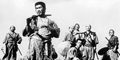
There's an odd poignancy watching a film like this and knowing there's no way of recreating the very attitudes that make it hurtle along so. It's also the only film I can think where it recreates fairytale archetypes for every character with such total success - in point, the seduction scene in the garden (to my mind, one of the three or four best seduction scenes in all cinema) which is totally preposterous, and yet you simply buy every word of it and that within 30 seconds they are meant to be together for all time. I think the purity of the film's heart is the most dazzling thing about it nowadays. My favourite bit in the entire film is when Ahmad and Abu appear on the horizon in their little boat to save the Princess from Jaffar - I misremembered it and thought that Ahmad says something like "We will sail all the seas until we find her again" before embarking, but no such line appears anywhere in the film. He simply goes ahead and does it and the impact (especially with Rozsa's score swelling at the moment of reveal) is ten times greater because of it.
It's also a rare fantasy film that expands the imagination. In The Wizard of Oz it's impossible to imagine any lands that don't end up in front of the camera. Not that the film isn't bursting with charm, but it's so patently an indoors film there's not much to set the mind reeling. In The Thief of Bagdad however it's hard to keep from imagining all the oceans, mountains, rivers and valleys encountered on their (elliptical) journeys, the same way you would as a child reading a picturebook.
I've gone through both commentaries and they're a lovely pairing. Bruce Eder's is, as usual, outstanding and the Scorsese/Coppola commentary is half-excellent (the excellent half being Scorsese's - Coppola really has almost nothing worthwhile to say apart from one insightful nugget: "If you have a strong villain, you have a strong story")
-
Zazou dans le Metro
- Joined: Wed Jan 02, 2008 2:01 pm
- Location: In the middle of an Elyssian Field
-
Matango

- Joined: Mon Aug 01, 2005 5:19 am
- Location: Hong Kong
I enjoyed everything about this DVD except for Coppola's inane commentary. Seems like it was just another excuse to dust off various members of his family and give them an airing in a series of dull childhood anecdotes. If Scorsese had done the whole thing by himself, it would have been a near-perfect package.
-
zedz

- Joined: Sun Nov 07, 2004 11:24 pm
Gorgeous transfer indeed.
For me, this is a rare release where the audio supplements steal the show. The Powell recollections run for over an hour and are wonderfully detailed and revealing. Rosza's interview is similarly expansive and enlightening. I loved the way that Korda got around his contractual obligations to Berger in terms of the music for the film.
Eder's fact-filled commentary was superb. It helps that this was such a complicated production: there was precious little filler. Scorsese was great too, if more reflective. His singling out of particular pieces of editing (e.g. the series of shots revealing the All-Seeing Eye) as influential on his work was an especially useful tidbit. As noted above, Coppola was the weak link, adding little of interest. The only thing I took away from his contributions was how completely obsessed he is with food! Whenever anyone on screen was eating you could practically hear his not insubstantial stomach rumbling.
Of the remainder, the special effects piece is decent and The Lion Has Wings, though no masterpiece, is great to have (and surprisingly effective in its dramatic passages), and this is definitely the right place to put it.
Although there was already a fine transfer in existence, Criterion have really added value here.
-
Antoine Doinel

- Joined: Sat Mar 04, 2006 5:22 pm
- Location: Montreal, Quebec
- Contact:
Roger Ebert on the effects of the film.
-
tryavna
- Joined: Wed Mar 30, 2005 8:38 pm
- Location: North Carolina
I finally got around to watching Lion last night. And it's still as much of a mess as I remembered it being! Though, as Tom says, it's still weirdly compelling. In my opinion, the voiceover works very well during the first 15-20 minutes, during the more straightforward documentary sequences, but later on it becomes downright excruciating.Tommaso wrote:Okay, so I treated myself to a nice Powell/Korda double bill, starting with "The Lion has wings" of course. This is well worth seeing and cleverly done, but certainly not exciting and not in the same league as, say, "The Volunteer". Its main drawback is the voice-over narration, making sure that even the dumbest viewer gets the propaganda message (all good vs bad here, without the subtleties of "49th parallel", let alone "Canterbury") right. The fictional scenes directed by Powell fare quite well, as expected, though the dialogue occasionally borders on the ridiculous and acting can be quite stiff in some moments. The main interest lies in seeing Powell preparing himself for visually similar aircraft scenes in "One of our aircraft is missing" or even AMOLAD. The pictureboxed transfer is great, although not cleaned up. But it has CC's usual clarity and razor-sharpness with nearly perfect contrast levels on top of it. Well done!
Tangential observation: I'm still always impressed by just how gentle British propaganda films were during WWII, especially documentaries. (Think of Humphrey Jennings' Fires Were Started, where the film doesn't even identify the source of the fires (i.e., German bombs).) In this film, there's no overt vilification of individual Germans, apart from Hitler being made to look and sound like a jackass. The film basically makes them look like children led astray by a misguided father-figure.
The worst segments were probably the bizarre interludes with Ralph Richardson and Merle Oberon, and as with Thief, I'm becoming interested in who exactly directly what. Based on Christie's essay and Powell's dictations, it sounds like Powell was primarily responsible for the flying sequences. (And I think that the bombing run on Kiel bears the mark of his early style the most.) But the heavy class- and regional-accent-based humor that occurs throughout the scenes involving the AA guns and look-outs strikes me as being much more like Brian Desmond Hurst's work on Scrooge, etc. -- with more of an emphasis on tangible atmosphere (like wisps of fog) than you typically get in Powell's work. Of course, this is probably more of a fool's errand than with Thief, since this movie was churned out so quickly that the various directors' last thought would probably have been to make those sequences "their own," so to speak.
As others have said, this was the perfect place for Lion. It's a film where the historical significance outweighs everything else about it.
-
Tommaso
- Joined: Fri May 19, 2006 2:09 pm
True, though the opposition of the German vs the British 'lifestyle' is pretty much black and white (but probably not unjustified at that time).tryavna wrote: In this film, there's no overt vilification of individual Germans, apart from Hitler being made to look and sound like a jackass. The film basically makes them look like children led astray by a misguided father-figure.
It's funny though that many bits of the Hitler/Third Reich footage seem to be taken directly from Riefenstahl's "Triumph", and that it's just the way they are cut in here and are commented on by the voice-over give this totally different impression than the same footage in Riefenstahl's film. A close comparison would probably be rewarding for anyone interested in the art of the propaganda film.
Yes, very much so, and I also think that these are the best parts of the whole film. But some of the heavy-handed humour that you (and I) don't like can also be found in "The Volunteer", though it works much better there. But that one also wasn't exactly a P&P dream project. Still I hope you are right at least in thinking that Powell didn't direct the Richardson/Oberon scenes; they'd easily be among the worst he ever made.tryavna wrote: Based on Christie's essay and Powell's dictations, it sounds like Powell was primarily responsible for the flying sequences. (And I think that the bombing run on Kiel bears the mark of his early style the most.)
-
tryavna
- Joined: Wed Mar 30, 2005 8:38 pm
- Location: North Carolina
Yes, but even there, the contrast is set up in terms of the different "games" the British and the Germans choose to "play": rowing vs. goosestepping, watching horseracing vs. attending rallies, etc. The impression that I get is that the difference in lifestyle boils down to this: the British simply know how to have more fun because they don't take themselves so seriously (like the Head of State taking part in a nonsense song).Tommaso wrote:True, though the opposition of the German vs the British 'lifestyle' is pretty much black and white (but probably not unjustified at that time).
I'll have to rewatch The Volunteer at some point, but is the humor in that short film also derived from regional dialects? I associated those moments more with Hurst because he'd later explore caricature/grotesque (as all directors must) when adapting Dickens.