By "correctly," do you mean they look as dark as they do on the CE DVD? Or can you actually tell what the hell is going on in those scenes, like you should be able to (hence the whole point of "day for night")? This whole practice of "correcting" day-for-night is one of my pet peeves. I actually prefer to be able to see what's going on, so like you the "fakeness" of it has never really bothered me.davidhare wrote:Try, the day for nights are all "cleaned up" so to speak so they present "correctly". Frankly they never bothered me on the old 1997 SD disc. (Nor theatrically for that matter.)
DVDBeaver Comparisons
-
tryavna
- Joined: Wed Mar 30, 2005 8:38 pm
- Location: North Carolina
-
Gary Tooze

- Joined: Fri Nov 05, 2004 1:07 am
- Contact:
New...
Warner - Region 1 - NTSC "Mishima: A Life in Four Chapters" vs. Criterion (2-disc) - Region 1 - NTSC
http://www.dvdbeaver.com/
Cheers,
Warner - Region 1 - NTSC "Mishima: A Life in Four Chapters" vs. Criterion (2-disc) - Region 1 - NTSC
http://www.dvdbeaver.com/
Cheers,
-
denti alligator

- Joined: Thu Nov 04, 2004 1:36 am
- Location: "born in heaven, raised in hell"

-
denti alligator
- Joined: Thu Nov 04, 2004 1:36 am
- Location: "born in heaven, raised in hell"
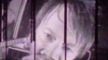
Yeah, but why isn't it visible on the Warner disc cap?davidhare wrote:Dent I can see what you mean about "blockiness" in Gary's caps from the Mishima example. It's exactly the same thing that affects some of mine, and I am sure it's a combination of the downscaled resolution, and possibly, the fact part of the elements in frame are in motion when the grab is taken. As you know a DVD "frame" in motion is not the same as a 24fps film frame, even in HD encodes. There is virtually ALWAYS compression of motion.
Also, I don't really see this in any of the other caps, so it must have something to do with the graphic lettering.
-
HerrSchreck

- Joined: Sun Sep 04, 2005 3:46 pm
I think I see a touch of it in the wb caps, and that boosting in the CC caps brought it out a bit more.. edge enhancement wouldnt hurt either.
This is one of the most confusing side-by sides Ive seen inna dogs age, there are (as Gary said) so many instances where the WB looks simply magnificent next to the CC which look drab and lifeless, and some of the CC's have their moments where the colors seem more avant and in keeping w the film's themes.
This is one of the most confusing side-by sides Ive seen inna dogs age, there are (as Gary said) so many instances where the WB looks simply magnificent next to the CC which look drab and lifeless, and some of the CC's have their moments where the colors seem more avant and in keeping w the film's themes.
-
GringoTex

- Joined: Wed Nov 03, 2004 9:57 am
The site's yours so own up to it.Gary Tooze wrote:LOL - How refreshingly rude.
Leonard Norwitz does most of those Blu-ray reviews....A lot of those BRD reviews are not to my own taste either
You have a terribly faithless tendency to your throw your own reviewers under the bus at the first sign of criticism. That makes you a lousy editor/publisher.
-
The Fanciful Norwegian

- Joined: Tue Nov 02, 2004 6:24 pm
- Location: Teegeeack
The Mishima jaggies seem related to the brightness of the reds (a notoriously difficult color for video) -- the Wayward Cloud caps show similar artifacting on the umbrellas, with the problem being least pronounced on the darker Deltamac release. Are the jaggies visible in motion or only in still frames (this goes for both Mishima and The Wayward Cloud)?
-
Darth Lavender

- Joined: Sun Aug 13, 2006 6:24 pm
True, that (about reds) from what I understand, it has something to do with the C:Yr:Yb compression, or something to that effect. As I understand it, reds get the least bandwidth, because it's harder to spot errors in that color. It's worth noting; I remember seeing those kinds of artefacts a lot on my older computer (running something like PowerDVD 5) and don't ever seem to see them on my current HTPC, so I think it's one of those effects, like interlacing, were the severity depends on your player.
As for Gringo, I'm going to moderately support his comment; you really should stand by your reviewers more, Gary. "A bad tradesman blames his tools" and all. Having said that, I don't see anything too wrong with the number of popular blu-rays being reviewed. As an early adopter, I buy a lot of HD movies for the picture quality (heck, I just bought "Final Fantasy" on blu-ray the other day) so I don't mind seeing films like 'The Rock' and 'Con Air' getting an occasional review, especially if you believe that will increase revenue for your site.
As for Gringo, I'm going to moderately support his comment; you really should stand by your reviewers more, Gary. "A bad tradesman blames his tools" and all. Having said that, I don't see anything too wrong with the number of popular blu-rays being reviewed. As an early adopter, I buy a lot of HD movies for the picture quality (heck, I just bought "Final Fantasy" on blu-ray the other day) so I don't mind seeing films like 'The Rock' and 'Con Air' getting an occasional review, especially if you believe that will increase revenue for your site.
-
Rufus T. Firefly

- Joined: Wed Nov 10, 2004 8:24 am
- Location: Sydney, Australia
No, that's not correct. What you are seeing in that screen cap is known as the "Chroma Upsampling Error" or "Chroma Bug". It's basically caused by the MPEG decoder in the DVD player, when it uses the same algorithm on both progressive and interlaced frames and that decoder only works for one or the other. It should use separate decoders for each. It shows up on the Criterion and not the Warner because the screen caps were taken on different computers, which presumably have different MPEG decoders on them (Beaver has a thank you to someone else for the Warner caps).
-
The Fanciful Norwegian
- Joined: Tue Nov 02, 2004 6:24 pm
- Location: Teegeeack
Looks like the IFC 4 Months... wasn't recalled after all -- it just became a Borders exclusive.
Do some frame-by-frame captures and then whip up an Animated PNG? A bit bleeding-edge, perhaps, but GIF isn't really suitable for this sort of thing. You could just display the individual images in sequence on a single page, but it wouldn't be as obvious. Odd that The Sun should have grain issues -- did AE not use an all-digital source?davidhare wrote:The only remaining problem for me in terms of grabs vs. image in motion is something in the inverse: how do you capture the spectacularly horrible compression/deinterlacing artefacting on for example the R2 Madame de.. or the AE Sokuorv The Sun in a frame grab? I have tried over and over and cannot. But the minute you play them again the particular (telecine?) compression throbbing - which is what it looks like, from no grain to massive gtain within a frame - is screamingly obvious.
-
Rufus T. Firefly
- Joined: Wed Nov 10, 2004 8:24 am
- Location: Sydney, Australia
Here's a question that's been puzzling me: why does this comparison have caps from another person in another country? Presumably, given the way that Mr Tooze discusses the differences between the transfers and the fact that he gives the audio preference to the Criterion (not stated why though), he must have a copy of the Warner disc to hand. You would think therefore that he would have been able to produce the caps himself.
BTW the dual subtitles could be from having the secondary subtitles option switched on if using PowerDVD.
BTW the dual subtitles could be from having the secondary subtitles option switched on if using PowerDVD.
-
denti alligator
- Joined: Thu Nov 04, 2004 1:36 am
- Location: "born in heaven, raised in hell"
-
HerrSchreck
- Joined: Sun Sep 04, 2005 3:46 pm
-
Gary Tooze
- Joined: Fri Nov 05, 2004 1:07 am
- Contact:
Mr Tooze discusses the differences between the transfers and the fact that he gives the audio preference to the Criterion (not stated why though), he must have a copy of the Warner disc to hand.
Yes, Mr. Tooze owns both...
I am able to. Per-Olaf created the Warner caps a long while ago - it saved some time.You would think therefore that he would have been able to produce the caps himself.
NOTE: His methodolgy is slight different, but we feel viable for comparison purposes.
I can't speak about cdchris's caps only that I know they are at a higher compression and lessor quality. I see edge-enhancement in his - I'll try to duplicate and see if I see in mine.This seems to imply that there's something awry with Gary's cap.
My caps are done the same way as I've done for 4 years - same software(s). Same process as used in over 4000 reviews/comparisons.
P.S.
he gives the audio preference to the Criterion (not stated why though)
See in the Report card:
"The CRITERION has the Roy Scheider narration, the Warner has replaced it with an other voice!"
Added to our comparison:
Warner
REMOVED - TOO LARGE _ SEE COMPARISON
Criterion
Although the Warner claims in the closing credits that it is Roy Scheider's voice...
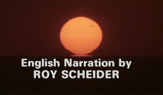
It is not...
Regards,
Gary
Last edited by Gary Tooze on Mon Jun 23, 2008 11:39 am, edited 1 time in total.
-
denti alligator
- Joined: Thu Nov 04, 2004 1:36 am
- Location: "born in heaven, raised in hell"
Thanks for those extra caps, Gary. They and all the others except the one I posted don't show any of the blockiness or chroma bug. Do you have any explanation as to why that cap shows this? I'd be curious to know if it's visible in motion. Can you or anyone else check on this. I'd like to know if Gary's or cdchris's cap more accurately shows what the disc looks like in motion in this particular scene.
-
Gary Tooze
- Joined: Fri Nov 05, 2004 1:07 am
- Contact:
????You have a terribly faithless tendency to your throw your own reviewers under the bus at the first sign of criticism. That makes you a lousy editor/publisher.
I actually don't think these films are to Leonard's taste either. His comments about Fool's Gold (ohh yeah - you don't read the reviews - just complain at our posting of them):
You don't have to like a film to review it GringoTex."Fool's Gold" is a romantic comedy and an adventure story, but in this case that just means it bombs in two distinct ways.
I don't know why this should be explained to you, but as one example - to get, say Gangster Vol 4 from Warner as a screener - we may have to review other product they send. These are some of the films your elitist attitude is rejecting.
Frankly I don't know whay you just don't ignore the review and move on. If you don't like the site - don't visit. If you have constructive advice - I am always willing to accept, but comments like this:
I find incredibly rude and presumptive. Here's an idea - you don't tell me how to 'waste my time' (and bandwidth) and I won't do the same to you (with these contemptive posts of yours). Deal GringoTex?If you didn't waste so much time and bandwidth on completely redundant and superfluous Blu-Ray reviews of the latest Hollywood Studio smack
Regards,
Gary Tooze
-
Jeff

- Joined: Wed Nov 03, 2004 1:49 am
- Location: Denver, CO
I'm late to the 4 Months discussion. It was shot in Super 35, which usually has a native ratio of around 1.66. This format is often used to allow for flexibility of framing for different formats. The viewfinders and monitors on the cameras usually have at least two ratios framed on them for the cinematographer. An extraction at 2.39 is almost always done for theatrical exhibition, but plenty of directors have chosen different framing for home viewing. Extracting a ratio between 1.78 and 2.00 from a Super 35 source is done for home video all the time. Sometimes this is done with the director's approval and sometimes it is not. It's certainly nothing new. Those of us who have been around for a while will recall that James Cameron used to insist that his Super 35 films be framed at 1.33 for laserdisc. Comparisons to films shot in anamorphic Panavision are completely nonsensical here.
I don't know if the 4 Months reframe was done with Mungiu's participation or not. I'm thrilled with it either way. I saw the film twice theatrically, and was struck by how tight some of the compositions were. It was obvious enough that it made me check my suspicions that it was shot in Super 35 -- perhaps by a d.p. inexperienced with that format. I find the film to be personally much more aesthetically pleasing at 1.78. And yes, I do feel that I am qualified to determine what is pleasing to my eye, and I make my purchasing decisions accordingly.
I don't know if the 4 Months reframe was done with Mungiu's participation or not. I'm thrilled with it either way. I saw the film twice theatrically, and was struck by how tight some of the compositions were. It was obvious enough that it made me check my suspicions that it was shot in Super 35 -- perhaps by a d.p. inexperienced with that format. I find the film to be personally much more aesthetically pleasing at 1.78. And yes, I do feel that I am qualified to determine what is pleasing to my eye, and I make my purchasing decisions accordingly.
-
denti alligator
- Joined: Thu Nov 04, 2004 1:36 am
- Location: "born in heaven, raised in hell"
Gary, is there a reason you removed the Mishima cap in question from your review? If it accurately represents what's on the DVD it is very valuable to those of us deciding whether to purchase the DVD, since it shows a dramatic difference in image between the two versions. If it is not, why dismiss my queries as to the strange blockiness?
Last edited by denti alligator on Sun Jun 22, 2008 9:12 pm, edited 1 time in total.
-
Gary Tooze
- Joined: Fri Nov 05, 2004 1:07 am
- Contact:
Most of us with region-free capability have an option and your points are all well and good but it doesn't alter the fact that the majority of North Americans will only be able to see the 2007 Palme D'or winning film, in their home theaters, altered from its theatrical composition - with all due respect to what is 'pleasing to your eye'. I happen to think this is very wrong aside from the suggestion that the director would want people in the UK to see it in a different ratio than those in the US. It seems unlikely to me - regardless of your noted abberations.
Denti, I honestly don't know why that one capture has 'that strange blockiness'. We will look into the situation.
Regards,
Denti, I honestly don't know why that one capture has 'that strange blockiness'. We will look into the situation.
Regards,
-
cdnchris

- Site Admin
- Joined: Tue Nov 02, 2004 6:45 pm
- Location: Washington
- Contact:
I'm a little late to this but after seeing Gary's cap I became curious and went back to the disc. I can't recreate the issue on my HD DVD player, my PC or my Mac, whether playing through or pausing. BUT if I play the disc on my older Panasonic DVD player the issue becomes quite obvious. Still, I can't recreate what Gary gets when I take a screen grab.denti alligator wrote:Thanks for those extra caps, Gary. They and all the others except the one I posted don't show any of the blockiness or chroma bug. Do you have any explanation as to why that cap shows this? I'd be curious to know if it's visible in motion. Can you or anyone else check on this. I'd like to know if Gary's or cdchris's cap more accurately shows what the disc looks like in motion in this particular scene.
-
Gary Tooze
- Joined: Fri Nov 05, 2004 1:07 am
- Contact:
This would obviously depend on the system you are viewing. We can't concern ourselves with the variance of a multitude of systems people are viewing these DVDs.Gary's or cdchris's cap more accurately shows what the disc looks like in motion
I would guess cdnchris' HD player has filters that 'correct' this inherent flaw - where his older Panasonic DVD player does not have the same filters. Hence why he sees it on one and not the other.
We've tried to remove this factor from our review/comparison screen caps. We try to use software (older) that does not contain the corrective filters. A prominent example of this would be when we show interlaced 'combing' or 'ghosting'. We want to be accurate in our claims that it exists in the transfer regardless of whether your particular system picks this weakness up and you even see it. It is not our concern whether you see it - only whether it is part of the DVD transfer. Progressive transfers and those utlizing sources from the correct standard will have more detail and less (of those inherent) artefacts than those without. It is VERY common now for newer systems to have built-in color boosting (they call it 'correction' systems) and hence why Denti posted a while back that our Last Emperor caps didn't represent what he saw on his new system.
I don't know what software cdnchris is using to get his captures but I am guessing it more modern than ours and has filters (perhaps defaulting to a 'more vibrant setting as well) and this is why he can't 'recreate what I can when he takes a screen grab'. We take these issues quite seriously and go to fairly extensive lengths to insure we are representing as close as we can what is on the disc we are reviewing or comparing. We keep our player settings flat - color 0 - 0 - 0 and original. We, very purposely, deselect 'Forced Bob' and 'Weave' see see the disc as purely as possible. We try to establish a consistency with this and post our captures at less than a 10% compression. I can tell you all cdnchris' caps are at exactly 20% compression (lesser quality).
These are some of the reasons I've always been suspicious of threads with different people posting screen grabs - there is no consistency. People using different sofware(s) with different settings. Some masking the disc's inherent flaws - others boosting the colors. There doesn't appear to be a 'standard'. This is the same reason you can't compare my caps with cdnchris'. Unless they were taken with the same software, with the same compression and the exact same frame - they are unrelatable.
Just to assure people - we haven't simply been throwing up screen captures on DVDBeaver without some serious thought behind what we are doing. Following some pre-determined guidelines is essential to reviewing/comparing with any authority.
We wil go through the same process now that we have started cracking Blu-ray captures. Hopefully this will be fully in place when the Criterion 1080P's roll out.
Best,
Gary
-
MyNameCriterionForum

- Joined: Sat Jun 21, 2008 9:27 am
Perhaps this should be asked/mentioned elsewhere, but I get that Mishima title card "jagginess" on all dvds - particularly bright reds (as stated) but also white text on black. It drives me crazy, especially when the rest of the picture seems to be in perfect resolution. I am *far* from a tech person so I can only assume it has something to do with my set-up... but those who are knowledgeable about such things and who I have asked, have also said there's not much to be done?
-
denti alligator
- Joined: Thu Nov 04, 2004 1:36 am
- Location: "born in heaven, raised in hell"
Thanks for your detailed response, Gary.
Can you tell us how you have been making caps of Blu-rays? Are you using software like AnyDVD?Gary Tooze wrote:We wil go through the same process now that we have started cracking Blu-ray captures. Hopefully this will be fully in place when the Criterion 1080P's roll out.
-
Gary Tooze
- Joined: Fri Nov 05, 2004 1:07 am
- Contact:
The Blu-ray capture method is still being finalized. Frankly, I wouldn't want to pass-on this information as it is really not mine to share. It is quite a laborious procedure and someone has gone through a lot of trial and error to establish it. As with HD - it initially involves copying the entire disc contents to your hard drive.
I'd like to continue working on it for a while to obtain the most uniform process - this involves sharing it with our reviewers and doing some internal experimentation.
Hopefully the Criterion Blu-ray timing will be just perfect for utilizing it extensively and using it in reviews and, especially, comparisons.
Cheers,
Gary