Touch of Evil: 50th Anniversary Edition

Discuss North American DVDs, Blu-rays, UHDs, and related topics
Post Reply
Message
Author
Jonathan S
Joined: Sat Jun 07, 2008 7:31 am
Location: Somerset, England

#51 Post by Jonathan S »

davidhare wrote:What is interesting to me is that the 98 ("Final") version is open matted for UK TV. Given Universal's prediclition for 1.85 revisionism I had assumed this was now the "Official" Universal Master.
It probably is now. My recording was made about eight years ago (if shown on UK TV today it would almost certainly be widescreen) but it does indicate that the restoration was initially mastered in Academy Ratio.

Another reason for keeping the off-air tape was that it actually looks sharper on my projector than my (R2) DVD! The latter looks to me like a "zoomed in" widescreen transfer. I hope that the forthcoming release will at least improve on that.
User avatar
Jeff
Joined: Wed Nov 03, 2004 1:49 am
Location: Denver, CO

#52 Post by Jeff »

Savant refers to the 1.37 camp as "misinformed flamers."
User avatar
domino harvey
Dot Com Dom
Joined: Wed Jan 11, 2006 6:42 pm

#53 Post by domino harvey »

Oh, you mean Glenn "Blast of Silence was filmed in 1961 so clearly it was intended to be seen in widescreen" Erickson? There's a reliable source-- of derision!
User avatar
Jeff
Joined: Wed Nov 03, 2004 1:49 am
Location: Denver, CO

#54 Post by Jeff »

domino harvey wrote:Oh, you mean Glenn "Blast of Silence was filmed in 1961 so clearly it was intended to be seen in widescreen?" Erickson? There's a reliable source-- of derision!
I'm not siding with him (yet). Just stirring the pot. :twisted:
broadwayrock
Joined: Thu Jun 22, 2006 1:47 pm

#55 Post by broadwayrock »

More contributions for the 'misinformed flamers':

R2 DVD
Image
TV Broadcast
Image

R2 DVD
Image
TV Broadcast
Image
User avatar
tojoed
Joined: Wed Jan 16, 2008 3:47 pm
Location: Cambridge, England

#56 Post by tojoed »

If ever I needed proof that 1.37 is right, and Glenn Erickson wrong, then those caps are it.

Erickson has a nerve, calling David Hare a "misinformed flamer".
Haggai
Joined: Wed Jun 25, 2008 1:31 pm
Location: San Diego

#57 Post by Haggai »

I'm still wondering, though, about why a major-studio funded movie filmed in 1957 would have had an intended theatrical aspect ratio of 1.37:1. Weren't theaters pretty much all switched over by then to widescreen ratios? Or was the situation more complex than that?
Props55
Joined: Wed Jan 09, 2008 3:55 pm

#58 Post by Props55 »

Most non-anamorphic "widescreen" films were shot open matte and thus could be screened 1.37 in older theatrical venues (unconverted small town, big city neighborhood and 2nd run houses) or 1.85 in larger, flagship theatres (which had actually installed a larger area screen to benefit Cinemascope) by use of a projector aperture plate or adjustment of curtains and valences. "Hard matting" (printing the black borders directly on the prints) didn't become common until around the early '60s when directors and DPs were uniformly composing for 1.85 and became fed up with depending on the local projectionist to properly frame their compositions. I've sat in many an older venue and seen mis-framed open-matte films where the tops of sets, the studio lighting grid and the ubiquitous boom mike were visible if disposed to the top and floor lamps, sandbags and the actors chalk marks if shifted to the bottom. I recall an interview with Richard Brooks in which he stated that he made IN COLD BLOOD in anamorphic Panavision only because Columbia refused to "hard matte" for 1.85.

The controversy surrounding TOUCH OF EVIL (and by extension all "post-scope" Universal titles) more specifically centers around the "studio policy" of cropping to 1.85 despite the preferred director/cinematographer choice in the interim "changeover" period of the late '50s. This policy has been documented by various online reviewers, historians, bloggers etc. ( I believe Erickson is one of them) and comes from presskits, studio memos, trade ads etc. That such documentation exists and reflects the corporate intent of Universal Studios I've no doubt. But at the end of the day we are still dealing with a top-heavy bureaucratic organization in the entertainment industry. Rocket science it's not.

I believe the evidence of the screencaps posted by David Hare and others proves conclusively that TOUCH OF EVIL was composed and lighted for 1.37. That someone, somewhere in the rarified air of the executive suites thought it was (A) mandatory (B) preferable (C) OK or (D) entirely up to the "great unwashed" to project this film at 1.85 is moot as far as I am concerned. To anyone who cares about such things it looks better at 1.37. Is it ruined at 1.85? Well not as much as others I could name (ATTACK, NIGHT OF THE HUNTER) but it's a shame it can't be available in both ARs. _
User avatar
HerrSchreck
Joined: Sun Sep 04, 2005 3:46 pm

#59 Post by HerrSchreck »

Jonathan Rosenbaum, misisnformed flamer... well so sayeth the emperor of film scho-- ahem I mean online forums, Glenn Erickson.
Haggai
Joined: Wed Jun 25, 2008 1:31 pm
Location: San Diego

#60 Post by Haggai »

Props55, thanks for the historical context. It seems to me that if hard-matting didn't become common until a few years after ToE, that might be one of the key points in the ongoing aspect ratio controversy about this film.

I looked at some threads on the WellesNet discussion boards that brought up a number of other points, e.g., Welles may very well have "protected" for both ratios due to considerations about 2nd run theaters and television. I'm not sure I buy arguments along of the lines of "look at these screen caps, this proves that 1.37 is the way it should be seen." One can prefer this or that aspect ratio in a case like this, but I don't think that definitively "proves" anything regarding Welles' intentions. I suppose that in a case like this, where there really is some lingering controversy, it would be better for the DVD to be issued in both possible ARs.

I'll also observe that I saw a screening of Night of the Hunter a couple of months back, and it looked fine to me at 1.85:1. Not that I want to derail this thread into a discussion of that particular film's AR--I imagine there are other threads for that, or if not, someone could start one, perhaps if that SE DVD ever comes out. I'm just observing that even people who "care about such things"--I'm certainly one of them--aren't necessarily of of one mind about them.
User avatar
The Fanciful Norwegian
Joined: Tue Nov 02, 2004 6:24 pm
Location: Teegeeack

#61 Post by The Fanciful Norwegian »

A fair compromise would be to present the "preview" version at Academy AR -- Schmidlin may argue that 1.85:1 is "what Orson wanted," but it's safe to say that "what Orson wanted" has already been ignored by issuing two cuts of the film that he obviously didn't want (of course, he didn't approve the '98 reconstruction, but he didn't disapprove it either...). The arguments for including the earlier cuts are pretty much all historical (although I do like the Mancini-ized opening shot), and there are historical reasons to issue the preview cut at Academy ratio: as I understand it, repertory screenings of the preview cut (which began in the late '70s) were typically shown full-frame, and the early '90s laserdisc was full-frame even though LD buyers were hardly averse to widescreen. Using Academy AR for the preview cut would preserve the way it was actually seen by most viewers and give contemporary buyers a chance to compare for themselves, instead of uncritically accepting the word of experts (self-styled and otherwise).

I'll take all this back in an instant if Schmidlin, Erickson or anyone else produces bulletproof evidence that Welles wanted a 1.85:1 AR above all others -- Schmidlin's claimed to have documentation to that effect, but AFAIK he's never produced it or even described it, beyond a bald assertion that it exists and he's seen it. Not exactly a compelling argument thus far, and the supporting claims -- "there's too much headroom" (nevermind that Welles and Metty actually use that headroom) and "Universal had already switched to 1.85:1 by the late fifties" (sorry, but I'm not interested in the studio's preference) -- are no more persuasive.
Ishmael
Joined: Tue Nov 02, 2004 6:56 pm

#62 Post by Ishmael »

The Fanciful Norwegian wrote:the supporting claims... "Universal had already switched to 1.85:1 by the late fifties" (sorry, but I'm not interested in the studio's preference) -- are no more persuasive.
I e-mailed Savant about this and his position was basically what you've put in quotes here, but he also noted that Touch of Evil was a studio film all the way. An independent production like Arkadin could have been intended for 1.37, but Savant's reasoning is that Welles and Metty were making a studio film, they would certainly have known the studio's preferences, and composing for 1.37 anyway would have been pointless given that projectionists wouldn't have been instructed to show it that way.

I'm just reporting this. I've always loved the way the films looks at 1.37, and I don't give a shit about the "correct" ratio, which it doesn't seem like anyone's going to ever be able to definitively establish anyway. Full frame! Who's got the petition?
domino harvey wrote:Oh, you mean Glenn "Blast of Silence was filmed in 1961 so clearly it was intended to be seen in widescreen" Erickson? There's a reliable source-- of derision!
Actually, what he said was that "by 1961 one expects all U.S. releases to be at widescreen, at least 1:66." This seems perfectly fair ("expects" not "knows"), and he doesn't state that he's definitely right about this. He just says that when he cropped the picture himself, it looked good. Although, one could argue that his bringing up this point about Blast with only his personal preference as evidence is exactly what he's accusing the Touch of Evil crowd of doing.
User avatar
The Fanciful Norwegian
Joined: Tue Nov 02, 2004 6:24 pm
Location: Teegeeack

#63 Post by The Fanciful Norwegian »

Ishmael wrote:I e-mailed Savant about this and his position was basically what you've put in quotes here, but he also noted that Touch of Evil was a studio film all the way. An independent production like Arkadin could have been intended for 1.37, but Savant's reasoning is that Welles and Metty were making a studio film, they would certainly have known the studio's preferences, and composing for 1.37 anyway would have been pointless given that projectionists wouldn't have been instructed to show it that way.
My problem with this is the Almighty Studio couldn't guarantee a film would be shown at any particular AR -- as Props noted, many lower-end theaters still hadn't switched over, and 16mm prints (a big market in those days) were almost invariably shown full-frame (as of course were TV airings). There were ample opportunities for the full-aperture version to be seen, and Welles and Metty surely knew that as well. There's also the possibility that Welles, a confirmed member of the Academy AR faithful, was framing for Academy more or less subconsciously even in light of the studio's confirmed preference for 1.85:1. But even leaving internal evidence/personal preference aside, the idea of 1.85:1 as the One True Ratio is difficult to square with Welles' comments to the New Statesman.
Last edited by The Fanciful Norwegian on Sun Jul 13, 2008 4:52 pm, edited 1 time in total.
Adam
Joined: Mon Dec 10, 2007 12:29 am
Location: Los Angeles CA
Contact:

#64 Post by Adam »

Projectionist always gets final cut.
User avatar
HerrSchreck
Joined: Sun Sep 04, 2005 3:46 pm

#65 Post by HerrSchreck »

Haggai wrote:I'm not sure I buy arguments along of the lines of "look at these screen caps, this proves that 1.37 is the way it should be seen." One can prefer this or that aspect ratio in a case like this, but I don't think that definitively "proves" anything regarding Welles' intentions..

How anyone could say "studying the artwork itself is not a valid means for Studying An Artwork.. only peripheral documents, scribbled notes, videotaped conversations, etc, are valid.."-- is beyond me. This is like saying in the absence of a direct confession, evidentiary clues cannot be legally permitted to contribute to the solving of a crime.

In the absence of out and out "proof", i e something that constitutes a clear directive from Welles regarding the intended OAR of the film (and as has been mentioned, Welles intentions for the film were shat on by the studio from day one) we are left with clues... Welles nearly 20 yrs working previously in the academy ratio establishes his visual propensities well enough. Arguments about "excess headroom" simply fall apart like sandcastles in the case of Welles and this picture. Look at all the caps of his previous feature film to Touch of Evil-- 
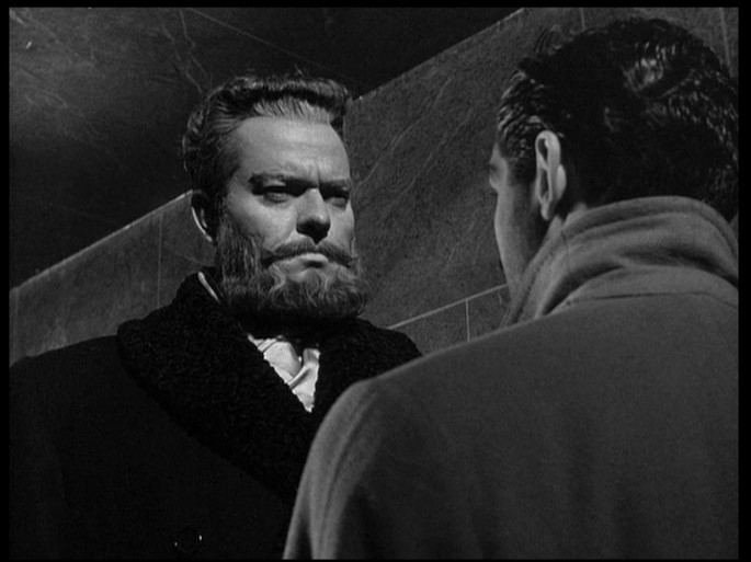
Mr. Arkadin. A clear visual style is demonstrated, with expanses of air or ceiling visible over the heads of actors, and this goes in close-up as well as in 2 and 3 shots. The man preferred to place his actors within a space that punctuated their predicament.. he was by routine not a fan of isolating the actor in tight space or stifling frames.. His actors were photographed operating in an environment, he was an extremely visually talented storyteller with a very definite visual style that becomes visible as the films are viewed and reviewed. A shot like this:

Image

is pure Welles. This

Image

is supersonic crappola. Go back to Arkadin, look at all of Gary's caps, or better yet watch the film. Now look at this cap:

Image

Here Russ Metty has charged a couple hundred/couple thousand dollars of unionized studio time to set up in another room off set, and meticulously fire a lamp from the floor up at an otherwise dark ceiling to have it register over the actors. This

Image

obliterates the director & dp's intentions. That splotch of light is an actor in the film, it's a set decoration that was specifically put there, a positive action was required to get this magnificent effect... and only the lamentably misinformed could see this shot, and construe, simply because it was during the changeover period and some theaters may have projected the film in 1.85, that the effect was labored over with time and studio money because it was not supposed to be seen in the first place.

Quite frankly Erickson has lost whatever last shred of credibility he's had with this reader, and I daresay with this forum (notwithstanding the amusing condescention to "online forums".. this knowing the status of DVDTalk as a dotcom style dvd forum wallowing in kerfluffle, at least versus this one).

I can't emphasize enough how crucial it is to examine the film, the caps (which, as opposed to seeing the film in motion, simulate-- the caps that is-- the act of the director looking thru the viewfinder to set up a shot, holding the actors in one place, throwing lights at them, to set up the dynamics of the image).

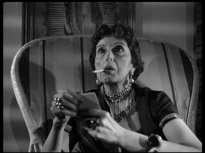
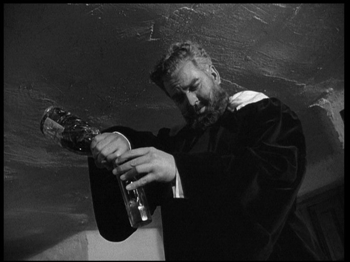
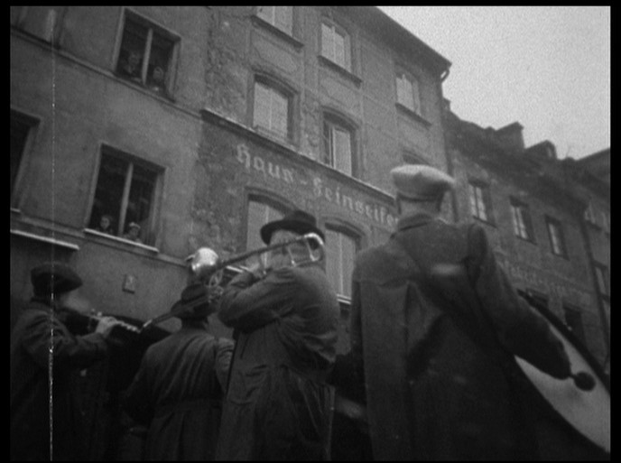
For the headroom tendency of Welles, versus the chopped heads/no- headroom look of the 1.85 version, see these caps from 2-3 yrs before Touch of Evil, of Mr Arkadin. Each and every shot resembles the open matte version of Touch of Evil:here, and here, and here and here, and here, and here. Each one of these caps displays a visual sense directly tuned into the visual style represented in the full aperture caps of Touch of.. , i e in academy. If comparing these caps with the open matte TOE doesn't establish for you Welles visual style, then, well, that's a tough one and I'm at a loss there.

Looking at the films and making up your own mind is key-- just like studying paintings, studying Grecian or Chinese pottery to determine their authenticity or authorship.. you use your eyes and your knowledge of your subject's history and historical tendencies, visual signatures that become tipoffs. In the absence of handwritten proof (which is rarely there to aid authenticators) you must sniff it out. Surely one must not throw up one's hands and say "O well, history is making it difficult, so let them do what they will.."

However:

The primary, overriding issue in this thread is now The Fanciful Norwegian changing his mindfuck avatar without forum authorization. This is going too far, far further than Universal has in corrupting Touch of Evil into 1.85.
Last edited by HerrSchreck on Sun Jul 13, 2008 5:16 pm, edited 1 time in total.
User avatar
The Fanciful Norwegian
Joined: Tue Nov 02, 2004 6:24 pm
Location: Teegeeack

#66 Post by The Fanciful Norwegian »

Man, I had that thing for like two years and nobody ever mentioned it. You bastards never appreciate anything until it's taken away from you.
User avatar
HerrSchreck
Joined: Sun Sep 04, 2005 3:46 pm

#67 Post by HerrSchreck »

I can't tell you how many times I stared at that thing trying to solve the mindfuck, but to no avail. Probably has a lot to do w why my nervous system is so shot.
User avatar
The Fanciful Norwegian
Joined: Tue Nov 02, 2004 6:24 pm
Location: Teegeeack

#68 Post by The Fanciful Norwegian »

Haggai
Joined: Wed Jun 25, 2008 1:31 pm
Location: San Diego

#69 Post by Haggai »

HerrSchreck wrote:
Haggai wrote:I'm not sure I buy arguments along of the lines of "look at these screen caps, this proves that 1.37 is the way it should be seen." One can prefer this or that aspect ratio in a case like this, but I don't think that definitively "proves" anything regarding Welles' intentions..

How anyone could say "studying the artwork itself is not a valid means for Studying An Artwork.. only peripheral documents, scribbled notes, videotaped conversations, etc, are valid.."-- is beyond me. This is like saying in the absence of a direct confession, evidentiary clues cannot be legally permitted to contribute to the solving of a crime.
I don't know how anyone could say what you think I said...but I certainly didn't say it. And I don't appreciate being condescended to. I only intended to say that I don't think arguments resting on screencaps are, themselves, definitive proof that Universal are a bunch of schmucks for releasing ToE in the WRONG WRONG WRONG aspect ratio. You want to cite screencaps in support of your argument that 1.37:1 is the better ratio for this film, fine. I don't have a problem with that, nor did I ever say that I did.

Admittedly, perhaps some of my wording could have given the impression that I was dismissing any and all arguments based on screencaps as being totally devoid of any worth. But when I immediately followed that by saying that I don't think screencaps "definitively 'prove' anything regarding Welles' intentions," it should have been clear enough that I wasn't making any sort of categorical statement.
User avatar
HerrSchreck
Joined: Sun Sep 04, 2005 3:46 pm

#70 Post by HerrSchreck »

I'm sorry you're wounded, if you're wounded, but I'm calling shenanigans here. You jumped into a conversation and threw down the first condenscention in paraphrasing (as you rightly mention in your second paragraph above), a la quoting the 1.37 crowd viz
"look at these screen caps, this proves that 1.37 is the way it should be seen."
. Surely you know that nobody said that-- what folks were actually doing was providing evidence and history to build a persuasive case. You're talking with some well informed folks who are in communication with leading Welles scholars on this. Not-- "Here, lookit dis pitchuh-- I win, enda story, no?"

And rather than stopping the convo, why not keep the conversation moving forward?.. I tried to respond to your post as substantively as possible, using examples, historical evidence and comparisons, etc, rather than bleat about your nitzy quotation of our standpoint. First and foremost, what does the similarity between visual style of TOE's preceding feature-- Arkadin-- and the full aperture caps of TOE tell you? Does it persuade you a bit more viz either the intended oar of the film, or the ability of caps to sway an argument? Unfortunately the tone of this argument has set by the idiotic appellation by Erickson of us as Misinformed Flamers... so appearing to side up with him (and quote us w condescention) is not going to get you any overnite-fedexed lei's... at least not today.

That is, provided you're not Glenn himself. Shenanigans!
Last edited by HerrSchreck on Sun Jul 13, 2008 6:14 pm, edited 1 time in total.
User avatar
GaryC
Joined: Fri Mar 28, 2008 7:56 pm
Location: Aldershot, Hampshire, UK

#71 Post by GaryC »

Props55 wrote:I recall an interview with Richard Brooks in which he stated that he made IN COLD BLOOD in anamorphic Panavision only because Columbia refused to "hard matte" for 1.85.
There could be an interview with Brooks where he says that, but there certainly is one with Conrad Hall where he says that - in Masters of Light by Dennis Schaefer and Larry Salvato. I'd cite a page reference if my flat was less in turmoil at the moment and I could find my copy. Strangely enough, Columbia were less opposed to black and white for In Cold Blood than they were for hard-matted 1.85:1.

Just to play devil's advocate, can you point to examples of the kind of framing you describe in earlier Welles films, i.e. those made pre-1953 and not in any doubt in Academy?

Incidentally, what are the ratios of Welles's later films, Chimes at Midnight and The Immortal Story? I've only seen these on British TV, nearly twenty-five years ago, and I don't remember.
Haggai
Joined: Wed Jun 25, 2008 1:31 pm
Location: San Diego

#72 Post by Haggai »

HerrSchreck wrote:I'm sorry you're wounded, if you're wounded, but I'm calling shenanigans here. You jumped into a conversation and threw down the first condenscention in paraphrasing (as you rightly mention in your second paragraph above), a la quoting the 1.37 crowd viz
"look at these screen caps, this proves that 1.37 is the way it should be seen."
Surely you know that nobody said that
As a matter of fact, some people here did say that. For instance, props55 said, "I believe the evidence of the screencaps posted by David Hare and others proves conclusively that TOUCH OF EVIL was composed and lighted for 1.37." And I thanked him for his informative comments regarding hard-matting, but I still disagree with how strongly he worded his conclusion. In any event, I have no interest in debating tone anymore, and I'm sure both of us are more than willing to move past that and get back to the substance of the discussion.

I appreciate your effort in compiling those Arkadin screencaps, but since I have yet to see that film (in any version), I'm not going to try to come to any conclusions based on it until I've done so.
User avatar
HerrSchreck
Joined: Sun Sep 04, 2005 3:46 pm

#73 Post by HerrSchreck »

Squashed, then. Aside from the relevance to the discussion here, you need to grab Arkadin because it's 1) one of CC's best (if not THE best) comprehensive study sets for a single title, and 2) one bitchin funhouse of a labyrinthine film. As I said someplace earlier... about as close as you can get to the feel of a Thomas Pynchon novel in the cinema. Layers of reality boxed within each other chinese style, phildickian-type paranoia.. the hyperfocus on the fact of multiple possible versions of reality ultimately blowing the veneer of Reality Itself away, leaving nothing but the theme of the individual stranded outside of the usual life-paradigm that others enjoy... forever moving between shabby waystations wherein sneering debate over the "what's" are had with mountebanks, mental cripples, outlaws, drug addicts, various other tarnished souls, etc etc. Sublime! With more time and money and a better cast this film could have easily bettered Kane, I believe. It just had so much going for it.
Jameson281
Joined: Sat May 19, 2007 5:53 am

#74 Post by Jameson281 »

broadwayrock wrote:More contributions for the 'misinformed flamers':

R2 DVD
Image
Calling this "proof" that 1.85:1 is wrong is silly--this is at the end of a long, complex shot with both camera and actors moving. Two seconds after this frame, Heston takes a step and his head is no longer cropped. You cannot grab a frame here and a frame there and declare it "proof" of misframing throughout the film.

As for the argument that "Aha! You can see details in this shot in the unmatted version that are lost in the matted version"--you can say that about pretty much any film shot open matte and then projected matted, whether shot by a genius or a no-talent hack. I remember Tim Lucas arguing that JURASSIC PARK should be 1.33:1 because a logo on a construction worker's hat got cropped. Look at the balance of the entire film in motion, not isolated frames.
User avatar
MichaelB
Joined: Fri Aug 11, 2006 10:20 pm
Location: Worthing
Contact:

#75 Post by MichaelB »

GaryC wrote:Incidentally, what are the ratios of Welles's later films, Chimes at Midnight and The Immortal Story? I've only seen these on British TV, nearly twenty-five years ago, and I don't remember.
The Immortal Story is essentially a French TV movie, so I'd say 1.33:1 without a doubt - though it may well have been cropped to 1.66:1 in cinemas, and possibly designed so this wouldn't hurt.
Post Reply