ellipsis7 wrote:Michael's grab of the scene from the Shochiku - seems to be less green and more red than the Panorama, but not quite as far the Criterion...
I was surprised that the Panorama DVD of this didn't look more like the Shochiku one (could a higher degree of compression play some role). The Panorama and Shochiku Late Autumn DVDs were closer.
Too bad the Shochiku release is subbed only in Japanese -- as I feel it is the clear winner image-wise (since it doesn't appear that Criterion fixed the first reel glitches either).
The white shirt is still registering as slightly green, but the red objects are working as effective colour cues... Yes that hic-hic-hiccup in the first reel is mildly irritating... What do you think of the Bordwell commentary, Michael?... Seems to me to distil his decades of Ozu study in a highly palatable and informative fashion... Certainly beats Richie stating the near obvious and repeating himself...
Haven't gotten to actually see the Criterion DVD (only the various screen shots). I will eventually get the Criterion -- because of the commentary -- but I just wish I could watch my Shochiku DVD while I listen to Bordwell's comentary.
My copy came with a complete booklet. I liked the look of the Criterion: it's more vibrant than the Shochiku but not to the film's detriment IMO (the skin tones didn't strike me as overly red as in their Eclipse transfer of The End of Summer for example). Hopefully they'll reissue Good Morning some time soon.
Well, Pinkish Old Codgers is what the CC edition is offering us.
Interestingly, the accompanying booklet has beautiful reproductions of color stills from the film--using a palette heretofore unseen in any of the video presentations. Yet another alternative to chose from.
Jack Phillips wrote:Well, Pinkish Old Codgers is what the CC edition is offering us.
Too bad. I had hoped Criterion would get the color right for this (as it did for Late Autumn).
Interestingly, the accompanying booklet has beautiful reproductions of color stills from the film--using a palette heretofore unseen in any of the video presentations. Yet another alternative to chose from.
Can you describe this? (And are these publicity shots rather than taken from the film itself)?
That's a tricky one - Criterion do not officially recognise non-US (& Canada) customers - so will not mail you a replacement in Spain, or anywhere outside North America for that matter... You could contact your retailer and ask them to obtain a replacement for you, or alternatively get a friend living in the States to request a replacement booklet from Criterion sent to their address, from where they can pass it on to you....
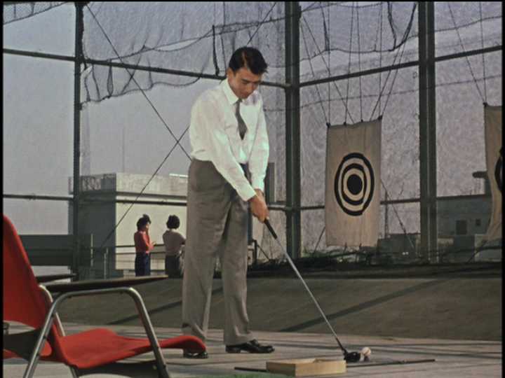
Brown, not green which we see in the Panorama and Shochiku...
As it happens I was just listening to Roger Ebert's commentary on FLOATING WEEDS and he states Ozu's favourite colour was red and that it is known he built his colour films round the reds - in fact Ozu is supposed have said that there are 14 shades of red in FLOATING WEEDS...
So my postulation above on the driving range sequence seems to be upheld...
I actually think that whether the more neutral and muted colours are slightly brown, green or blue, is very much a secondary issue, the key thing is the reds which are bright in the stills and CC's AUTUMN AFTERNOON...
It's going round in circles, I know, but I'm not getting pink skin at all in my CC AUTUMN AFTERNOON, projected via HDMI and HD projector onto 2.5m screen (I just checked again to be sure)... On the contrary I'm getting really true flesh colours, with some of the older characters more yellow than the others... What I am getting really excites me - I believe it is a really good transfer, the image to me is incredibly fine... I can't criticise a pink skin colour that ain't there for me...
Michael, have you decided not to pick up this disc after all?...
ellipsis7 wrote:It's going round in circles, I know, but I'm not getting pink skin at all in my CC AUTUMN AFTERNOON, projected via HDMI and HD projector onto 2.5m screen (I just checked again to be sure)..
Why then do almost all the screen captures seem to show pink skin? Perhaps Criterion is now balancing colors for post-CRT displays?
Criterion is probably balancing for LCD or Plasma screens, but most captures are via a computer DVD drive, a pretty basic tool despite sophisticated software, compared with high end SD DVD players (of which I'm using one) to get far more detailed and subtle images from Criterion and other boutique discs (often comparable with what Gary the Beaver is showing in grabs from Blu-Rays).... Whereas I can't get that quality and colour range when I play the same disc through my bog standard desktop DVD player connected to much smaller 32cm LCD screen... Same disc, completely different image, but there you are... I suppose it's to be expected - CRT, LCD, Plasma and the imaging chip that is in my projector are all quite different technologies...
But I totally accept your preference, Michael, for the Shochiku... I'm just sticking with my own personal choice....