Can't get enough, huh? Here some others. I particularly like the Johnny Depp stand-in.
I think that's most of the good ones, but if you want to browse: http://www.redbox.com/Titles/AvailableTitles.aspx
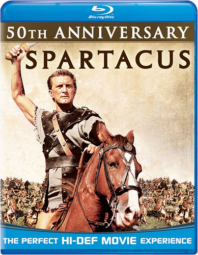
That looks like somebody realised they'd completely forgotten to design a cover until ten minutes before it went to press. "Get me a still! Any still!"
It was just announced and is coming out on March 9th so I think you might be right, zedz. It unfortunately reduces the chance that this is just some cruel joke and the cover will be changing before release - it's probably already being pressed.
The redbox rental service seems to need to make mock-up covers for some of their choices. I'm not clear if it is a rights issue, or what.
In any case their images are more amusing than offensive. In fact I appreciate the highly minimalist neutered look
Actually the INGLORIOUS BASTERDS cover is pretty damn good. The others ...meh.
(Althought HANGOVER gets points for having a tiger...)
For as wonderful a company as they are (are they a "company?") - BFI consistently underwhelms with their DVD artwork...it's consistently very blah. bums me out.
I'm pretty sure that those banners (as well as most of the others that have been decried on this forum) will not be on the actual packaging, or at least will be more subdued. I think they just use those large ones for the advertisements. You know, to really get their point across.
That said, the picture is still just sort of blah. I think I will always prefer Criterion's cover.
Trying to imagine the consumer who actually made it through something called A Boy Named Woof and felt the need to subject themselves to a sequel. I assume it's some sort of Catholic penance thing