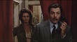
The Only Son and There Was a Father are far from minor Ozu (in fact, I think the latter is one of his very best). Love the covers!Flike wrote:Ha, and there's the dreaded Tomine contribution, which I find wonderful. Penguin has had success with their "graphic classics" and I think the participation of contemporary cartoonists is a great way to grab the attention of people who wouldn't normally bite on something like minor Ozu.
Criterion & Eclipse Cover Art & Packaging Babble-on Vol.4
-
reno dakota

- Joined: Mon Mar 17, 2008 3:30 pm
Re: Criterion & Eclipse Cover Art & Packaging Babble-on
Last edited by reno dakota on Thu Apr 15, 2010 4:28 pm, edited 1 time in total.
-
HistoryProf

- Joined: Mon Mar 13, 2006 7:48 am
- Location: KCK
Re: Criterion & Eclipse Cover Art & Packaging Babble-on
Before reading anyother responses: They bat a thousand this month...absolutely stunning artwork on every release! I'm in the significant minority in being just kind of "they're nice, but don't need to own them" on Ozu...but these covers are among the best they've ever done. The P&P blus are pure awesome. I did not like the 'screengrab' covers for blus at first, but i'm warming to them, and they are always better in hand than on-screen.
-
TMDaines
- Joined: Wed Nov 11, 2009 5:01 pm
- Location: Greater Manchester
Re: Criterion & Eclipse Cover Art & Packaging Babble-on
Yeh, both are shite. All the others I love though.Murdoch wrote:Well, Red Shoes and Black Narcissus sadly look like something from the fake cover thread.
-
HistoryProf
- Joined: Mon Mar 13, 2006 7:48 am
- Location: KCK
Re: Criterion & Eclipse Cover Art & Packaging Babble-on
swo17 wrote:In the interest of completeness, here are the individual Ozu covers:
[img]http://criterion_production.s3.amazonaws.com/product_images/999/524_box_348x490.jpg[/img][img]http://criterion_production.s3.amazonaws.com/product_images/1002/525_box_348x490.jpg[/img]
so cool.
-
HistoryProf
- Joined: Mon Mar 13, 2006 7:48 am
- Location: KCK
Re: Criterion & Eclipse Cover Art & Packaging Babble-on
are we to assume the Secret of the Grain Art comes from the same person who did Monsoon Wedding? I had forgotten about that release, but it just jumped out at me that they are indeed quite similar...almost like partner releases. odd.
-
bnowalk

- Joined: Wed Oct 14, 2009 6:27 pm
Re: Criterion & Eclipse Cover Art & Packaging Babble-on
God, those Ozus are impressive. I agree with the consensus about more representations of the films rather than direct screen-caps. That said, that particular Black Narcissus shot is my favorite from the film, much more striking and inviting than its counterpart on The Red Shoes, which I haven't seen. I was bothered by the font at first, too, but it works for me on Black Narcissus, and the literal coloring is okay for me since the films are all about color. My real problem is the placement of the "A film by Powell/Pressburger" on The Red Shoes.
-
Jean-Luc Garbo

- Joined: Thu Dec 09, 2004 5:55 am
- Contact:
Re: Criterion & Eclipse Cover Art & Packaging Babble-on
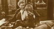
That's one hell of a deleted scene!Svevan wrote:No, while Moira Shearer and Marius Goring are canoodling in a carriage one day, they run over an old lady; Shearer doesn't admit to the crime, her and Goring have lots of sex, but then she goes to hell.
-
Murdoch

- Joined: Mon Apr 21, 2008 3:59 am
- Location: Upstate NY
Re: Criterion & Eclipse Cover Art & Packaging Babble-on
The cover from the UK release would've been much better IMO (sans black border of course)
Or this poster would've been nice as well.
Or this poster would've been nice as well.
-
triodelover
- Joined: Sat Jan 27, 2007 6:11 pm
- Location: The hills of East Tennessee
Re: Criterion & Eclipse Cover Art & Packaging Babble-on
swo17 wrote:In the interest of completeness, here are the individual Ozu covers:
[img]http://criterion_production.s3.amazonaws.com/product_images/999/524_box_348x490.jpg[/img][img]http://criterion_production.s3.amazonaws.com/product_images/1002/525_box_348x490.jpg[/img]
Can you do that for the individual Guitry covers (or tell me how :-" ).
-
swo17

- Bloodthirsty Butcher
- Joined: Tue Apr 15, 2008 2:25 pm
- Location: SLC, UT
Re: Criterion & Eclipse Cover Art & Packaging Babble-on
Re: Red Shoes, I can understand the motivation for wanting to go with a close-up still, as it highlights the level of detail you're going to be able to see in the BD, but I agree that it looks like a cover for the film described by Svevan.
Here are individual Guitry covers:
[img]http://criterion_production.s3.amazonaws.com/product_images/1007/Guitry_Cheat_348x490.jpg[/img][img]http://criterion_production.s3.amazonaws.com/product_images/1010/Guitry_Pearls_348x490.jpg[/img]
[img]http://criterion_production.s3.amazonaws.com/product_images/1013/Guitry_Desire_348x490.jpg[/img][img]http://criterion_production.s3.amazonaws.com/product_images/1016/Guitry_Quadrille_348x490.jpg[/img]
-
cdnchris

- Site Admin
- Joined: Tue Nov 02, 2004 6:45 pm
- Location: Washington
- Contact:
Re: Criterion & Eclipse Cover Art & Packaging Babble-on
I never liked the original Narcissus cover and once thought that if they could have somehow incorporated the shot they're now using into it it could have been great. Unfortunately they just used a static shot but it still looks nice. I like the others as well, expecially the Ozu's.
-
whaleallright

- Joined: Sun Sep 25, 2005 4:56 am
Re: Criterion & Eclipse Cover Art & Packaging Babble-on
While they're far from being ugly, does anyone else find many of the recent Criterion packaging to seem a bit cheap and uninspired?
They resemble the quick Photoshop layering jobs found, for instance, in the forum's faux covers thread in the way they place the title roughly in the center, using a stock font, over a single image from the film. That is, the typography is not permitted to be a strong graphic element, nor truly integrated with the picture:
[img]http://criterion_production.s3.amazonaws.com/release_images/2761/44_box_348x490_w128.jpg[/img] [img]http://criterion_production.s3.amazonaws.com/release_images/2755/93_box_348x490_w128.jpg[/img] [img]http://criterion_production.s3.amazonaws.com/release_images/2722/520_box_348x490_w128.jpg[/img] [img]http://criterion_production.s3.amazonaws.com/release_images/2662/514_box_348x490_w128.jpg[/img]
This is downright ugly (do they not want to sell any of this title?):
[img]http://criterion_production.s3.amazonaws.com/release_images/2743/522_box_348x490_w128.jpg[/img]
And this is questionable as well, taking the design principle of the covers presented above and just adding one tacky Photoshop effect:
[img]http://criterion_production.s3.amazonaws.com/release_images/2725/519_box_348x490_w128.jpg[/img]
The other covers among Criterions new titles seem to carry on in their tradition of inventive and appealing design. Of the recent releases, I prefer those that commission new images that represent the tone of the film, though with the Ozu set, the attractive image is let down by the uninspired overall design:
[img]http://criterion_production.s3.amazonaws.com/release_images/2752/FatherSon_box_348x490_w128.jpg[/img]
-
domino harvey

- Dot Com Dom
- Joined: Wed Jan 11, 2006 6:42 pm
Re: Criterion & Eclipse Cover Art & Packaging Babble-on
The Ozu slipcase reminds me of the template university presses use for film books. Not a complaint
-
whaleallright
- Joined: Sun Sep 25, 2005 4:56 am
Re: Criterion & Eclipse Cover Art & Packaging Babble-on
Yes, I agree -- it's appealing for that reason, but also seems like something of a category error.
Last edited by whaleallright on Thu Apr 15, 2010 6:24 pm, edited 1 time in total.
-
ShellOilJunior

- Joined: Tue Apr 28, 2009 11:17 am
Re: Criterion & Eclipse Cover Art & Packaging Babble-on
Secret of the Grain is very nice!
-
Matt

- Joined: Tue Nov 02, 2004 4:58 pm
Re: Criterion & Eclipse Cover Art & Packaging Babble-on
I'm pretty happy with the P&P covers. Each features a shot from perhaps the greatest moments in each film. They might not be terribly enticing to people unfamiliar with the films, but they're nice nods to adoring fans. I do agree that the type treatment is a bit lazy. I'm not fond of all caps run together like that.
One interesting thing they could have done with these paired releases is to put the famous close-up of Kathleen Byron on Black Narcissus, but I don't really care that they don't match like P&P salt and pepper shakers.
One interesting thing they could have done with these paired releases is to put the famous close-up of Kathleen Byron on Black Narcissus, but I don't really care that they don't match like P&P salt and pepper shakers.
-
TMDaines
- Joined: Wed Nov 11, 2009 5:01 pm
- Location: Greater Manchester
Re: Criterion & Eclipse Cover Art & Packaging Babble-on
Yup. I much prefer the original poster art stylings of labels like MOC and RHV. I hate to think how many films RHV have piqued my interest in on the basis of the cover alone. Criterion do do some great covers (Berlin Alexanderplatz is my favourite) but they're a lot more hit and miss in my opinion.jonah.77 wrote:While they're far from being ugly, does anyone else find many of the recent Criterion packaging to seem a bit cheap and uninspired?
-
Highway 61

- Joined: Mon Nov 08, 2004 8:40 pm
Re: Criterion & Eclipse Cover Art & Packaging Babble-on
Wow, I hate The Red Shoes cover. It's just laughable. If they wanted to convey the film's darker tone, they should have gone with Walbrook.
-
Tribe

- The Bastard Spawn of Hank Williams
- Joined: Tue Nov 02, 2004 11:59 pm
- Location: Toledo, Ohio
- Contact:
Re: Criterion & Eclipse Cover Art & Packaging Babble-on
I'm sure you'll find plenty to agree with you...and anticipating that, I'm one who disagrees with the "cheap and uninspiring" opinion.jonah.77 wrote:While they're far from being ugly, does anyone else find many of the recent Criterion packaging to seem a bit cheap and uninspired?
-
zitherstrings
- Joined: Wed Mar 03, 2010 4:35 am
Re: Criterion & Eclipse Cover Art & Packaging Babble-on
The Red Shoes cover is as bad as anything they've ever done. They need to fix it. BN is the right still but the font is horrid.
-
Feego

- Joined: Thu Aug 16, 2007 11:30 pm
- Location: Texas
Re: Criterion & Eclipse Cover Art & Packaging Babble-on
This is another great poster for The Red Shoes. For a film that is so much about movement, I really wish they would have created/chosen an image that showed Moira Shearer's whole body and her limberness. It also would be nice to emphasize the fantasy elements of the film (it is based on a fairy tale, after all). Although, I do at least find the image striking.Murdoch wrote:The cover from the UK release would've been much better IMO (sans black border of course)
Or this poster would've been nice as well.
I find the Black Narcissus image striking IN THE FILM, but not on that cover. I also don't like the way they have rotated the image. I always thought the image of Kathleen Byron standing on the edge was more representative of the temptation to jump into or surrender herself to the unknown and forbidden. The rotation gives it a disorienting effect more reminiscent of Vertigo's bell tower scene than BN's.
-
Michael Kerpan

- Spelling Bee Champeen
- Joined: Wed Nov 03, 2004 5:20 pm
- Location: New England
- Contact:
Re: Criterion & Eclipse Cover Art & Packaging Babble-on
On the other hand, I often find the original poster art far cheesier than the films being promoted by the posters. ;~}
(This includes the Red Shoes posters above).
(This includes the Red Shoes posters above).
-
StevenJ0001

- Joined: Mon May 05, 2008 4:02 pm
- Location: Los Angeles
Re: Criterion & Eclipse Cover Art & Packaging Babble-on
Indeed. That's one of the things I like so much about it.domino harvey wrote:The Ozu slipcase reminds me of the template university presses use for film books. Not a complaint
-
HistoryProf
- Joined: Mon Mar 13, 2006 7:48 am
- Location: KCK
Re: Criterion & Eclipse Cover Art & Packaging Babble-on
As I noted earlier, I was initially annoyed by the Ride cover along with Revanche and the growing penchant for using screengrabs on the blu covers - but have changed my mind after seeing those that have been released in person. I don't know precisely what it is, but in the case of RWtD for instance, in person it just feels better. I suspect both RS and BN are going to look amazing in person as well. For some reason these types of covers just look better in person than on the screen. no idea why.jonah.77 wrote:While they're far from being ugly, does anyone else find many of the recent Criterion packaging to seem a bit cheap and uninspired?
They resemble the quick Photoshop layering jobs found, for instance, in the forum's faux covers thread in the way they place the title roughly in the center, using a stock font, over a single image from the film. That is, the typography is not permitted to be a strong graphic element, nor truly integrated with the picture:
[img]http://criterion_production.s3.amazonaws.com/release_images/2761/44_box_348x490_w128.jpg[/img] [img]http://criterion_production.s3.amazonaws.com/release_images/2755/93_box_348x490_w128.jpg[/img] [img]http://criterion_production.s3.amazonaws.com/release_images/2722/520_box_348x490_w128.jpg[/img] [img]http://criterion_production.s3.amazonaws.com/release_images/2662/514_box_348x490_w128.jpg[/img]
And I think the Everlasting Moments cover is utterly gorgeous - just like the film. Though I was secretly hoping they'd use a still from the kids peaking through the window at the dead body as she takes her first picture 'for hire.' That moment haunted me for weeks, and seemed the perfect representation of the title.
-
HistoryProf
- Joined: Mon Mar 13, 2006 7:48 am
- Location: KCK
Re: Criterion & Eclipse Cover Art & Packaging Babble-on
agreed....I think those two posters would make terrible dvd/bd covers. *shrugs*Michael Kerpan wrote:On the other hand, I often find the original poster art far cheesier than the films being promoted by the posters. ;~}
(This includes the Red Shoes posters above).