Criterion & Eclipse Cover Art & Packaging Babble-on Vol.4
-
swo17

- Bloodthirsty Butcher
- Joined: Tue Apr 15, 2008 2:25 pm
- Location: SLC, UT
Re: Criterion & Eclipse Cover Art & Packaging Babble-on
That poster Feego linked to would make a great cover. It kind of reminds me of what Criterion did for Il generale della Rovere.
-
zedz

- Joined: Sun Nov 07, 2004 11:24 pm
Re: Criterion & Eclipse Cover Art & Packaging Babble-on
Lovely and appropriate Ozus.
I think Black Narcissus looks terrific (even down to the BLACK / WHITE text), but the same template on The Red Shoes looks like fan art. I'm not in love with the still, and it's not one that can accommodate text comfortably. There must be plenty of images from the film that communicate passionate intensity as well as dance.
I think Black Narcissus looks terrific (even down to the BLACK / WHITE text), but the same template on The Red Shoes looks like fan art. I'm not in love with the still, and it's not one that can accommodate text comfortably. There must be plenty of images from the film that communicate passionate intensity as well as dance.
-
knives

- Joined: Sat Sep 06, 2008 10:49 pm
Re: Criterion & Eclipse Cover Art & Packaging Babble-on
The light over her as she spins? Personally I'm okay with the cover even if I know it could be better.
-
StevenJ0001

- Joined: Mon May 05, 2008 4:02 pm
- Location: Los Angeles
Re: Criterion & Eclipse Cover Art & Packaging Babble-on
It may make a good MoC cover, but although there are exceptions, poster art doesn't seem to lend itself to Criterion's house style very well.swo17 wrote:That poster Feego linked to would make a great cover.
-
Alphonse Doinel

- Joined: Sun Dec 06, 2009 4:42 pm
Re: Criterion & Eclipse Cover Art & Packaging Babble-on
I'm all for simplicity, but those P&P covers look like complete ass. Not only did they choose Trajan, the current generic default poster typeface, but its placed poorly too.
The Ozu covers are great. Not sure I did that typeface though. Looks an awful lot like Woody Allen's default.
The Ozu covers are great. Not sure I did that typeface though. Looks an awful lot like Woody Allen's default.
-
Feego

- Joined: Thu Aug 16, 2007 11:30 pm
- Location: Texas
Re: Criterion & Eclipse Cover Art & Packaging Babble-on
I wasn't really suggesting that the poster itself should be used as the cover, but rather that a more ideal cover would somehow incorporate the movement and dancing, the expressive colors, and the fantasy of the movie, as that poster does. I would have loved if Criterion had comissioned an artist to create a new design rather than just using a screenshot.
Either way, I won't be spending much time looking at the cover. My eyes will be fixed on the stunning Blu-ray transfer.
Either way, I won't be spending much time looking at the cover. My eyes will be fixed on the stunning Blu-ray transfer.
-
cdnchris

- Site Admin
- Joined: Tue Nov 02, 2004 6:45 pm
- Location: Washington
- Contact:
Re: Criterion & Eclipse Cover Art & Packaging Babble-on
I actually like the cover for The Red Shoes. I wish they stuck closer to the original artwork or maybe used something similar to the ITV artwork, but I still like it.
-
Cinephrenic

- Joined: Tue Nov 02, 2004 6:58 pm
- Location: Paris, Texas
Re: Criterion & Eclipse Cover Art & Packaging Babble-on
Secrets of the Grain is very original. The best in the bunch I think.
-
peerpee
- not perpee
- Joined: Tue Nov 02, 2004 7:41 pm
Re: Criterion & Eclipse Cover Art & Packaging Babble-on
After reading this thread for years, what strikes me is the number of wonderful illustrated Criterion covers which follow a particularly lovely logic harking back to classic iconography associated with the films' histories. These are usually specially commissioned, created in conjunction with an artist/illustrator and when they appear, they're often the most widely praised. Examples:
GRAND ILLUSION
new AMARCORD
all the Wes Anderson
LE CORBEAU
EYES WITHOUT A FACE
HEAVEN CAN WAIT
KIND HEARTS AND CORONETS
SALVATORE GIULIANO
SWEET MOVIE
GREEN FOR DANGER
all the Ophuls
MISS JULIE
WISE BLOOD
MAKE WAY FOR TOMORROW
SUMMER HOURS
STAGECOACH
MYSTERY TRAIN
NIGHT TRAIN TO MUNICH
THE ONLY SON/THERE WAS A FATHER
But some of my favourite Criterion covers are heavily based on original poster designs which are so strong it would have been foolish not to use:
LE MILLION
NIGHTS OF CABIRIA
SULLIVAN'S TRAVELS
THE DISCREET CHARM OF THE BOURGEOISIE
all the Tati
BOUDU
PICKPOCKET
TRAFIC
etc
The two new Ozu covers are stunning.
-
Jeff

- Joined: Wed Nov 03, 2004 1:49 am
- Location: Denver, CO
Re: Criterion & Eclipse Cover Art & Packaging Babble-on
The stills for the P&Ps are both perfect for me. That climactic scene and close-up in The Red Shoes is so emblematic of the look and feel of the film. It's a cover I never would have though of, but it works. For me, it does convey movement -- frenetic movement, but that's because I am aware of what immediately preceded it. I suppose it might not work for luring in new viewers. The still for Black Narcissus showed up in the fake cover thread a while back I think. I don't want to dig it up, but I remember it looking a lot like that cover. I liked it when it was fake, so I'm glad they used it. The font, title treatment, and placement on both films is pretty lousy, and will hopefully be changed.
-
Jean-Luc Garbo

- Joined: Thu Dec 09, 2004 5:55 am
- Contact:
Re: Criterion & Eclipse Cover Art & Packaging Babble-on
I just had an idea that Criterion could always do a matching trio of variant covers for RS: Goring and Walbrook to go with Shearer.  Collect all three!! (This is why I'm not in advertising.)
-
HistoryProf

- Joined: Mon Mar 13, 2006 7:48 am
- Location: KCK
Re: Criterion & Eclipse Cover Art & Packaging Babble-on
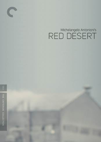
I was having trouble seeing the difference without the old one to compare it too....so here goes:swo17 wrote:They also finally listened to everyone's complaints about Red Desert (it's too gray!) and changed that cover:
[img]http://criterion_production.s3.amazonaws.com/release_images/2743/522_box_348x490.jpg[/img]
-
triodelover
- Joined: Sat Jan 27, 2007 6:11 pm
- Location: The hills of East Tennessee
Re: Criterion & Eclipse Cover Art & Packaging Babble-on
They didn't listen hard enough, then. Monica Vitti still,isn't on the cover.HistoryProf wrote:swo17 wrote:They also finally listened to everyone's complaints about Red Desert
-
rwaits
- Joined: Tue Dec 21, 2004 4:24 pm
Re: Criterion & Eclipse Cover Art & Packaging Babble-on
Wow, I hadn't thought of that - that would have been nice! Missed opportunity.Matt wrote:One interesting thing they could have done with these paired releases is to put the famous close-up of Kathleen Byron on Black Narcissus, but I don't really care that they don't match like P&P salt and pepper shakers.
-
MyNameCriterionForum

- Joined: Sat Jun 21, 2008 9:27 am
Re: Criterion & Eclipse Cover Art & Packaging Babble-on
Jesus Christ, is there a more boring and predictable artist on the planet than Adrian Tomine? I'd rather Thomas Effing Kinkaid had painted those Ozu covers, however inappropriate it might have been. Tomine is dull as paste, and just about as useful. He's never taken the slightest chance (on his stories or drawing) in his entire life. Utterly uninspired, his whole oeuvre. Dude either has no intuitive skills or no access to them. Kill me now.
And all those female Sassy readers who flock to these films because Adrian is such a dreamboat and because he understands will be bored out of their skulls...
And all those female Sassy readers who flock to these films because Adrian is such a dreamboat and because he understands will be bored out of their skulls...
-
domino harvey

- Dot Com Dom
- Joined: Wed Jan 11, 2006 6:42 pm
Re: Criterion & Eclipse Cover Art & Packaging Babble-on
And of course I love Tomine
-
bugsy_pal

- Joined: Mon May 12, 2008 5:28 am
Re: Criterion & Eclipse Cover Art & Packaging Babble-on
I can't believe that this thread has ventured into personal insults on the designers. Sure, we can all express an opinion, but how many of us here have the training and skill to really critique all aspects of the cover designs? To suggest that the P&P covers are no better than some of the crappy mockups done by hobbyists here is another insult (I'm not referring to specific mockups, and acknowledge that there have been plenty of really good ones done...)
Anyway, I think the new P&P covers are great. They are fresh and a departure from the predictable. I would even say they look beautiful.
I would agree that there has been a move towards greater simplicity with Criterion's covers of late, especially those where a crop from the film is used. And a corresponding move towards simpler more elegant typography, with perhaps less dicking around in Photoshop to give things a layered or textured appearance. I don't think it's a bad trend - it'll be interesting to see if it's sustained over the long term.
-
Murdoch

- Joined: Mon Apr 21, 2008 3:59 am
- Location: Upstate NY
Re: Criterion & Eclipse Cover Art & Packaging Babble-on
That Red Desert cover change makes all the difference 
-
jbeall

- Joined: Sat Aug 12, 2006 1:22 pm
- Location: Atlanta-ish
Re: Criterion & Eclipse Cover Art & Packaging Babble-on
I love the Ozu covers (it helps that I'm a fan of Tomine). I think it's a great change of pace for Criterion, For that matter, The Secret of the Grain cover is fantastic. Ambivalent on the P&P covers, but the first three make is a good month for Criterion in the cover dept.
-
Michael Kerpan

- Spelling Bee Champeen
- Joined: Wed Nov 03, 2004 5:20 pm
- Location: New England
- Contact:
Re: Criterion & Eclipse Cover Art & Packaging Babble-on
I have no objection at all to the Ozu covers -- but prefer the artwork (and style) of the Shochiku Shimizu sets.
-
Svevan

- Joined: Mon Nov 22, 2004 11:49 pm
- Location: Portland, OR
Re: Criterion & Eclipse Cover Art & Packaging Babble-on
For a movie that makes Moira Shearer look beautiful 99% of the time, they picked a photo featuring her sweaty forehead and ugly eyeliner. The comments about Criterion's "house style" are probably correct - to use an authentic poster as a cover NOW would be totally out of nowhere, like Criterion releasing a silent film (ba-dum). But as that House Style is getting more and more disconnected (in many but not all cases) from the actual art of the films involved, I find it difficult to support. I think Mr. Wrigley's post above is on the money: matching an illustrator to the style of the film in question can bear some great fruit. The Ozu covers, in my mind, succeed - the Red Shoes just doesn't. It's like they heard everyone clamoring for Monica Vitti on the cover of Red Desert and decided to put a big unflattering picture of Shearer on this cover instead. NOBODY WINS.
This makes me wonder how you react to Ozu himself, as the criticisms sound very similar...MyNameCriterionForum wrote:Jesus Christ, is there a more boring and predictable artist on the planet than Adrian Tomine? I'd rather Thomas Effing Kinkaid had painted those Ozu covers, however inappropriate it might have been. Tomine is dull as paste, and just about as useful. He's never taken the slightest chance (on his stories or drawing) in his entire life. Utterly uninspired, his whole oeuvre. Dude either has no intuitive skills or no access to them. Kill me now.
-
headacheboy

- Joined: Thu Nov 04, 2004 12:57 am
Re: Criterion & Eclipse Cover Art & Packaging Babble-on
Wasn't Magnificent Obsession based on the poster art? And didn't it rate quite high in the Criterion Awards last year?
-
HistoryProf
- Joined: Mon Mar 13, 2006 7:48 am
- Location: KCK
Re: Criterion & Eclipse Cover Art & Packaging Babble-on
you could at least spell Kinkade's name right if you are going to use him to insult TomineMyNameCriterionForum wrote:Jesus Christ, is there a more boring and predictable artist on the planet than Adrian Tomine? I'd rather Thomas Effing Kinkaid had painted those Ozu covers, however inappropriate it might have been. Tomine is dull as paste, and just about as useful. He's never taken the slightest chance (on his stories or drawing) in his entire life. Utterly uninspired, his whole oeuvre. Dude either has no intuitive skills or no access to them. Kill me now.
And all those female Sassy readers who flock to these films because Adrian is such a dreamboat and because he understands will be bored out of their skulls...
-
Feego
- Joined: Thu Aug 16, 2007 11:30 pm
- Location: Texas
Re: Criterion & Eclipse Cover Art & Packaging Babble-on
Yes, as was El Norte.headacheboy wrote:Wasn't Magnificent Obsession based on the poster art?
-
MyNameCriterionForum
- Joined: Sat Jun 21, 2008 9:27 am
Re: Criterion & Eclipse Cover Art & Packaging Babble-on
Gosh, maybe those of us who make our livings as artists and designers too?bugsy_pal wrote:I can't believe that this thread has ventured into personal insults on the designers. Sure, we can all express an opinion, but how many of us here have the training and skill to really critique all aspects of the cover designs?
Or are we not allowed to criticize any medium/form we ourselves are not expert practitioners in? If that's the case, you better shut the forums down, because I'd bet 97% of the contributors here are not filmmakers -- and according to you their thoughts about film don't matter.
Dude, it's the fucking I N T E R N E T