Criterion & Eclipse Cover Art & Packaging Babble-on Vol.4
-
mfunk9786

- Under Chris' Protection
- Joined: Fri May 16, 2008 8:43 pm
- Location: Miami, FL
Re: Criterion & Eclipse Cover Art & Packaging Babble-on
I prefer the BD artwork. And they've been doing that a lot lately, varying the interior/disc art.
-
cdnchris

- Site Admin
- Joined: Tue Nov 02, 2004 6:45 pm
- Location: Washington
- Contact:
-
Napier

- Joined: Wed Nov 03, 2004 1:48 pm
- Location: The Shire
Re: Criterion & Eclipse Cover Art & Packaging Babble-on
3-D interior artwork?
-
Tribe

- The Bastard Spawn of Hank Williams
- Joined: Tue Nov 02, 2004 11:59 pm
- Location: Toledo, Ohio
- Contact:
Re: Criterion & Eclipse Cover Art & Packaging Babble-on
That so discriminates against those of us with lazy eye...Napier wrote:3-D interior artwork?
-
kaujot

- Joined: Mon May 08, 2006 10:28 pm
- Location: Austin
- Contact:
Re: Criterion & Eclipse Cover Art & Packaging Babble-on
Gorgeous package.
-
Matt

- Joined: Tue Nov 02, 2004 4:58 pm
Re: Criterion & Eclipse Cover Art & Packaging Babble-on
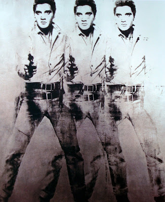
I assume that's some kind of Warhol Triple Elvis allusion, but it seems a little odd for this package.
-
Svevan

- Joined: Mon Nov 22, 2004 11:49 pm
- Location: Portland, OR
Re: Criterion & Eclipse Cover Art & Packaging Babble-on
I'm fond of the whole package, equal parts pop-art, 50s kitsch, and modernism. Very cool.
-
MyNameCriterionForum

- Joined: Sat Jun 21, 2008 9:27 am
Re: Criterion & Eclipse Cover Art & Packaging Babble-on
Yeah, obviously a Warhol reference, and pretty clever in my opinon. This is, after all, considered the first "modern" western, no? Perhaps the first "Pop" western?
-
Tom Hagen

- Joined: Mon Apr 14, 2008 4:35 pm
- Location: Salt Lake City, Utah
Re: Criterion & Eclipse Cover Art & Packaging Babble-on
I like the art, but I don't get it. I understand the ironist impulse to pierce the "Cowboys and Indians" bravado of John Wayne and the genre as a whole, but this is Stagecoach for chrissakes.Matt wrote:I assume that's some kind of Warhol Triple Elvis allusion, but it seems a little odd for this package.
-
Tribe
- The Bastard Spawn of Hank Williams
- Joined: Tue Nov 02, 2004 11:59 pm
- Location: Toledo, Ohio
- Contact:
Re: Criterion & Eclipse Cover Art & Packaging Babble-on
It is on the back of the cover paper, after all.Tom Hagen wrote: I like the art, but I don't get it. I understand the ironist impulse to pierce the "Cowboys and Indians" bravado of John Wayne and the genre as a whole, but this is Stagecoach for chrissakes.
-
domino harvey

- Dot Com Dom
- Joined: Wed Jan 11, 2006 6:42 pm
Re: Criterion & Eclipse Cover Art & Packaging Babble-on
Selling this as some kind of kitsch product makes me want to vom all over those responsible
-
HistoryProf

- Joined: Mon Mar 13, 2006 7:48 am
- Location: KCK
Re: Criterion & Eclipse Cover Art & Packaging Babble-on
=D> =D>
that should put to rest the whining about this particular cover. As expected the shade of teal is much more natural/faded in person. that looks absolutely gorgeous, and I can't wait to own it! Love the Walkabout blu are too...and prefer the blu interior. for a film that's so vibrant the SD interior is far too bland.
I just have to figure out how i'm going to afford all of these releases in May and June. it's pretty ridiculous, and in may they are coming one a week
-
godardslave

- Joined: Tue Nov 02, 2004 8:44 pm
- Location: Confusing and open ended = high art.
Re: Criterion & Eclipse Cover Art & Packaging Babble-on
Stagecoach package is a horrible ugly mess. 
This ranks up there with the pink cover for Viridiana as a failure.
Just looking at it gives me a headache.
Pop art post-modernism just doesn't work for Classicism.
This ranks up there with the pink cover for Viridiana as a failure.
Just looking at it gives me a headache.
Pop art post-modernism just doesn't work for Classicism.
Last edited by godardslave on Fri Apr 30, 2010 5:20 pm, edited 1 time in total.
-
Napier
- Joined: Wed Nov 03, 2004 1:48 pm
- Location: The Shire
Re: Criterion & Eclipse Cover Art & Packaging Babble-on
I think a nice shot of Monument Valley would have worked well on the interior art. Regardless, I can't wait for this!
-
aox

- Joined: Fri Jun 20, 2008 4:02 pm
- Location: nYc
Re: Criterion & Eclipse Cover Art & Packaging Babble-on
This is pretty much the best release ever. I'm going to get high and watch the artwork when I finally receive it.
-
med

- Joined: Tue Mar 17, 2009 9:58 pm
Re: Criterion & Eclipse Cover Art & Packaging Babble-on
While I "get" the artwork and think it's done well in the formal sense, I think it's completely inappropriate in relation to the picture. I'm surprised it's been received so warmly around these parts. Discounting domino's and godardslave's absurd hyperbole, of course.
With that said, yes, I can't wait to get this. It's not the interior artwork that I'll be watching on my TV screen.
With that said, yes, I can't wait to get this. It's not the interior artwork that I'll be watching on my TV screen.
-
godardslave
- Joined: Tue Nov 02, 2004 8:44 pm
- Location: Confusing and open ended = high art.
Re: Criterion & Eclipse Cover Art & Packaging Babble-on
That's actually reasonably funny.aox wrote:This is pretty much the best release ever. I'm going to get high and watch the artwork when I finally receive it.
And it might just be the only way this artwork could make sense.
-
swo17

- Bloodthirsty Butcher
- Joined: Tue Apr 15, 2008 2:25 pm
- Location: SLC, UT
Re: Criterion & Eclipse Cover Art & Packaging Babble-on
Anyone who doesn't like it is just jealous that they can't see what it looks like when you cross your eyes just right.
Spoiler
There are four John Waynes!
-
godardslave
- Joined: Tue Nov 02, 2004 8:44 pm
- Location: Confusing and open ended = high art.
Re: Criterion & Eclipse Cover Art & Packaging Babble-on
Hey, leave my hyperbole alone! [-o<med wrote:Discounting domino's and godardslave's absurd hyperbole, of course.
-
mfunk9786
- Under Chris' Protection
- Joined: Fri May 16, 2008 8:43 pm
- Location: Miami, FL
Re: Criterion & Eclipse Cover Art & Packaging Babble-on
Did Mr. Brainwash do the interior artwork? I mean, I like it, but I'm fully aware that I shouldn't.
-
godardslave
- Joined: Tue Nov 02, 2004 8:44 pm
- Location: Confusing and open ended = high art.
Re: Criterion & Eclipse Cover Art & Packaging Babble-on
The forum has become afraid to be outspokenly critical of artwork in recent times!med wrote: I'm surprised it's been received so warmly around these parts.
-
Svevan
- Joined: Mon Nov 22, 2004 11:49 pm
- Location: Portland, OR
-
sidehacker
- Joined: Sat Mar 17, 2007 6:49 am
- Location: Bowling Green, Ohio
- Contact:
Re: Criterion & Eclipse Cover Art & Packaging Babble-on
Don't you guys know? This is Russ Meyers' version of "John Ford's Stagecoach."
-
domino harvey
- Dot Com Dom
- Joined: Wed Jan 11, 2006 6:42 pm
Re: Criterion & Eclipse Cover Art & Packaging Babble-on
Wouldn't that interior be more appropriate for I Shot Liberty Valance?
-
cdnchris
- Site Admin
- Joined: Tue Nov 02, 2004 6:45 pm
- Location: Washington
- Contact:
Re: Criterion & Eclipse Cover Art & Packaging Babble-on
By Brakhage Blu-ray Set
I apologize for the light in the photos. My wife loaned the camera out to someone and I had to use my cell phone. I'll take shots with a proper camera once I get it back.
I apologize for the light in the photos. My wife loaned the camera out to someone and I had to use my cell phone. I'll take shots with a proper camera once I get it back.