
The folks at
88MPH Studios and DVDAnswers
have been all over this one already, but in summary:
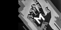
1. Slimy color scheme looks inspired by box of ecto-cooler.
2. Lack of cover credit for Ernie Hudson.
3. "Gift Set."
4. One of the most recognizable insignia of the 1980s gets shitty, photoshoppy augmentation and is
inexplicably tilted five degrees to the right.
5. It's "
II", like the fingers and the poster say (the movie itself has no title card). Not "2". And it's not "Ghostbusters 1", for that matter.
EDIT: I want to make it clear, the image linked in this post and displayed in the post below was not something that I did, but was done by Sebastien Clavet from
88MPH, the imprint that produces the
Ghostbusters comic book series. As they appear to be the only professional outfit who give a shit about this franchise anymore, and specialize in graphic artwork, it's rather ridiculous that Columbia didn't bother to solicit any input from them on this.


