A few points in defense of Criterion (devil's advocate really):
Colors: The MoC might look 'better' to the majority of people on this board in terms of today's standards, but the bluer tones are not necessarily more faithful to how the original prints looked in 1970. When performing restorations and color adjustments for older films there exists a debate between a) contemporary color aesthetics, b) expectations of earlier color aesthetics, and c) theories as to what the real colors actually were. Style Journal once ran a terrific article on the problems in color restoration for Meet Me In St Louis that paralleled Schrödinger's cat a bit. So unless you know specifically how a film's coloring was intended to look like I'm not sure you can argue that one is more accurate based upon today's standards.
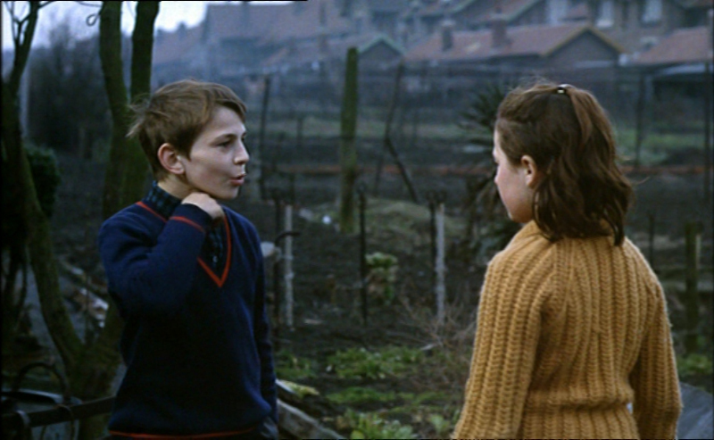
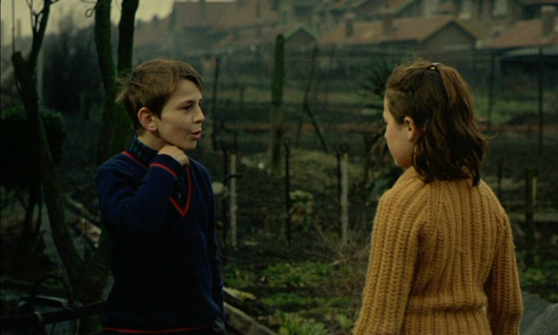
Cropping: The MoC's cropping issues looks to be problematic in the first example at DVDBeaver. In the Criterion the girl in the upper left is not cropped and is framed nicely with a thin layer of space. In the MoC she's butchered and once you notice this stuff watching the film becomes quite unbearable as I assume this occurs numerous times in the film. Criterion is guilty of this as well in a few of their titles, specifically High and Low when the film is presented at 2.035:1 instead of 2.35:1. Kurosawa would never crop off the gentlemen at the edge of the frames in that way that the Criterion disc does.
Anyway, these are things to think about when trying to determine which version is more correct.
534 L'enfance nue
-
Steven H

- Joined: Tue Nov 02, 2004 7:30 pm
- Location: NC
Re: 534 L'enfance nue
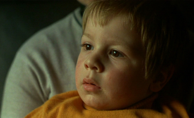
Interesting points, but while we sit here rationalizing that poor baby is dying of jaundice. But anyway the Criterion also has an IMMENSE amount of detail loss and does anyone else find it curious that the Menu backgrounds on the Criterion look like they came from the MoC disc instead of theirs?
-
justeleblanc

- Joined: Wed Nov 03, 2004 10:05 pm
- Location: Connecticut
Re: 534 L'enfance nue
"IMMENSE detail loss" on the Criterion? Point to an example please. If anything, MoC's stretching would decrease sharpness. I'm looking specifically at the young girl's hair barrette (4th comparison). But even more strikingly please take a look at the ride side of that girl's arm. The MoC has a nasty white outline whereas the Criterion does not have that artificial light blur. The more I look for details the more the Criterion looks to be slightly superior.
MoC (bottom right corner, light/edge distortion):
Criterion (bottom right corner, light/edge preservation):
MoC (bottom right corner, light/edge distortion):
Criterion (bottom right corner, light/edge preservation):
-
Mikos Stenopolis

- Joined: Sun Jan 31, 2010 7:00 am
- Location: I have 400 Blows on VHS
Re: 534 L'enfance nue
27 advanced OOP copies of Thin Red Line with all the deleted footage reinstated.Der Spieler wrote:How much did they give you?Mikos Stenopolis wrote:I actually like the Criterion colors. Gives the film a better tone
-
Steven H
- Joined: Tue Nov 02, 2004 7:30 pm
- Location: NC
Re: 534 L'enfance nue
Yes, I see what you're saying and agree (her sweater, for instance, is sharper and has more texture). I think I was referring to maybe say the bottom left of that shot, where it seems that details are left in shadow and there are objects that you can't even make out in the Criterion vs. the MoC. But maybe I just have bad eyes.
-
Doctor Sunshine

- Joined: Wed Nov 03, 2004 2:04 am
- Location: Brain Jail
Re: 534 L'enfance nue
Here's a relevant quote from Marja Warehime's 2006 book on Pialat, make of it what you will:
Pialat's fidelity to his medium leads him to reject the kind of aesthetic concerns that caused Truffaut to downplay potentially depressing, ugly or sordid elements of his story. In fact, Pialat considered the photography of L'Enfance nue successful precisely because it rendered the ugly colours and harsh contrasts of the setting.
-
Gary Tooze

- Joined: Fri Nov 05, 2004 1:07 am
- Contact:
Re: 534 L'enfance nue
Yeah - those were the good old days. <confused>Remember when he bragged about not reviewing the Martha Graham set as evidence that he wasn't bought and sold by Criterion? LOL forever...
Just the other day I was 'bragging' to a new guy in the Fitness Club I belong. We were sitting beside each other on Life-cycles and I told him out of the blue "You know Criterion sent me Martha Graham Dance and Eclipse 20 Shaw on Film... and I never reviewed them!", then I giggled. He genuinely seemed impressed but it was hard to tell as he was on the 'hill profile' and pumping pretty hard.
Gee... I would have thought the sceeencaptures would have spoken for themselves but if this is the way you thank me for matching them and posting them, well ... you're welcome... I guess... I, uh, suppose... whatever. Yes - for those sensitive, MoC has PAL speedup, is cropped and I personally think it is horizontally stretched - but I don't supose it matters that much now. It otherwise, OBVIOUSLY, looks far superior to the Criterion. Duhhh.Gary needs to have his head examined for not calling this clearly in favour of MoC -
As Nixon said: "You won't have me to kick around anymore" (or something like that). Honestly, I was never bothered by the snippits - I think I just thought I should be upset. Anywho, we are very close to a deal where three ambitious and likeable chaps will be taking over the reigns of DVDBeaver and I'm sure they can run it much more professionally and effectively than lone moi. I will be consulting for 6 - 9 months during the 'transition' - if all things go through. I hate to use the word 'sale' as it sounds so... final and formal.
Unfortunately, it doesn't appear that they will be heading 'the Beav' in the direction that many in this Forum will appreciate. Like said foriegn film/arthouse comparison(s) probably won't be existing - but I guess that's just a sign of the financial, or web-based, times. I think they are moving to more HTF - way of thinking.
Best of luck to all of you. I, hopefully, gotta find something new to do - but, whatever it is, I bet it won't involve posting in this here Forum.
Take care,
-
justeleblanc
- Joined: Wed Nov 03, 2004 10:05 pm
- Location: Connecticut
Re: 534 L'enfance nue
Again, everyone who is having a knee jerk reaction towards the Criterion is basing their conclusions on what they think is "Aesthetically Prettier": Bluer/Cooler tones. This conclusion is not based upon Pialat's intention, original theatrical exhibitions, or the contemporary aesthetics of 1970. Further, their disregard of Criterion's higher levels of contrast and detail (as exemplified in the above picture) reveal a disinterest in evidence. And now they are ganging up on Gary for sharing a different opinion. I had no idea tea-partiers were such fans of Maurice Pialat.Doctor Sunshine wrote:Here's a relevant quote from Marja Warehime's 2006 book on Pialat, make of it what you will:Pialat's fidelity to his medium leads him to reject the kind of aesthetic concerns that caused Truffaut to downplay potentially depressing, ugly or sordid elements of his story. In fact, Pialat considered the photography of L'Enfance nue successful precisely because it rendered the ugly colours and harsh contrasts of the setting.
-
Peacock

- Joined: Mon Dec 22, 2008 11:47 pm
- Location: Scotland
Re: 534 L'enfance nue
Your conclusion, that other posters conclusion about the transfer was not based on theatrical exhibitions is incorrect, as two people have said they saw it in 35mm (zedz and Florinaldo) and said it didn't look like the Criterion.
-
justeleblanc
- Joined: Wed Nov 03, 2004 10:05 pm
- Location: Connecticut
Re: 534 L'enfance nue
They saw it in 35 mm in 1970 and remember the color schemes? Amazing! Or did they see the most recent print when it toured a few years ago? If we assume their memory is accurate this does not mean the print they saw was an accurate striking.Peacock wrote:Your conclusion, that other posters conclusion about the transfer was not based on theatrical exhibitions is incorrect, as two people have said they saw it in 35mm (zedz and Florinaldo) and said it didn't look like the Criterion.
New prints and new restorations can be very different than the original theatrical prints, particularly in terms of color, sound, and shot number. For instance, Warner's most recent print of The Searchers completely fucks up a few day for night shots, and it would be absurd to say certain shots were meant to take place during the day. How to tint the print in general is very problematic not just in terms of silent films or select sequences from color films (such as If..., Mirror, or Pierrot le fou) but as I've continued to say, even films like Gone with the Wind, Meet me in St Louis, or Contempt have had a history or ever-changing color schemes for each new restoration in terms of finding the exact hues or chromas.
If the MoC is more aesthetically pleasing to you than the Criterion, then by all means by the MoC. BUT the MoC's tinting is not necessarily more correct/accurate than the Criterion.
-
domino harvey

- Dot Com Dom
- Joined: Wed Jan 11, 2006 6:42 pm
Re: 534 L'enfance nue
Why anyone would exert so much effort defending something as vile looking as this transfer is beyond me
-
mfunk9786

- Under Chris' Protection
- Joined: Fri May 16, 2008 8:43 pm
- Location: Miami, FL

-
domino harvey
- Dot Com Dom
- Joined: Wed Jan 11, 2006 6:42 pm
Re: 534 L'enfance nue
Also, never been prouder of this forum that no one took Gary Tooze's bait
-
tojoed

- Joined: Wed Jan 16, 2008 3:47 pm
- Location: Cambridge, England
Re: 534 L'enfance nue
What's so amazing about having a good memory for films?justeleblanc wrote:They saw it in 35 mm in 1970 and remember the color schemes? Amazing!
-
Florinaldo

- Joined: Thu Jul 31, 2008 11:38 pm
- Location: Canada
Re: 534 L'enfance nue
I did preface my observation by saying it was a long-time ago that I saw the film, in what I will suppose was indeed a 35 mm print (mid-70s). And yes, I do believe that I would have been struck by such a pissy-looking image since such a yellow overkill is so outside the norm, and would indeed remember it even after such a long time.justeleblanc wrote:They saw it in 35 mm in 1970 and remember the color schemes? Amazing! Or did they see the most recent print when it toured a few years ago? If we assume their memory is accurate this does not mean the print they saw was an accurate striking.Peacock wrote:Your conclusion, that other posters conclusion about the transfer was not based on theatrical exhibitions is incorrect, as two people have said they saw it in 35mm (zedz and Florinaldo) and said it didn't look like the Criterion.
The quote from Warehime is interesting, but it does not settle the issue. One could persuavely argue that the MoC color scheme works better at showing up the ugly contrasts she talks about, whereas the CC seems to soften them in a more uniform mass by putting a yellow veil over everything.
That being said, both of these editions appear to have their particular issues, like cropping and stretching (although Mr. Tooze seems to overstate this problem), both in his review and in his petulant rejoinder above).
Was no one from the original production around to consult on this title? I know the cinematographer died quite some time ago, but producer Mag Bodard is still around as far as I know while Claude Berri may have still been alive when work started on preparing the film for DVD reissue.
Last edited by Florinaldo on Sun Aug 08, 2010 10:41 pm, edited 1 time in total.
-
Doctor Sunshine
- Joined: Wed Nov 03, 2004 2:04 am
- Location: Brain Jail
Re: 534 L'enfance nue
So you're saying the MOC is better at being ugly than the Criterion?Florinaldo wrote:The quote from Warehime is interesting, but it does not settle the issue. One could persuavely argue that the MoC color scheme works better at showing up the ugly contrasts she talks about, whereas the CC seems to soften them in a more uniform mass by putting a yellow veil over everything.
-
Florinaldo
- Joined: Thu Jul 31, 2008 11:38 pm
- Location: Canada
Re: 534 L'enfance nue
No, rather that the CC is ugly in its own peculiar and quirky way.Doctor Sunshine wrote:So you're saying the MOC is better at being ugly than the Criterion?Florinaldo wrote:The quote from Warehime is interesting, but it does not settle the issue. One could persuavely argue that the MoC color scheme works better at showing up the ugly contrasts she talks about, whereas the CC seems to soften them in a more uniform mass by putting a yellow veil over everything.
The jury still being out as to whether it is faithful to the director's original intentions.
Last edited by Florinaldo on Sun Aug 08, 2010 10:42 pm, edited 1 time in total.
-
Doctor Sunshine
- Joined: Wed Nov 03, 2004 2:04 am
- Location: Brain Jail
Re: 534 L'enfance nue
But they're both ugly now. At least we're getting somewhere.
-
Svevan

- Joined: Mon Nov 22, 2004 11:49 pm
- Location: Portland, OR
Re: 534 L'enfance nue
Are you saying this in defense of the Criterion? Cause if a new print or resto can't be trusted, then certainly the Criterion can't be trusted. This feels like one of those "no right answer" responses to a tough question.justeleblanc wrote:New prints and new restorations can be very different than the original theatrical prints, particularly in terms of color, sound, and shot number.
This seems to be the fallback position whenever Criterion editions look substantially different than other editions from DVD houses that have nearly equal reputations (Red Desert, M, Trafic, etc). It's an absurd position, though, to assume that one tinting is "not necessarily more correct/accurate" because one surely IS more correct than the other. You can argue that we don't know which one is more correct, fine. But to counter every opinion here, many of them familiar with Pialat, the film, and specifically 35mm prints of this film, with the statement that "it's up to your own aesthetic choice" is not only relativism of the highest order (about something fairly objective, given enough evidence) but appears to be instigated by the attitude that Criterion just doesn't make mistakes (because, well, they're Criterion).justeleblanc wrote:If the MoC is more aesthetically pleasing to you than the Criterion, then by all means by the MoC. BUT the MoC's tinting is not necessarily more correct/accurate than the Criterion.
-
justeleblanc
- Joined: Wed Nov 03, 2004 10:05 pm
- Location: Connecticut
Re: 534 L'enfance nue
I didn't mean to offend you as obviously I'm insinuating that your memory is unreliable when it comes to this question. But with nothing to compare it to at the time, it seemed unlikely that anyone could be sure about this. Just looking at a Criterion image by itself, without seeing the MoC, does it look tinted or wrong? I've asked some friends online and they don't see anything wrong weird about the colors until I show them the MoC. Then they think both are weird.Florinaldo wrote:I did preface my observation by saying it was a long-time ago that I saw the film, it what I will suppose was indeed a 35 mm print (mid-70s). And yes, I do believe that I would have been struck by such a pissy-looking image since such a yellow overkill it is so outside the norm, and would indeed remember it even after such a long time.
But I'm sorry for starting a personal battle.
-
justeleblanc
- Joined: Wed Nov 03, 2004 10:05 pm
- Location: Connecticut
Re: 534 L'enfance nue
I'm sorry if I proposed there not being a conclusive answer to which one is more correct. Yes, one is more correct, but I still don't think we can determine which one is, so I suggested that you should buy whichever one looks better to you.Svevan wrote:Are you saying this in defense of the Criterion? Cause if a new print or resto can't be trusted, then certainly the Criterion can't be trusted. This feels like one of those "no right answer" responses to a tough question.justeleblanc wrote:New prints and new restorations can be very different than the original theatrical prints, particularly in terms of color, sound, and shot number.
This seems to be the fallback position whenever Criterion editions look substantially different than other editions from DVD houses that have nearly equal reputations (Red Desert, M, Trafic, etc). It's an absurd position, though, to assume that one tinting is "not necessarily more correct/accurate" because one surely IS more correct than the other. You can argue that we don't know which one is more correct, fine. But to counter every opinion here, many of them familiar with Pialat, the film, and specifically 35mm prints of this film, with the statement that "it's up to your own aesthetic choice" is not only relativism of the highest order (about something fairly objective, given enough evidence) but appears to be instigated by the attitude that Criterion just doesn't make mistakes (because, well, they're Criterion).justeleblanc wrote:If the MoC is more aesthetically pleasing to you than the Criterion, then by all means by the MoC. BUT the MoC's tinting is not necessarily more correct/accurate than the Criterion.
And I'm not defending Criterion blindly at all. They make a lot of mistakes, many of which can ruin a movie for me. In this situation it seems as if the growing consensus was that the Criterion was wrong because it looked uglier. To me this was an absurd argument given the context of film restoration in general, so I merely voiced my objections. I'm sorry if I came off as a troll and pissed people off in the process.
-
Svevan
- Joined: Mon Nov 22, 2004 11:49 pm
- Location: Portland, OR
Re: 534 L'enfance nue
Well now I feel bad cause you're being such a gentleman. Fair enough, thanks for the response.
-
Florinaldo
- Joined: Thu Jul 31, 2008 11:38 pm
- Location: Canada
Re: 534 L'enfance nue
Expressing different opinions hardly qualifies as a personal battle in my view.justeleblanc wrote:But I'm sorry for starting a personal battle.
-
zedz

- Joined: Sun Nov 07, 2004 11:24 pm
Re: 534 L'enfance nue
I have no idea when or where the 35mm prints I saw in approx 2004 and 2006 (in different hemispheres) were struck, or whether or not they were, in fact, the same print, but neither were yellow. No, I wasn't at the Paris premiere in the late 60s, but I figured that the look of the film in 35mm was somewhat relevant to the discussion, and as far as I can tell it's the best evidence presented so far to support the MoC colour scheme. The only evidence put forward for Criterion's choice of tinting so far seems to be "I like Criterion!"
-
Florinaldo
- Joined: Thu Jul 31, 2008 11:38 pm
- Location: Canada
Re: 534 L'enfance nue
Well, not quite. According to the Warehime quote, Pialat intended with this film to show the "ugly colors and sharp contrasts of the setting". Which does not mean that the DVD version that reproduces that more faithfully is uglier or less ugly than the other.Doctor Sunshine wrote:But they're both ugly now. At least we're getting somewhere.
I may be mistaken, but the issue at play here is not the relative ugliness of what we are being shown, but which version is truer to the director's intentions.