The Fuller covers are fantastic.
Broadcast News is alright. I like the concept but not overly thrilled by the execution.
Criterion & Eclipse Cover Art & Packaging Babble-on Vol.5
-
ianungstad
- Joined: Thu Mar 17, 2005 1:20 am
-
Cinephrenic

- Joined: Tue Nov 02, 2004 6:58 pm
- Location: Paris, Texas
Re: Criterion & Eclipse Cover Art & Packaging Babble-on Vol.
All covers are good.
-
Tom Hagen
- Joined: Mon Apr 14, 2008 4:35 pm
- Location: Salt Lake City, Utah
Re: Criterion & Eclipse Cover Art & Packaging Babble-on Vol.
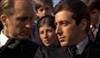
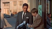
The Blu sticker on Broadcast News must a Simpsons tribute to Brooks in honor of the episode where Moe wins the Duff bartender competition and gets his own calendar, only to have a dozen Duff stickers put over his face.
-
domino harvey

- Dot Com Dom
- Joined: Wed Jan 11, 2006 6:42 pm
Re: Criterion & Eclipse Cover Art & Packaging Babble-on Vol.
And that's why it's over William Hurt's picture?
On the plus side, overall these are the best Eclipse covers. yet
On the plus side, overall these are the best Eclipse covers. yet
-
Mr. Ned
- Joined: Sun Apr 05, 2009 10:58 pm
Re: Criterion & Eclipse Cover Art & Packaging Babble-on Vol.
I'm happy Shock Corridor has finally been rereleased, but what a let-down those new covers are: "Hey, I have an idea! Samuel Fuller just screams pulp noir, right? So why don't we make the cover like a PULP COMIC BOOK?!" Yawn. And Yawn to January's titles, although that Eclipse looks like fun.
-
zedz

- Joined: Sun Nov 07, 2004 11:24 pm
Re: Criterion & Eclipse Cover Art & Packaging Babble-on Vol.
Agreed. Whoever did these is swinging that template.domino harvey wrote:On the plus side, overall these are the best Eclipse covers yet
Otherwise, I think the Broadcast News cover is a bit of a mess in execution, though a nice idea for dealing with the 'big heads' conundrum, and the Clowes Fuller ones yawnsome. Wishy-washy pink and lilac seem completely wrong choices for such vivid films.
-
Tribe

- The Bastard Spawn of Hank Williams
- Joined: Tue Nov 02, 2004 11:59 pm
- Location: Toledo, Ohio
- Contact:
Re: Criterion & Eclipse Cover Art & Packaging Babble-on Vol.
Those Fuller covers are Daniel Clowes, right? I love those!
EDIT: Ooops, just saws zeds' comments, they are. "Yawnsome?"
EDIT: Ooops, just saws zeds' comments, they are. "Yawnsome?"
-
HistoryProf

- Joined: Mon Mar 13, 2006 7:48 am
- Location: KCK
Re: Criterion & Eclipse Cover Art & Packaging Babble-on Vol.
Holy crap. that's a helluva month!
-
swo17

- Bloodthirsty Butcher
- Joined: Tue Apr 15, 2008 2:25 pm
- Location: SLC, UT
Re: Criterion & Eclipse Cover Art & Packaging Babble-on Vol.
I like the illustrations but I agree with zedz that the colors seem wrong on the Fullers. Maybe something bolder, like the dark green/purple color scheme on the original Shock Corridor cover, would improve things.
-
zedz
- Joined: Sun Nov 07, 2004 11:24 pm
Re: Criterion & Eclipse Cover Art & Packaging Babble-on Vol.
Well, full disclosure: I've never been that much of a Clowes fan in terms of his cartooning. Some good writing, and I don't mind his rendering style, though it's a little arch, but I find him compositionally weak. And I don't find the 'split cover' Criterion cliche suddenly exciting simply because it's a cartoon.Tribe wrote:Those Fuller covers are Daniel Clowes, right? I love those!
EDIT: Ooops, just saws zeds' comments, they are. "Yawnsome?"
-
jbeall

- Joined: Sat Aug 12, 2006 1:22 pm
- Location: Atlanta-ish
Re: Criterion & Eclipse Cover Art & Packaging Babble-on Vol.
Good Eclipse covers, but I've been eagerly awaiting the reissue of Shock Corridor and I'm disappointed by the cover.
-
Murdoch

- Joined: Mon Apr 21, 2008 3:59 am
- Location: Upstate NY
Re: Criterion & Eclipse Cover Art & Packaging Babble-on Vol.
Sapphire's cover is my favorite of the bunch, that's a first for an Eclipse!
-
Cash Flagg
- Joined: Fri Jan 25, 2008 3:15 am
Re: Criterion & Eclipse Cover Art & Packaging Babble-on Vol.
To my eyes, the two Fullers have the worst cover art Criterion has ever used.
-
karmajuice
- Joined: Tue Jun 10, 2008 2:02 pm
Re: Criterion & Eclipse Cover Art & Packaging Babble-on Vol.
The Fuller covers are alright, but that color scheme is a bizarre choice. The eclipse set is fantastic, though.
The specs for the Fuller discs suggest that Clowes will have illustrations throughout. While I'm iffy about those covers, I'd still be interested to see what the package as a whole look like. I wonder why they chose him to design them. Then again I don't think I've ever read Clowes' work, so if Fuller had any influence I wouldn't know.
The specs for the Fuller discs suggest that Clowes will have illustrations throughout. While I'm iffy about those covers, I'd still be interested to see what the package as a whole look like. I wonder why they chose him to design them. Then again I don't think I've ever read Clowes' work, so if Fuller had any influence I wouldn't know.
-
MyNameCriterionForum

- Joined: Sat Jun 21, 2008 9:27 am
Re: Criterion & Eclipse Cover Art & Packaging Babble-on Vol.
They chose Clowes because, if you've read his earlier work - particularly Lloyd Llewellyn - you'd recognize his infatuation with Russ Meyer/Sam Fuller/Jack Webb visual style, all punch and bluster and gusto. Frankly, though, he's been limply phoning it in ever since he started palling around with Adrian Tomine. I don't think they're so bad, myself. He's just obviously not dialled-in to that sort of tone any more.
-
HistoryProf
- Joined: Mon Mar 13, 2006 7:48 am
- Location: KCK
Re: Criterion & Eclipse Cover Art & Packaging Babble-on Vol.
I guess I just don't understand the colors for the Fullers. It's very bubblegummy - which don't exactly scream "pulpy noir!" to me. That bubblegum color was a horrid choice. Anything else would have been better....should have stuck w/ the blue/green combo of the original SC cover. Or at least some deep reds. something. anything. eesh.
I was thinking the same thing - only for League of Gentleman. Very Peter Watkins-esque. Makes me want to own it now.Murdoch wrote:Sapphire's cover is my favorite of the bunch, that's a first for an Eclipse!
-
Steven H

- Joined: Tue Nov 02, 2004 7:30 pm
- Location: NC
Re: Criterion & Eclipse Cover Art & Packaging Babble-on Vol.
I love the Clowes covers and while they are "pulpy" his style really brings out how paranoid and full of nervous energy the films feel to me. Good stuff, but the Dearden covers take the cake.
-
movielocke

- Joined: Fri Jan 18, 2008 4:44 am
Re: Criterion & Eclipse Cover Art & Packaging Babble-on Vol.
I think it's the bubblegum color palate that I find most offputting about the fuller covers, There'll still quite nice but the color scheme is odd. I ran them through photoshop, and viewing the black and white red or green layers by themselves makes both look really excellent (as always a straight up desaturate looks terrible).HistoryProf wrote:I guess I just don't understand the colors for the Fullers. It's very bubblegummy - which don't exactly scream "pulpy noir!" to me. That bubblegum color was a horrid choice. Anything else would have been better....should have stuck w/ the blue/green combo of the original SC cover. Or at least some deep reds. something. anything. eesh.
I love the Broadcast News cover, from the font to the image arrangement, to even the semi malicious covering of William Hurt's head. It's a really astute design that captures the feel of the movie so well. But I think my favorite bit is the "A Film By" and "James Brooks" parts, both of which are so well integrated into the piece and the feel of the studio control room. :-p
and I'm really glad the eclipse set went with the Kurasawa/Shepitko template as that's my favorite kind of eclipse cover. I really don't like it when they fully cheap out and just have a blank white front in both panels.
-
knives

- Joined: Sat Sep 06, 2008 10:49 pm
Re: Criterion & Eclipse Cover Art & Packaging Babble-on Vol.
Really even easier for them would have been taking off the top of Naked Kiss and bottom of Shock Corridor. It may not have been perfect (I think his style is too fluid for Fuller) but it would seem less cluttered and off. That being said the covers aren't bad and certainly not enough to damper even a miligram of my excitement for these two.movielocke wrote: I think it's the bubblegum color palate that I find most offputting about the fuller covers, There'll still quite nice but the color scheme is odd. I ran them through photoshop, and viewing the black and white red or green layers by themselves makes both look really excellent (as always a straight up desaturate looks terrible).
Last edited by knives on Sat Oct 16, 2010 4:20 am, edited 1 time in total.
-
Doctor Sunshine

- Joined: Wed Nov 03, 2004 2:04 am
- Location: Brain Jail
Re: Criterion & Eclipse Cover Art & Packaging Babble-on Vol.
Maybe it's just me, it's been a while since I've seen either Fuller, but I recall detecting a hint of camp.
-
Mr. Ned
- Joined: Sun Apr 05, 2009 10:58 pm
Re: Criterion & Eclipse Cover Art & Packaging Babble-on Vol.
When I first saw Shock Corridor, I had recently broken up with a girl I was in love with: I remember going "I'm heartbroken, but this movie was mad, insane genius." Bubblegum Pink and Honeysuckle Yellow are not the first things I think of when I think of heartbrokenness or insanity: I think deep reds, angry greens, and pictures that don't look like a shitty comic book. Sam Fuller deserves more than cartoons.
-
karmajuice
- Joined: Tue Jun 10, 2008 2:02 pm
Re: Criterion & Eclipse Cover Art & Packaging Babble-on Vol.
Well a lackluster cover is no reason to condescend to an entire art form.
-
Steven H
- Joined: Tue Nov 02, 2004 7:30 pm
- Location: NC
Re: Criterion & Eclipse Cover Art & Packaging Babble-on Vol.
The post makes a lot more sense when I imagine it as a page out of Wilson.karmajuice wrote:Well a lackluster cover is no reason to condescend to an entire art form.
-
MyNameCriterionForum
- Joined: Sat Jun 21, 2008 9:27 am
Re: Criterion & Eclipse Cover Art & Packaging Babble-on Vol.
Are you kidding? Have you watched any Fuller films or read any comics? Because most of Fuller's movies are more hamfisted, knuckleheaded and didactic than the average comic book of the era, and that's a fact.Mr. Ned wrote:Sam Fuller deserves more than cartoons.
-
HistoryProf
- Joined: Mon Mar 13, 2006 7:48 am
- Location: KCK
Re: Criterion & Eclipse Cover Art & Packaging Babble-on Vol.
I think the drawings themselves are fantastic...I actually really like them. It's just that dammed bubblegum color that grows more and more blech each time I look at it....especially paired with the paleish lemony color. It needed to be BOLD w/ Reds and Deep blues and greens.
oh well. I'm just glad we finally get to see them in high def.
oh well. I'm just glad we finally get to see them in high def.