Criterion & Eclipse Cover Art & Packaging Babble-on Vol.5
-
dad1153

- Joined: Thu Apr 16, 2009 2:32 pm
- Location: New York, NY
Re: Criterion & Eclipse Cover Art & Packaging Babble-on Vol.
^^^ I also like the "Senso" cover (ducks!) but I've never seen the movie (or any of Visconti's work for that matter). For what it's worth, the cover makes me want to see the movie way more than "The Leopard's" cover.
-
Finch

- Joined: Mon Jul 07, 2008 9:09 pm
- Location: United States
Re: Criterion & Eclipse Cover Art & Packaging Babble-on Vol.
The font for his name is perfectly fine (about the only good thing in this cover). What puts me off more than anything else is the chosen font for the title which to me just feels utterly out of place. Maybe I have more conservative tastes in covers than I realise but in this instance I think they'd have served the film better by choosing a still or high def shot from the film with the font of Visconti's name also used for the title.Michael wrote:Apparently I'm looking at Senso in the wrong way because I don't seem to find anything wrong with it. It's perfectly Visconti - the font of his name matches the font of his titles
-
felipe
- Joined: Thu May 06, 2010 3:06 am
Re: Criterion & Eclipse Cover Art & Packaging Babble-on Vol.
No packaging photos for Night of the Hunter and Modern Times?
-
cdnchris

- Site Admin
- Joined: Tue Nov 02, 2004 6:45 pm
- Location: Washington
- Contact:
Re: Criterion & Eclipse Cover Art & Packaging Babble-on Vol.
There was a delay in sending them out so I haven't received them yet. Theoretically they should be here tonight.
-
swo17

- Bloodthirsty Butcher
- Joined: Tue Apr 15, 2008 2:25 pm
- Location: SLC, UT


-
Murdoch

- Joined: Mon Apr 21, 2008 3:59 am
- Location: Upstate NY
Re: Criterion & Eclipse Cover Art & Packaging Babble-on Vol.
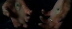
Aw yeaaa, Mitchum hand-to-the-sky still on back.
-
Tom Hagen

- Joined: Mon Apr 14, 2008 4:35 pm
- Location: Salt Lake City, Utah
Re: Criterion & Eclipse Cover Art & Packaging Babble-on Vol.
BTW, I noticed at B&N today that the DVD is in a figure 8 keepcase.
-
matrixschmatrix

- Joined: Wed May 26, 2010 3:26 am
Re: Criterion & Eclipse Cover Art & Packaging Babble-on Vol.
When the interior package is folded over, it has a visual effect where Mitchum with his hand up seems to be casting a shadow through the case- it's pretty great. This looks one of my favorite packages Criterion's ever put together, on every level.
-
Murdoch
- Joined: Mon Apr 21, 2008 3:59 am
- Location: Upstate NY
Re: Criterion & Eclipse Cover Art & Packaging Babble-on Vol.
I like how it's similar to White Dog in how it has this docile cover, then you open the packaging and Mitchum does a complete 180.
-
HistoryProf

- Joined: Mon Mar 13, 2006 7:48 am
- Location: KCK
Re: Criterion & Eclipse Cover Art & Packaging Babble-on Vol.
the black background is bad enough (I don't mind the confetti so much...but the execution is so elementary)...but you hit the nail on the head here as to the most egregious offense with this one: The freaking TITLE of the movie. It is something you would expect to see for a 70s western or something, like Duchess and the Dirtwater Fox, Posse, or Monte Walsh - not a 19th century melodrama set among royalty. I just don't get it.Finch wrote:The font for his name is perfectly fine (about the only good thing in this cover). What puts me off more than anything else is the chosen font for the title which to me just feels utterly out of place. Maybe I have more conservative tastes in covers than I realise but in this instance I think they'd have served the film better by choosing a still or high def shot from the film with the font of Visconti's name also used for the title.Michael wrote:Apparently I'm looking at Senso in the wrong way because I don't seem to find anything wrong with it. It's perfectly Visconti - the font of his name matches the font of his titles
-
zedz

- Joined: Sun Nov 07, 2004 11:24 pm
Re: Criterion & Eclipse Cover Art & Packaging Babble-on Vol.
Beautiful. I count five first-rate covers in that package, particularly the three that don't show Mitchum's face.
-
HistoryProf
- Joined: Mon Mar 13, 2006 7:48 am
- Location: KCK
Re: Criterion & Eclipse Cover Art & Packaging Babble-on Vol.
I do have to agree that it feels oddly oversized and cheaper than the other recent blu digis. It's awfully pretty, but doesn't have the same textured feel of Seven Samurai and others.
-
mfunk9786

- Under Chris' Protection
- Joined: Fri May 16, 2008 8:43 pm
- Location: Miami, FL
Re: Criterion & Eclipse Cover Art & Packaging Babble-on Vol.
I saw a lot of crushed ones at BN today. Definitely oversized and cheapo.
-
domino harvey

- Dot Com Dom
- Joined: Wed Jan 11, 2006 6:42 pm
Re: Criterion & Eclipse Cover Art & Packaging Babble-on Vol.
Sorry, I know I have a tendency to revert back to music label examples, but it was killing me all afternoon what this digipak reminded me of: the budget thick digipaks from the early days of digipak releases, before they realized each compartment didn't need to be as thick as a jewelcase. It's probably hard to know what I'm talking about unless you dealt with boutique labels, but it's definitely an antiquated type of digipak, at least with CDs, and I'm surprised to see it in play from Criterion in 2010. My guess? A custom job gone wrong and whoever Criterion hires to oversee things like this not happening is surely the same dept head who okayed Modern Times and donated $100 to the new Allison Anders movie
-
swo17
- Bloodthirsty Butcher
- Joined: Tue Apr 15, 2008 2:25 pm
- Location: SLC, UT
Re: Criterion & Eclipse Cover Art & Packaging Babble-on Vol.
Is it any different from the packaging for The Leopard?
-
mfunk9786
- Under Chris' Protection
- Joined: Fri May 16, 2008 8:43 pm
- Location: Miami, FL
Re: Criterion & Eclipse Cover Art & Packaging Babble-on Vol.
I'd swear it's a bit wider.
-
matrixschmatrix
- Joined: Wed May 26, 2010 3:26 am
Re: Criterion & Eclipse Cover Art & Packaging Babble-on Vol.
Having just got up and compared them- it's a tiny bit wider than the Leopard, but exactly the same width as Seven Samurai. It's printed on different material than Seven Samurai, though, the paper is slicker and thinner.
-
mfunk9786
- Under Chris' Protection
- Joined: Fri May 16, 2008 8:43 pm
- Location: Miami, FL
Re: Criterion & Eclipse Cover Art & Packaging Babble-on Vol.
It is too wide for what's inside, which means 90% of these are going to be smushed in one way or another. Definitely a missed opportunity for a classy digi.
-
Cinephrenic

- Joined: Tue Nov 02, 2004 6:58 pm
- Location: Paris, Texas
Re: Criterion & Eclipse Cover Art & Packaging Babble-on Vol.
By the time it gets in my hands, all digipaks are smashed or have folds on its spine. Even with the amaray titles, most of the inserts I receive are wrinkled. Perhaps I'm just picky in that way, but still nothing seems to look brand new other than the disc. I don't think its Criterion's fault, just faulty handling from distributors.
-
Zinoviev

- Joined: Tue Dec 09, 2008 11:45 pm
Re: Criterion & Eclipse Cover Art & Packaging Babble-on Vol.
Can't stand them. Sooner or later every one is going to end up with a crushed spine and dented corners.Cinephrenic wrote:I don't think its Criterion's fault, just faulty handling from distributors.
Digipacks, not distributors.
-
Crab Society North
- Joined: Fri Oct 22, 2010 12:08 pm
Re: Criterion & Eclipse Cover Art & Packaging Babble-on Vol.
So is the Night of the Hunter blu only in the digipack? all I could find today at 3 different B&N's were the figure 8 cases for the SD's which is what I collect.
-
Jeff

- Joined: Wed Nov 03, 2004 1:49 am
- Location: Denver, CO
Re: Criterion & Eclipse Cover Art & Packaging Babble-on Vol.
Correct. Digipak for the Blu, figure-eight for the SD.Crab Society North wrote:So is the Night of the Hunter blu only in the digipack? all I could find today at 3 different B&N's were the figure 8 cases for the SD's which is what I collect.
-
Crab Society North
- Joined: Fri Oct 22, 2010 12:08 pm
Re: Criterion & Eclipse Cover Art & Packaging Babble-on Vol.
Thanks. I'm actually breathing a sigh of relief because I thought for some reason they were distributing the SD in both the figure 8's and digi's all at once.Jeff wrote:Correct. Digipak for the Blu, figure-eight for the SD.Crab Society North wrote:So is the Night of the Hunter blu only in the digipack? all I could find today at 3 different B&N's were the figure 8 cases for the SD's which is what I collect.
-
knives

- Joined: Sat Sep 06, 2008 10:49 pm
Re: Criterion & Eclipse Cover Art & Packaging Babble-on Vol.
How are they fitting three discs into the figure eight? Is that the first time this has happened since the adoption?
-
Jeff
- Joined: Wed Nov 03, 2004 1:49 am
- Location: Denver, CO
Re: Criterion & Eclipse Cover Art & Packaging Babble-on Vol.
I believe the SD release is crammed on to two discs.knives wrote:How are they fitting three discs into the figure eight? Is that the first time this has happened since the adoption?